


Minus20 management.
Brand identity + Web
Task
Create a identity and graphic language that reflect the unique nordic models and
butique concept of the newly formed model agency "Minus 20".
Execution in short
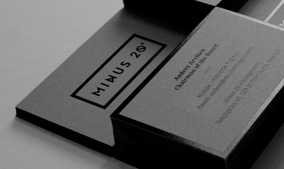
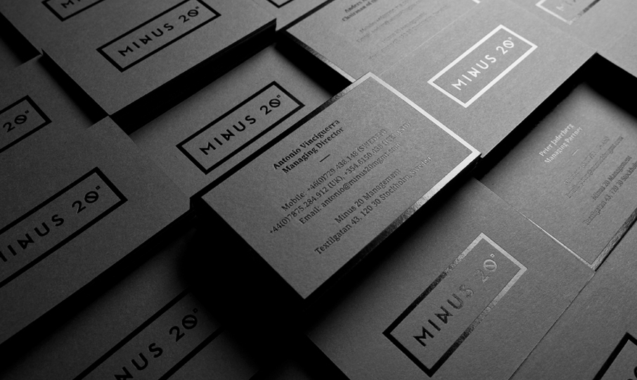
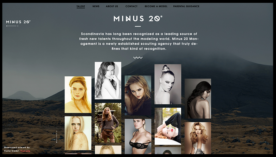
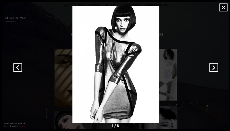
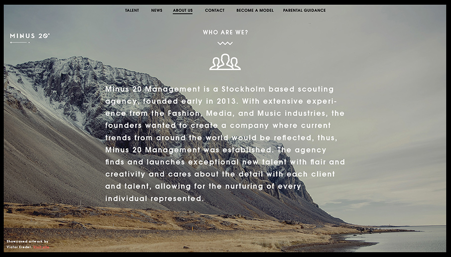
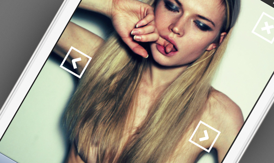
"Runes", old nordic typograpgy used by vikings grasped our interest and created that graphic space and nordic touch we were looking for. The "Rune" style typography was simplified and then brought in to the logo (seen on the first picture on the business card). The UX for the model agency website was a big part of the execution and thanks to Victor we were able to set a nice tone on it.
Many thanks to Victor Eredel for letting us use his fantastic photos from the "2012 iceland case".
Visit "Minus 20" here.


We are very happy for all the appreciations,
we have also received a honorable mention on awwwards.com
Thanks!


