T.Vukaj
T.VUKAJ is a Mexican-Albanian brand dedicated to the design of handmade footwear, its commercialization and production. The brand focuses on offering premier quality in its products, in breaking the established patterns and standards, in innovating the processes and in denoting minimalism in the details of their models, leaving the old school behind.
Objective:
Create the brand’s concept in which it is possible to reflect the elegance of its identity and its irreverence at the same time, excelling its qualities like colorimetry and photography in its logo, being integral in all its image.
Resolution:
The integral Branding focused on reflecting a minimalism that denoted elegance but at the same time had a touch in contrast that gave it strength.
The integral Branding focused on reflecting a minimalism that denoted elegance but at the same time had a touch in contrast that gave it strength.
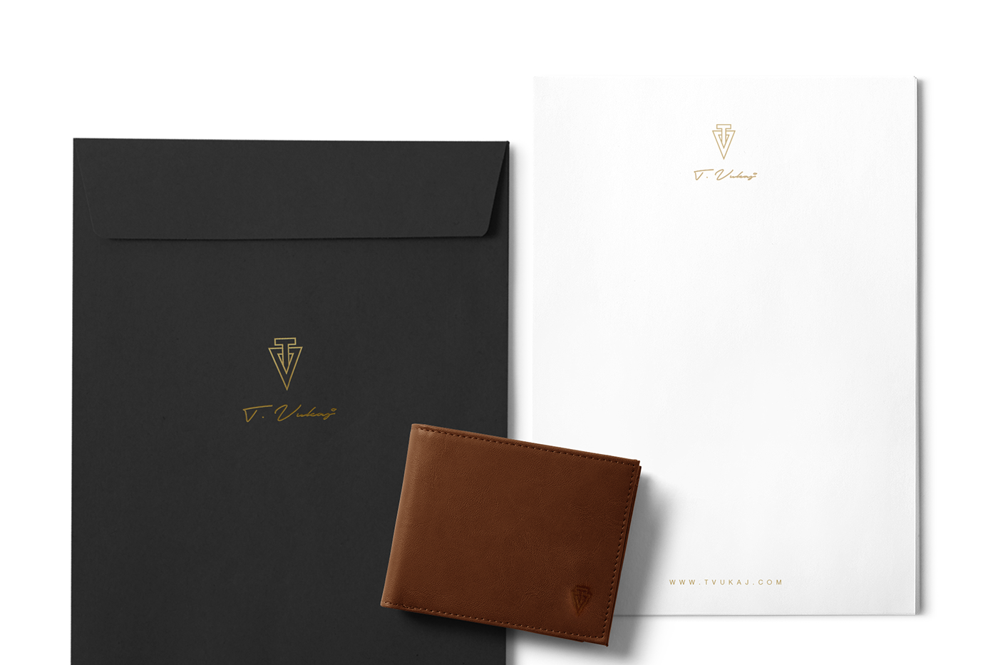
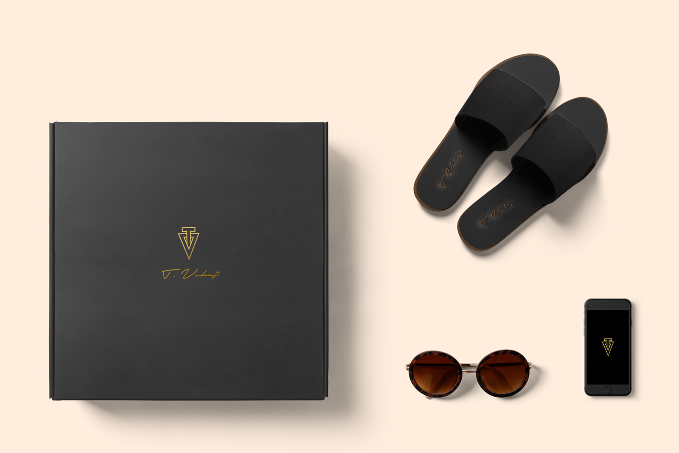
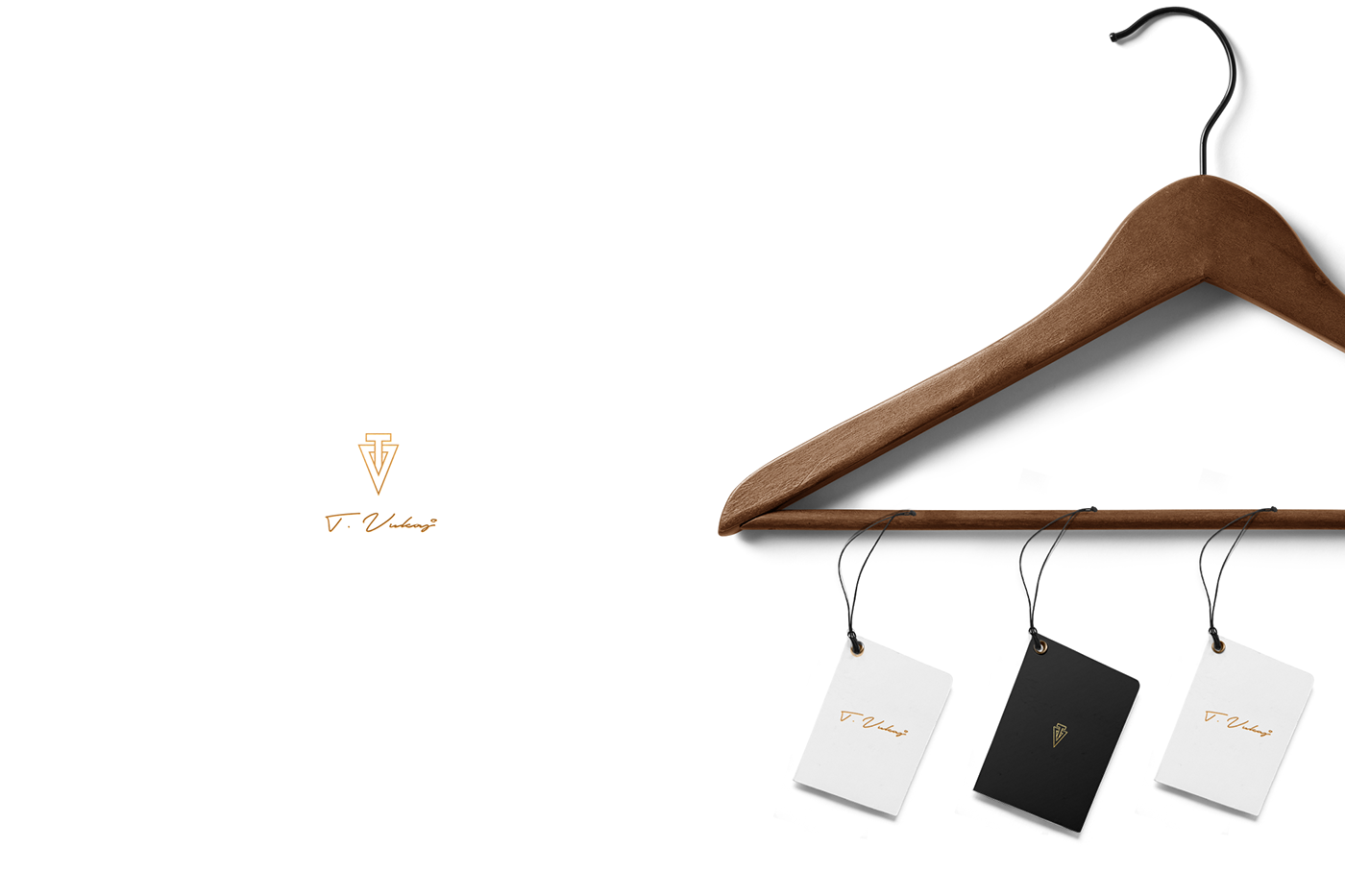
As a distinctive (or badge), we have the isotype formed by the letters "T" and "V" (Acronyms of the brand’s name) in a linear and angular way, inserted one in the other simulating the banner, as a symbol of breaking with the established, in antithesis with the signature of the brand, written in a cursive manner simulating a signature, giving balance, making an allusion to the irreverence of the concept, forming the final logo.
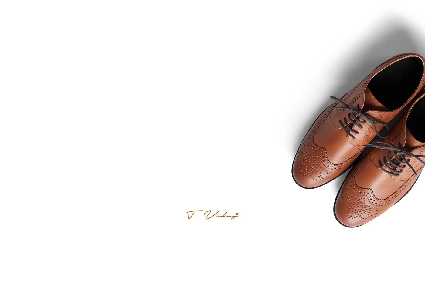
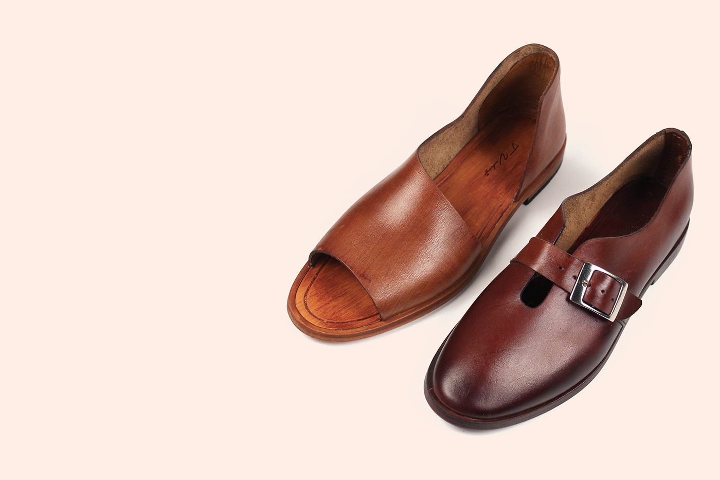
The concept suggests elegance in the gold and black colors with a subtle touch of beige in certain details that denote the natural color (also called raw color), because that is the color that presents the wool when it hasn’t been submitted to any process of treatment, alluding to the quality and nature of the handmade technique used by the brand in its procedure, balancing both parts of the concept’s coin. Using the same criteria in the photography.

T.Vukaj
T. VUKAJ es una marca Mexico-Albanesa dedicada al diseño de calzado artesanal, su comercialización y producción. Enfocados en la calidad premier de los productos, en romper los patrones y estándares establecidos, innovando en el proceso, denotando minimalismo en los detalles en sus modelos dejando detrás la vieja escuela.
Objetivo:
Crear el concepto de marca en la que se logre reflejar la elegancia de su identidad y a la vez su irreverencia, sobresaliendo sus cualidades en el logotipo, colorimetría y fotografía siendo integral en toda su imagen.
Resolución:
El Branding integral se enfocó en reflejar un minimalismo que denotó elegancia con un toque en contraste que le dio fuerza.
Como distintivo tenemos el isotipo formando por las letras "T "y "V" (Siglas del nombre de la marca) de manera lineal y angular, insertada una en la otra simulando el estandarte, a su vez simbolo de romper con lo establecido, en antítesis con la firma de la marca de manera cursiva simulando una firma, dando un equilibrio, haciendo alusión a la irreverencia del concepto, formando el Logotipo final.
El concepto sugiere elegancia en los colores dorado y negro y un sutil toque de baige en detalles que denote el color natural o también denominado crudo, porque es el color que presenta la lana cuando no ha sido sometida a ningún proceso de tratamiento, haciendo alusión a la calidad y naturaleza de la técnica empleada (handmade) por la marca en su procedimiento, equilibrando ambas partes de la moneda del concepto. Usando en la fotografía el mismo criterio.