

Smiltynės Ferry Terminal
Identity for ferry terminal, transferring people to holiday destination & mood
Identity for ferry terminal, transferring people to holiday destination & mood
Challenge
Neringa is a unique place in Lithuania. Just like theater begins with a cloakroom, Neringa begins with Smiltyne Ferry Terminal. Previously its style was ineffective, and communication tools caused dissatisfaction with people. We took a challenge to create an appealing and coherent style of all the signage that help people get around the terminal territory easier. Through them we seeked to convey good emotions and holiday feel.
Our solution
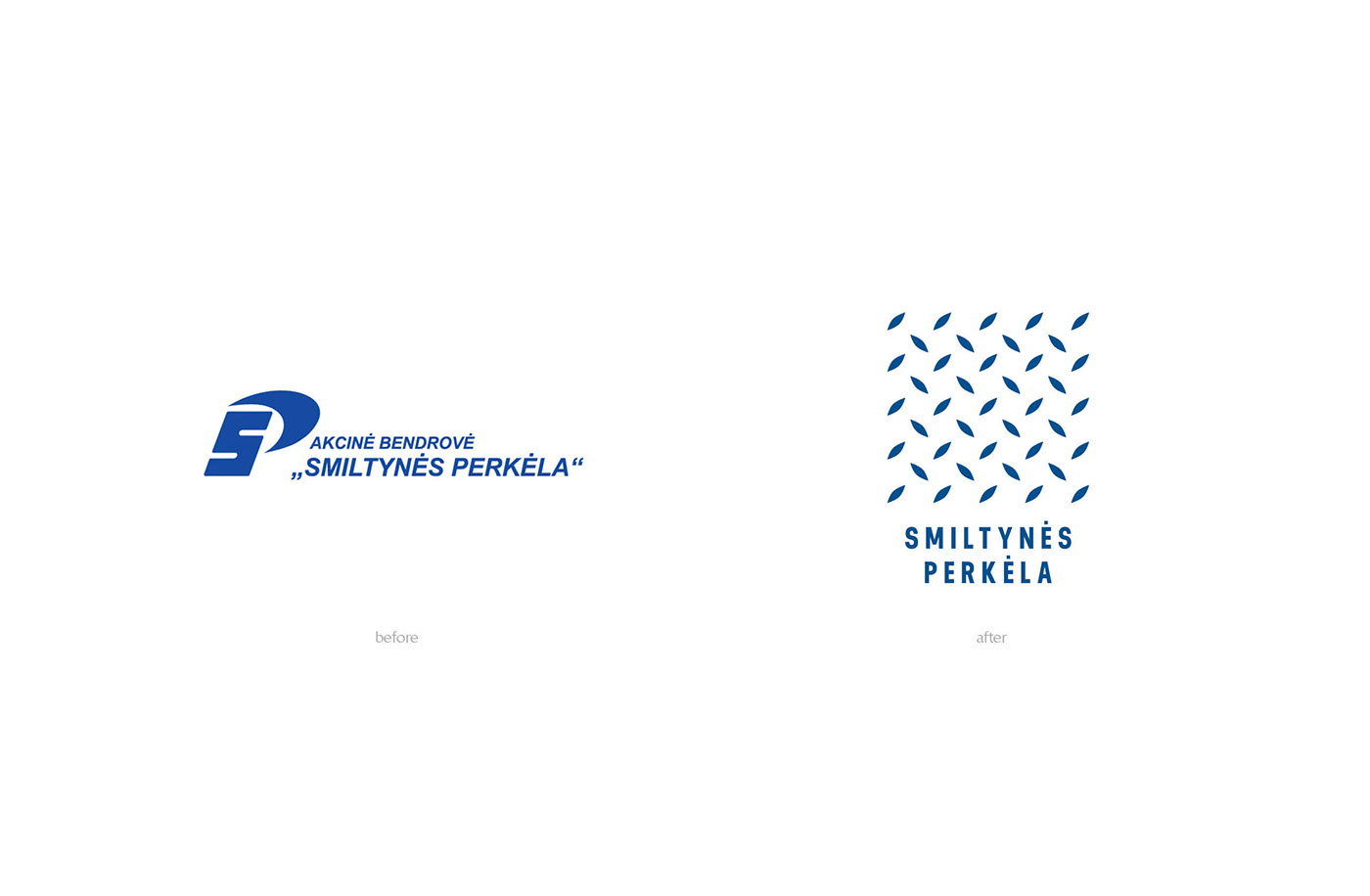
The powerful sound of a metal ferry paving, while walking or driving on it, is a symbol that announces the beginning of holidays in Neringa. The paving pattern gave us the idea for a logo. It was used on all the communication tools and helped create a solid identity. The main colours we chose were bright blue and yellow – the shades of water, dunes, and holidays in general. The ferry terminal was filled with wayshowing signs, such as arrows, timetables, prohibition signs. In these bright colours they became clear and visible from afar. We also arranged their hierarchy so that the most relevant information would reach the eye first and would not disadvantage travelers.
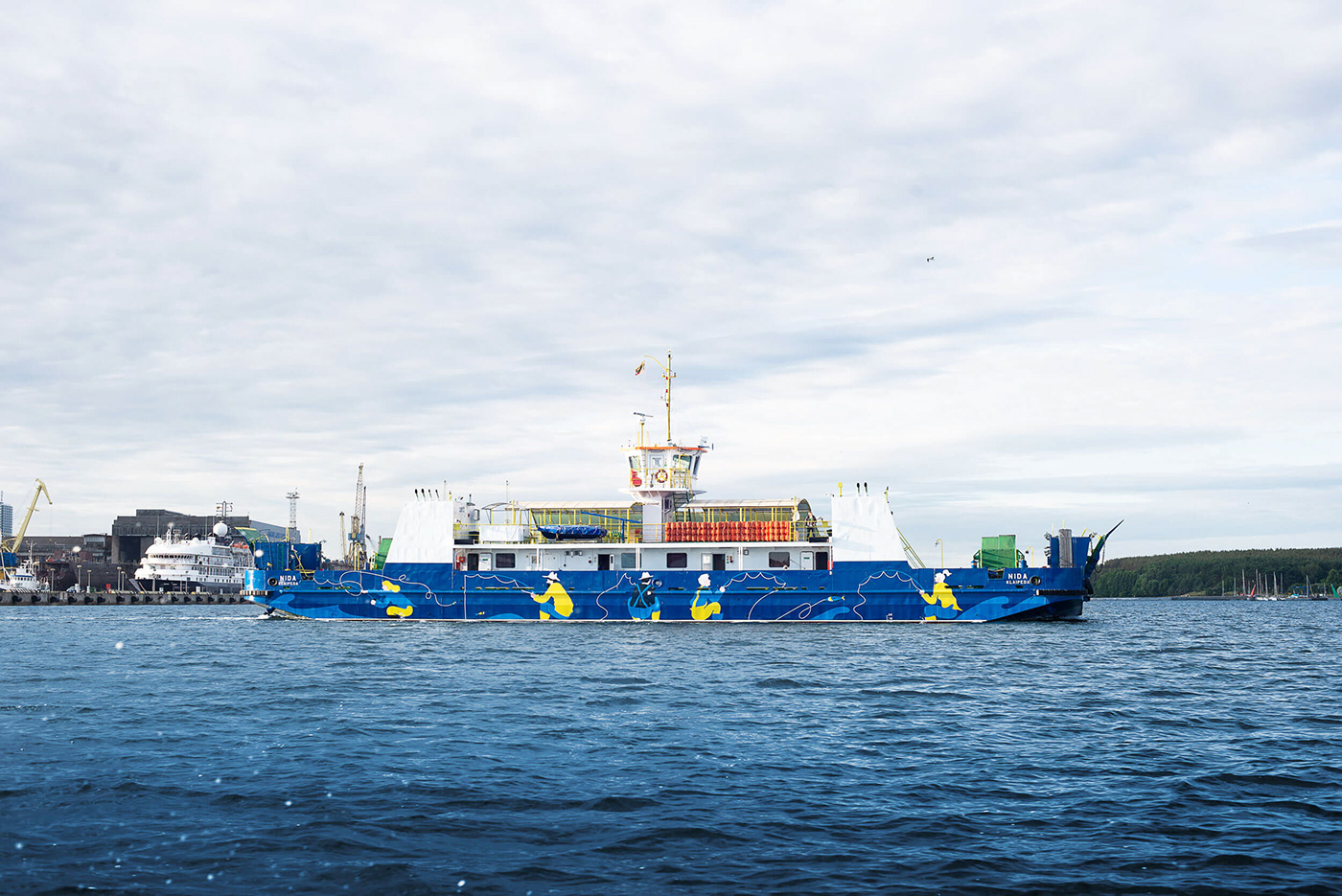
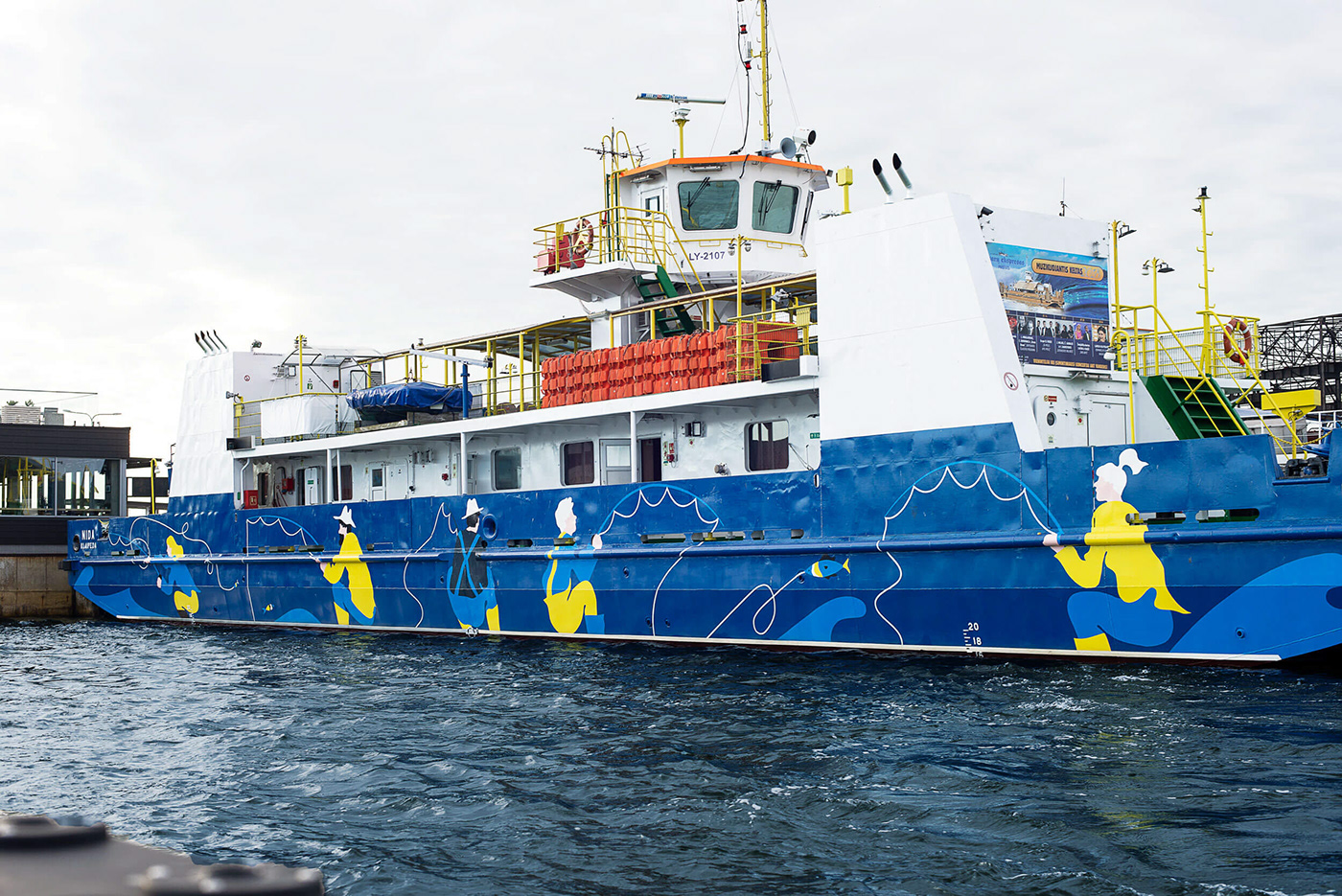
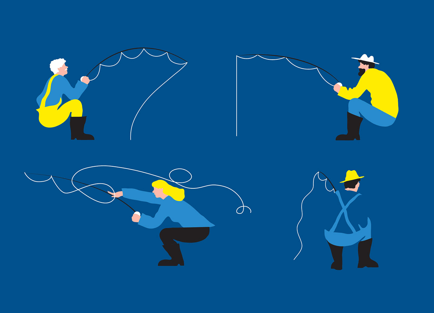
The most fun part of this project was the chance to give character and add even more holiday feel by using the ferry ships. The ferry is on water at all times, so we created certain swimming, sports or leisure scenarios that were painted on the intersection where ferry meets water. These plots become alive when ferries are in motion.


Follow us on Instagram


