1. Pre-Project Notes
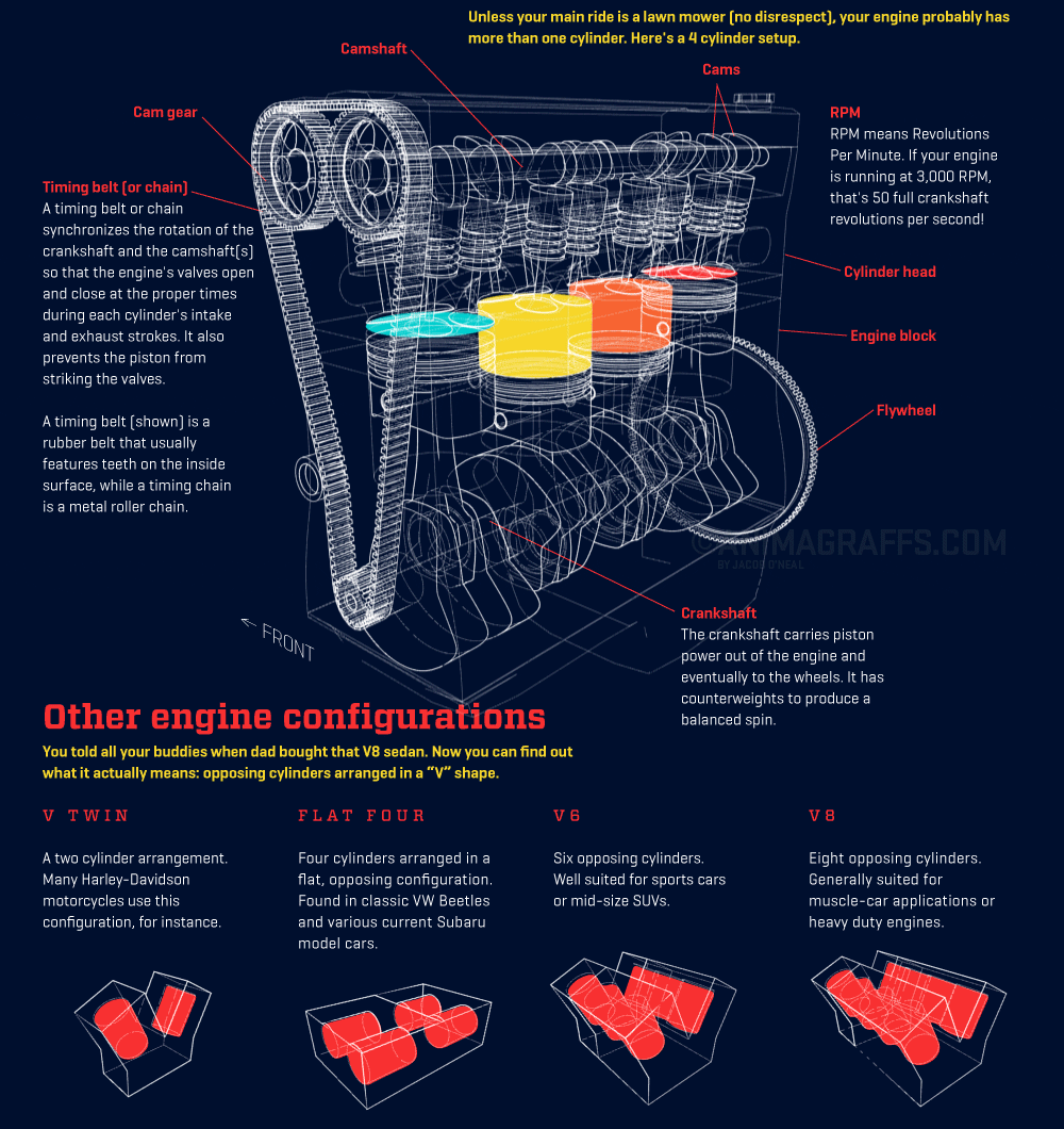
This project analyzes a section of an infographic called "How a Car Engine Works." To ensure that the infographic chosen for this assignment was easily scrolled and brief, per the assignment parameters, I specifically chose to focus on the section that detailed various engine parts and configurations. That said, this was one piece of a larger project that is also engaging to review.
The project evolved significantly after the peer review last week, moving from a one-page "poster" to, instead, a style meant to evoke a digital magazine. Because Behance requires images rather than PDFs, I am submitting a JPG version of the project in this Behance posting.
2. Individual Design Project


Additional Background Images:
Rodion Kutsaev, "Yellow wall," Flickr CC.
wittman_howell, "Cuppa. Open Road," Flickr CC.
wittman_howell, "Cuppa. Open Road," Flickr CC.
3. Designer Statement
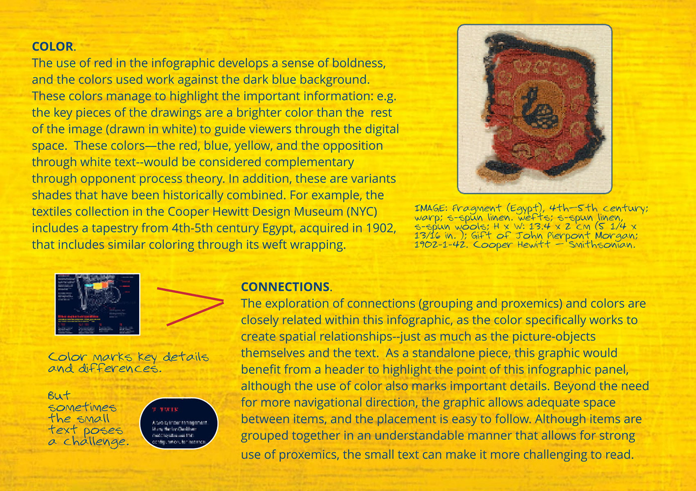
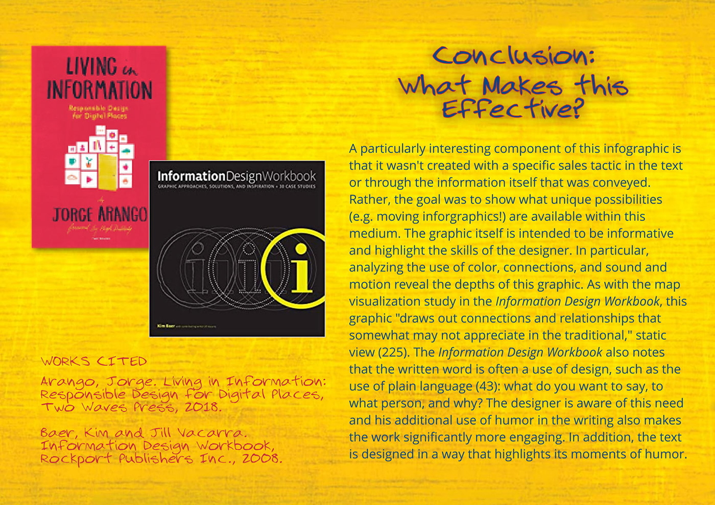
This design project was an adventure as it developed broadly in scope and design. Looking at my original draft of this project shows how drastically it changed since first developed! Helpful feedback from my peers led me to consider colors in my analysis that were more complementary to the infographic itself, as well as play with the idea of taking readers on a "road trip" through my design. In addition, I chose to include a video (with, as required, the source cited beneath the media).
To fit each of these elements, I attempted a digital magazine design, but the first iteration was a simple, one-page poster.
To fit each of these elements, I attempted a digital magazine design, but the first iteration was a simple, one-page poster.
First Draft of Project:

Upon review, I actually realize that I prefer the fonts selected in my original version, as these align more closely with that of the infographic analyzed. My goal in the revised version had been making the text "clearer" to read rather than too close together, so I went with a classic Arial. For the captions and headers, I chose a font that, to me, evoked the feeling of a map or road trip, although I recognize this may be a subjective feeling and this not a clear-cut design decision.
In the final version, I used bright colors that matched up with the infographic without being overwhelmingly identical. For the "sound and motion" section, I chose to use an image of the open road in the background, and arrange the text and supplementary items as if taking readers down this road. This is where I included the audio (more precisely, a video highlighting audio), as a topic such as engines connect closely with sound. Because the infographic itself did not include sound, I chose to place this in the sky above the road, slightly faint in color, as something at a distance but worthy of consideration.
