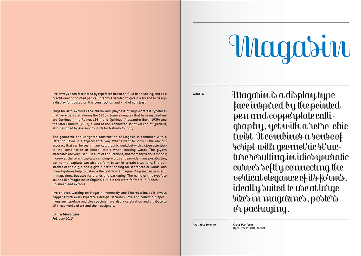
Magasin is a display typeface inspired by the pointed pen and copperplate calligraphy, yet with a retro-chic twist. It combines a sense of script with geometric structure resulting in idiosyncratic curves softly connecting the vertical elegance of its forms, ideally suited to use at large sizes in magazines, posters or packaging.
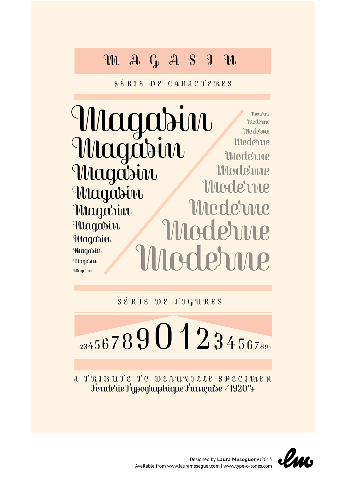
Cover of Magasin Specimen, at tribute to Deauville Specimen by the Fonderie Typographique Française, 1920s.
Magasin also explores the charm and playness of high-contrast typefaces that were designed during the 1930s. Some examples that have inspired me are Corvinus (Imre Reiner, 1934) and Quirinus (Alessandro Butti, 1939) and the later Fluidum (1951), a kind of non-connected script version of Quirinus, also designed by Alessandro Butti for Nebiolo foundry.

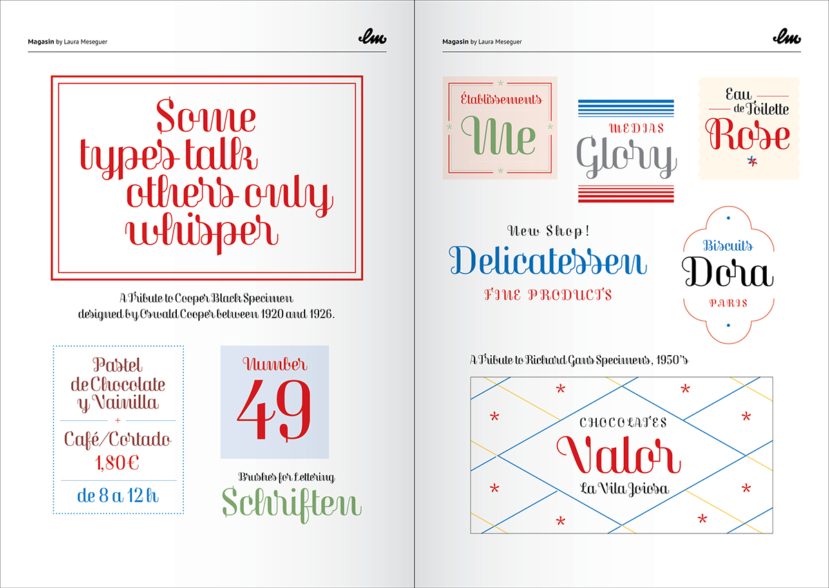
Spread of the Magasine Specimen, the image ont top left is a tribute to Cooper Black Specimen, designed by Oswald Cooper between 1920 and 1926. The stickers on the right are a tribute to Richard GansType Specimens from the 1950s.
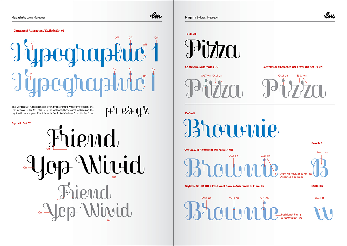
The geometric and uprighted construction of Magasin is combined with a lettering flavor in a experimental way. What I want to show is the obvious accuracy that can be seen in any calligraphic work, but with a close attention to the combination of linked letters when creating words.
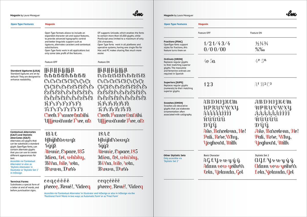
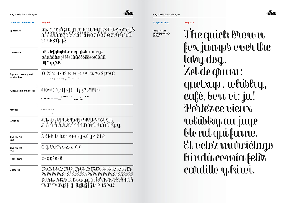
The glyphs alternates are very useful in a lot of applications, and for many various moods; moreover, the swash capitals can ‘pimp’ words and provide many possibilities, but normal capitals can also perform better in certain situations. The out-strokes of the c, ç, e and q give a better ending for sentences or words, and many ligatures help to balance the text flow. I imagine Magasin can be used… in magazines, but also for brands and packaging. The name of this typeface sounds like ‘magazine’ in English, but it is the word for ‘store’ in French.

I’ve enjoyed working on Magasin immensely, and I learnt a lot, as it always happens with every typeface I design. Because I love and collect old specimens, my typeface and this specimen are also a celebration and a tribute to all those works of art and their designers.
Go ahead and explore!
Go ahead and explore!
You can download this specimen here
Read more about the design of MAGASIN, at his article published at IloveTypography.
I’m also very happy to announce you that Magasin has been chosen as one of the “Our favourite typefaces of 2013" for Typographica, and reviewed by Tiffany Wardle de Sousa. Read it here
I’m also very happy to announce you that Magasin has been chosen as one of the “Our favourite typefaces of 2013" for Typographica, and reviewed by Tiffany Wardle de Sousa. Read it here
Magasin is available for purchasing at www.type-o-tones.com
