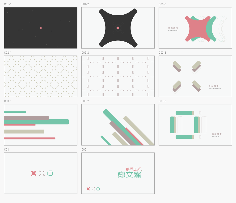
這是我們為桃園市長「鄭文燦」所製作的競選形象影片「The Best Taoyuan」。主視覺由田修銓所設計,也設計了一系列的輔助應用圖形,分別取自燦、桃、園,代表為「魅力」、「多元」、「團結」,形象影片並以這三個符號做為延伸 :
「魅力」代表著城市的自信,彷彿是黑夜最耀眼的一顆星,打亮整片夜空,也是最有魅力的城市。
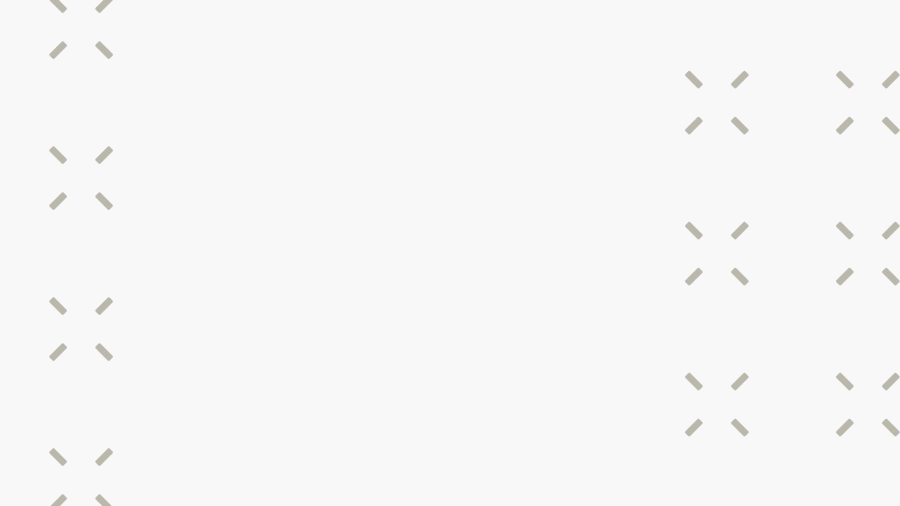
「多元」代表著擁抱不同族群,彼此間有交流、有互動,由內而外地展現文化底蘊,並匯聚了許多不同的聲音。
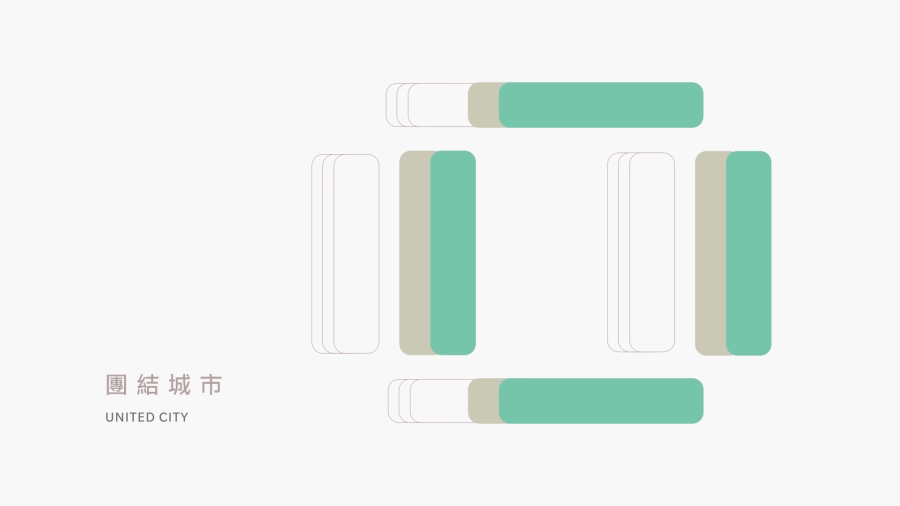
「團結」代表著市民朋友一致的期待,城市並且是非常有力量及速度的前進。
「魅力」代表著城市的自信,彷彿是黑夜最耀眼的一顆星,打亮整片夜空,也是最有魅力的城市。
「多元」代表著擁抱不同族群,彼此間有交流、有互動,由內而外地展現文化底蘊,並匯聚了許多不同的聲音。
「團結」代表著市民朋友一致的期待,城市並且是非常有力量及速度的前進。
The Best Taoyuan is a campaign video designed for the mayor of Taoyuan city, Cheng Wen-chan. The key visual and the series of auxiliary graphics were designed by Neil Tien.
This campaign video uses the ready-made graphics as elements to create movement and deepen its meaning; each shape represents a political goal of Cheng's campaign:
This campaign video uses the ready-made graphics as elements to create movement and deepen its meaning; each shape represents a political goal of Cheng's campaign:
"Charm" is a pun intended word of character Chan(燦), which represents confidence. The diamond-shape-like square acts as if the city is the brightest star at night that lights up the dark sky. It also carries the hope of Mr. Cheng to build an attractive city.
"Diversity" means embracing different ethnic groups and the connection and interaction between them. We designed the movements of the multiple signs to express cultural heritage from the inside out. The motion transcends the gathering of multicultural voices.
"Unity" represents the unanimous expectation of the citizens. From various lines to a square, the journey of the motion speaks that the city is moving forward with great strength and efficiency.
-
// Credit
Client : 鄭文燦 競選團隊
// Credit
Client : 鄭文燦 競選團隊
Production: 空集設計 Nulls Design
導演 Director : 鄭凱文 Kevin Cheng、徐光慧 Sylvia Hsu
視覺設計 Styleframe Designer : 鄭凱文 Kevin Cheng、徐光慧 Sylvia Hsu
動態設計 Motion Designer : 鄭凱文 Kevin Cheng、徐光慧 Sylvia Hsu
主視覺設計 Key Visual Designer : 田修銓 Neil Tien
音樂與聲音設計 Music/Sound Design : 許家維 Hsu Chia-Wei