


European Cities — Visualised as Corals
For the past six months I have been fascinated by the concept of making city networks look like living corals. The varying patterns of urban forms are inherently dictated by their road network; a complex, seemingly organic connection of links moving people across their city. Like branches of coral they have a pattern and a function, I chose to expose this pattern and manipulate it to become something far more conceptual. However, whilst being incredibly beautiful they are derived from various geo-spatial analysis of drive-times catchments making them somewhat informative as well.
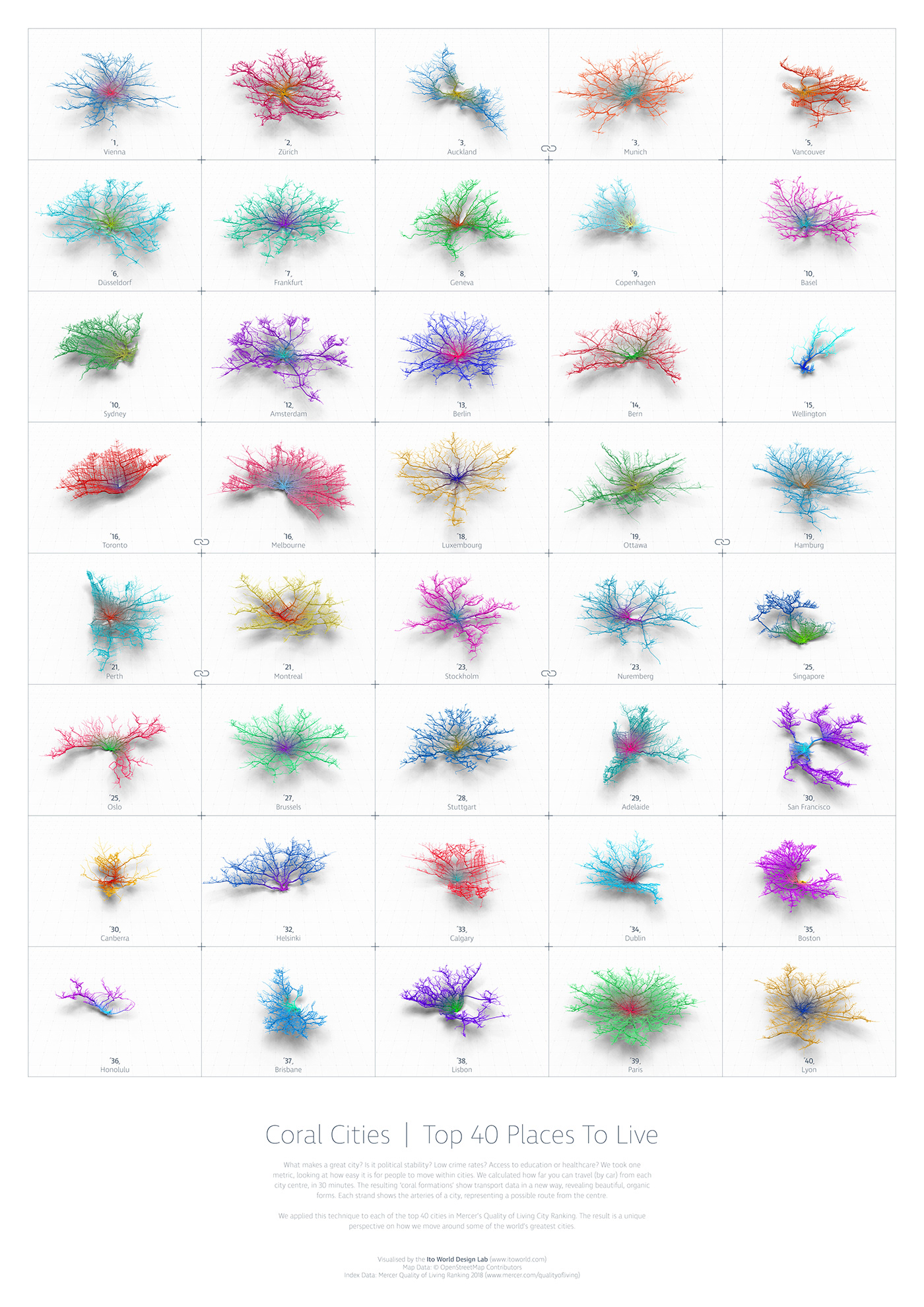
Top 42 places to live (Mercer Livability Index)
Projects:
Kantar Information is Beautiful Awards 2018.
Having produced so many of these coral formations over the past 6 months I thought it only fitting to embark on the biggest application of them yet; to map, analyse and animate 40 of the most liveable cities. I felt the concept and visuals were strong however the list of cities needed to be relevant and less random as with some of my earlier ‘concept’ projects. I decided to utilise a similar livability index to the Economist Intelligence Unit but through a company called Mercer, who publish a ranking annually (https://mobilityexchange.mercer.com/Insights/quality-of-living-rankings). With Mercer’s permission to utilise their list we created the below for submission into the awards.
What makes a great city? Is it political stability? Low crime rates? Access to education or healthcare? We took one metric, looking at how easy it is for people to move within cities. We calculated how far you can travel (by car) from each city centre, in 30 minutes. The resulting ‘coral formations’ show transport data in a new way, revealing beautiful, organic forms. Each strand shows the arteries of a city, representing a possible route from the centre.
We applied this technique to each of the top 40 cities in Mercer’s Quality of Living City Ranking. The result is a unique perspective on how we move around some of the world’s greatest cities.
Hi-resolution A0 poster
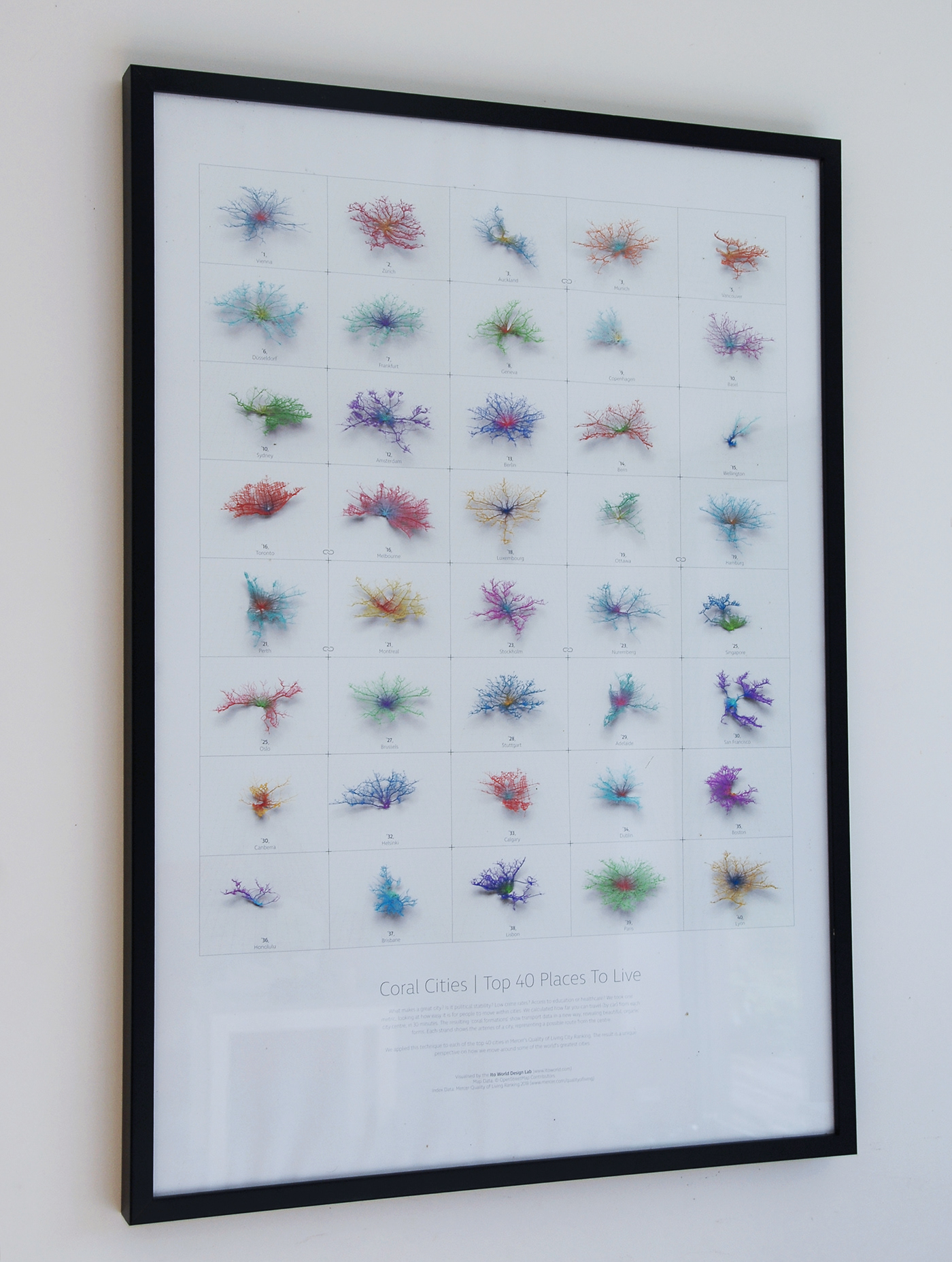
Printed, mounted and framed!
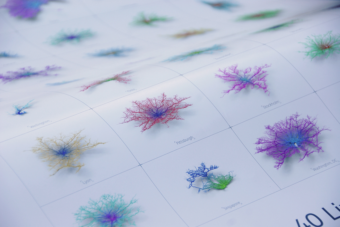
Close-up of detail
4k animated version
The A0 poster looks fantastic printed and mounted on a wall! The 4k animated version slowly iterates through a growing grid of cities 1, 12, 20 and finally 40. I did want to extend this to ~80 but after a grid of 40 the detail of the corals is lost unless you have a huge screen.
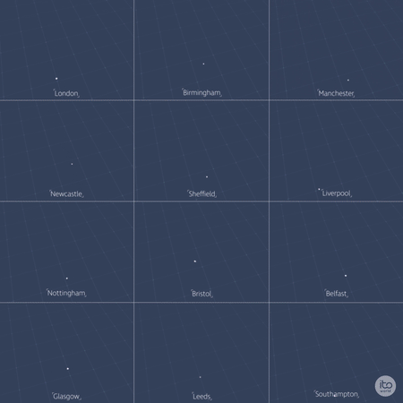
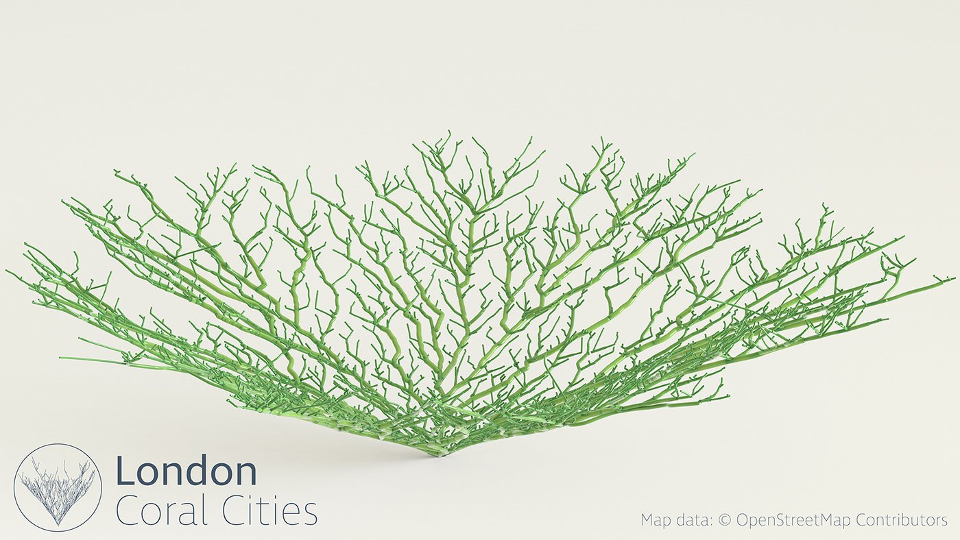
UK Coral Cities:
This was my first attempt at a small-multiple approach to the project and analysed 30-minute drive time catchments from various cities in the UK. The drive-time analysis is based on a optimistic view of zero traffic and as such presents catchments far wider than you would expect to see.
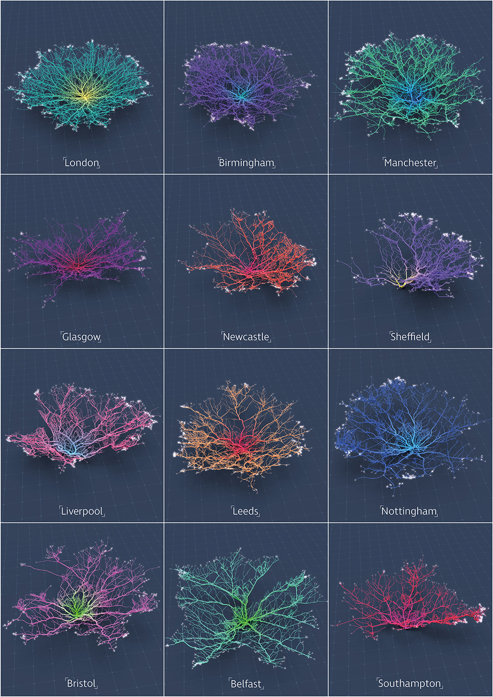
The high-resolution static image shows the intricacies of the formations with clear patterns where physical features such as rivers, oceans and mountains impact the network. I have also produced a 4k animated version seen in the above Vimeo link with the animation slowing down progressively towards the end of the video.
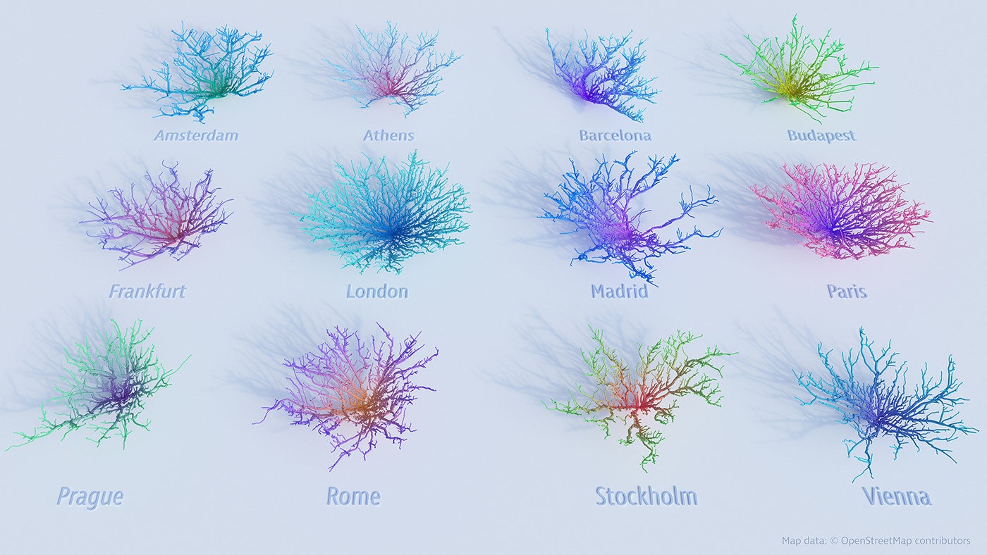
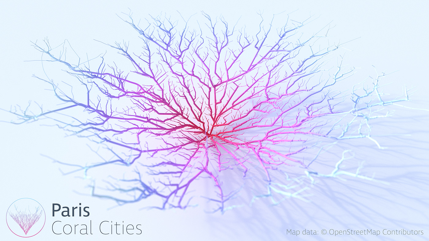
European Version:
Shortly after that, I set about producing a geographically larger version analysing some major European cities.
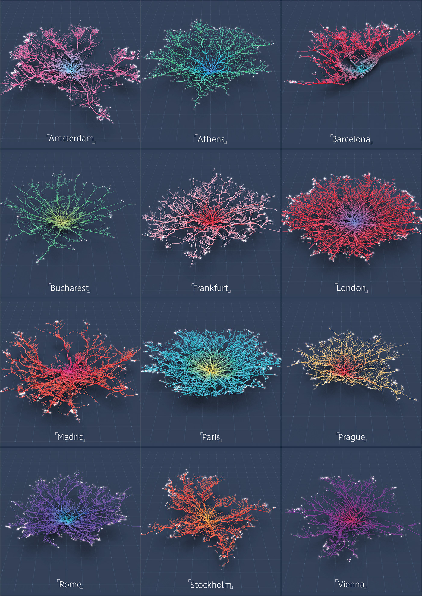
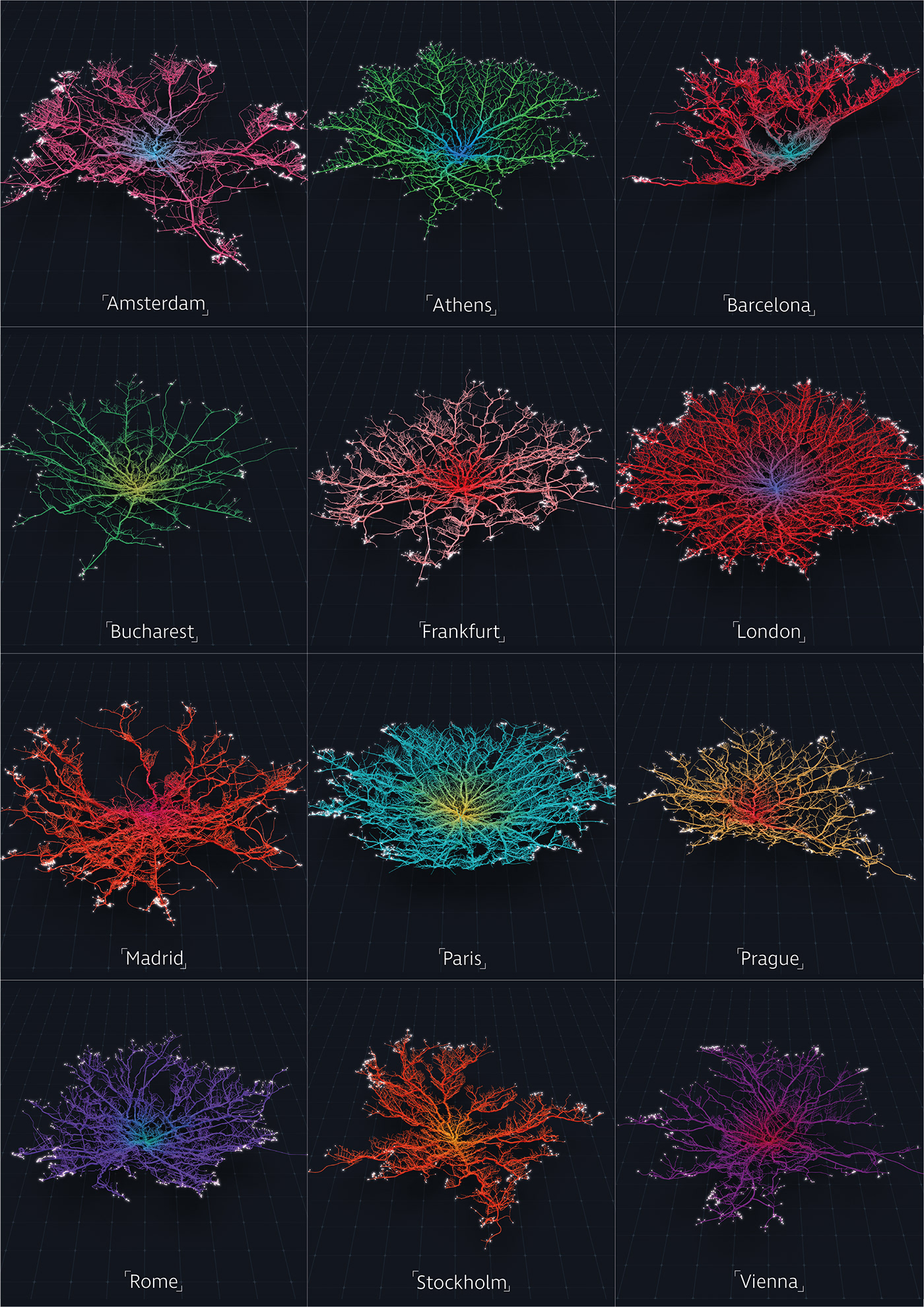
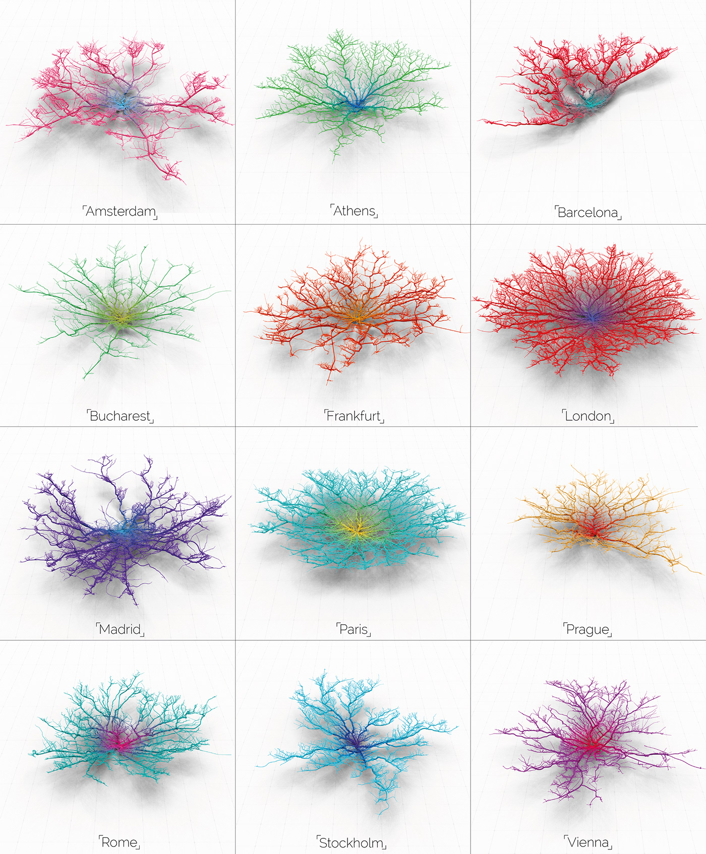
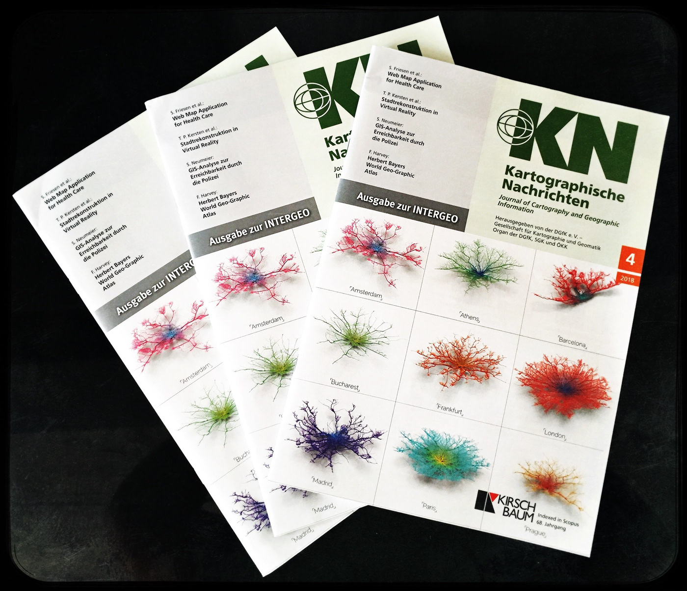
The style evolved slightly from the initial blue-grid base to a light palette with the ambient occlusion and shadows more pronounced. The concept of ‘Coral Cities’ reached the good folks at the ‘Kartographische Nachrichten’, the German journal of Cartography (http://www.kartographische-nachrichten.de/kartographische-nachrichten/aktuelles-heft.html) who were keen to include a European version on the front cover of their latest journal. The lighter palette looked lovely printed…
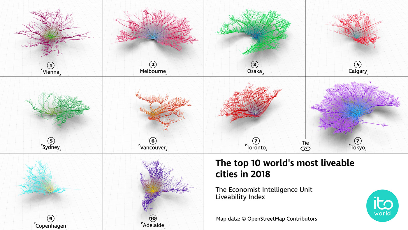
The Economist Intelligence Unit: Livability Index
Last month the EIU released their 2018 livability index which ranks all major cities to their livability index (http://www.eiu.com/topic/liveability). We thought it would be a great idea to produce a ‘Coral City’ version of this top 10 list and of course an animated version to follow.
How are they made?
Let’s explain exactly how they are calculated and what they are showing, to do this lets looks a little more closely at one of my favourite corals — Tokyo.
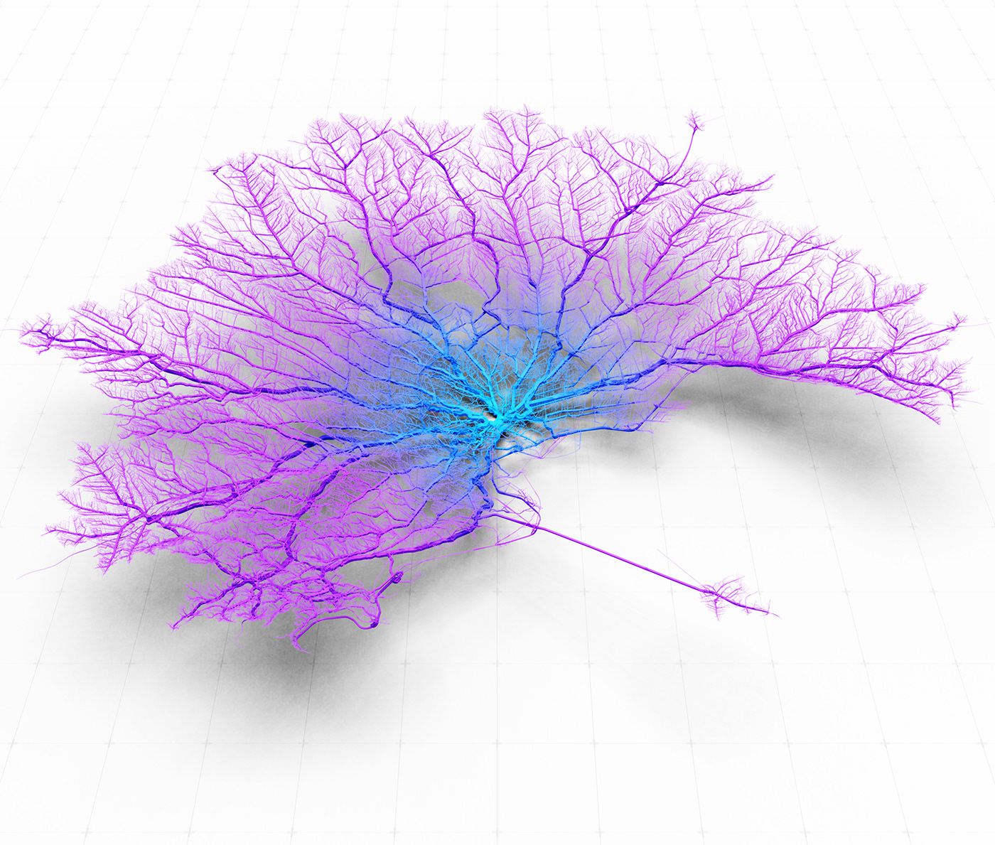
Tokyo City — 30 minute catchment
I start with a basic OpenStreetMap network for the city of Tokyo and the surrounding region. Using various methods I can then calculate the catchment area for a designated drive-time from the centre. At Ito World (www.itoworld.com) we have an in-house routing system which allow us to do this, however, there are a bunch of other methods and software which allow you to calculate drive-times (ESRI, PgRouting, GraphHopper, Here API etc). It’s important to note that in most cases the network catchment is calculated with zero traffic so the results are very optimistic. However, we have experimented with importing congestion based isochrones from the Here API and converting these to corals which has been fairly successful (see below)
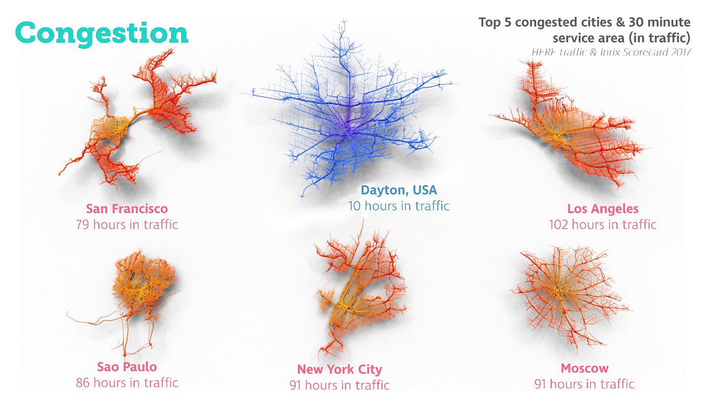
Comparing congestion catchments in the worst/best cities using data from Here API.
The catchment analysis will give a rough area, I then need to turn it into Corals, to do this each vertex on a linear link is given a distance value away from the centre of the city. I can use this distance metric as a height value for the link, creating a 3d network, growing higher with distance from the centre.
I also apply a ‘weight’ value to the link, this isn’t anything to do with the road classification, however it is often linked. The weight is proportional to the number of links connected to the branch, so the thicker networks have more arterial networks connected creating a coral-like appearance, it also suggests busier sections of the routing network.
Each of the links then undergoes a ‘sweep’ with a rectangular geometry creating a physical presence with which we can apply ambient occlusion to during our render.
The colour gradient is purely an aesthetic addition and just maps the gradient from the centre. Animating the links to appear in order of distance results in a mesmerising coral growth…
UK Cities — Coral Animation
Bespoke Versions
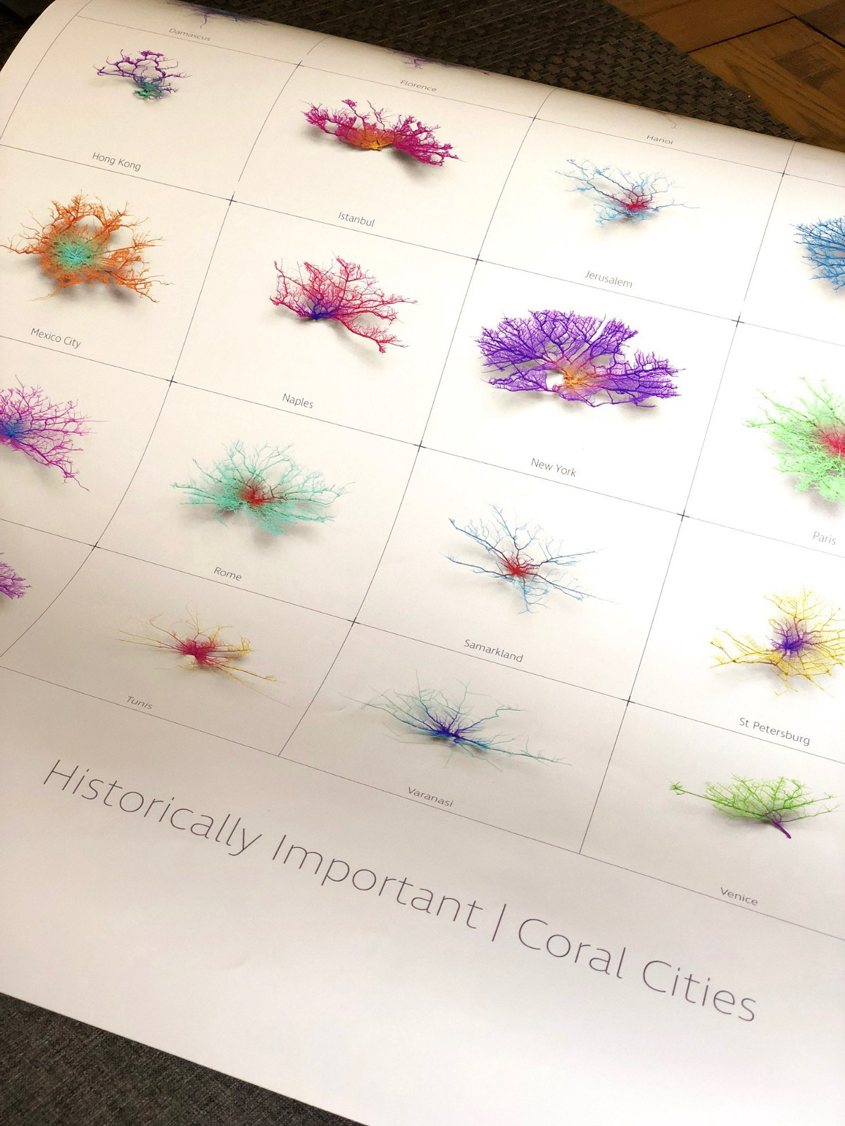
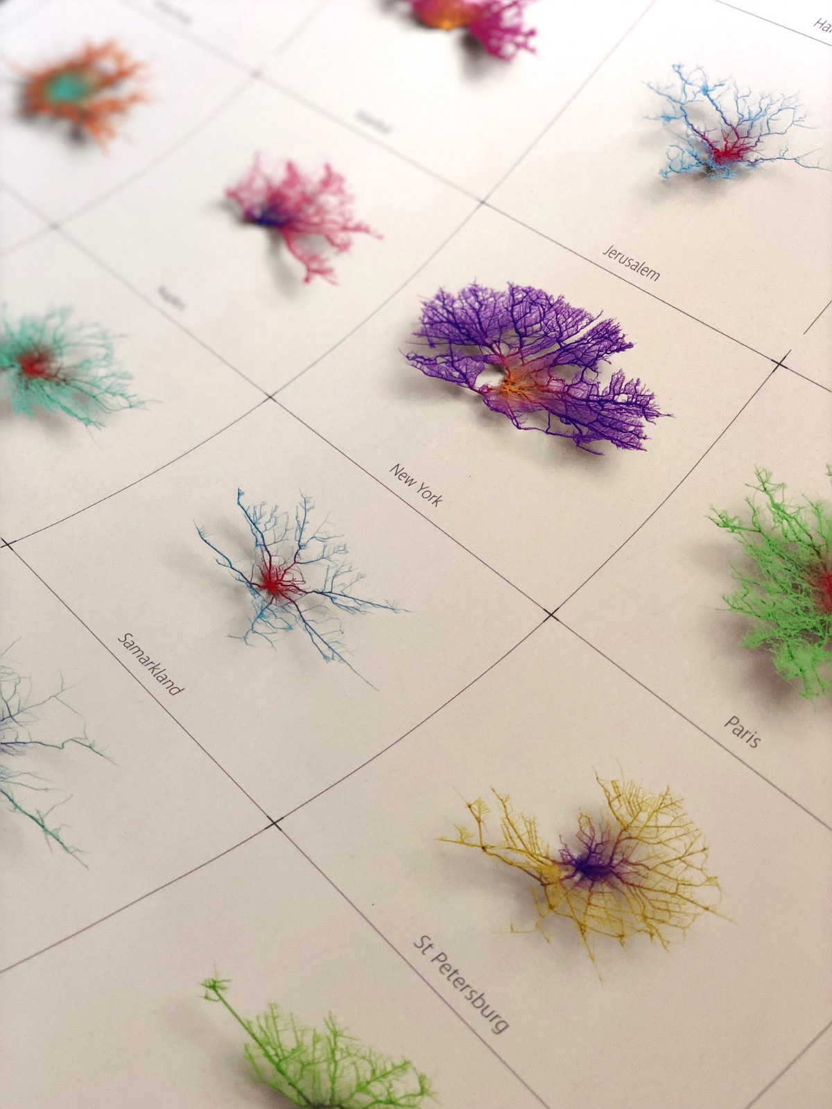
My wife usually takes very little interest in my work :) however she was quite taken with the Coral City posters, so much so that she commissioned me (payment in endless cups of tea and coffee!) to produce one for the house. Being a big history geek the topic was ‘Historically Important Coral Cities.’ We are still figuring out framing options but below are a couple of screenshots of the poster.
Cinema4d/Blender Renders:
Throughout this process, I have been increasingly interested in the possibilities of porting the analysis from our visualisation suite at Ito World into other 3d packages such as Cinema4d. This has been tricky… our analysis tools analyse each link of a network, node to node links are split with a height value for each node. This value then gets put into a shader with a z-min and z-max attribute which creates the height of the link. A similar method is also used for the links thickness. So importing this into other packages isn’t simple and results in massive amounts of CSV files. I did develop a methodology for Cinema4D but the process is pretty time-consuming but does result in some lovely looking renders.
Cinema4d has a pretty handy ‘Structure’ tab, where you can import linear paths by their x,y,z coordinates. Incidentally, some genius has created a script which can batch import links (https://www.c4dcafe.com/ipb/forums/topic/91550-create-spline-from-csv-file/?page=2) so this means as long as each of my individual links is a separate CSV file I can reconstruct the spline geometry in Cinema4d using the script. The downside being there are hundreds of thousands of links for each coral so huge volumes of csv’s…
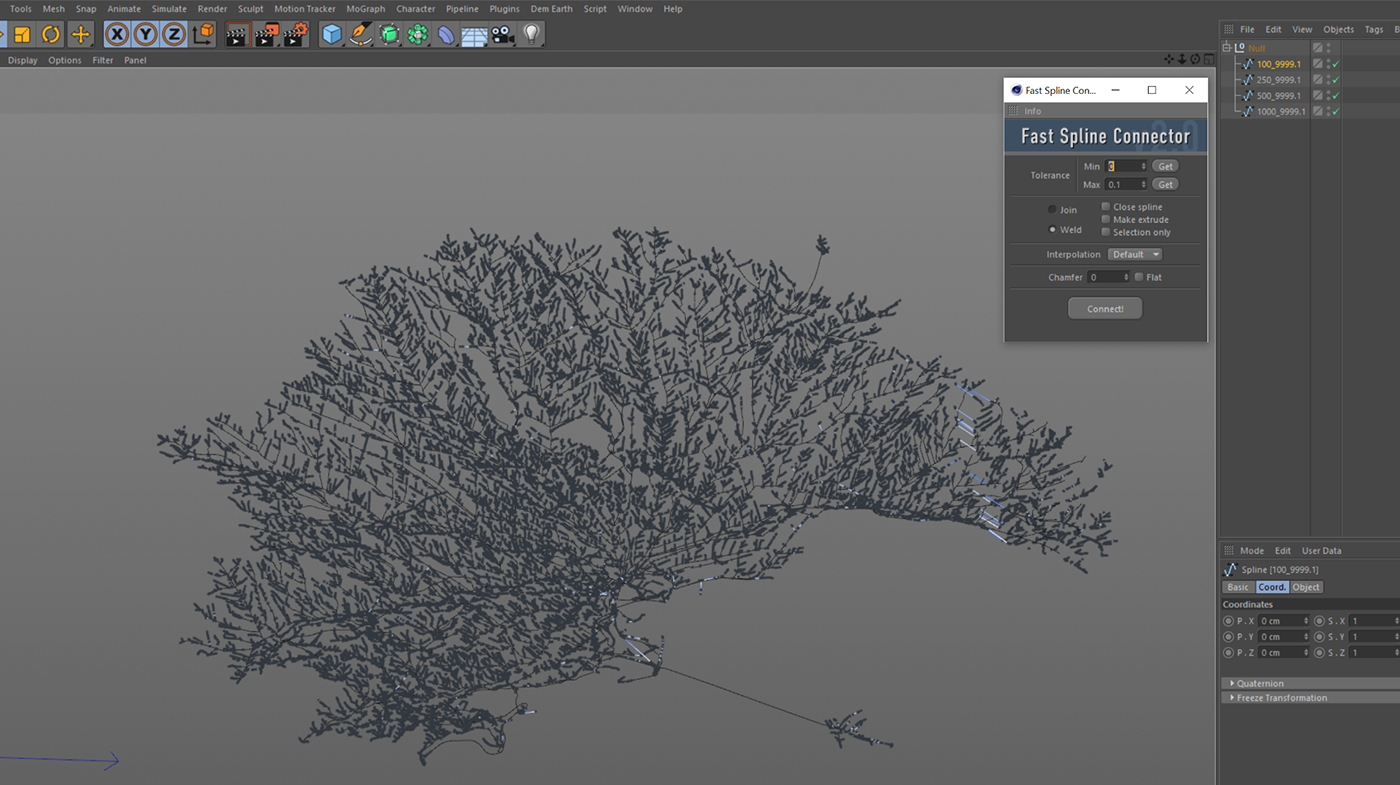
Once all my links were imported I then faced a new issue. Each individual link is a separate spline and although they overlap the next spline they aren’t in fact connected. This becomes problematic when ‘sweeping’ the spline, instead of nice 3d arteries you end up with hundreds of small arteries connecting which is a) a resource hog b) looks ugly. Cure? ‘Fast Spline Connector’, my saving grace (https://cgtools.com/fast-spline-connector/) worth every bit of the $15 price tag. Using this tool meant that any overlapping splines could be connected to a longer spline as long as you set the threshold low. So a pretty lengthy process which no doubt could be simplified, but either way I had a lot of fun with the cities I eventually imported.
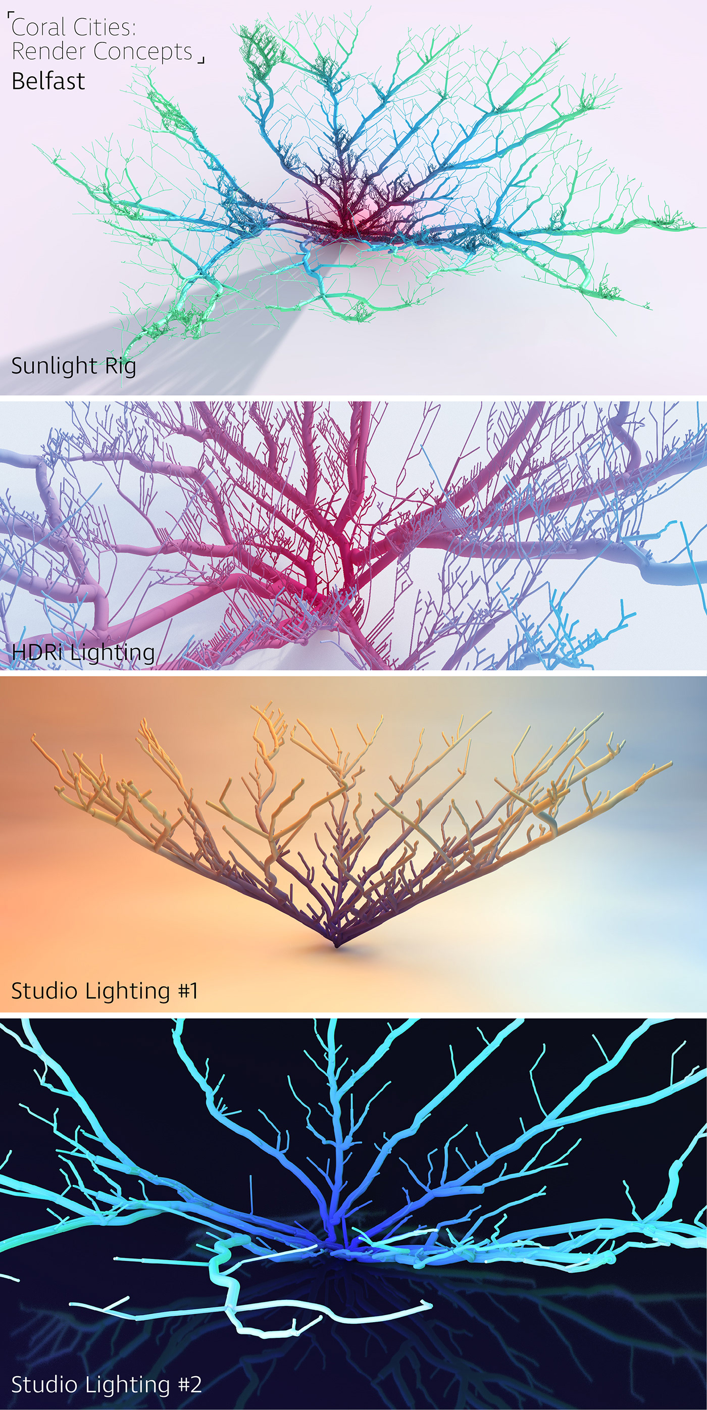
Early concepts for render lighting setups.
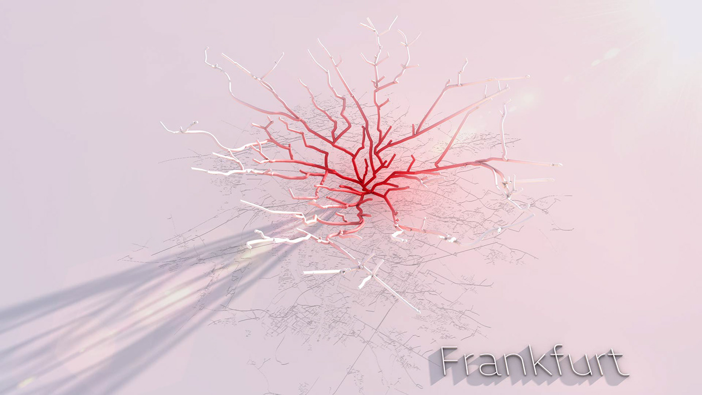
Frankfurt light test render with baseline OSM on the base.
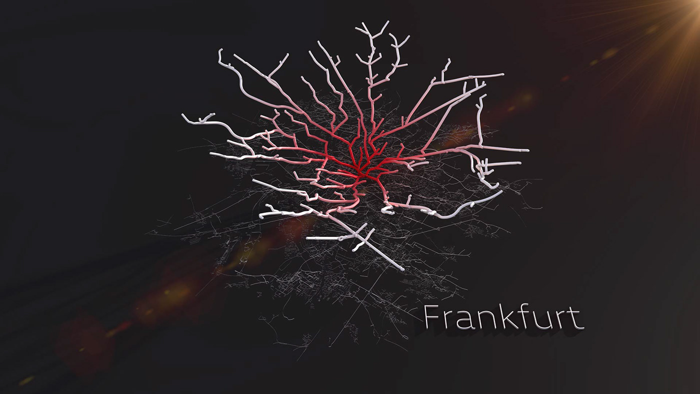
Frankfurt dark test render with baseline OSM on the base.

Cinema4d HDRi lighting render.
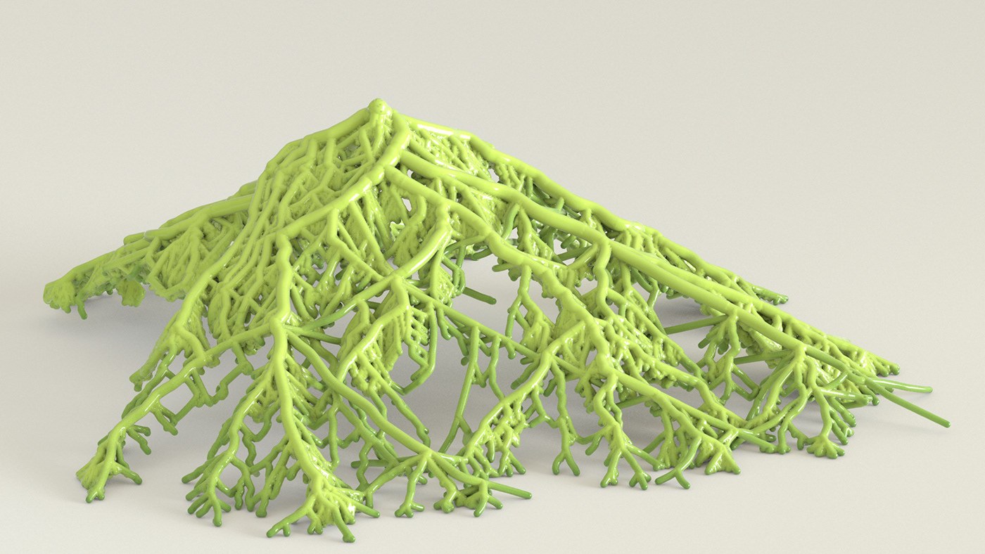
I also experimented with some rather questionable renders…
Jade Coral City
Inverted Coral City.

Some odd volumetric lighting tests…
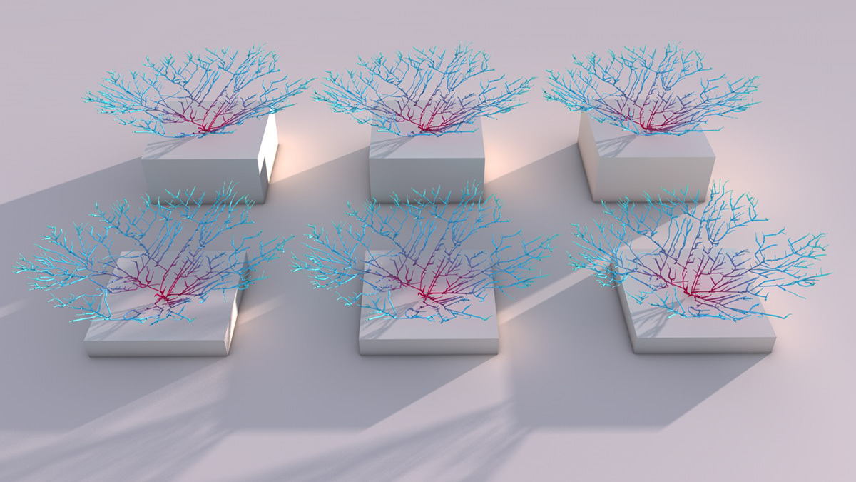
Early idea of plinth renders.

Early attempt at Corals in water.
Whats next?
I love how great the Kantar entry looks printed and I am keen to explore some options of creating bespoke pieces having already created a couple of versions for friends and family, however I am not sure how that works on a larger scale. We have also been talking internally about 3d printing some of the more impressive cities. Who knows, by Christmas you might see ‘Coral City Baubles’ on the shelves of John Lewis…


