#021 Home Monitoring Dashboard
The challenge was to design a dashboard UI for an home monitoring application . I balanced visual appeal with usability by presenting information in a clean and minimal as design whilst adding some visual flare to the most important element on the screen.
In addition to giving an attractive aesthetic to the design, the use of color helps to communicate information quickly and efficiently to the user at a glance.

#019-020 Leader Board & Location Tracker
The respective challenges for Challenges 19 and 20 were to design a leader board and location tracking map UI.
I took these challenges as an opportunity to produce a dog walking app concept with a consistent design across multiple screens with differing functions. The leader board screen is designed with the intention of engaging and motivating users to walk dogs by 'gamifying' the walking process with a list of of top performing dogs and earnable badges.
The map screen's UI is designed with a minimal HUD to maximize map visibility.

#018 Analytics Chart
The challenge was to design an analytics chart. Having experience running an eCommerce store, I took this opportunity to design an analytics page built that displays the information that I have found to be the most necessary in the home screen of the analytics page.
I made use of strict horizontal and vertical grids to make information as legible as possible and to make optimise limited space while retaining enough white space to prevent users from becoming visually overloaded.

#017 Email Receipt
The challenge was to design an email receipt. I tackled with this challenge with a simply formatted HTML email in mind and a focus on attractive typography. With many email services like Gmail now blocking images by default, it has never been more important to rely in CSS to add identity to emails.

#016 Pop-Up / Overlay
The challenge was to design a design a Pop-Up/Overlay. I made an app rating popup with custom emojis to enrich the users experience with an interactive and enjoyable element in a task that many users find tedious.

#015 On/Off Switch
The challenge was to design an On/Off Switch. It's a simple challenge here, so I put my focus into practising smooth visual transitions.

#014 Countdown Timer
The challenge was to design a Countdown Timer. I went with a mobile app design here. Since a likely scenario would have the user looking at the screen from across a kitchen counter or desk, I designed a minimal UI for visibility and used simply colours to convey the remaining time at a glance.

#013 Direct Messaging
The challenge was to design a Direct Messaging app, profile, or chatbox. I've been focusing a lot on mobile UI, so I went with a desktop app for this challenge. Vertical grids are a standard, but this exercise gave me some good experience with horizontal grid design.

#012 E-Commerce Shop
The challenge was to design a single product page of an e-commerce shop. I had a think about what the best way would be to maintain user engagement to keep them in the 'funnel' and decided to enrich the experience with a little animation.
#011 Flash Message
The challenge was to design a Flash Message with both the outcome for an error and success. I always enjoy the change to use illustration to improve a UI! Matching colours was a especially fun with this piece. Minty fresh success!

#010 Social Share
The challenge was to design a social share button/icon. I played around a little with motion graphics again in After Effects.
#009 Music Player
The challenge was to design a music player. This one was good fun to make. For something recreational like a music application, the aesthetics of the UI are almost as important as the usability. Elegance was a focus for this design.

#008 404 Page
The challenge was to design a 404 page. This one was enjoyable to make, it's a nice chance to illustrate with a fun concept. A cat with an empty bowl made a fun metaphor and lifts the mood up from a failed page search.
#007 Settings
The challenge was to design design 'settings for something'. I enjoyed the UI from the previous challenge, so I decided to expend on it with this challenge. I thought about how to alter the UI to be more versatile while remaining consistent with the previous screen.

#006 User Profile
The challenge was to design a design a user profile, so a design profile seemed quite appropriate! I designed a simple card-based UI to separate sections of information. Simple color coding to help users discern information quickly.

#005 App Icon
The challenge was to design app icon. I decided to design something with the current trends for minimal geometry and simply gradients.

#004 Calculator
The challenge was to design Standard, scientific, or speciality calculator. I went with a less formal design as a change from previous challenges. I also added a much needed function that is missing from most apps; a history function!

#003 Landing Page
The challenge was to design an above the fold landing page. Fintech has been getting bigger recently, so I went with that for subject. This seemed like a good opportunity to dabble a little into motion graphics. Simple blues and clear formatting since like #002, trust is a priority.

#002 Credit Card Checkout
The challenge was to design a credit card checkout form or page. Nothing fancy here, I didn't want to reinvent the wheel for something where familiarity and trust are a priority.

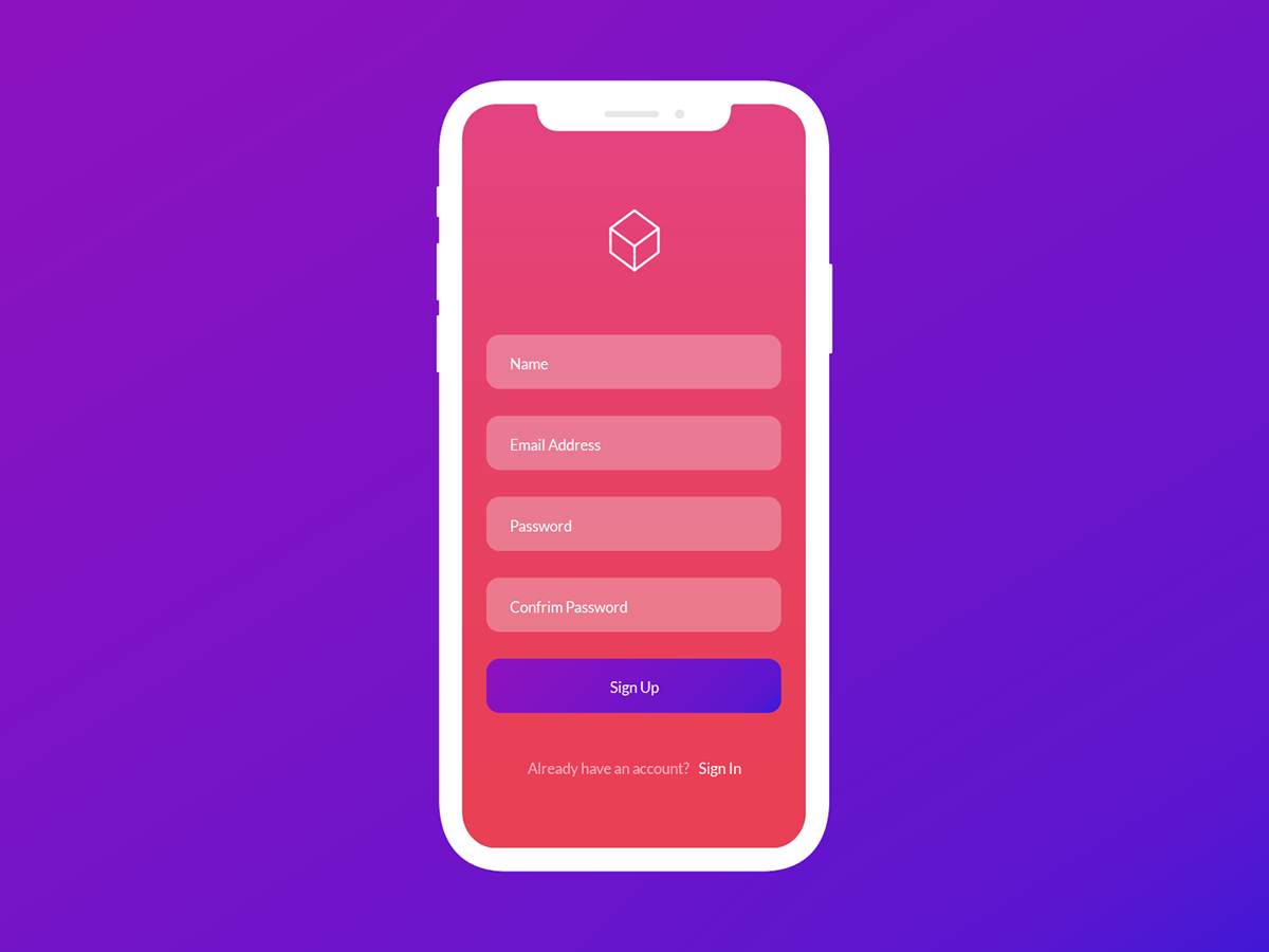
#001 Sign Up
The challenge was to design a sign up screen. I went with a simple and sweet minimal style and experimented with some bold colours.