This past September we celebrated our 10th Brand New Conference -- we've been doing it for 9 years but in 2016 we did 2 of them so not yet our 10th anniversary -- in New York, NY. Having done it there four times before we weren't sure what we could draw from the city to base the identity on. Turned out, that that something was the easiest and most obvious thing about New York...
Concept
This year’s identity is based on a cliché but we liked where that cliché took us so we went with it: New York is a “Concrete Jungle”, ergo we are going to use concrete. This wasn’t conceived as a metaphor but as the literal, core ingredient through which we would standardize all the materials. Later on, we realized that this concept was meant to be, as written down in the annals of hip hop 8 years ago…
Snippet of Empire State of Mind by Jay-Z featuring Alicia Keys. Wait for the TWO highlighted lyrics. The second one is everything.
Part of what makes New York a “Concrete Jungle” and, no big reveal here, are the buildings. Aside from being tall, one cool thing about New York buildings are the inscriptions carved unto some of them, regardless of whether they are a church, a bank, or a school. One of the great things about these inscriptions is the variety of typefaces and lettering they use.
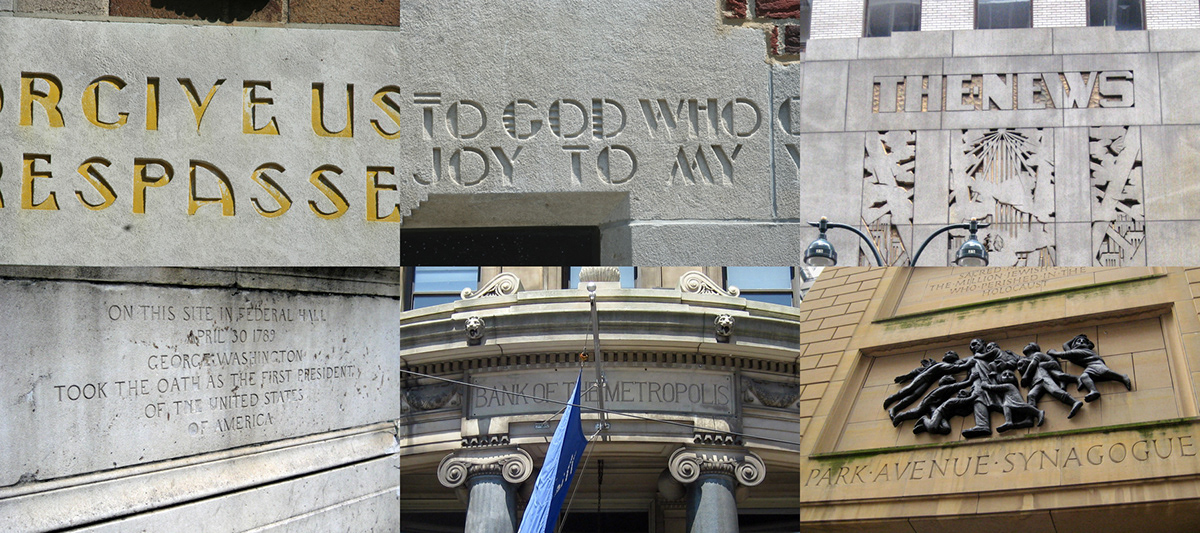
A small sampling of etched inscriptions and signage on New York buildings. Top two photos by Paul Shaw, all others by Wally Gobetz.
One style that we thought we could expand on is the high-contrast sans serif with its calligraphic/chiseled structure. As a way to further channel the cacophony that New York can be we decided that instead of choosing just one font or type family we would use a bunch of high-contrast sans serifs together. We chose Chap (Black to be specific) from Schick Toikka as the primary font and we added Hoefler & Co.’s Peristyle, Typotheque’s Valter, Fatype’s Beausite, and Frere-Jones Type’s Bosca and Bosca Compressed — that are not yet available but we got to take out for a trial spin.
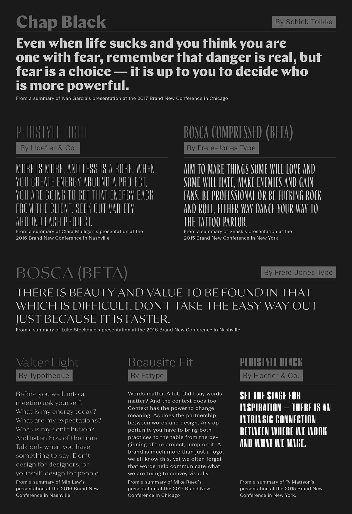
The five high-contrast sans serifs at play.
No Logo
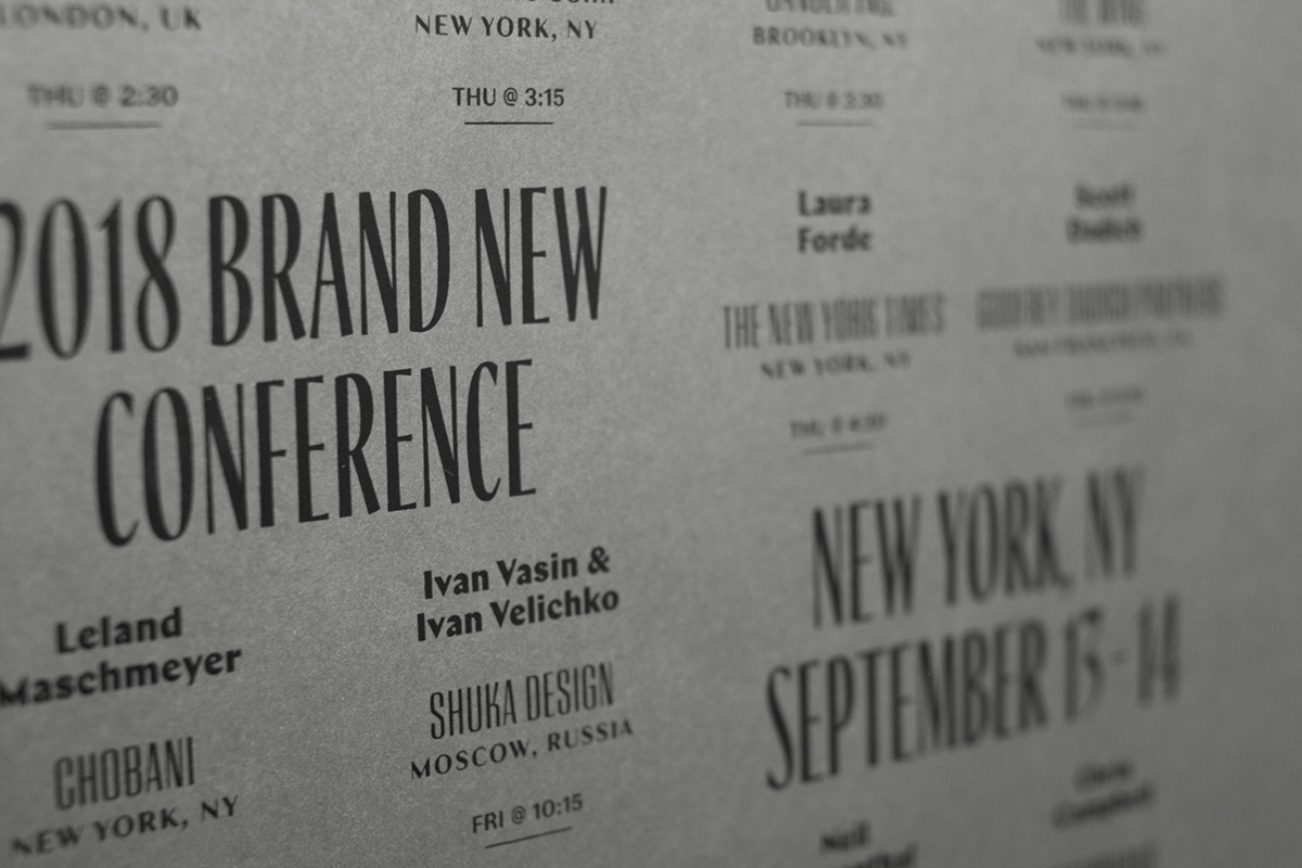
Although we had to decide on one treatment early on to use for the production that started six months before the conference, we decided to not have a single logo that would be repeated but instead allow the different typefaces to take on different configurations and allow the typography to set the tone.
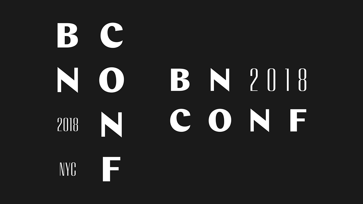
The closest we got to a logo.
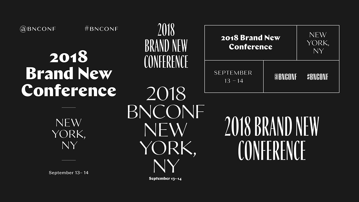
Different logo-ish treatments.
Concrete… For Real
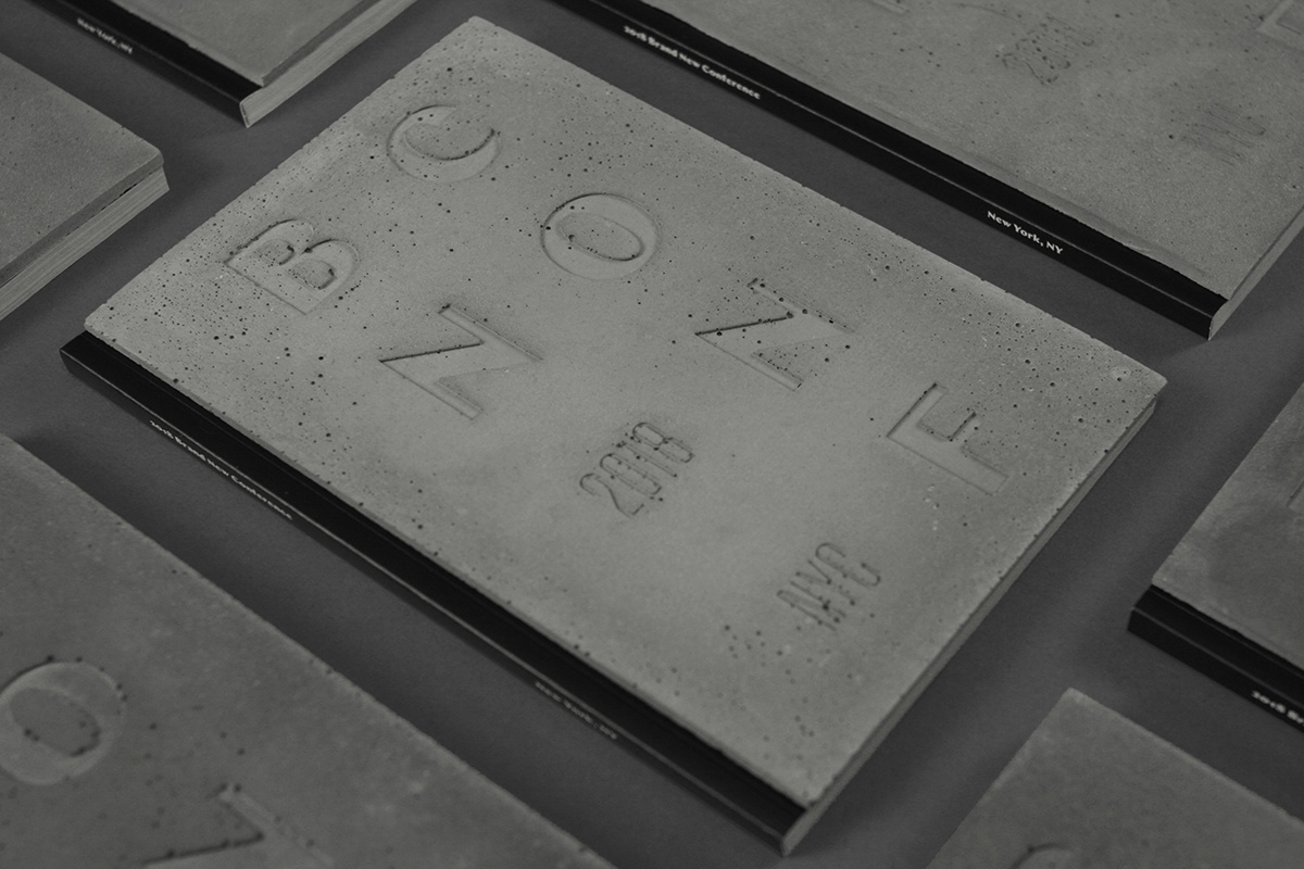
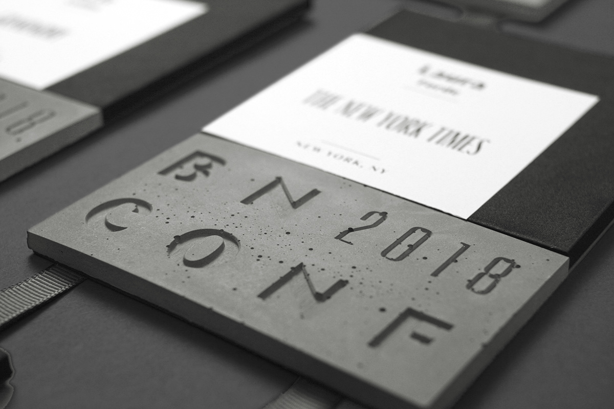
To reiterate: what you will see in the images to follow is made with real concrete. All 1,112 covers; 1,342 badges; and 939 cubes. These are not renders.
Program
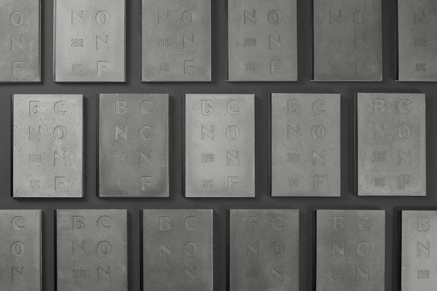
Once we decided to use concrete, the first step was figuring out how, where, and, well, HOW. We eventually decided we would apply it to the covers of the program, the attendee badges, and a little memento cube. The program has a slab glued on the cover, offset half an inch from the spine so that it would open smoothly. One unexpected — and quite welcome — outcome was that each slab of concrete came out in a different shade of gray and slightly different texture that yielded some pretty great variations.
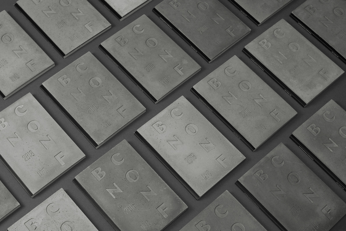
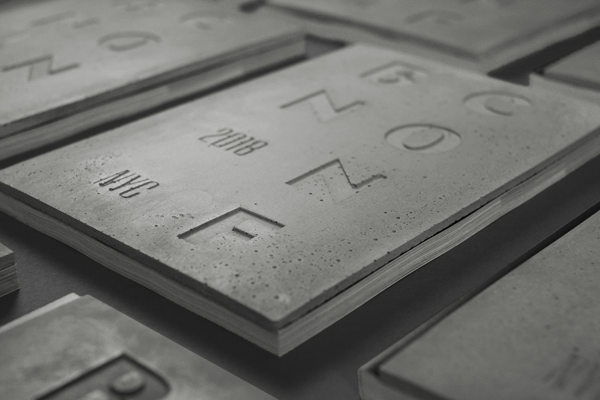
A few different views of the covers.
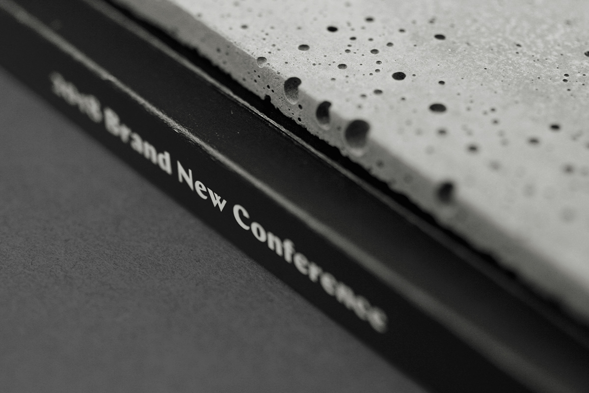
Spine detail. The air bubbles added a great range of texture.
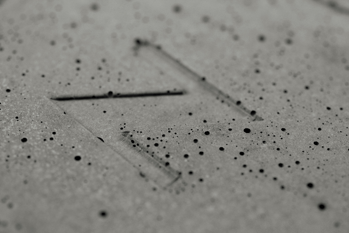
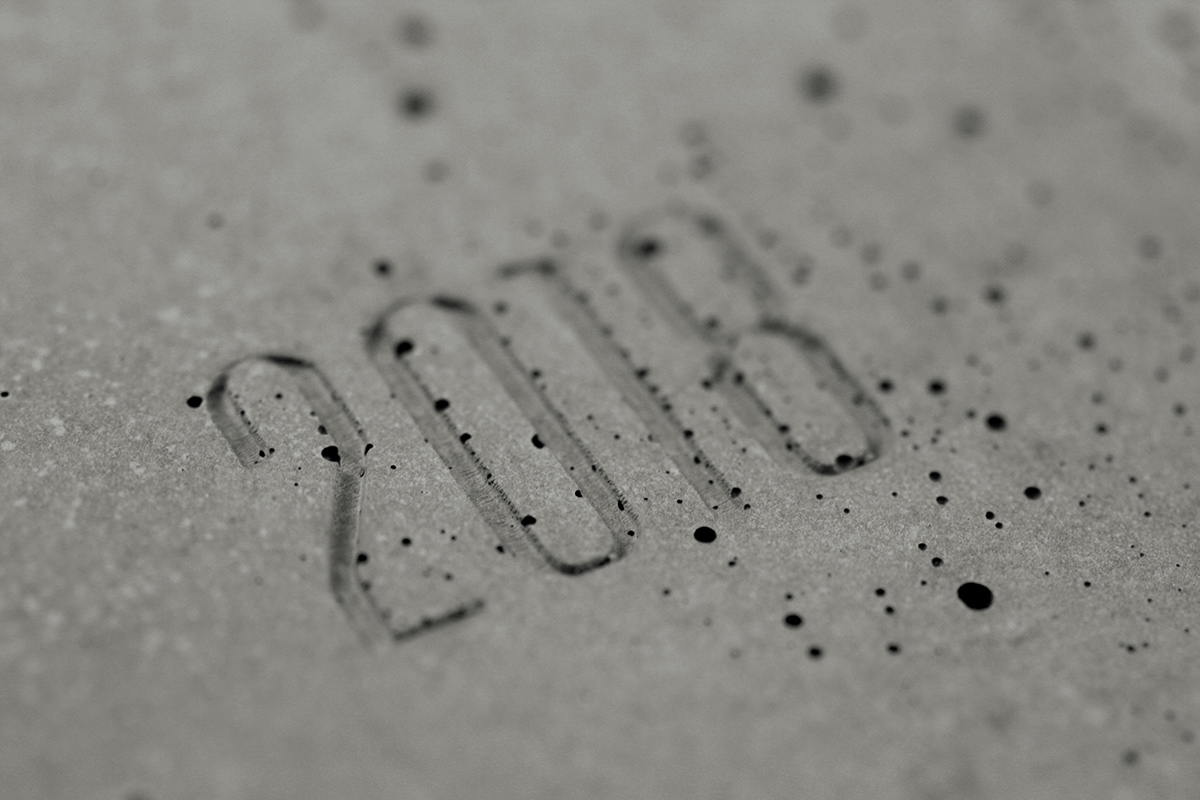
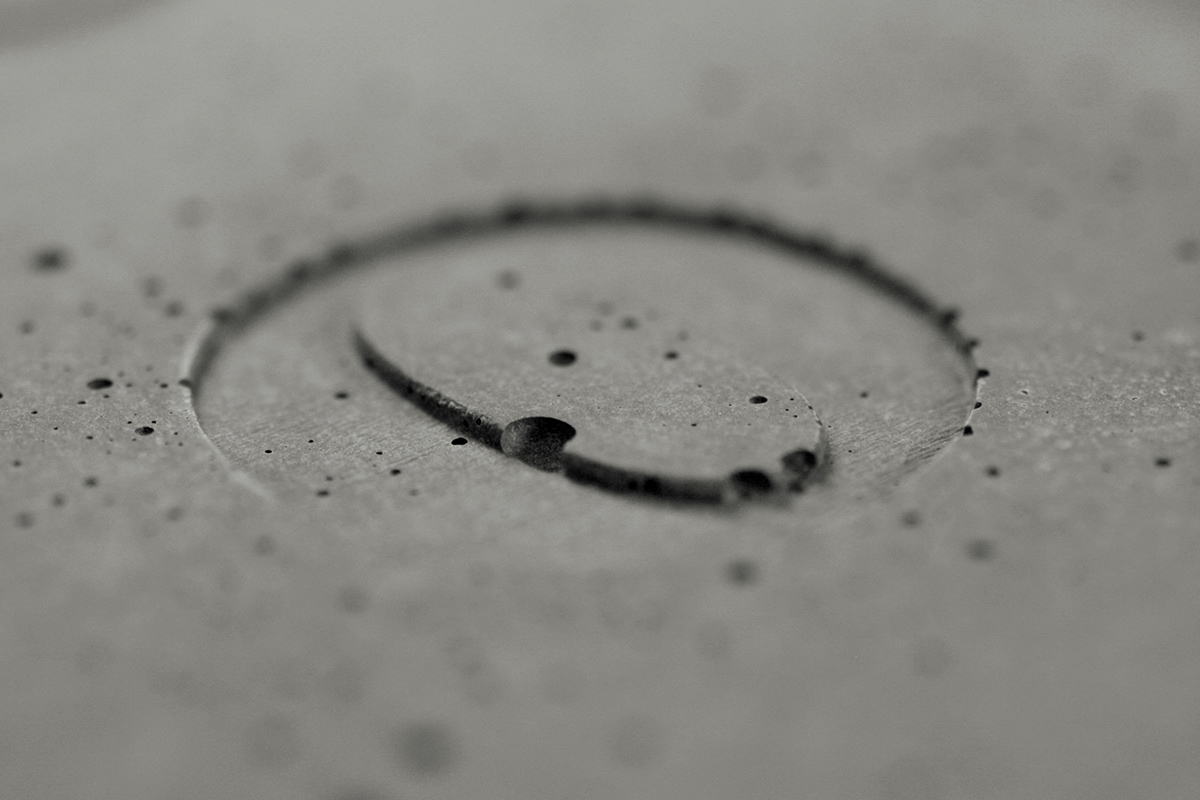
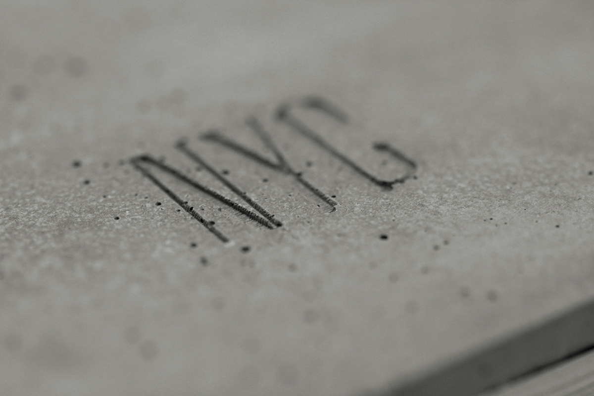
Close-ups of the letters.
If you are curious about how fragile a slab of concrete is on a book, we put it to the test: first we dropped it from the top of our roof but the tile glue we used proved to be too effective so we had to take more drastic measures…
Sound is NSFW. Two punchlines in this video, for the price of one. (Bonus: shot-by-shot comparison of punchline number two.)
For the interior of the program we went with a dense, boxy approach, much like what we had established on the website.
Sample spreads.
Badges
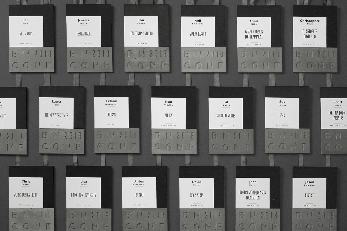
We created the pieces of concrete for the badges before we even had a finalized design for the overall badge. We don’t recommend this approach! But we’ve done so many badges by now that we knew we would be able to retrofit a design to the piece of concrete. Eventually it involved mixing the concrete with high-end Silly Winks — we say that both sarcastically and as an oxymoron — as well as a pretty nice gray stock from Colorplan (one of our sponsors) and adding each attendee’s info on a label.
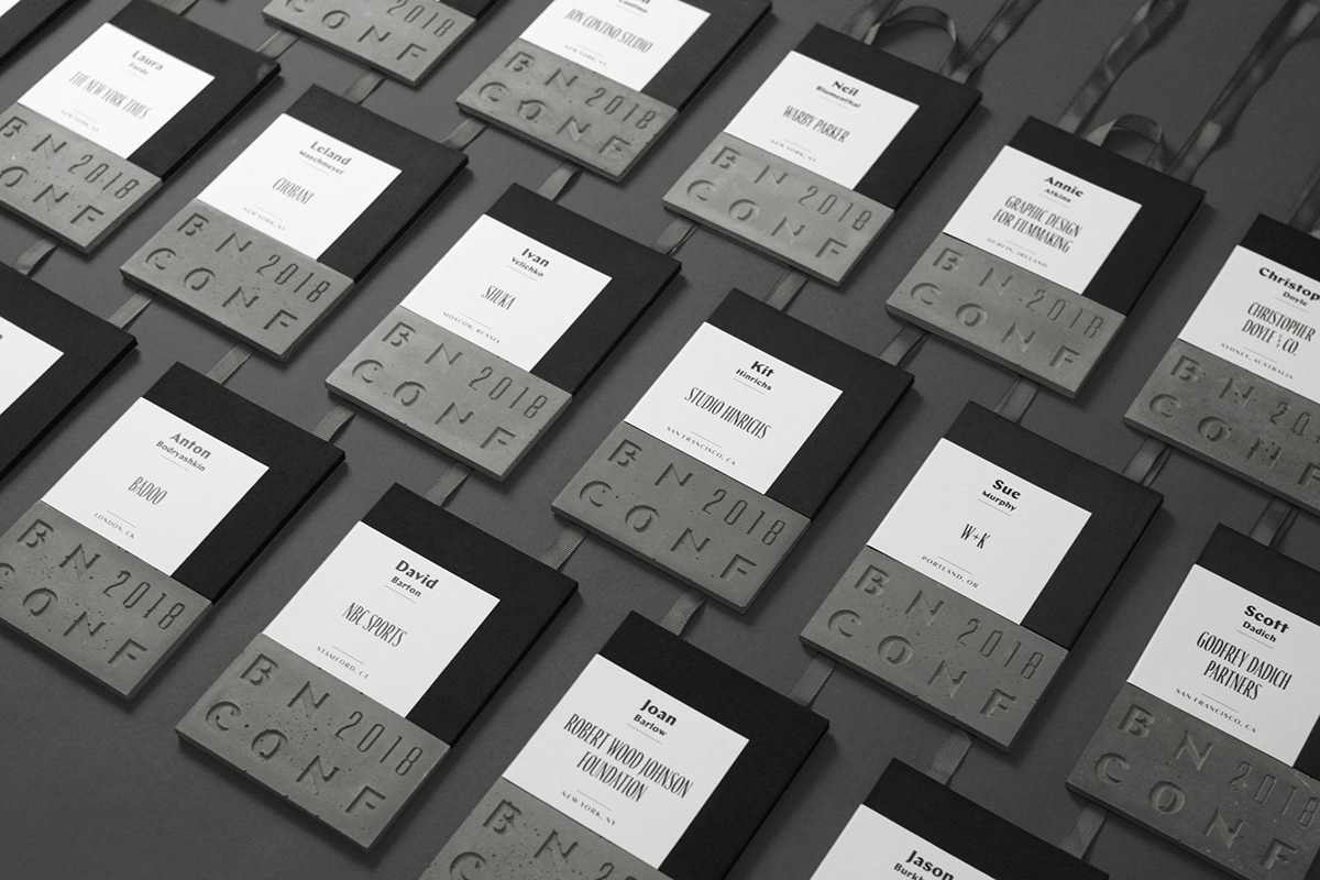
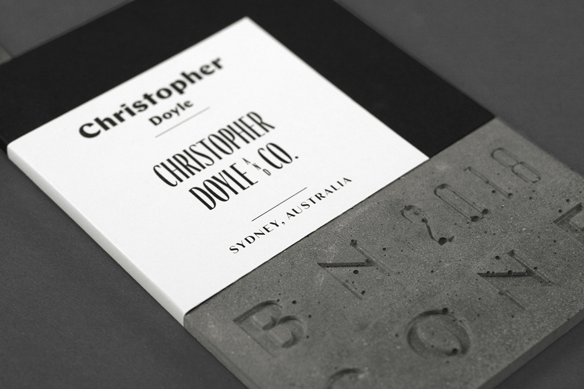
A few different views of the badges.
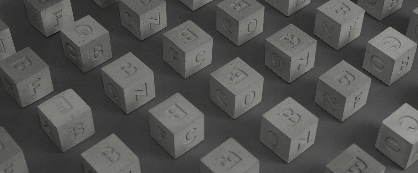
Cubes!
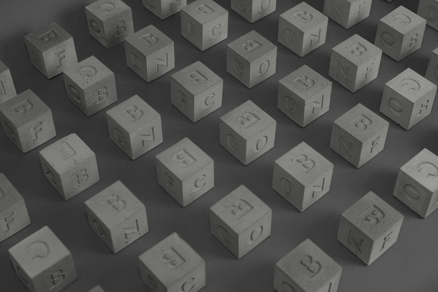
These cubes don’t really have a purpose other than them being little cubes made of concrete with “BNCONF” on them. We could have easily skipped them but after we did a prototype we were not able to let go off the idea. They are 2 × 2 × 2 inches.
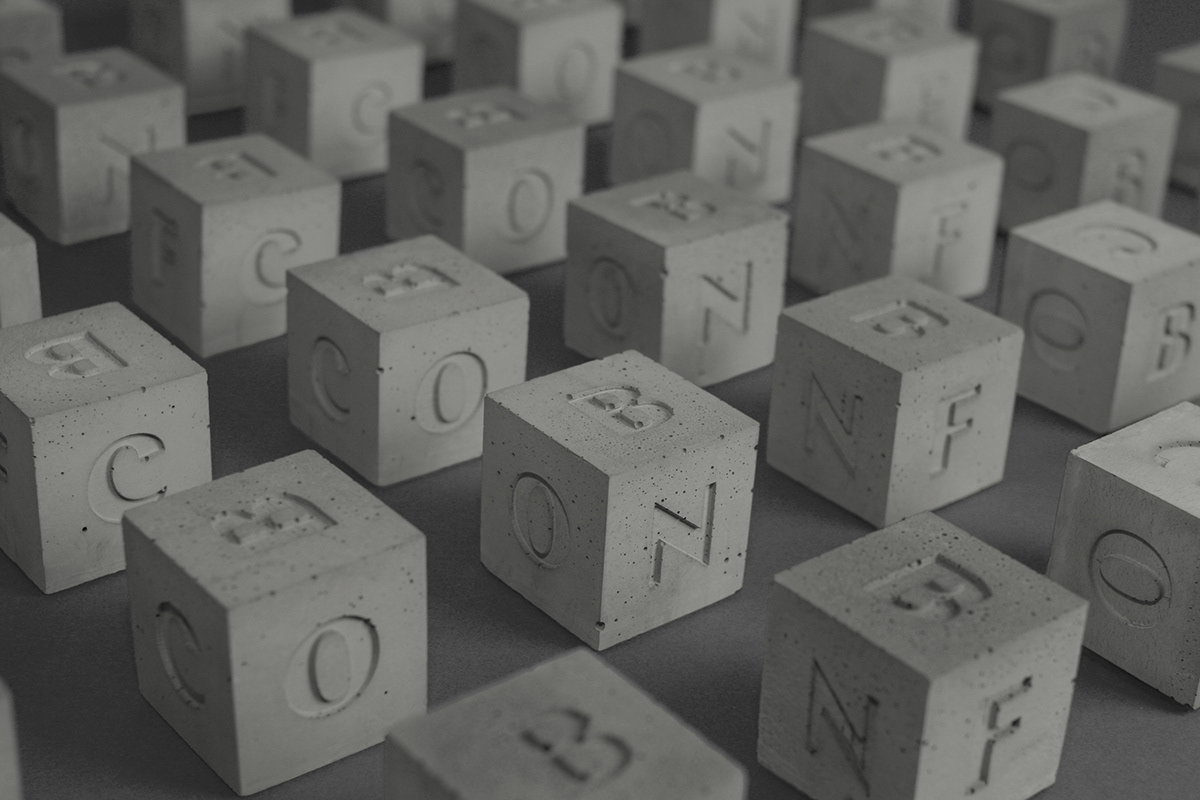
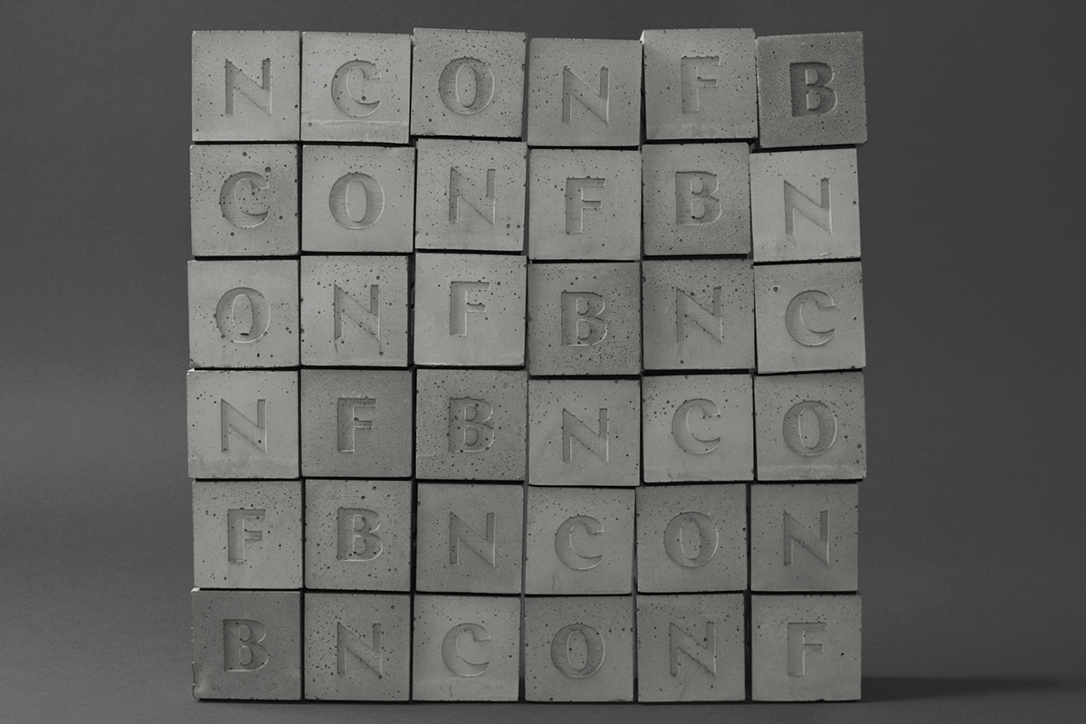
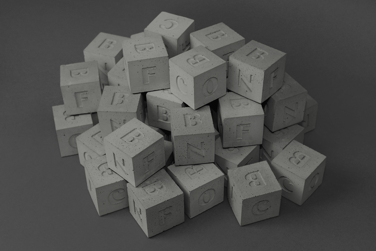
A few different arrangements.
Bags
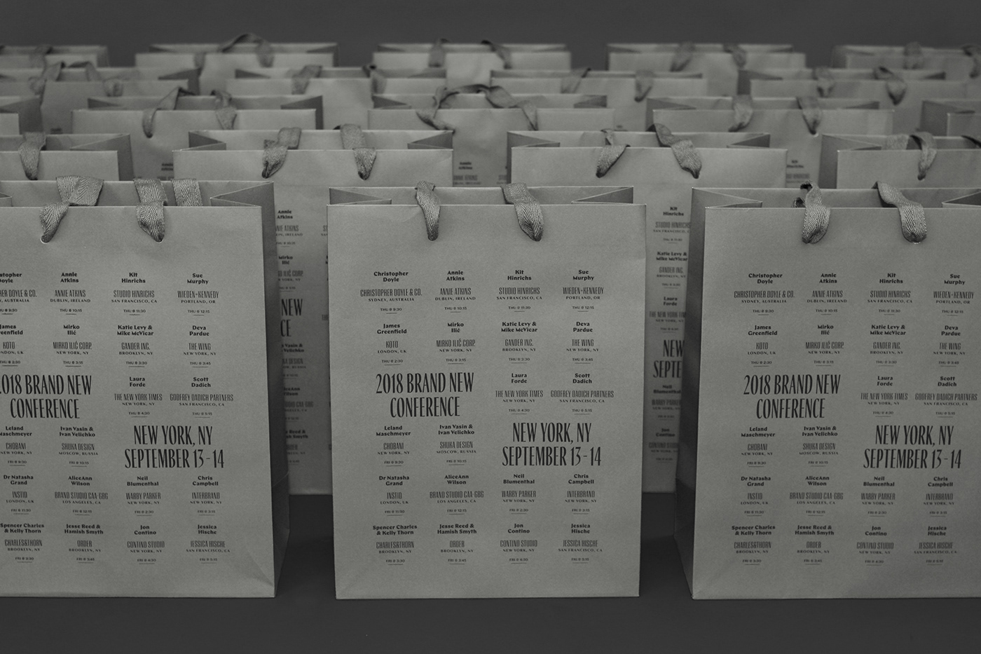
A cloth tote bag didn’t seem right this year as they are too floppy in contrast with concrete. We found some sturdy gray paper bags that, when filled with goodies, looked like a block of concrete — with some imagination, sure. We thought it would be a good break from our past approaches to print the full schedule of the conference on the bags. Not the most useful schedule but we thought the typographic texture was rather cool (and the schedule was on the program as well so it wasn’t like it was the only place to see it).
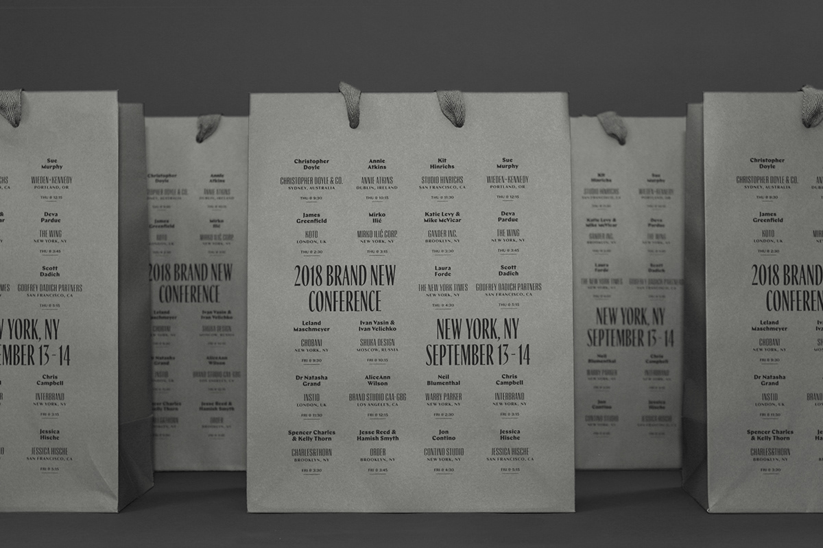
A couple of views.
T-shirts
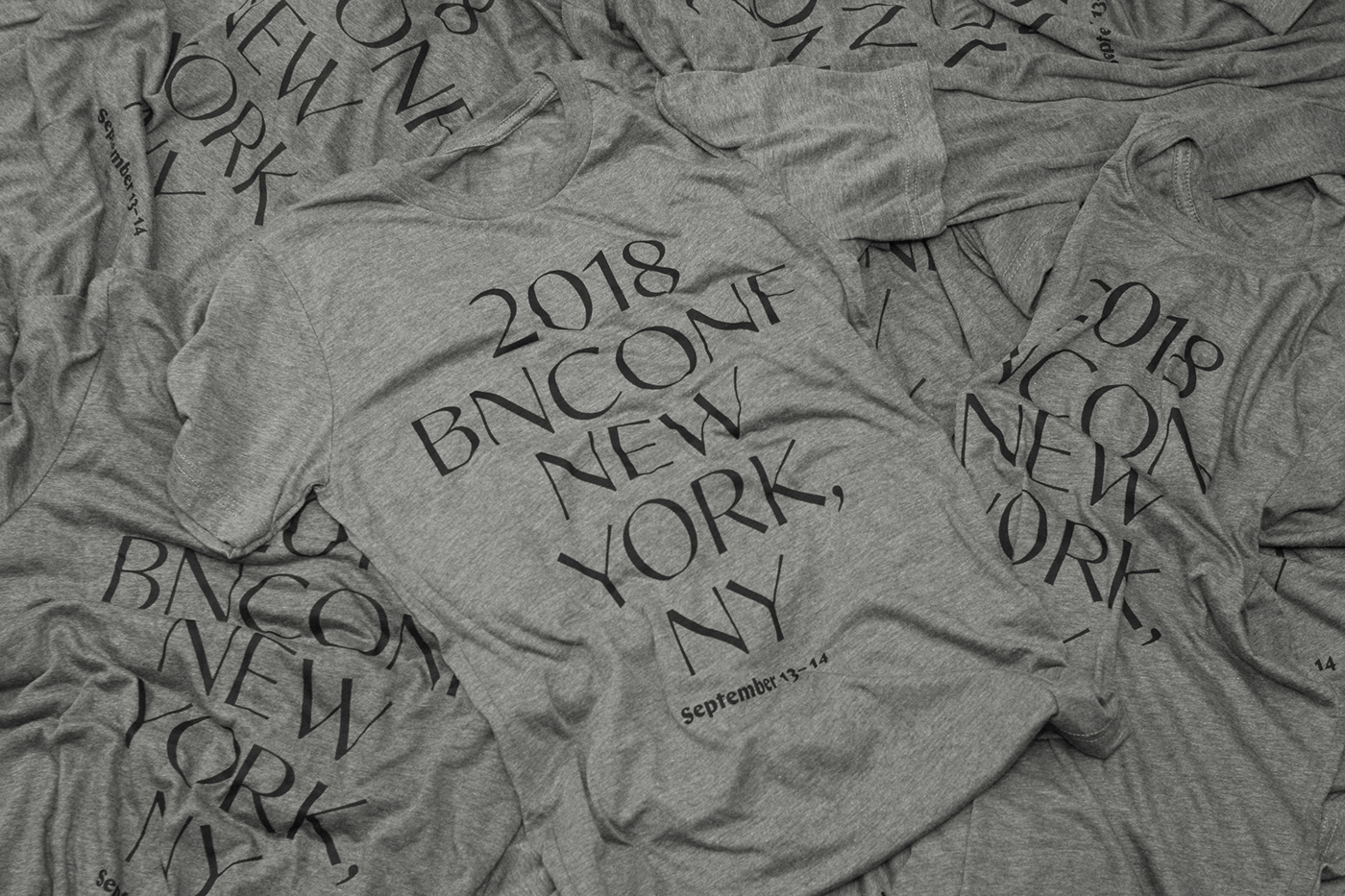
We originally wanted to mix and match three or four different shades of heather gray as the t-shirt base but unfortunately the inventory was not in our favor. We selected a mid gray and printed some big Bosca type on it using water-based printing, which colors the fabric instead of putting ink on top of the fabric, so it has a super nice soft feel.
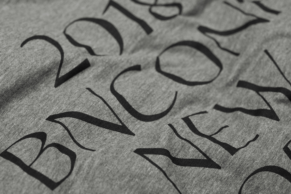
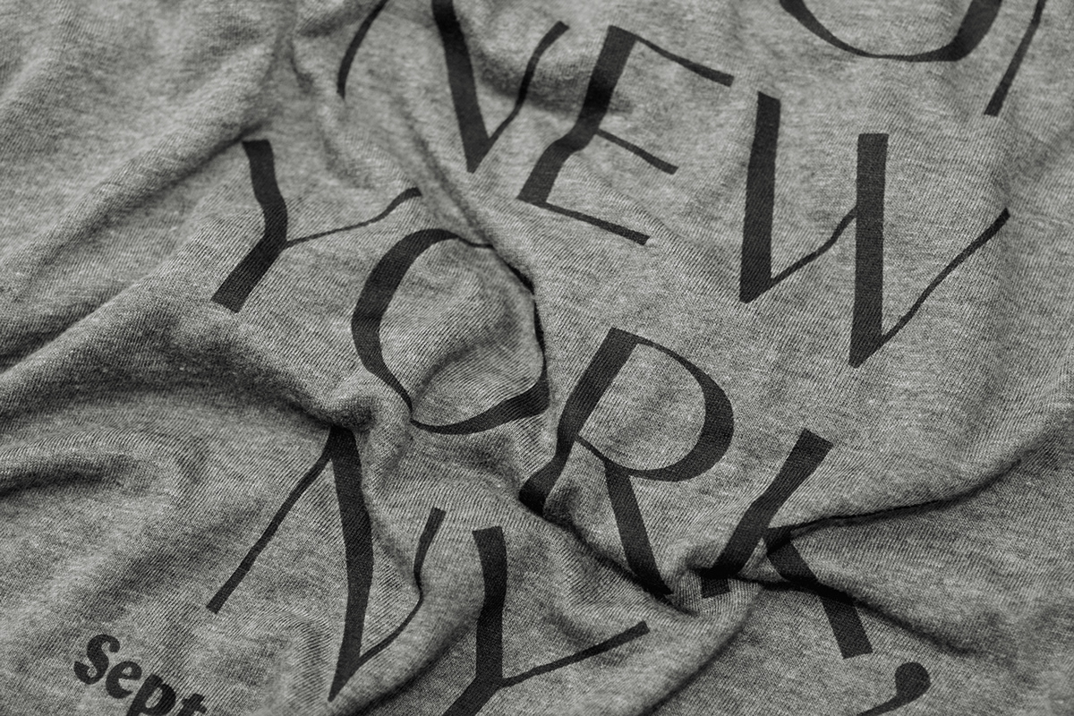
A couple of details.
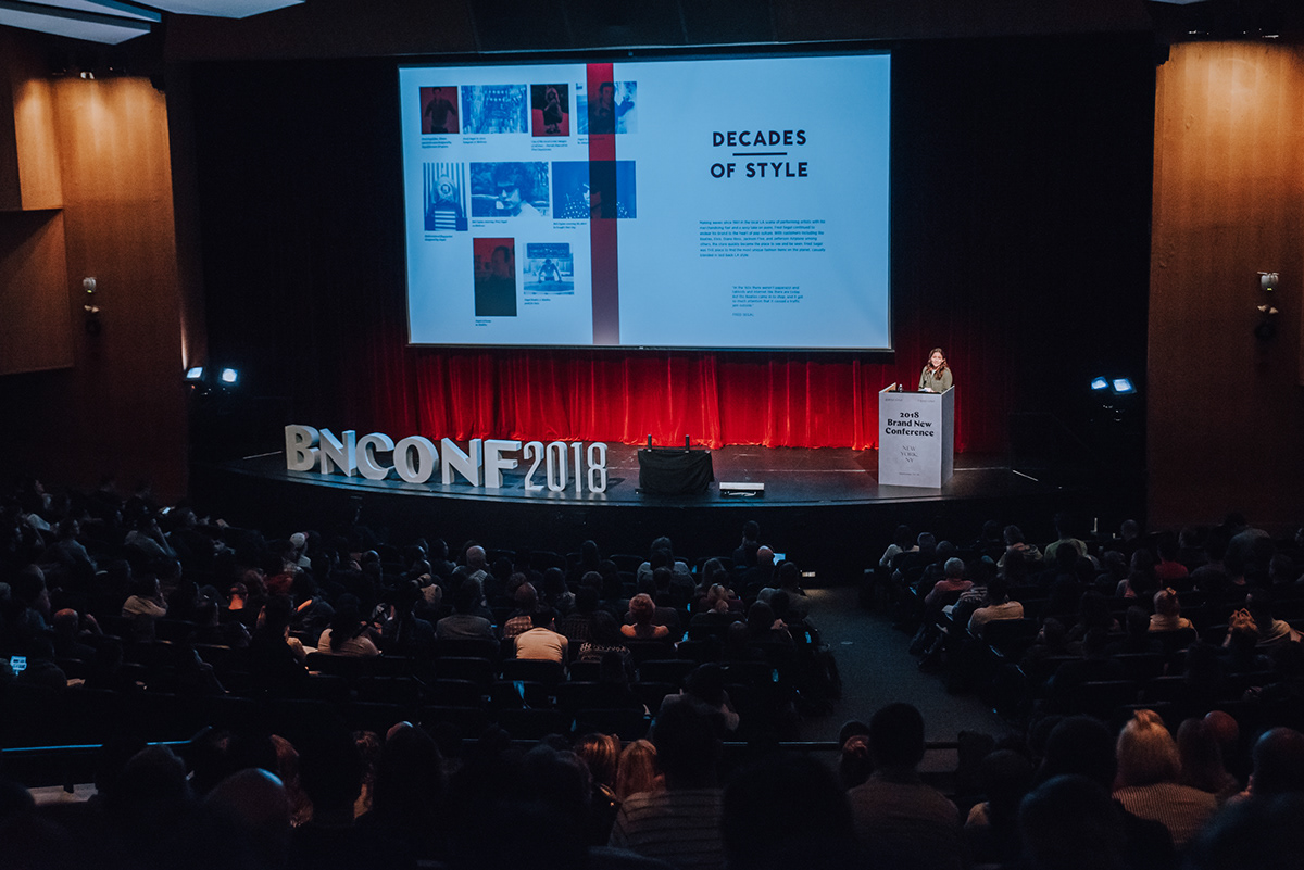
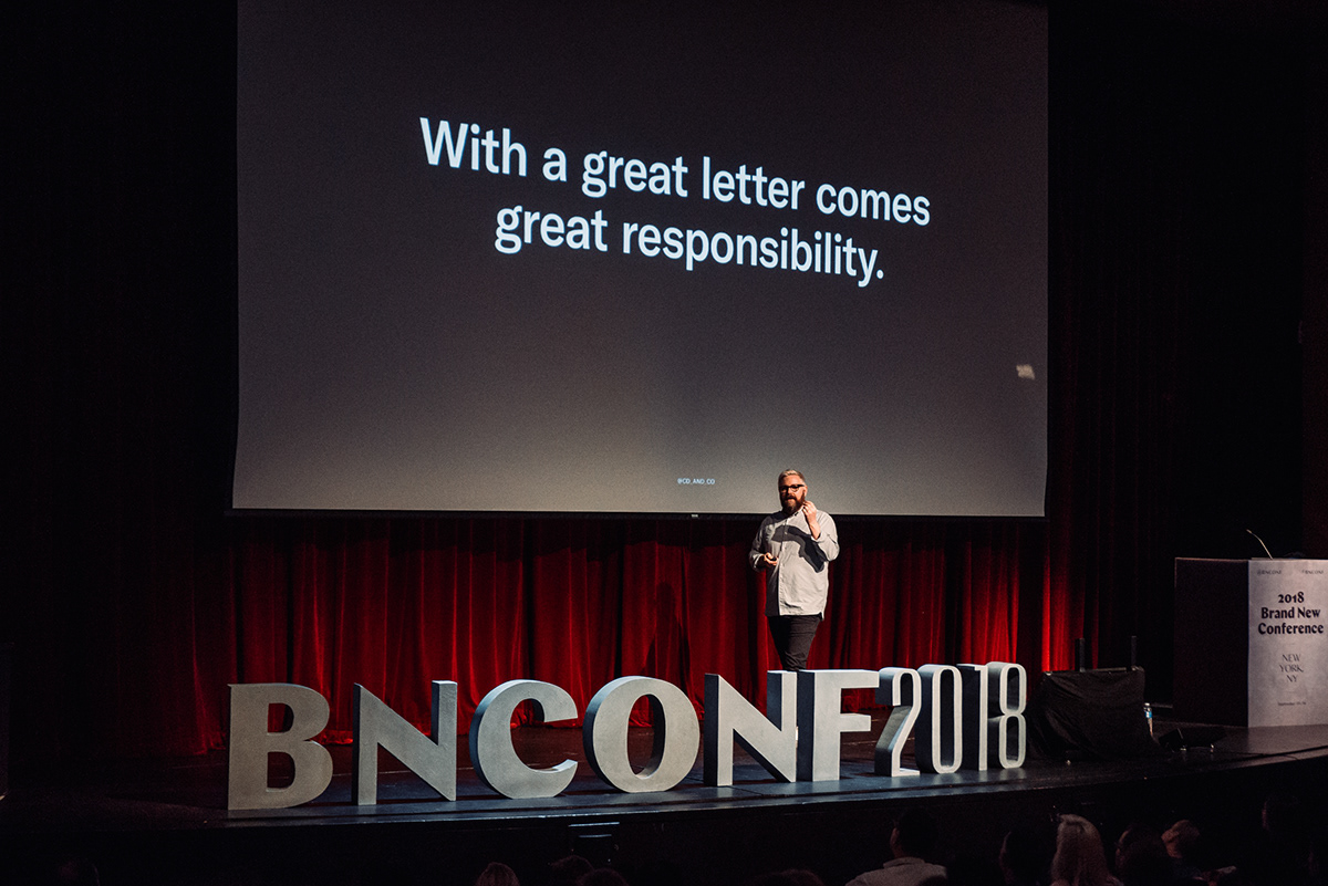
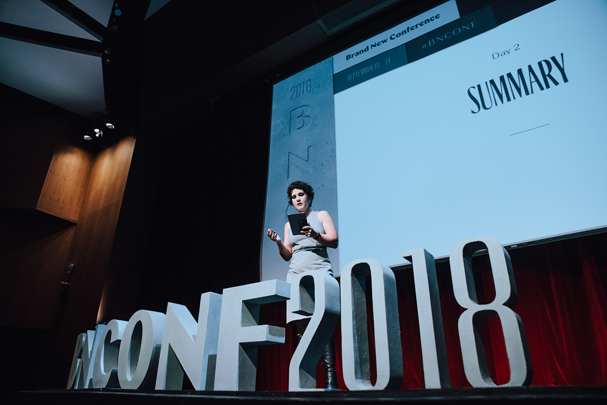
Stage Letters
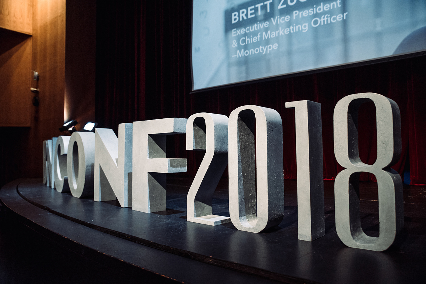
By now you are probably thinking “Oh, no, they didn’t” and you would be right, we did not. The letters are not made out of concrete. We thought about it, no doubt, but then realized both how difficult it would be and how impossibly heavy they would come out. We worked with a local carpenter who makes props for the theater in town and he made them out of insulation foam and a very convincing paint job.
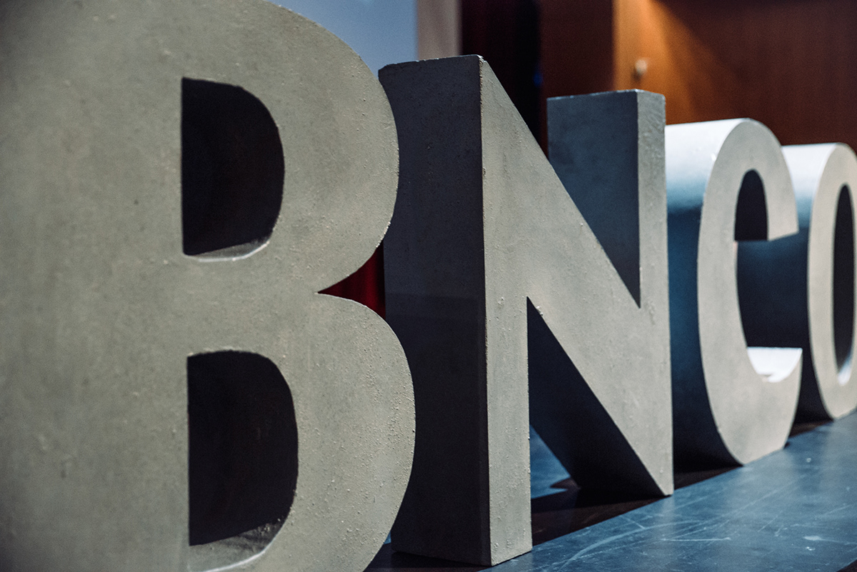
From far away to up close.
Screen Graphics
Last year we counted with the help of Studio TBT who created some awesome and snappy motion graphics. We thought we would earmark a budget for it this year but ultimately decided to spend that money on an endless supply of bags of concrete, so we were left to our own devices. Past speaker and friend of the agency, Mark Kingsley, who always prepares a soundtrack for the breaks during the conference had suggested a punk theme to this year’s music and we took that as a cue to make some modest speaker introductions. We made three different “styles” and each one has a subtle flashing sequence at some point in the video.
Three different music clips and animations.
We realize these are not very impressive but perhaps you might be surprised to learn that the music and flashes were synched using… Keynote. A good lesson here is to do the best that you can with what you have. And this last little clip we think sums that up nicely with an animation that punches above its weight using only close-up photos of the cubes and some semi-randomly-placed typographic treatments that helped open each day of the conference. Sound on!
Opening intro for the conference.
Instagram Love
Many thanks to everyone that expressed their appreciation of the materials on Instagram. It’s one of the most rewarding gestures for us.
That's it!
We have no idea where to go from here in terms of what 2019’s identity will be made of or how it will be made but we are going to be in Vegas, so there is no shortage of inspiration. If you know you don’t want to miss out, we are currently in pre-sale for the 2019 Brand New Conference on October 17 - 18!

