


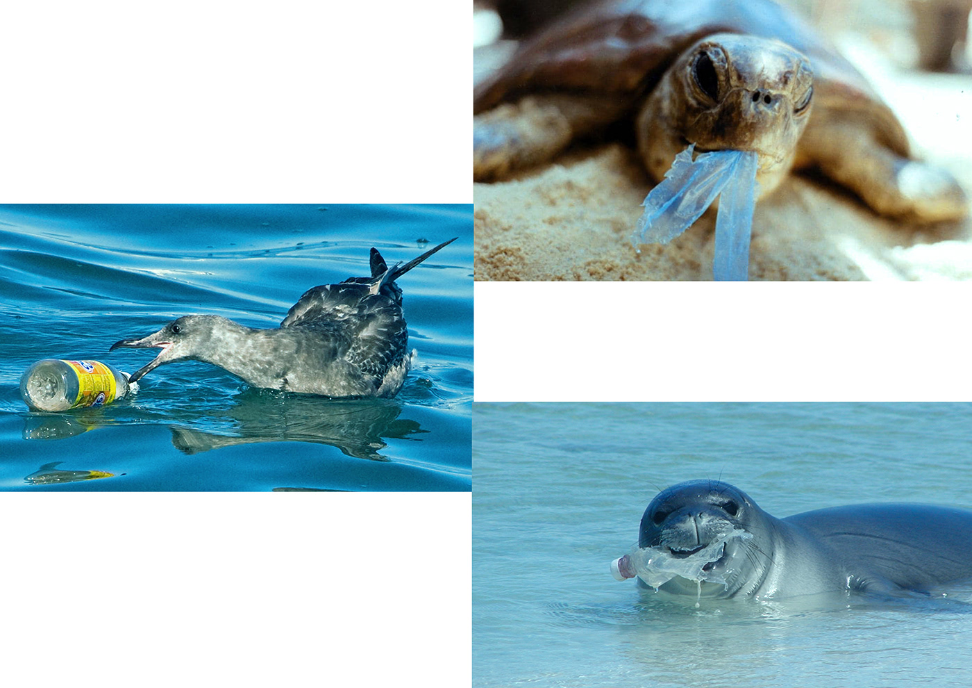
The typeface “DON’T USE” means we are saying no to the use of plastic items. It is a direct way to show the purpose of this typeface. In addition to that, it is also telling us that we should always try to use the
recyclable bottles instead of the disposable plastic bottles.


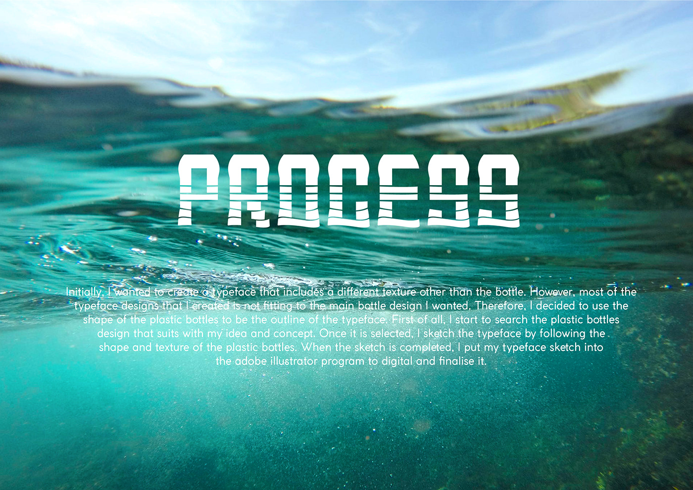

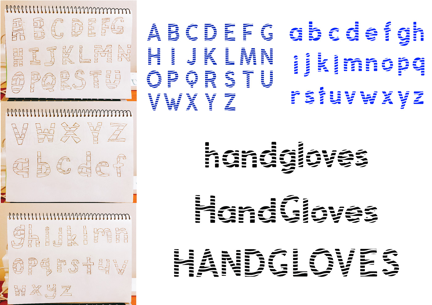
INITIAL DESIGN
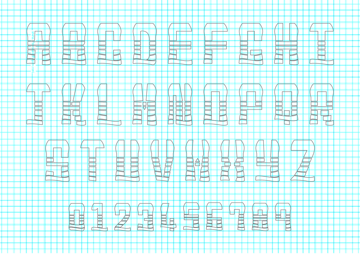
FINAL SKETCH

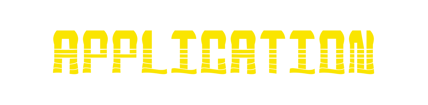
The font style is developed by the sans-serif, this design is completed by using uppercase A-Z and digital numbers 0-9. For this typeface, I use the texture of the plastic bottles to illustrate and include its elements in the typeface body, this allows the typeface to have the look of a plastic bottle. “DON’T USE” can be use by the environmental related or conservation organisations. Their advertisement such as poster, packaging and magazine and etcetera will be more appealing with “DON’T USE” typeface.
FINAL OUTCOME
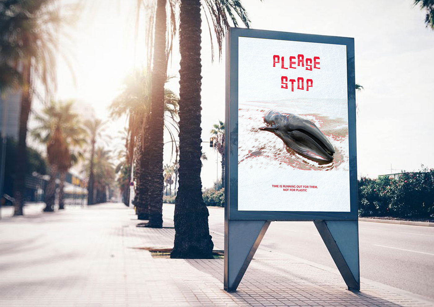
POSTER
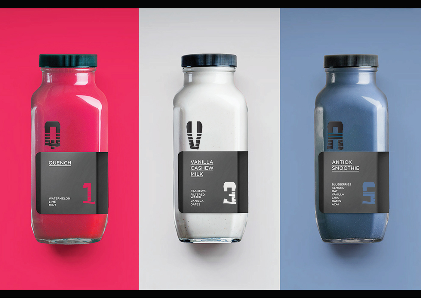
PACKAGING
MAGAZINE

THANK YOU


