

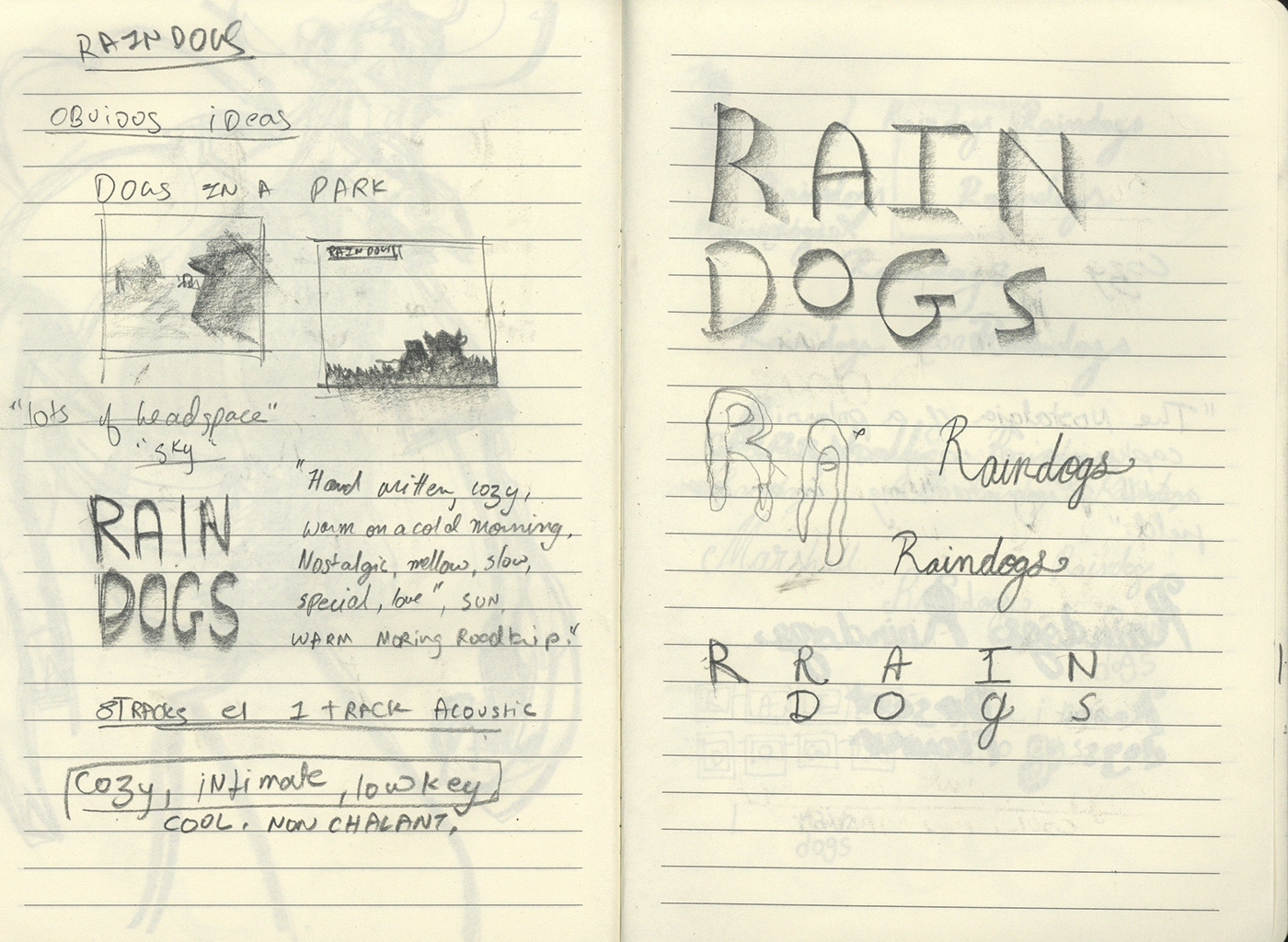
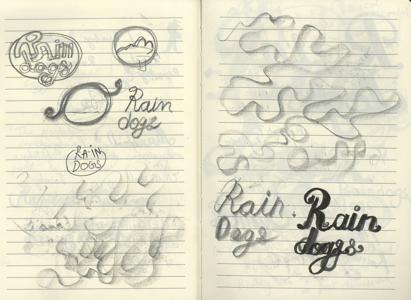


I was contracted to design a logo for a Danish blues band called Raindogs. Their sound really felt warm, round and full of love. It would require a logo that was equally "made with love" and thus the approach. As you can see with the sketches, innitally was on a completely different tangent. Unsatisfied, closed my eyes and let my pencil react to the sounds of the guitar in their songs.
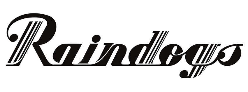
It thus was evident that I had to make a logo that had a very organic, rolling feel to it which would mimic the rolling notes of the guitar. The thick letters represent the full, heavy base guitar and kick drum which provide a constant visual beat. While the white stripes represent the occasional snare drum ;a feature in their sound.
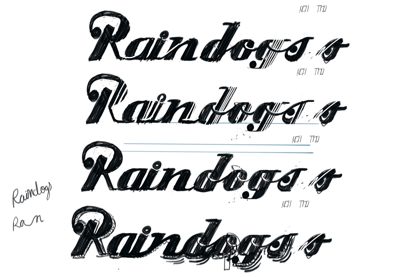
Since their sound was so emotional, the logo typeface had to be custom made. I based the typography of off a combination of the Glamour and Deftone Stylus typefaces. Glamour being referenced for it's regal look and Deftone Stylus for it's warm and brush like rolling feel.
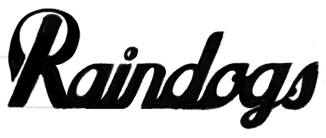
A few iterations further, I came to the results you see here.
It thus was evident that I had to make a logo that had a very organic, rolling feel to it which would mimic the rolling notes of the guitar. The thick letters represent the full, heavy base guitar and kick drum which provide a constant visual beat. While the white stripes represent the occasional snare drum ;a feature in their sound.
Since their sound was so emotional, the logo typeface had to be custom made. I based the typography of off a combination of the Glamour and Deftone Stylus typefaces. Glamour being referenced for it's regal look and Deftone Stylus for it's warm and brush like rolling feel.
A few iterations further, I came to the results you see here.


