

Didi Icon Play
I've wanted to make an icon set for a while and was inspired by my Didi Refresh: Meet DeeDee Project. Vector art and illustration are both hobbies I enjoy...so why not combine work with play to make...Didi Icons!
1. Discover
Because I'm an illustrator by hobby, I started off with sketches on paper in my notebook. Here are a few initial ideas from my ideation page. I looked around on Google for inspiration and Didi's app for ideas of what icons are commonly used.

2. Define
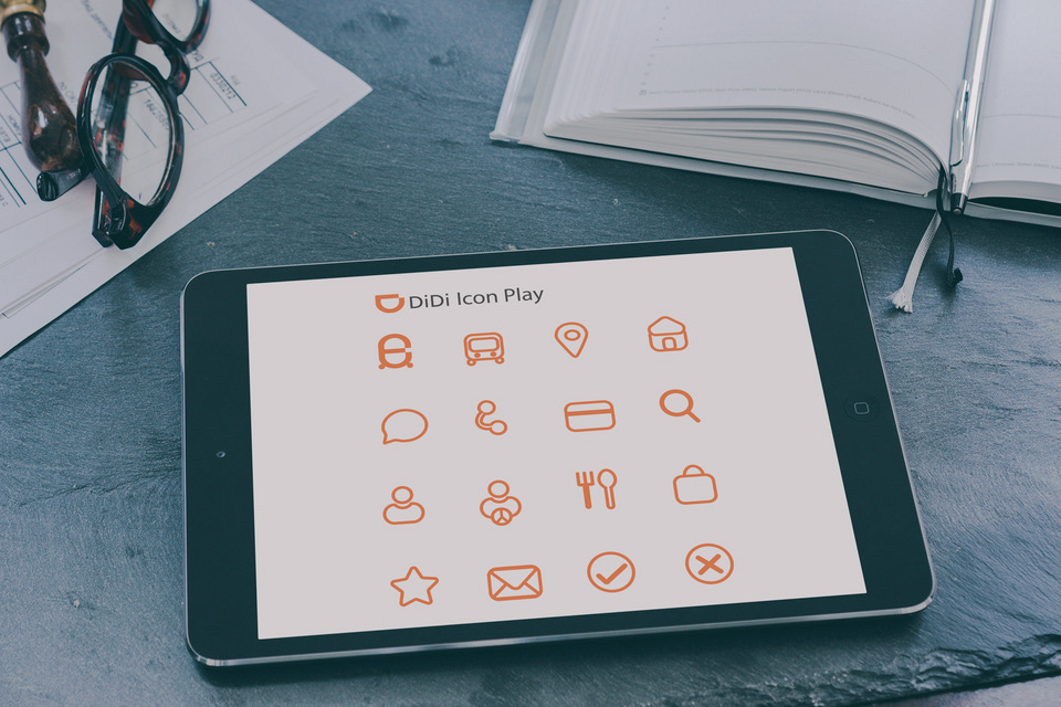
After looking at Didi's app, I identified 16 commonly used icons. Also, I realized that Didi's brand color is orange --which is similar to an idle state. I would have to create an additional active state and a disabled state.
My challenge: How might we create engaging icons that visualize active/passive states while retaining Didi's brand identity?
3. Develop
I began by locking in my grid in Illustrator. To be precise, I tried working on a 12-column grid. Grids are pretty essential in visual design, and although I maintained alignment, I would break the grid occasionally, especially in creating the fork and spoon icon.
Vector art is no easy work. I experimented with outlines versus solids. The outline icons seemed more on-brand with the Didi app, because the Didi Design System is light and flat. Having solid icons were far heavier, and perhaps more appropriate for desktop.
My design decision was to go with the outline icons.

Orange Solid Icon exploration

Orange Outlines Exploration (Direction)
4. Deliver
This was a fun project and here are my deliverables. A set of on-brand Didi Orange icons, Disabled-Grey state icons, and Active-Purple-Deedee icons.
Enjoy! Feel free to let me know what your thoughts are about my icon play :)

Grey-Disabled State Icons

Purple-DeeDee-Active State
These icons were inspired by DeeDee, my Didi Refresh project (see below).
She says Hello!


