
SIHE Branding | Motion Graphic
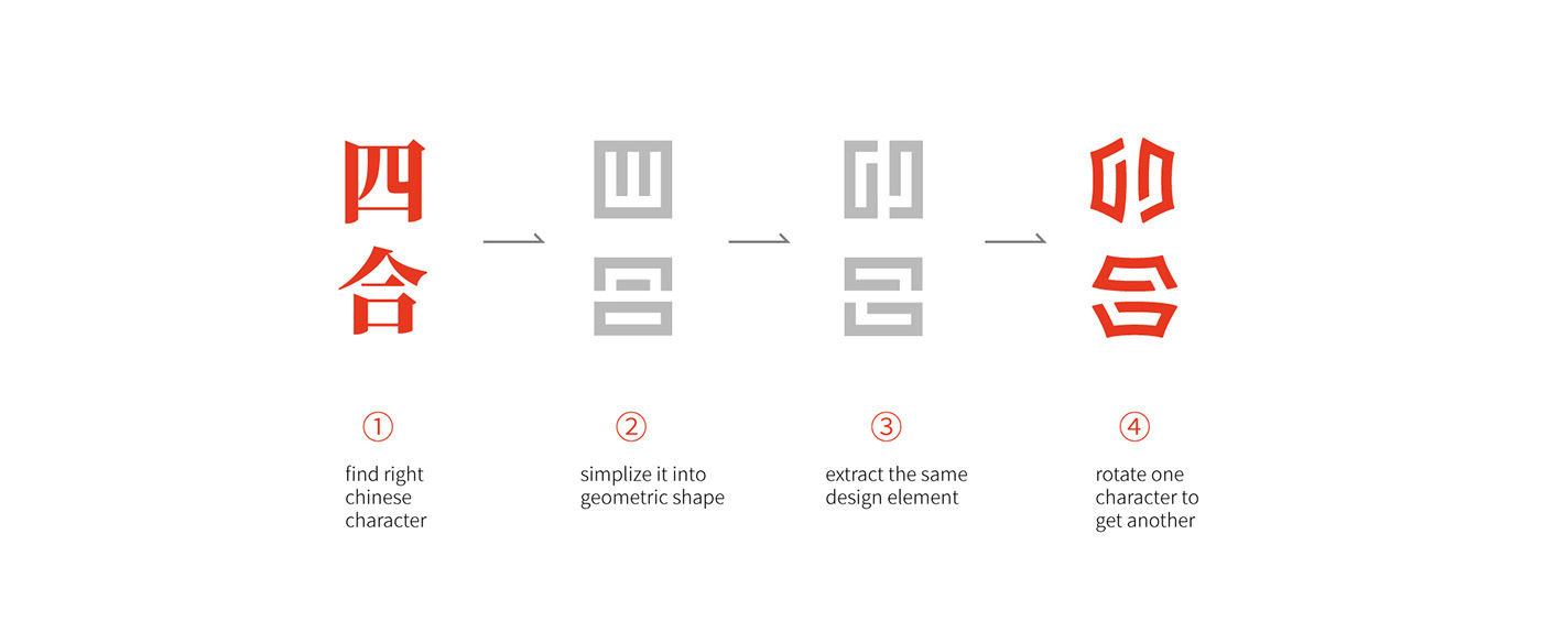
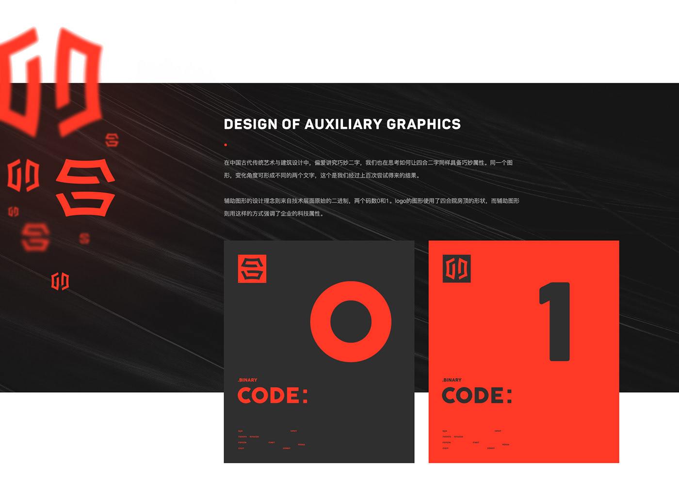
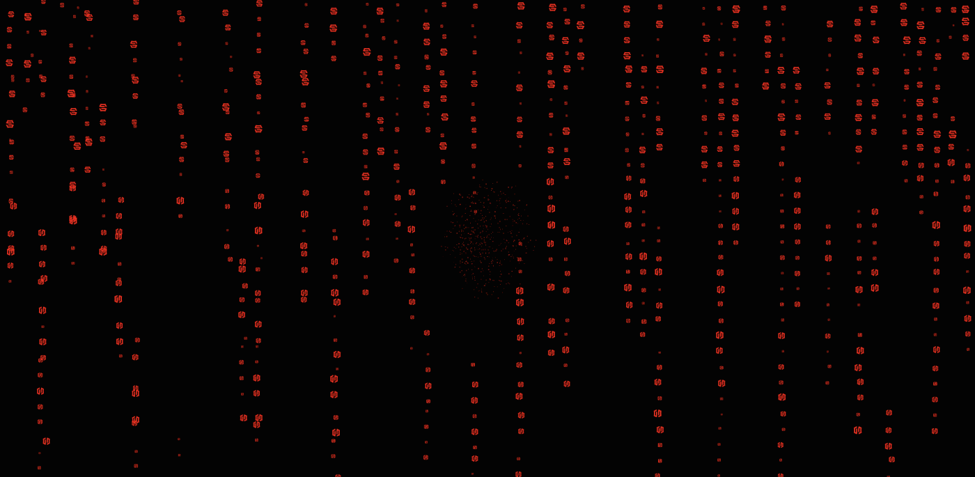
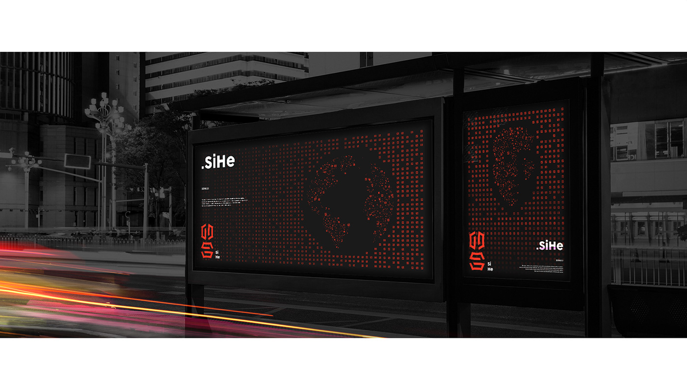
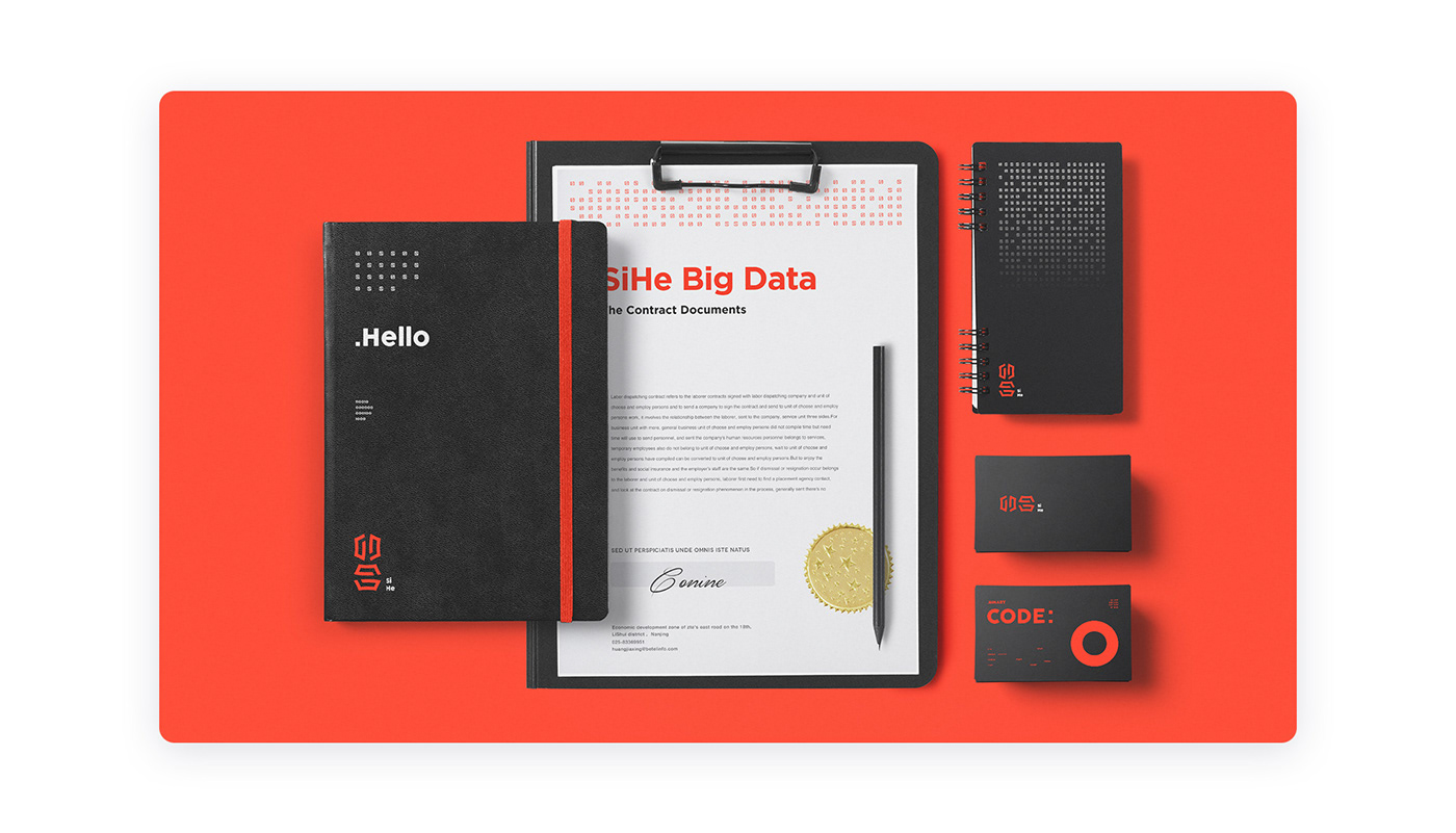
Sihe is a company focus on big data storage. Sihe in chinese is one of the most representative traditional architecture style. It is also a place that will integrate relationship between neighborhood and friends. So it becomes a symbol of cohesion. In modern life, client hopes using this symbol to represent big data which gets people more close to each other. This is the vision of Sihe Big Data and the origin of the company name. In traditional Chinese art, we usually play with the character itself. We think about how to make “四合” ingenious. We found these two characters have same figures. By extracting the same design element,"四"can be rotated to get "合". After that, we came up with an idea of the auxiliary graphics which inspired from binary system.Two characters represent two code numbers of 0 and 1. By rotating and replicating these two characters, we want to emphasize the technological property of the company. The shape of logo was inspired from roof of Sihe as well.
四合院是中国最具代表性的传统建筑,也是会融汇人与人之间感情的场所,增强内聚倾向的符号,在现代化的生活中, 客户希望用智能楼宇大数据能为邻里带来的更多的互动关系,让邻里不再冷漠。这是四合大数据公司的美好愿景,也是企业名称的由来。科技型企业的常规形象,如何与传统的四合院元素相融合,是我们这次考虑的重点之一。通过洞察智慧楼宇领域、地产行业态势、等多维度思考,作为从事2B产品的企业,梳理出应该给予企业及客户形象感受的情绪版,结合多方面分析结果,巧妙提炼出独有的品牌视觉元素,从而传递出正确的企业形象价值观,赋能企业发展。中国传统艺术与建筑设计中,讲究巧妙二字,我们思考如何让四合二字也能巧妙,同一个图形,变化角度可形成不同的两个文字,这个是我们经过百次尝试得来的结果。 辅助图形的设计理念则来自技术层面原始的二进制,两个码数0和1,logo的图形使用了四合院房顶的形状,而辅助图形则强调了企业的科技属性。
创意总监 Creative Director:傅译熳 Rachel Fu
设计总监 Design Director:馬季 Steven Ma
主创设计 Art Director:豆纸君 Bean
动效设计 Motion Graphics:豆纸君 Bean / 许尧 Yao Xu
视觉设计 Visual Designer:丁惟方 Weifang Ding
设计总监 Design Director:馬季 Steven Ma
主创设计 Art Director:豆纸君 Bean
动效设计 Motion Graphics:豆纸君 Bean / 许尧 Yao Xu
视觉设计 Visual Designer:丁惟方 Weifang Ding