


GRAR4S Graphic Design and Yearbook 2019
Mandy Szwaluk
________________________________________________________________
Project Thumbnail:

________________________________________________________________
________________________________________________________________
Yearbook Cover Brainstorming & Design:
Sketch:

This is our group's yearbook sketch, done by Angelo. We plan to borrow the Spartan helmet from the football team, and take a photo either in our english class (we're all in the same class) where there's lots of light, or in the hallway with a bunch of people walking, with a long exposure so everyone is blurred except for the person wearing the helmet.
Cover Design:

For cover the design, we mashed a bunch of our ideas together. We all really liked the marble, and the idea of an actual person wearing the Spartan head for the photo. We went to the library and asked a bunch of people to model for us. We ended up using this one, where we just found the person doing his homework, and he agreed to model. Later on, we Photoshopped out a trash can that was on the far left side of the image, and we desaturated the colour a lot.
Cover Mockup:

For our mockup, we were on a little bit of a time crunch, But it still shows how we plan to continue the marble and black onto the back of the book. This goes along with the minimalistic theme, because there's not much more to look at except for the image and the text, which is what we're going for.
________________________________________________________________
Yearbook Table of Contents Design:

For my table of contents design, I based it loosely off of one of the three yearbook covers that will be voted on. For the font, I typed it in, put it on the rectangles, then created outlines of the text and cut it out of the rectangles with pathfinder. For the background, I put in a marble image from the internet, then just put in a gold rectangle, and turned down the opacity.
________________________________________________________________
Final Table of Contents Design:
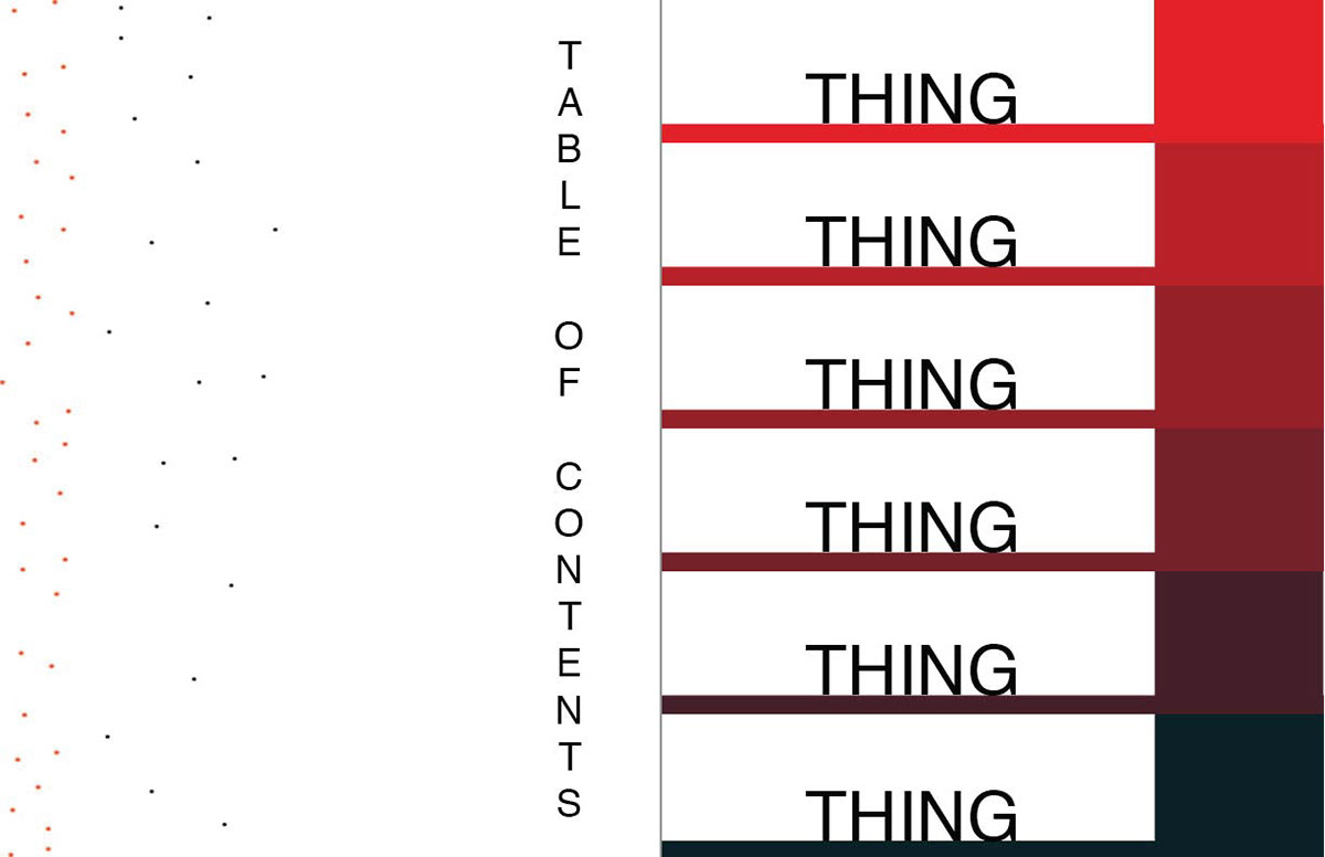
I remade my table of contents design to match the cover we chose. The previous one was made with Illustrator, while this one was made with Indesign.
________________________________________________________________
Colour Palette Assignment:

For the colour palate assignment, I chose an image of Asgard from the Marvel Cinematic Universe. I chose some of the nicest colours from the image, and put them in an aesthetically pleasing order.
________________________________________________________________
Colour Theory Assignment:

I used Illustrator to complete this assignment. I made the text as big as the spacing would allow for visibility's sake.
________________________________________________________________
Grad Announcement:
Unfortunately, I am unable to access my files at the moment. I will upload them as soon as possible.
Sketch:


These sketches are basically what I plan on doing for my grad announcement card.
Design Inspiration:

This is the image that I want to base my pose and design off of for the front of my grad announcement card. I like this design because it looks very vintage, artsy and colourful. For my design I plan on using mostly blues, but I might do a similar pose to this one.

This is the image I want to base the design off of for the back of my card. I like the vintage artsy style of this design, but for mine I will use a lighter blue to match what I plan on wearing.
Indesign Planning:

Overall Plan for this Assignment:
I plan on taking a mid shot of myself wearing several different shades of blue. I want the background to be white, or just generally neutral. Then I’ll bring the photo into Photoshop and slightly desaturate all other colours except for blue. When taking the photo, I hope to get the lighting so that my eyes are highlighted a bit, so that way, in Photoshop when I desaturate the other colours, my eyes will stand out as well. On the back, I want to have a white background, with subtle light blue text all over, listing some of my interests and stuff I like. In the centre, I will have more visible text with a title I have not completely decided on yet.
________________________________________________________________
Photo Retouching:
Before: After:

For this assignment, I loosely followed the three tutorials given. I got rid of all the acne spots, softened the skin, and changed the eye colour from blue to brown.
________________________________________________________________
Cinemagraph:

This was filmed on my 5 year old IPad, so the video quality isn't the greatest. That is my cat, Cody, and to film this I had to wait for him to settle down, (he was very playful before this, and it took several takes to get one where he didn't leave the frame; it took my mom tapping the wall behind me to distract him, and me lying on the table with the camera.) Editing this in Photoshop was fairly easy following the tutorial.
________________________________________________________________
Photo Restoration:

This is Portage Avenue in 1910, according to the website. I coloured this by using several layers of "colour balance", and masking certain points of the image. The only thing I didn't use this method on is the sky, where I used a rectangle, masked it and used a gradient.
________________________________________________________________


