About
Waitless.club is an app/chat that allows you to order food with no need to wait for the waiter to come to your table. Everything you need to do is to open any messenger and chat with our bot about your preference and allergies.
Colours
Colours that were used throughout the brand had psychological research behind them. It was found that red and mustard yellow are the colours increasing appetite. The green colour stands for health and organic. It has a very complementing contrast the chosen red and mustard yellow shade.

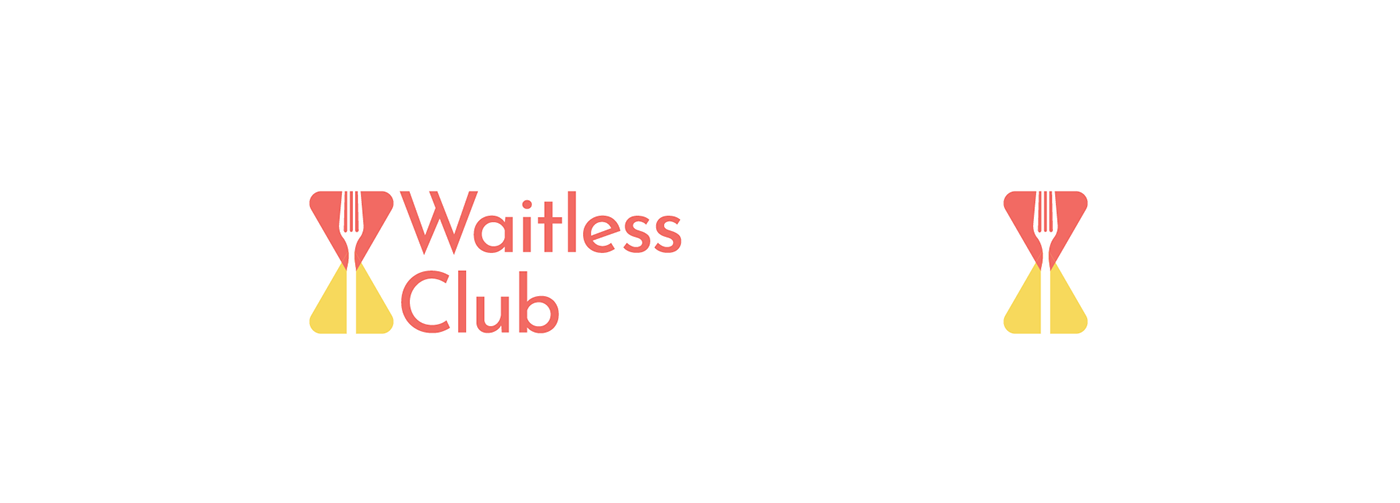
Logo
The requirement for the logo was to be simple and universal. It had to be considered for the logo to be used throughout different mediums including app stores. The solution was to design a minimal and memorable logo mark that would reflect the name of the app. After competitor, customer and association research it was found that the best way was to combine hourglass clock (time) and fork (food). The shapes compliment each other and look harmoniously with each other.


User Experience
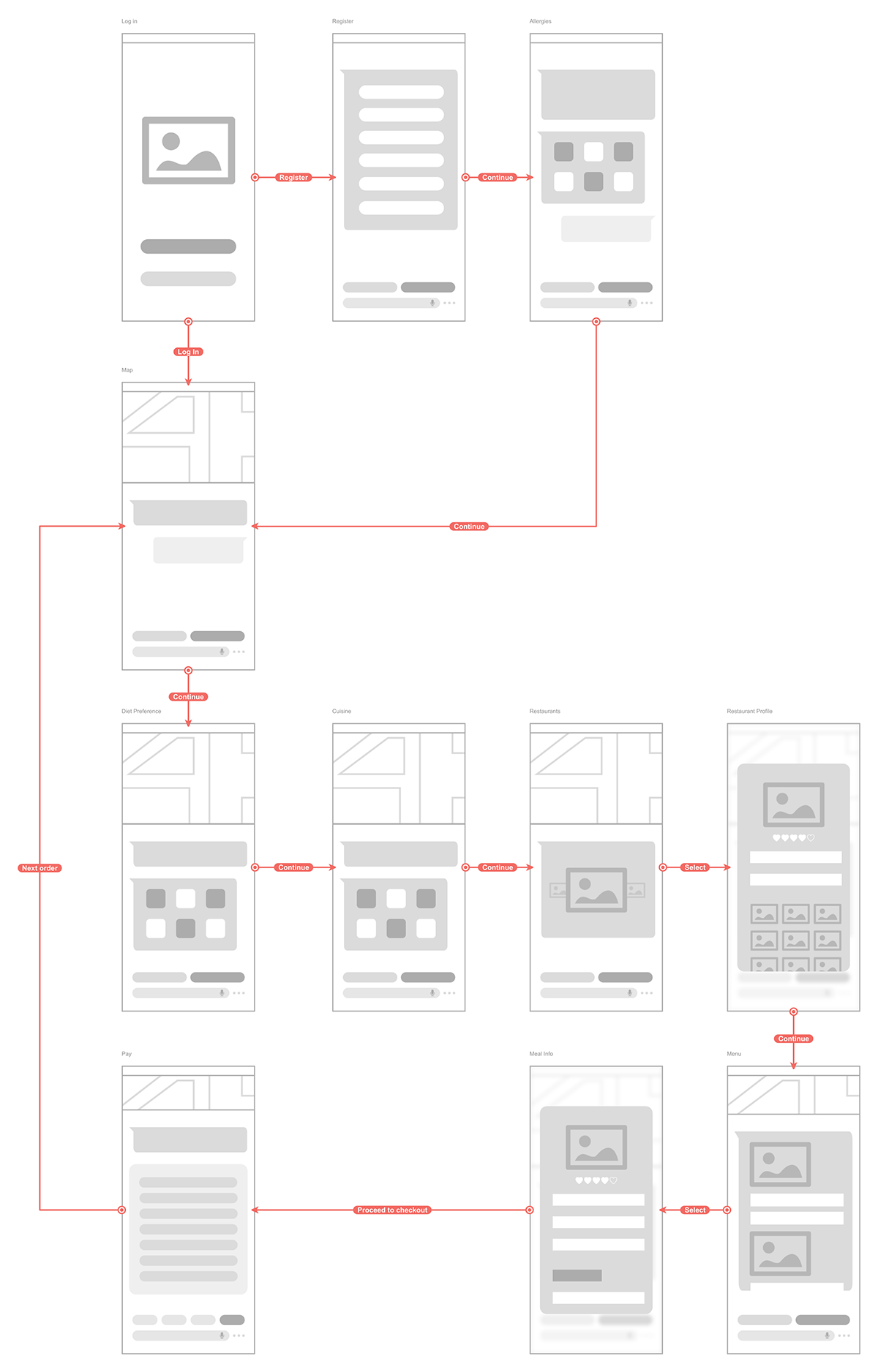
Create a simple bot chat that would allow a hassle-free food ordering experience.
Solution
Have created a simple flow that would take all needed information of the user during the registration process and then ask general information to what the user prefers. With the given information the bot will find the best restaurant and food options to save the users time. The bot will gather information to what the user prefers, best foods and restaurants to use in future orders. The user will have an easy paying method where he can choose to pay at the restaurant or through the app.
User Interface


For work and collaborations please email
aelenadesign@gmail.com
Thank you <3

