


WHAT IS COMP SOC?
The Computer Science Society for the University of Nottingham is a society that provides mental support, social events and industry tips for its members.
They are a group of young, social, fashion-orientated individuals, who are outgoing and strive to break the typical stereotype of programmers.
Comp Soc members are those who primarily study Computer Science and want to find outlets for the strenuous course. Its committee wants to convey the message to them that they are not alone and also provide its members with a support network that is often needed when at university.
THE BRIEF
One of the members of their awesome committee reached out to me and asked if I could help them with a new logo for their recent rebranding efforts.
After learning more about the Comp Soc group I was told that not only their old logo felt "clunky and outdated but didn't match the slick clean look of logos used by some startups and [fails to] represents the aesthetic of the current community"
With all that info and insights in mind, I tried my best to create a brand new logo, that could make their brand easily recognisable, modern and adaptable.
Before starting the design process, I tried to understood the committees likes, dislikes and the hopes for their brand, which helped me find the key attributes of Comp Soc: DIGITAL, MODERN and SOCIAL.

MOODBOARDS
In order to have better, visual ideas of Comp Soc’s vibe, I started putting together moodboards based on the three main attributes. Most of the images were taken from the awesome Unsplash community and a few others were given to me by one of the Comp Soc committee members.

INITIAL SKETCHES
With a moodboard full of imagery that could help me better visualise some ideas and concepts, I started sketching some possible symbols and logos that could have the potential to become “the one”.


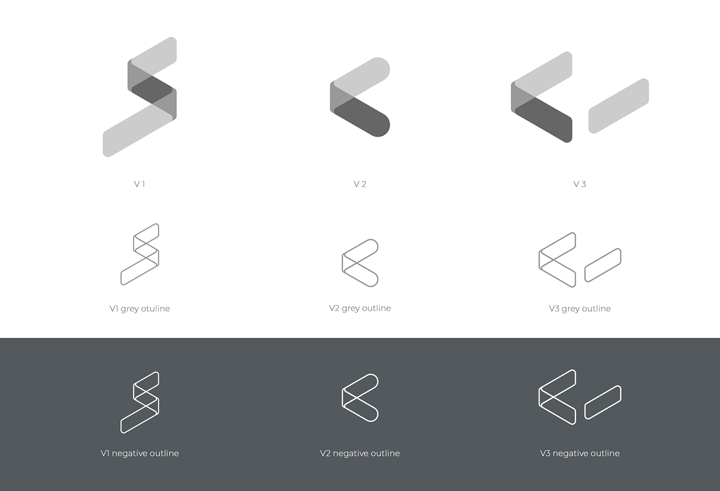
REDEFINING & POLISHING
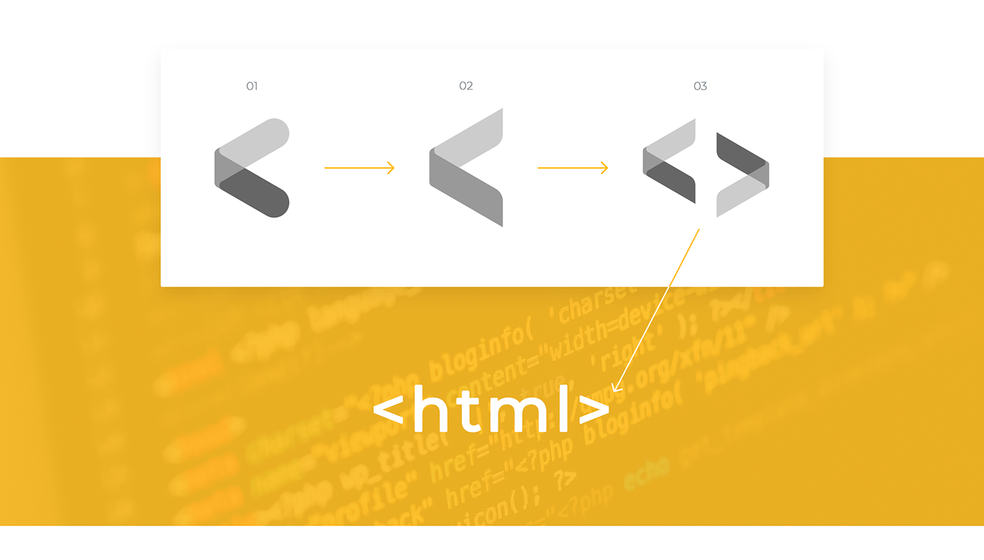
With the three solid options on the artboard, the middle version(s) just had the the potential of becoming Comp Soc’s new symbol, but still lacked some meaning to it.
After a few changes, and revisions to the moodboard, turning the symbol into something recognisable like HTML tags just felt right, and would be a good way of representing the society, as it is a recognisable symbol used in various other languages.
INITIAL COLOUR EXPERIMENTS
With the symbol now defined, various colour combinations that could be used to represent the three key attributes of Comp Soc were experimented with, resulting in the strongest options below:

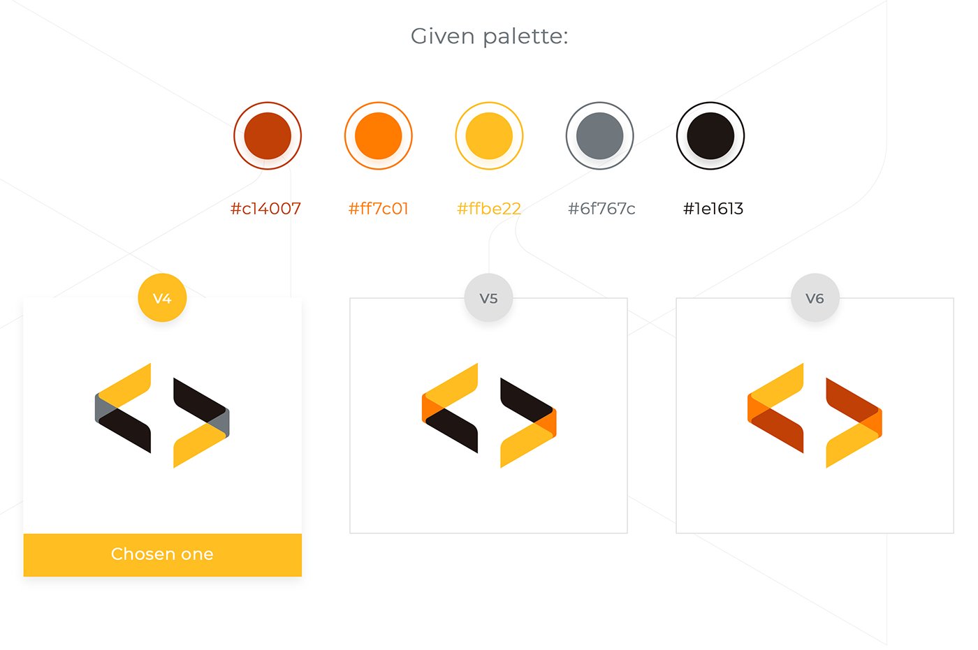
COLOUR REVISIONS
After showing the client the above colour experiments and better discussing how they wanted their brand to look and feel, I was told that they actually already had an idea for a colour palette that they’d like to adopt.
By taking inspiration from the client’s image, a few (similar) colour combinations were created.
While it limited the colour options in mind, it was definitely interesting to create a palette based on a given image, while still trying to keep a certain level of contrast between them.
TYPEFACE
With the same goal of creating a modern and sharp look for the Comp Soc group, going for a San Serif typeface was a no-brainer, but it was important to also see how they symbol would pair with modern Serifs.
After experimenting with Overpass, Overpass Mono, Montserrat and Arvo. We decided to opt for Montserrat, a modern typeface with over a dozen font weights that should provide them with a strong, consistent style they can use for all their needs.


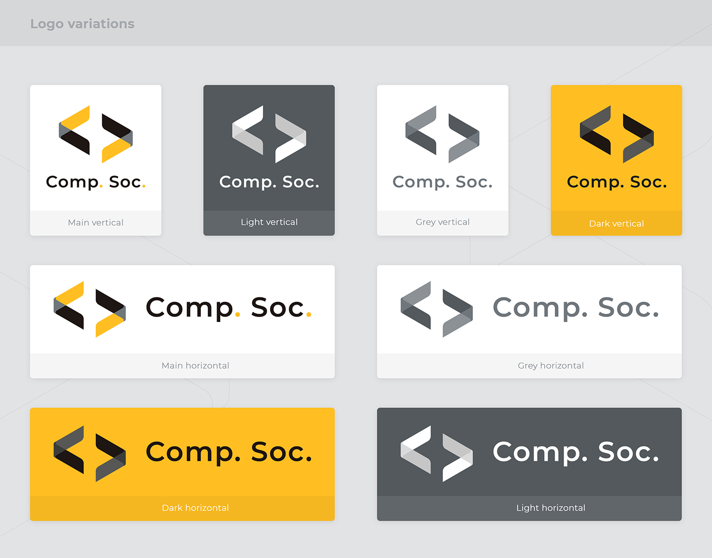

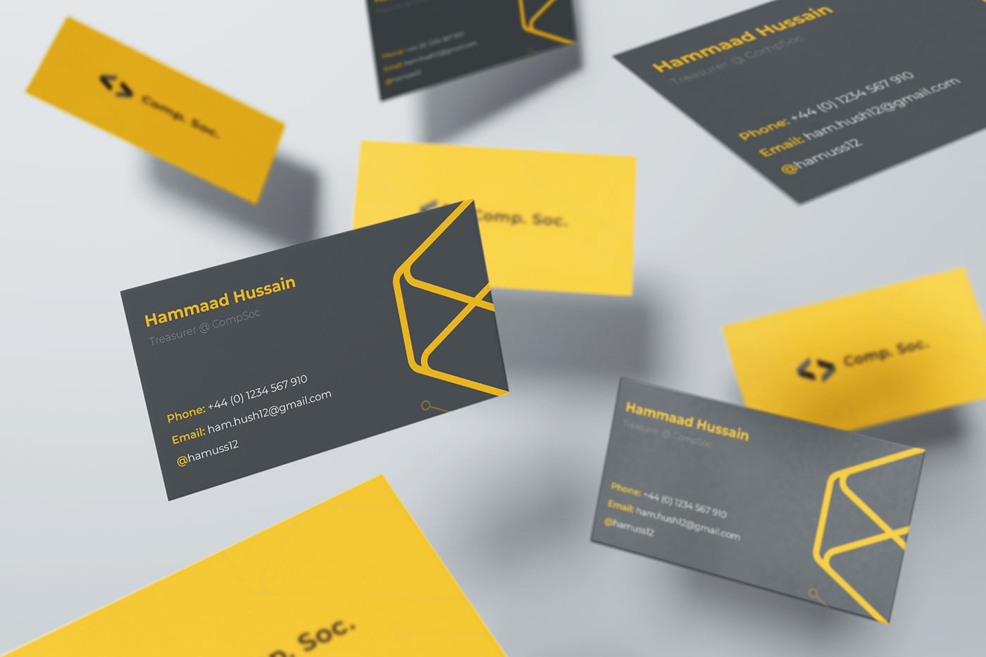
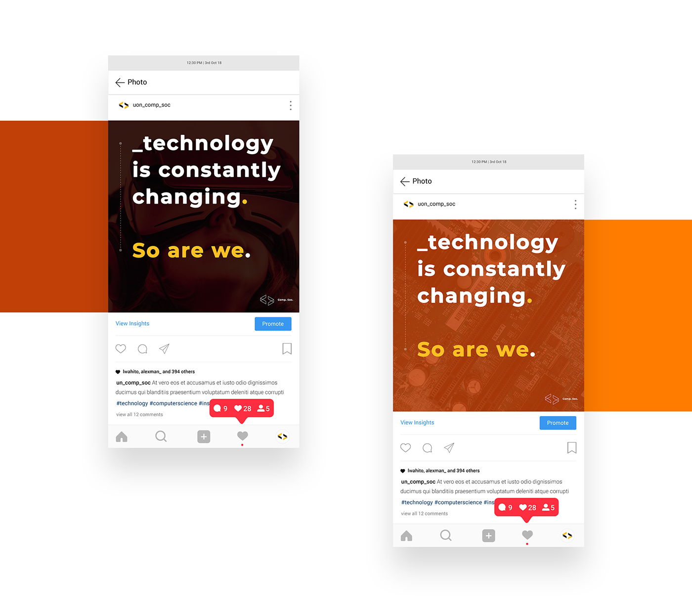
EXAMPLES OF BRAND IMPLEMENTATIONS


Thanks for scrolling this far!
🙏🏾
Feel free to appreciate or comment with any feedback.
(Have a great day!)


