

THE TASK
Nintendo Co. Ltd. a company founded in 1889 by Fusajiro Yamauchi in Kyoto, Japan.
Also known as the childhood of every single child on this planet.
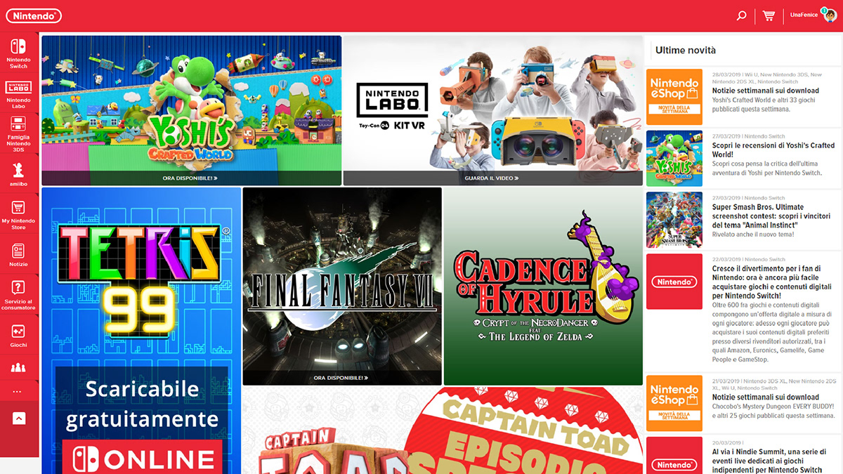
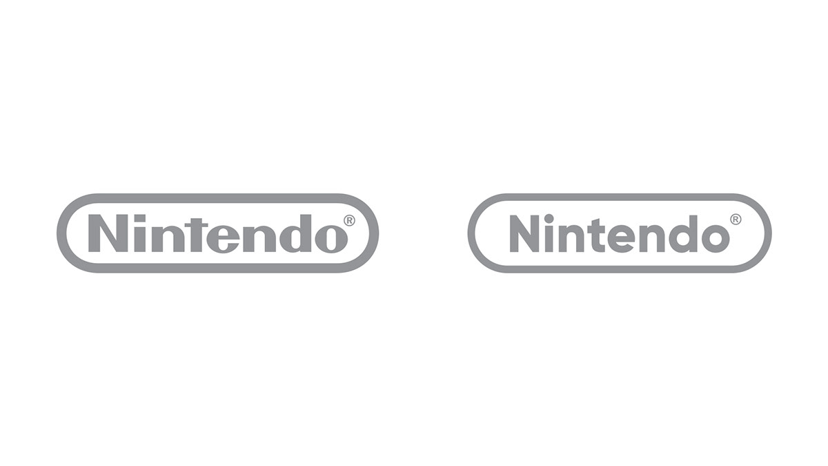
Working on a redesign of their legendary logo was a tough task.
My goal was simple and complex at the same time: refresh the Nintendo logo and make it more pleasant in the digital era.
My goal was simple and complex at the same time: refresh the Nintendo logo and make it more pleasant in the digital era.
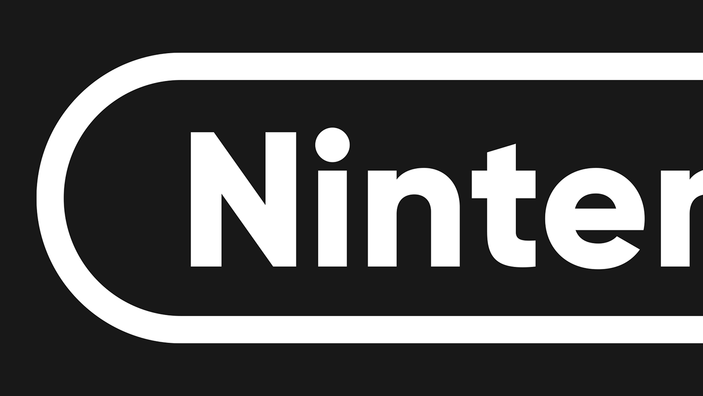
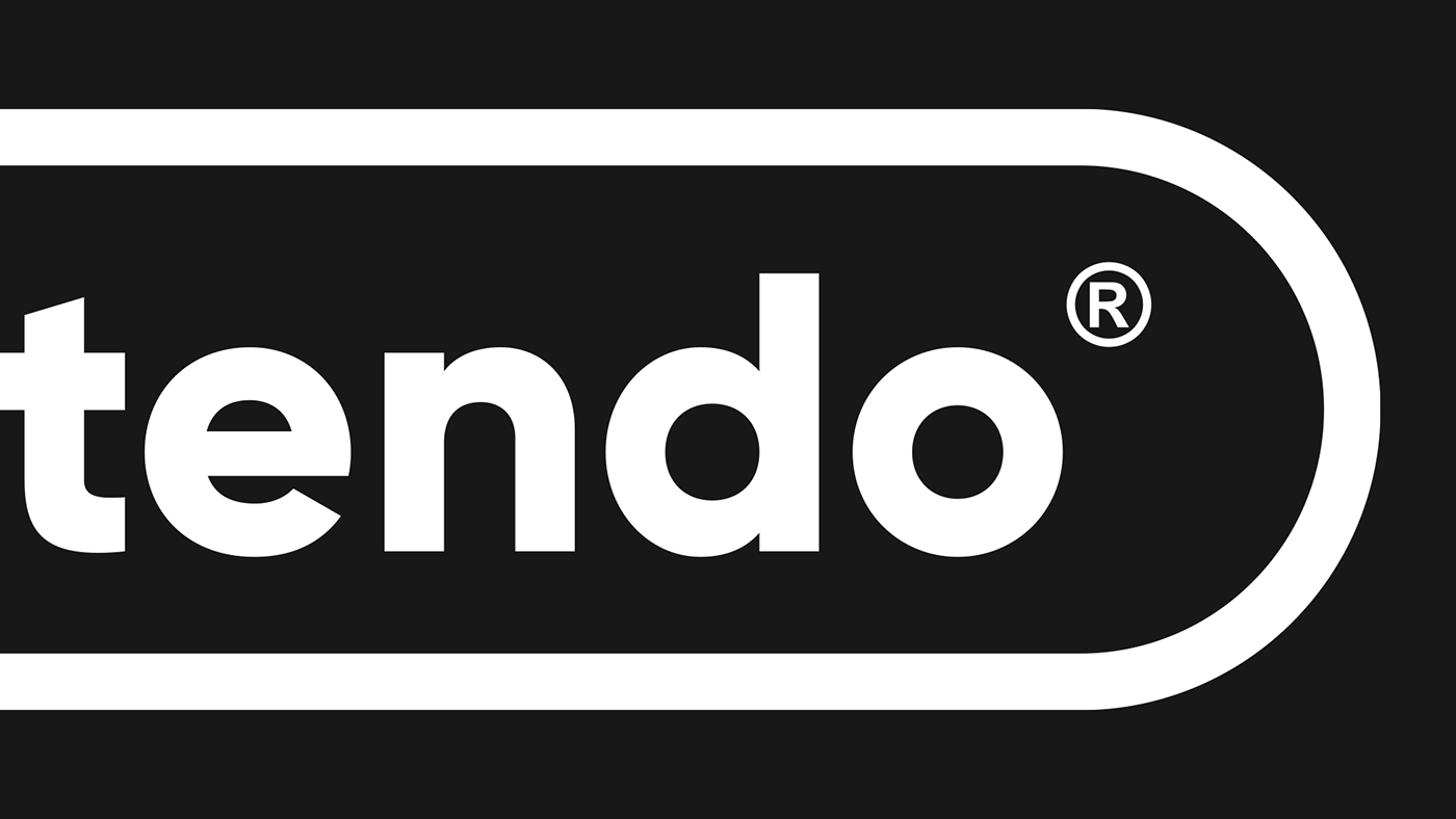
THE TYPE BEHIND THE LOGO
The font was an obvious choice: Gilroy.
A geometric and bold font created by Radomir Tinkov.
It is even used by Nintendo itself in their Nintendo Direct logo.
A geometric and bold font created by Radomir Tinkov.
It is even used by Nintendo itself in their Nintendo Direct logo.

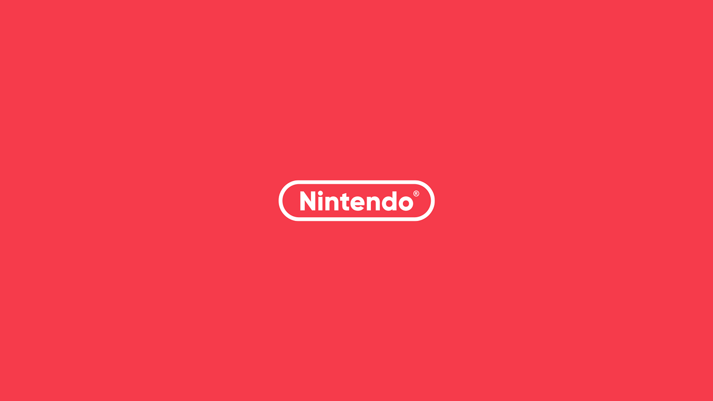
THE NEW COLORS
Changing the iconic red was a dangerous thing.
In the end, I decided to pick a softer red, less vibrant but more sophisticated.
In the end, I decided to pick a softer red, less vibrant but more sophisticated.


THE STRUCTURE BEHIND THE LOGO
So, I think this section is pretty self-explanatory.
Nothing to say. Enjoy.
Nothing to say. Enjoy.

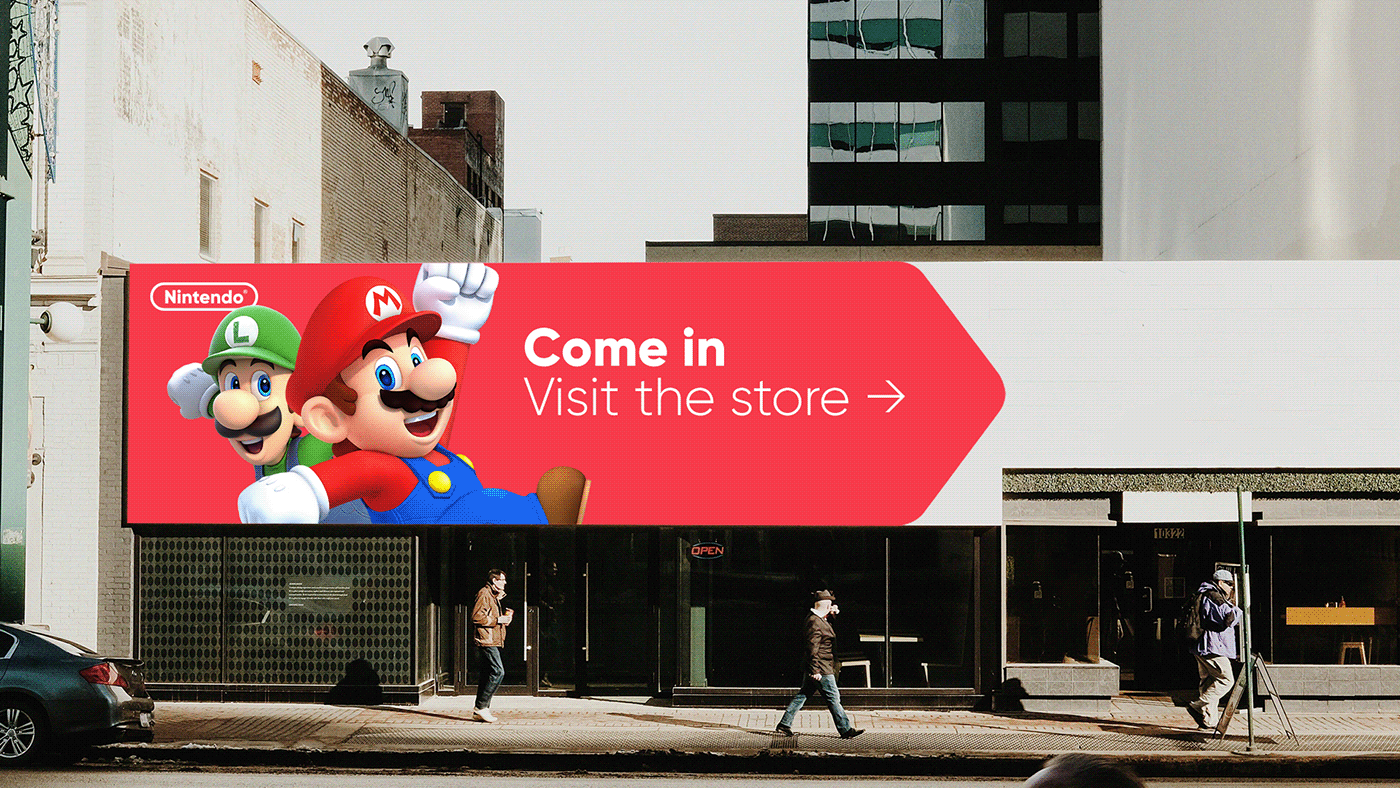
NEW LOGO AROUND THE WORLD+WEB


Hey, thanks for watching!
If you are interested in working with me send me an email at hello@giovanniciaccia.com.


