


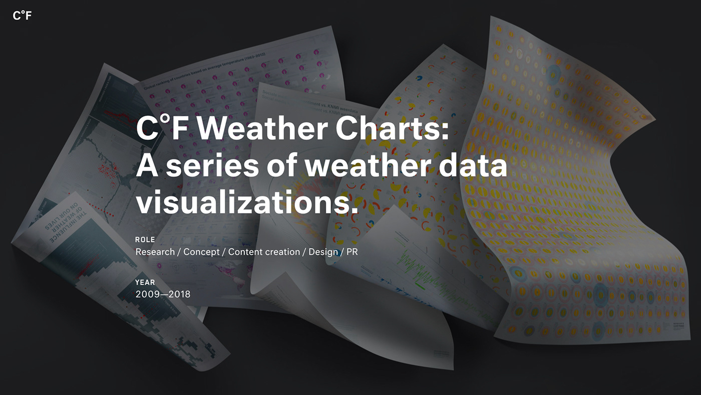
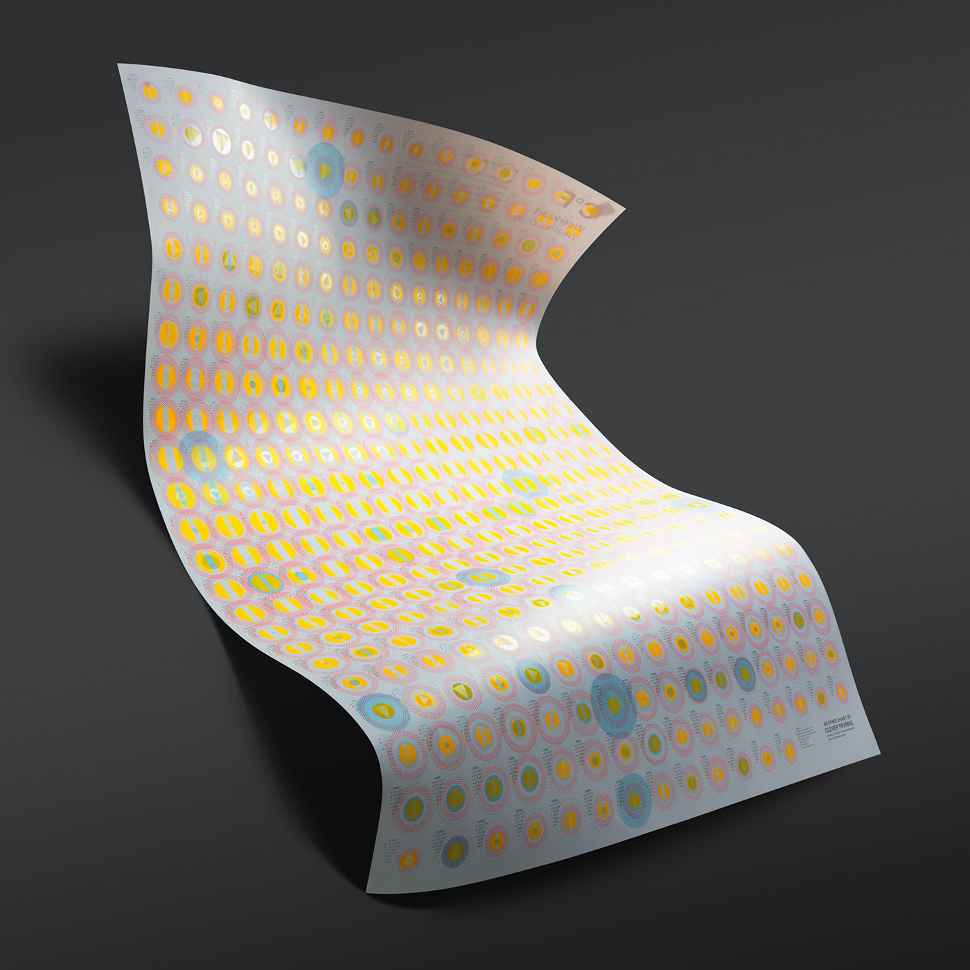
A decade of experimenting with data science, design and printing techniques.
The Weather Chart is for CLEVER°FRANKE a way to experiment and to demonstrate the power and use of data. Every edition reproduces weather data in a new and unique chart, visualizing particular aspects of meteorological activity.
The Weather Chart holds an important position in the heritage of CLEVER°FRANKE. The degree sign in our name, a reference to the astronomer Anders Celsius (°C) and the physicist Daniel Fahrenheit (°F), the minds behind the units with which we measure temperature, is also an assertion to our affinity with the weather and serves as the basis for the design of our visual identity.
Since 2019 the Weather Chart series is part of the collection of the Stedelijke Museum Amsterdam, the leading Dutch museum for modern art, contemporary art and design.
-
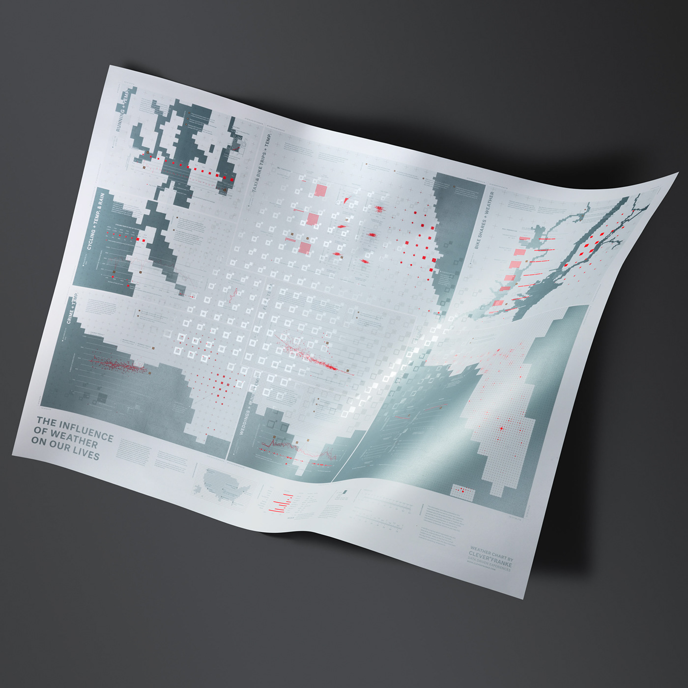
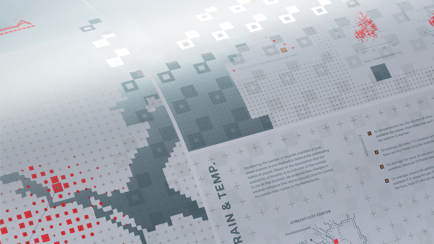
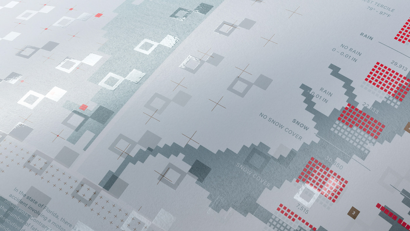
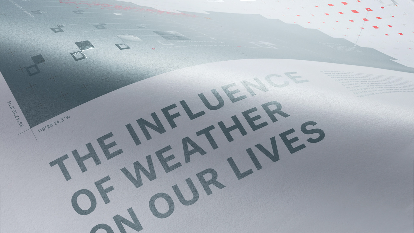
— 5th EDITION
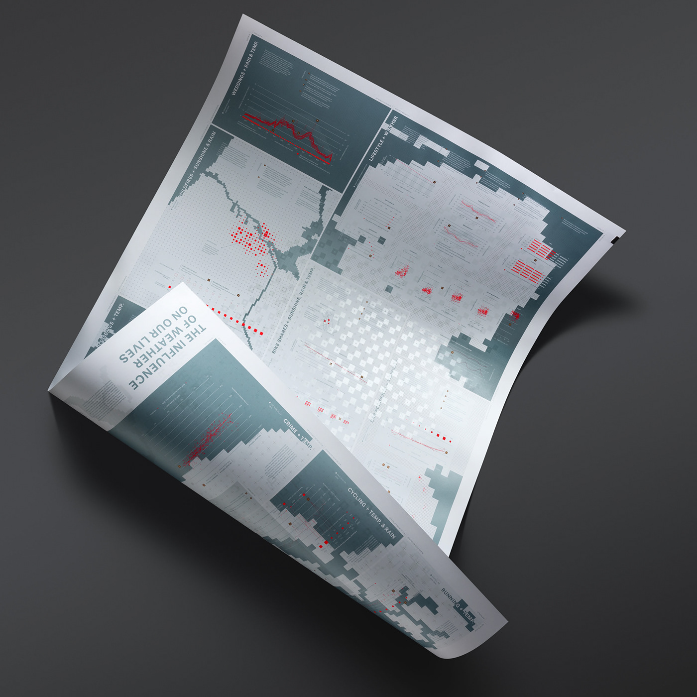
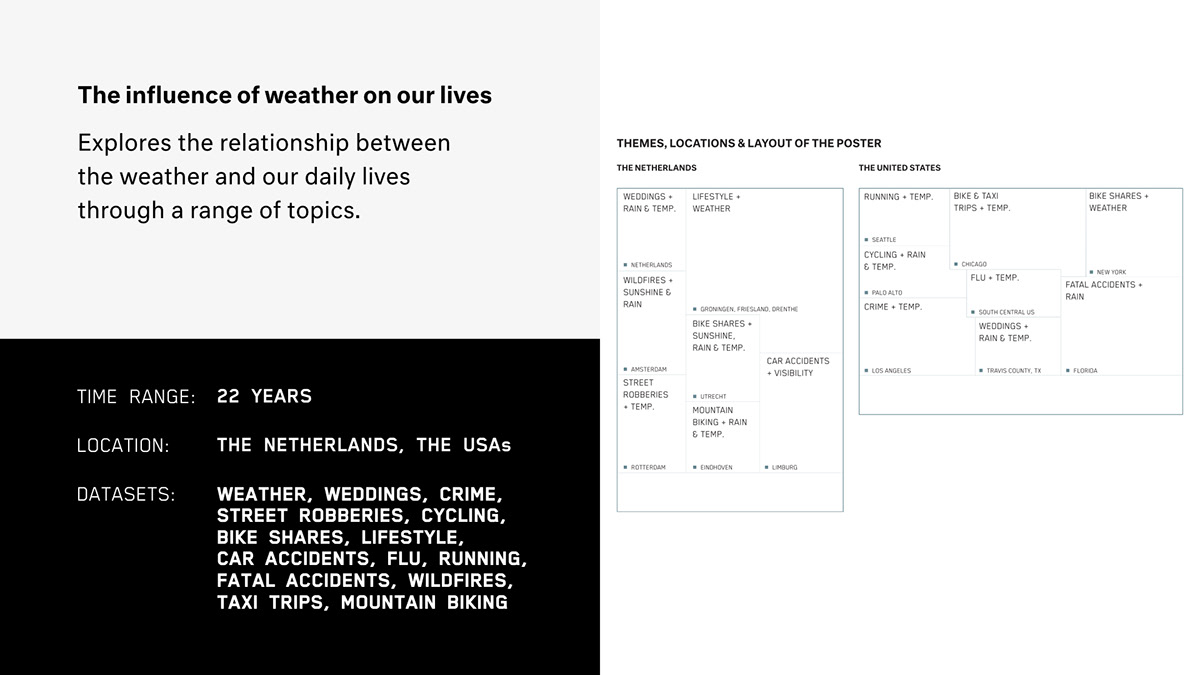
THE INFLUENCE OF WEATHER ON OUR LIVES
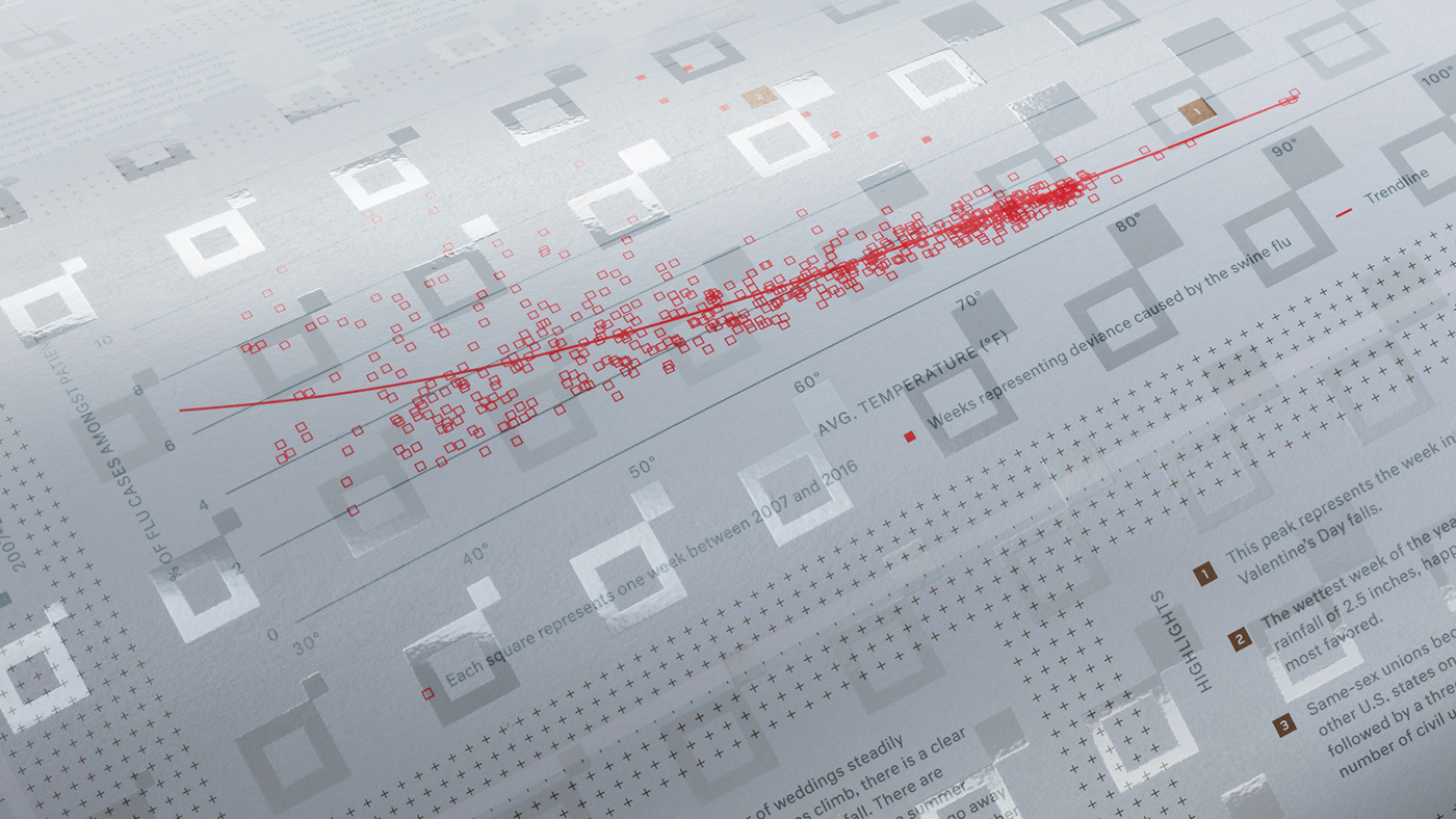
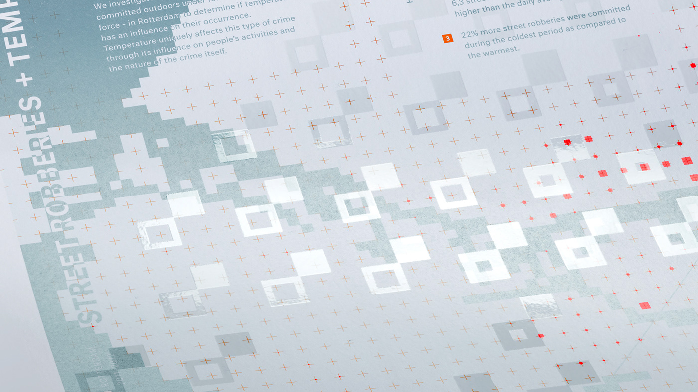
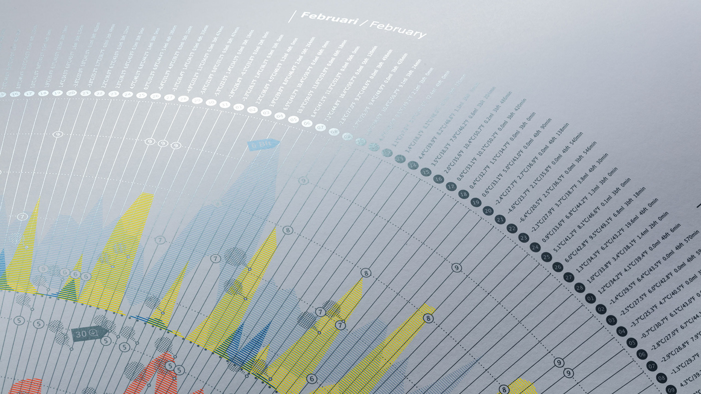
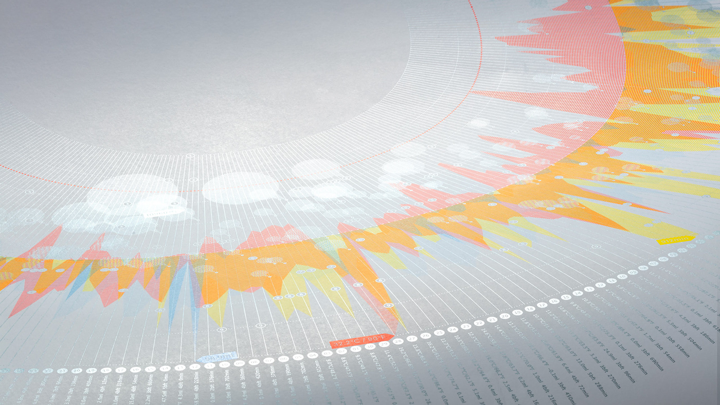
In this edition of our Weather Chart, we experiment with data to explore the relationship between the weather and daily life. For centuries, meteorologists have been observing and recording the weather. More recently, the rapid increase in sensor technology has enabled us to collect more data relating to various aspects of our lives. Separately, each dataset provides a single perspective. By combining this information, we reveal a layer of context and insights into the influence of weather on our lives. Each topic we have selected is an exploration of data, expressed as a visualization to uncover a telling story.
— 4th EDITION
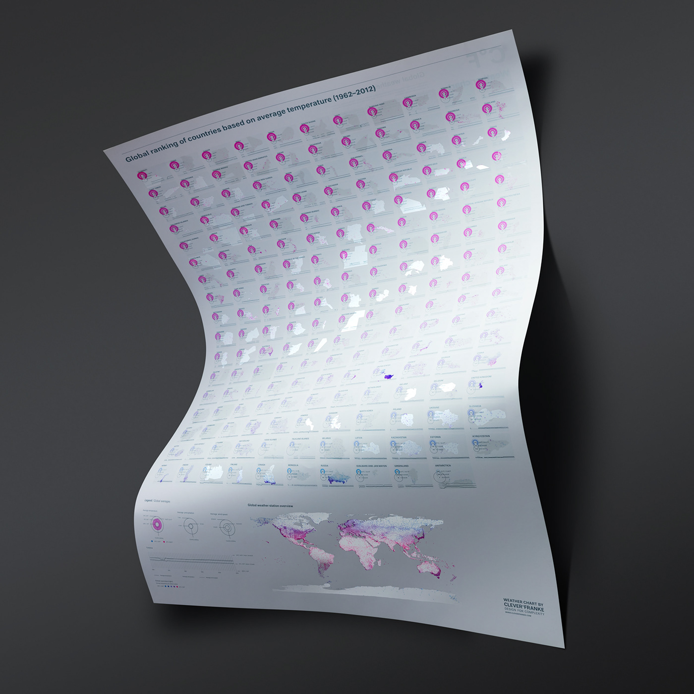
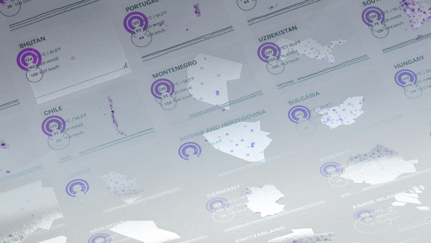
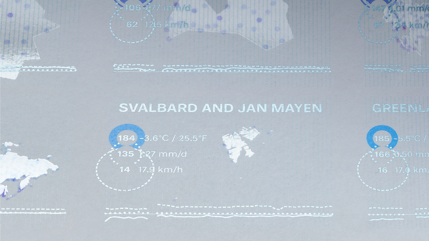
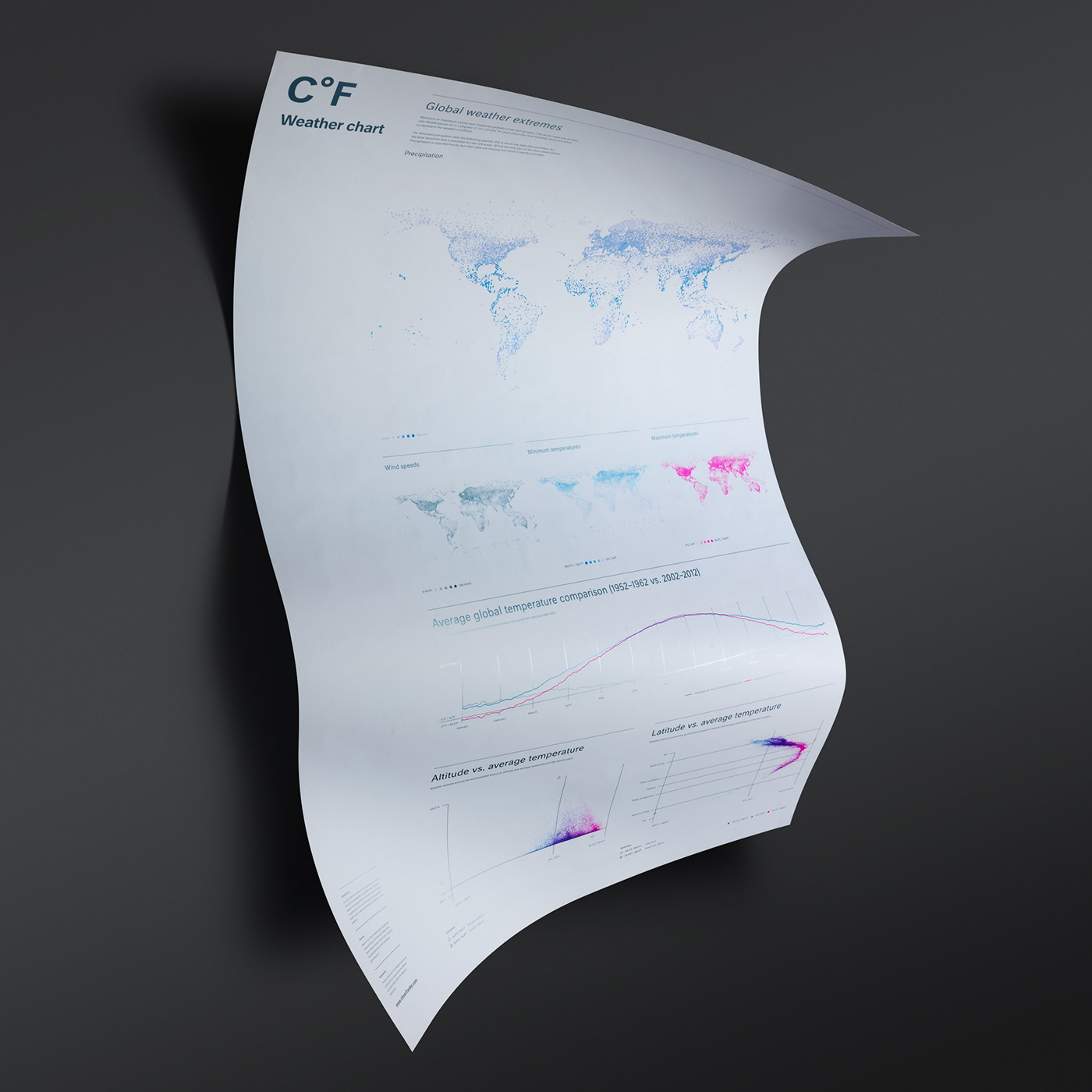
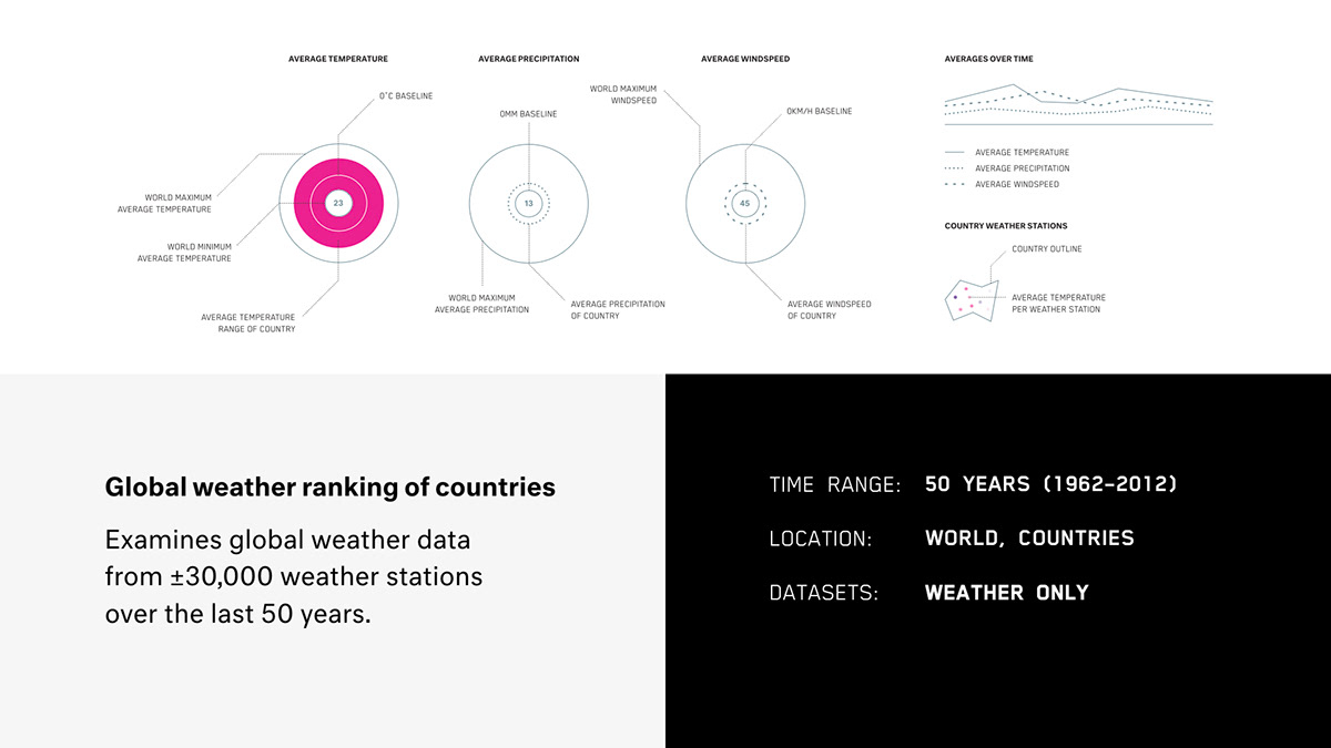
GLOBAL WEATHER OVER THE LAST 50 YEARS
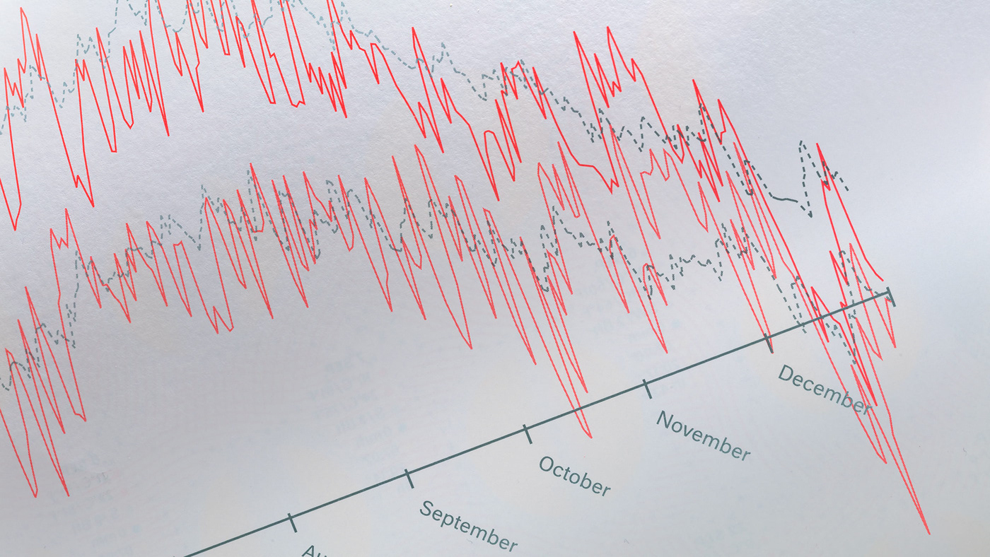
The fourth chart in our series examined global weather data from ±30,000 weather stations (based on the analysis of 736,995,534 global measurements of the National Climatic Data Center of the USA) over the last 50 years.


— 3rd EDITION
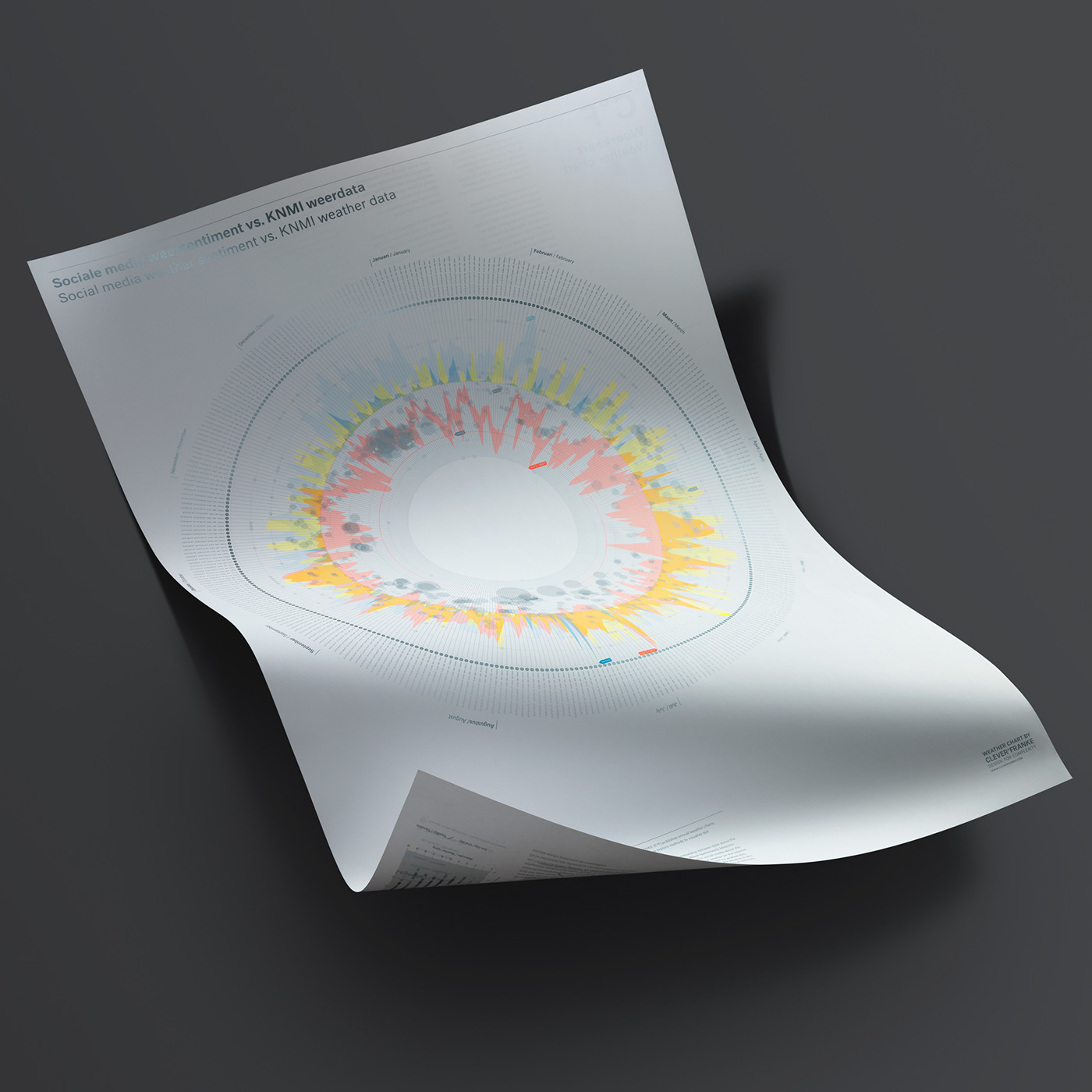
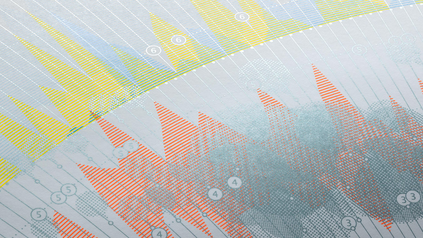
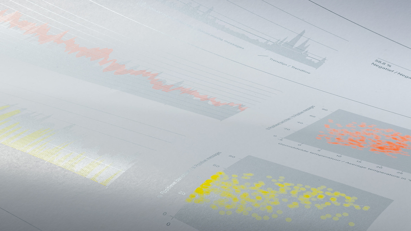
SOCIAL MEDIA SENTIMENT OF THE WEATHER
Compiled using weather data from 2012, the third edition focused on the relationship between weather data provided by the KNMI (Royal Dutch Meteorological Institute) and the reactions to the weather in social media. The idea behind this edition, was to investigate how the public rated the weather on the Internet and if it there was any correspondence with the meteorological facts.
To analyze this, we used 714,843 messages collected from a variety of websites, social media platforms and Internet forums, provided by Finchline, a company specialized in monitoring social media.


— 2nd EDITION
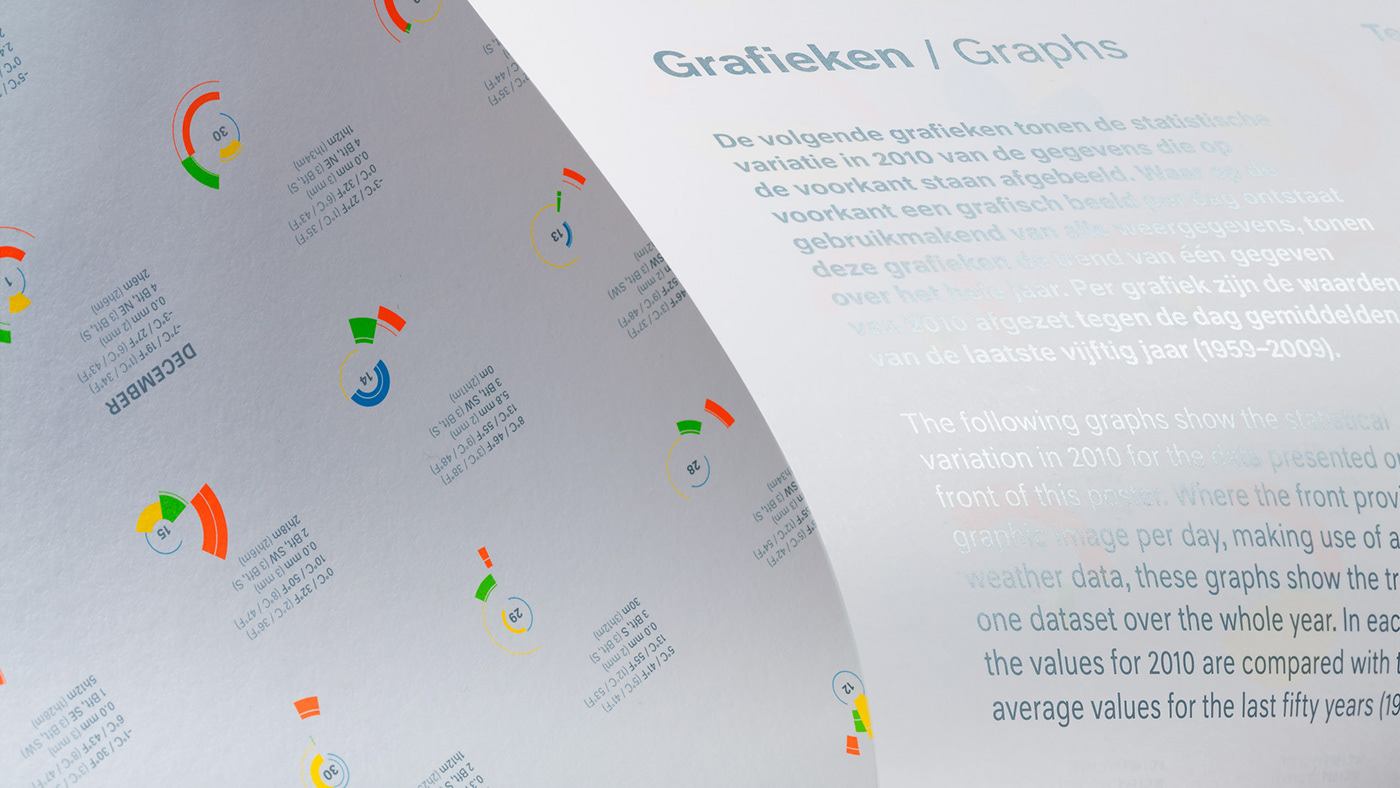
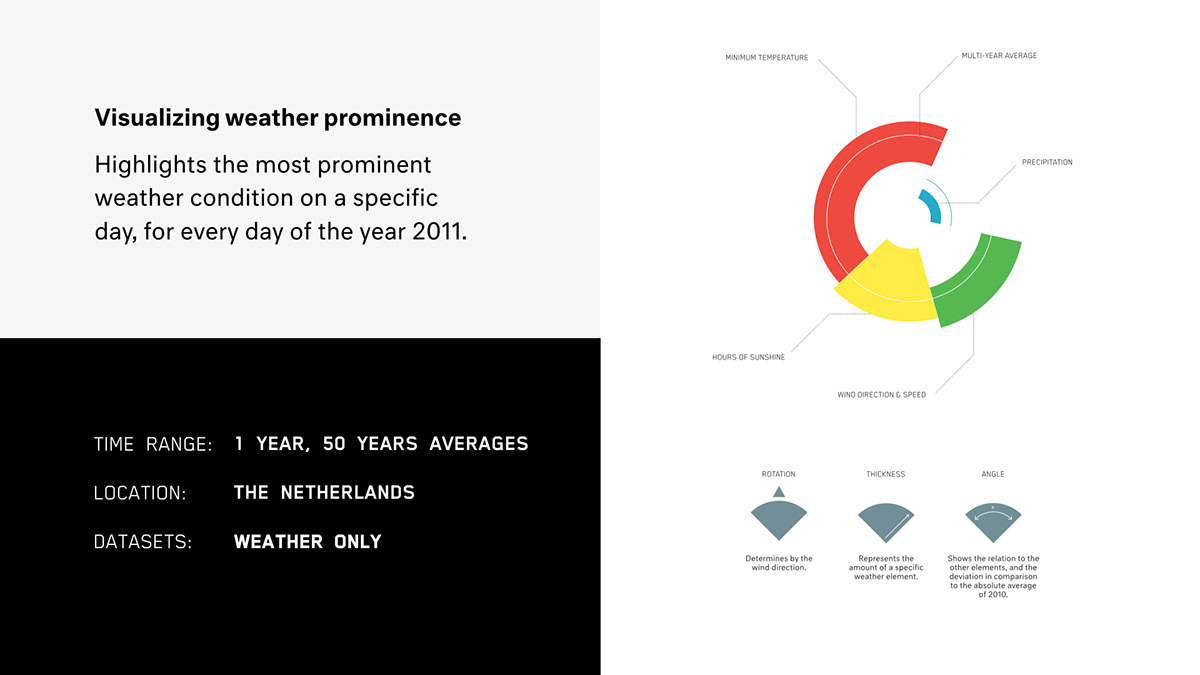
THE MOST PROMIMENT ELEMENT OF THE WEATHER IN 2011WEATHER IN 2011
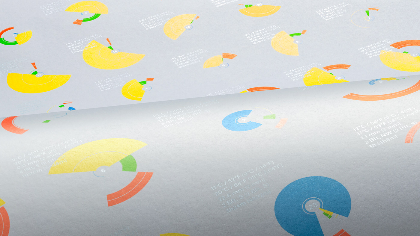
The second edition of the Weather Chart focused on the weather in 2011. We highlighted the most prominent weather condition on a specific day, for every day of the year in a single glance. We did this by showing the angle of the ‘pie slice’ in relation to the other weather elements and the deviation in comparison to the absolute average of 2010. As such, every day in 2010 could be easily classified as sunny, rainy or windy.


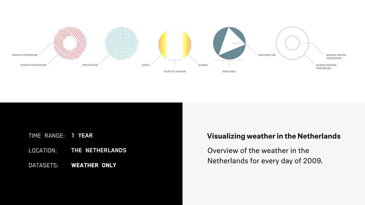
— 1st EDITION
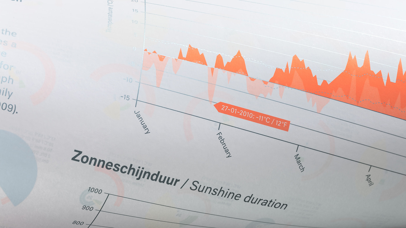
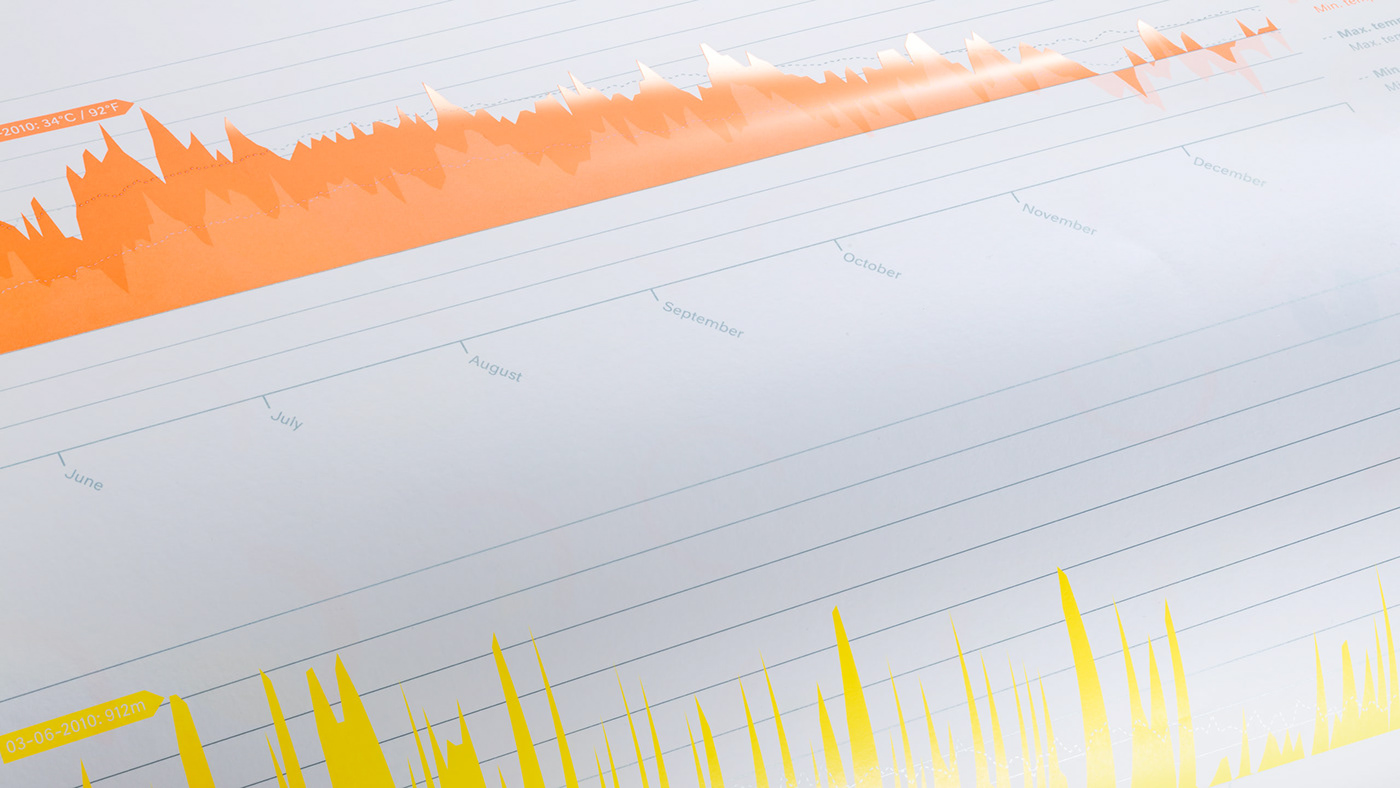
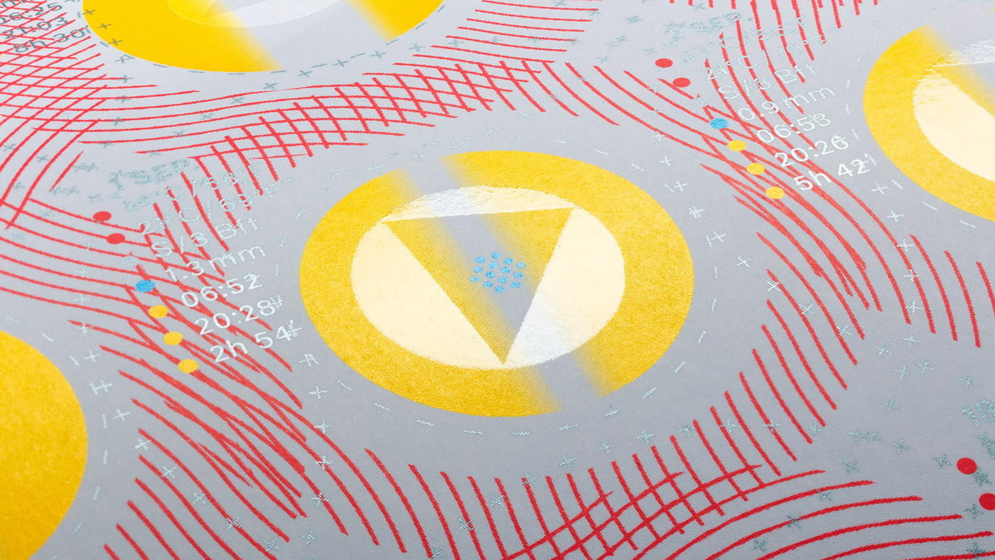
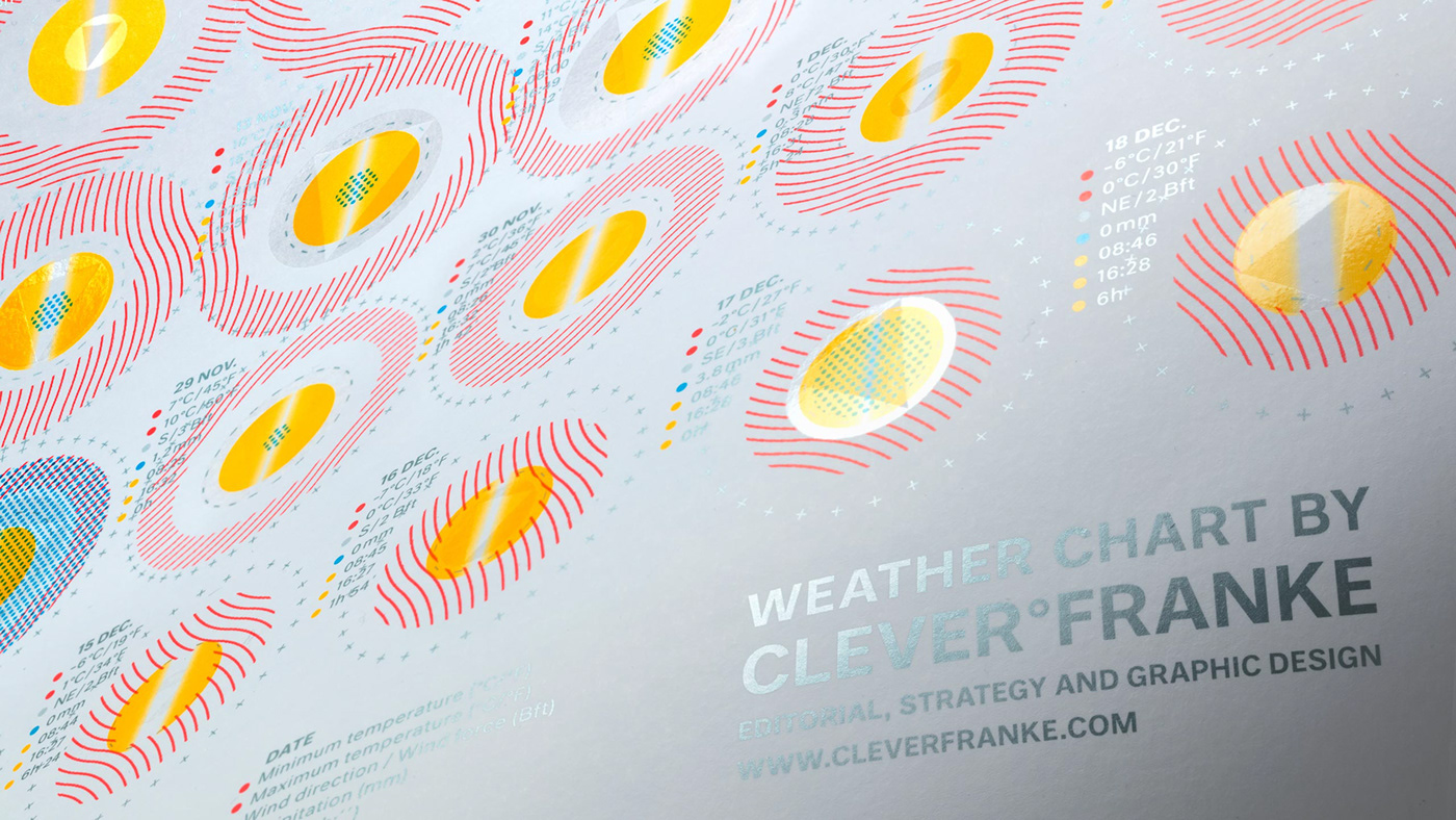
The very first edition of the Weather Chart features an overview of the weather for our location in the Netherlands for each day of the year 2009. Per day, the Weather Chart captures data relating to the minimum and maximum temperatures, wind speed and direction, precipitation, the amount of sunshine, sunrise and sunset and the averages of all the data for the period over 2000 until 2010.


— Documentary
— MORE INFO
For additional information check the full case on our website: cleverfranke.com
Photography by Gerrit Scheurs
Documentary by Niels Mud
The C°F Weather Charts are part of the collection of the Stedelijk Museum Amsterdam
Follow us: Instagram | Twitter | Linkedin | Newsletter


