
Introduction
Braniff Airlines was known for its bold colours and rich styling during the 1960s and 70s, announcing “the end of the Plain Plane,” and becoming famous for its many-coloured “Jellybean” fleet. It went bankrupt in the early 1980s following deregulation. Braniff Airlines wants to make a very strong comeback.
Scope & Focus
Although an app is in the long term roadmap, it’s not a focus at the moment. Braniff Airlines wants to start with a responsive site that doesn’t force users to download and install something.
The high level goals and objectives are:
• Design a responsive website with search, book, and online check-in functionalities for desktop and mobile devices.
• Redesign the brand with a more modern feel, keeping the essence of it still alive
Project Details
Client
Braniff Airlines
Role
UX/UI Designer
Tools
• Pen & Paper (Sketching)
• Sketch (Wireframes, High-Fidelity Mockups)
• Google Hangouts (Interviews)
• Adobe Illustrator (Logo Design)
• InVision (Prototype)
• Google Hangouts + InVision (Usability Testing)
Process

Research
Goals
To understand the needs and motivations of people looking to purchase airline tickets,
I created a research plan to guide me through my investigation of the aviation industry with the following objectives:
• Understand the travel booking standards
• Determine the best way to gain people’s trust for the brand to re-emerge and leave a mark on the market
• Best practices followed while re-branding a previously bankrupt company
• Identify where, how, and when people buy flight tickets online from the airline’s website versus a flight booking search engine
• Determine the most used device while booking flight tickets online
• Understand the pain-points and bottlenecks of the users during the purchasing process
Methodologies
I used three different approaches to research for Braniff Airlines. To understand the market and the aviation industry in depth, I conducted secondary analysis and competitive analysis. I conducted user interviews to understand the pain-points and bottlenecks that the users face while purchasing airline tickets online.
• Secondary analysis
Survey the market for standard practices followed by the aviation industry to attract the customers to use their airlines for purchasing tickets online. Read up on case studies of companies that made a successful comeback (adhering to aviation industry is not necessary), and identify the key takeaways. Detailed report on secondary analysis can be found here.
• Competitive Analysis
Study the patterns/standards followed, various services provided by airlines that are currently rated as the top service providers in the aviation industry. Through this study, determine the areas where Braniff Airlines can make improvements/introduce new functionalities to be the best. Detailed report on competitive analysis can be found here.
• User Interviews
Study the pattern of the users while booking flight tickets online. What are the most common steps followed by users while purchasing their tickets? Understand their pain-points and the bottlenecks that they face during this process? Gain empathy by listening to ticket booking stories, and users' decision making process. User interview findings can be found here.
Persona
From the research findings, participants inputs from the interviews, I analysed the research data to identify similarities/patterns in user behaviour and preference. I created a persona, Meredith Rose, to reflect and resonate the users' goals, needs and frustrations. Meredith is a software professional who loves travelling and exploring new places. She typically plans her vacations at least 3 months in advance to get the best air ticket deals. In her words, “I browse a lot before I book my flights. Everyone loves the idea of saving money. Getting a good deal is the best!”

Empathy Map
To further explore relationships and develop the persona that emerged from the data I’d gathered and mapped, I created an empathy map made up of observations and statements from my user interviews. Empathy maps are tools that and can be implemented at various points in the research and design process.

Define
Defining business goals
Moving from research and into the next stage of defining the product, I mapped the overlaps of business goals, and user goals. Identifying core project goals while considering technical aspects helps to define the sweet spot between finding viable solutions and prioritising those which benefit the needs and desires of both the business and the users. I established the project goals using overall research findings i.e. goals and pain points of both business and users.

Product Feature Roadmap
I developed a product feature roadmap using the inputs from the research phase. Each feature was backed using a corresponding research methodology. I sorted the desired features by priority, as well as ease of implementation.
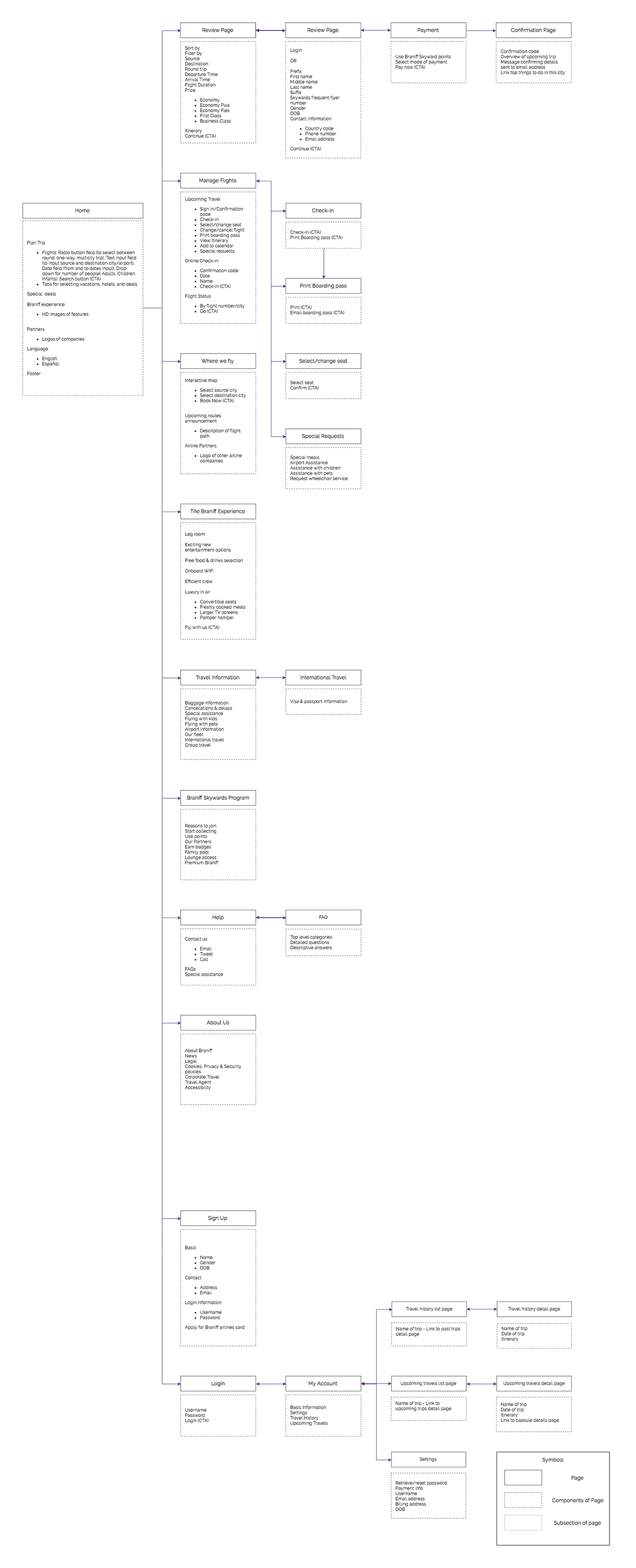
Information Architecture
Creating an information architecture map is crucial in gaining depth of clarity in how pages and services would be eventually laid out in the final version of the application. After a couple of iterations, I created the IA with an understanding of the features to be included in the prototype.
Design
Equipped with the content foundation of the site map, I moved into designing. Based on all the findings from my research, I was able to determine the structure of Braniff Airline's responsive website. I divided the design phase into Sketching, Wire-framing, Branding (Style Tile), and High-fidelity Mockups.
Sketching
Before moving into digitally sketching wireframes, I began with some hand-sketched concepts for the Braniff's home page. This gave me an opportunity to think through which direction might best meet the needs and wants of the users, as well as meeting Braniff's priorities and business goals.
Wireframes
I emphasised on the interface being simple, elegant, yet informative and well-equipped with the necessary tools to incorporate the key features for Braniff.

Desktop Wireframes

Mobile Wireframes
Branding
Braniff International Airways was an innovative, forward-thinking, iconic American airline that started many trends in the airline industry, several of which are still being utilised today. Nicknamed the "jellybean" fleet, the fleets were coloured turquoise, lemon yellow and lavender. I created a style tile and redesigned the brand with a more modern feel, keeping the essence of it still alive.


High-Fidelity Desktop Mock-up
Prototype for Mobile responsive design
Test
Test Objectives
• Identify inconsistencies in design, and determine the problem areas in usability within the user interface
• Determine if the users can easily and efficiently find information and accomplish tasks by testing the flow of the site’s architecture
• Observe representative users under controlled test environment, and analyse the collected data to determine the efficiency and effectiveness of the interface
Test Methodolgy
• In-person testing
• Remote Testing
Test Findings
Desktop
•First thing the users tend to do is scroll through the entire homepage before they begin to search for the flight tickets
• The users appreciated the Braniff Skywards Program section as it clearly states the unique advantages of joining the program
• The users found it very easy and simple to navigate through the website
• On the flight list page, a couple of users found it difficult to find the sort button. When guided to the sort button, they also mentioned that since the button was not clickable, they might have missed it.
• Some users expected more filter options like departure & arrival time
• The flight options seemed non-expandable in case of the flight being a 1 stop or 2 stop flight. The users would like to see the details of the stop-over in case the flight is not a non-stop flight.
• The users found the UI to be elegant and the colours refreshing.
• All the users completed the task of successfully booking a roundtrip flight from New York to Austin
Mobile
• All of the users found the mobile version to be very easily usable, in terms of readability, ease-of-access of buttons, instinctive nature of the website.
• Users mentioned they did not have to put in a lot of effort to complete the given task, as the flow of the website was seamless
• On the flight list page, one of the users felt the need of any indicator (like change of colour of the selected flight option, or a radio button or check-box) to specify which flight had been selected.
• The users highly appreciated the consistency of the design while comparing the desktop and the mobile versions of the website.


