

Final Logo
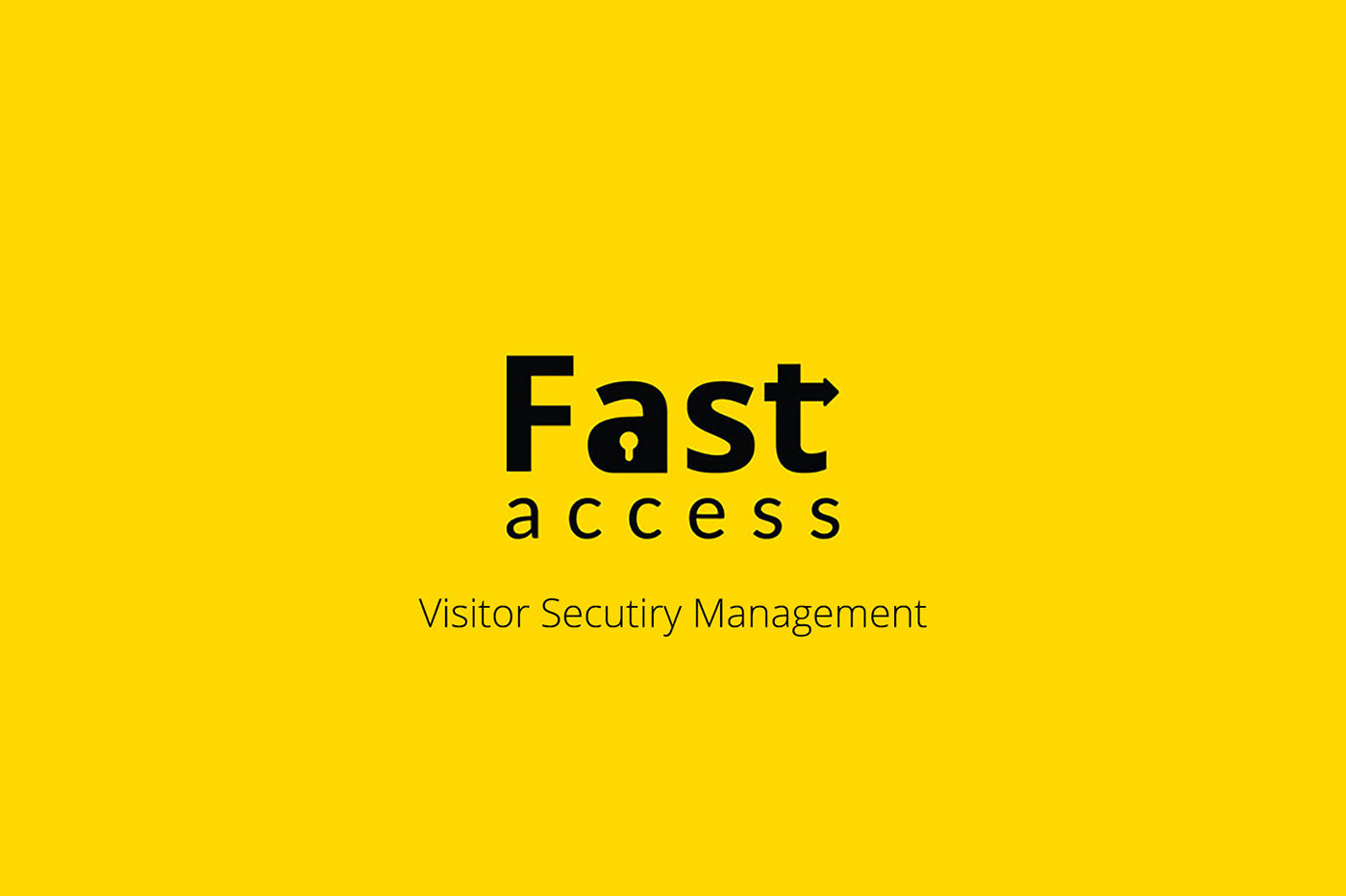
Fast access: Is a visitor security management firm, it helps companies organize its visitors through its application.
Objective: Design a logo which depicts the firms work, quality, oneness & it should be remembered in one wink time.
Design thought: Understanding above aspects and taking the inputs from the client i got to know that the logo should be speaking to its customers in a Bold, Unique and Secure way and I've come up with multiple solutions and 3 of them were up-to to the thought.
Color: choosing yellow shade color made it more bolder needed & giving oneness to the brand identity whichever may is final outcome.
Final outcome: The below Logo is the final and selected variant & i think I've achieved my goal using the bold typeface and adding elements like Lock and direction depicting arrow does the work themselves showing "FAST & SECURE ACCESS,"

Image: Variants of Logos

Image: Typeface specifications

Image: Visual representation of logo on a cap

Image: Visual representation of logo on staff ID Cards


