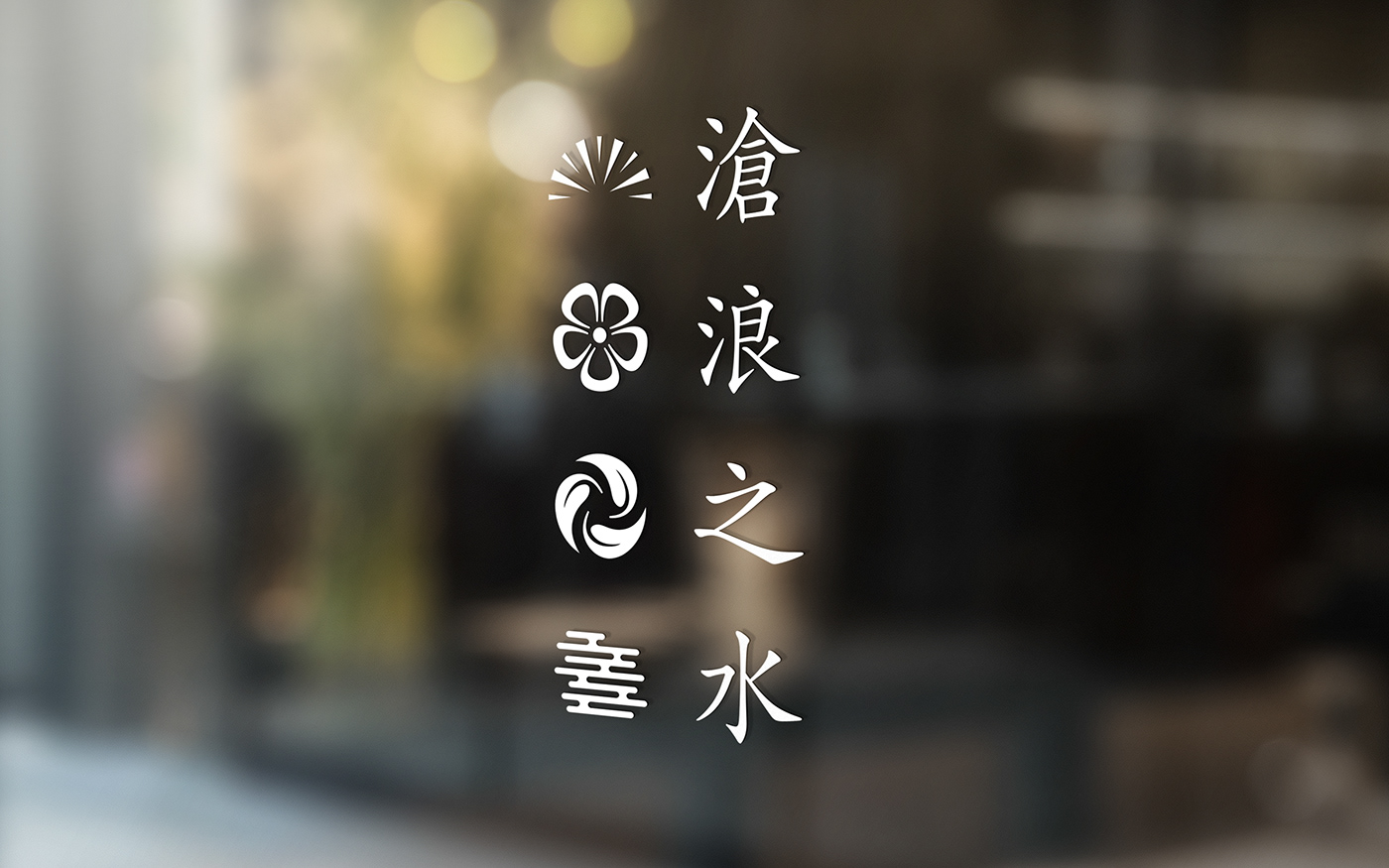
滄浪之水
BACKGROUND & OBJECTIVE
Following the visual identity we developed for Courtyard Corporation, we were asked us to create the identity for a new brand in their F&B holdings – a modern take on a chain of traditional teahouse launching in Foshan in 2019.


DISCOVERY
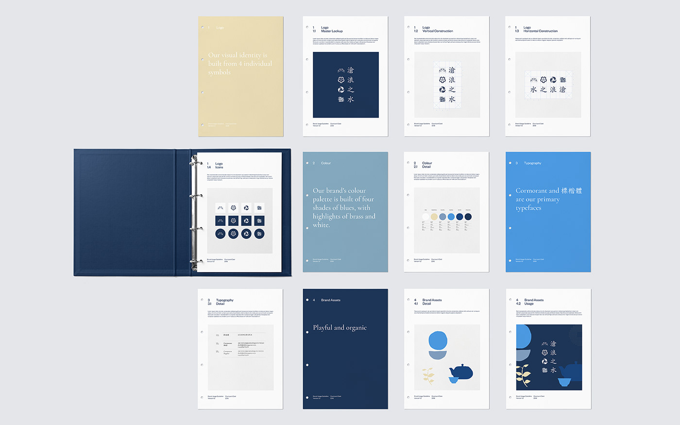
The client was looking to explore a Japanese aesthetic for the identity, that would also run through the interior of the teahouse. Following a research trip with the client to Kyoto, we were heavily inspired by different aspects of Japan's visual heritage. We were excited to bring through the deep blues, pristine whites and vibrant gold colours, the vertical script typography and the elegant use of matter-of-fact iconography.
IDEATION & DESIGN
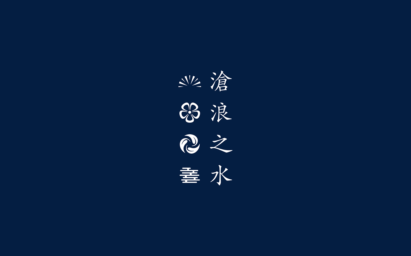
We created a set of four icons that holistically represent the process of making Pu erh tea. Sun-drying the tea leaves, reinvigorating the dried leaf with boiled water and allowing to brew.