Semol
Color of milk shelves
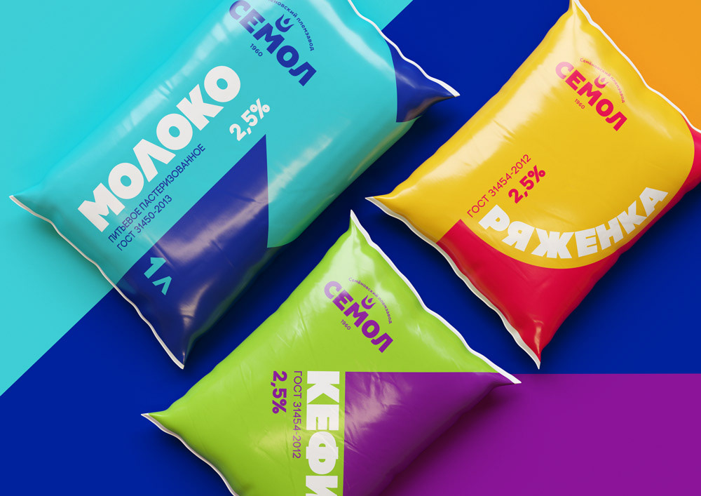
Milk in the carton is a product of the economy segment. On the typical milk package, there are meadows, cows and milk waves, the only difference is the drawing technique. To highlight the product, we bet on simplicity, brevity, and color. At the same time, the «simplicity» does not drift into a primitive design, whereas the buyer does not need to be reminded of his social status once again.
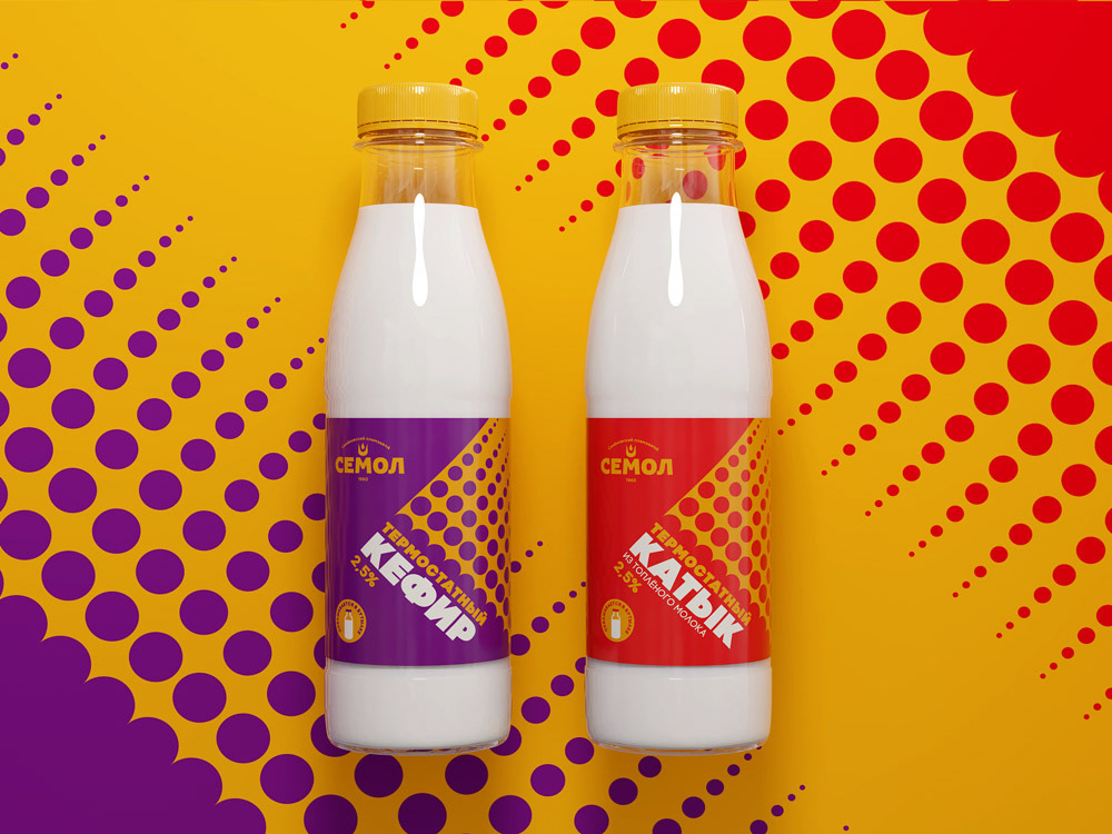
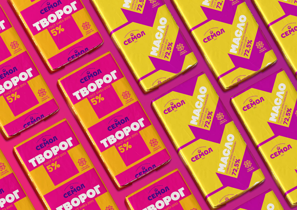
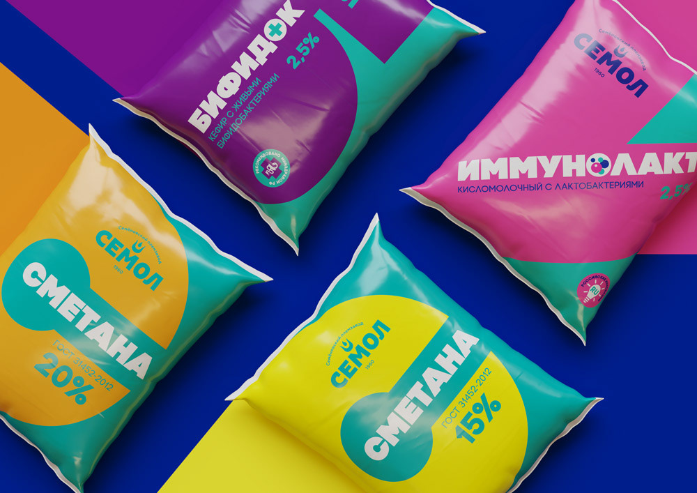
The principle of graphical concept is based on the first letters of the product name: M —milk, C — sour cream. Each product has its own primary color: the blue is for milk; the purple is for kefir. The second color stands for the fatness index, the higher the fat index the warmer the color. Combinations of colors are deliberately contrasting, provocative and harsh.
The graphic is more complex for products with peculiar properties — it conveys their key differences.
The ordering customer is satisfied with the result — new packages are hard not to notice on the shelves while remaining cost-effective in production.