Agro Expert Group — helping you get the harvest
Rebranding an agro industrial holding company
Context
Agro industrial holding company Agro Expert Group is a successful Russian company that has been targeting the market of plant protection chemicals for more than 15 years. The company addressed our agency with a task to help increase their market share and take a leadership position by turnover and overall perception of the brand.
Task
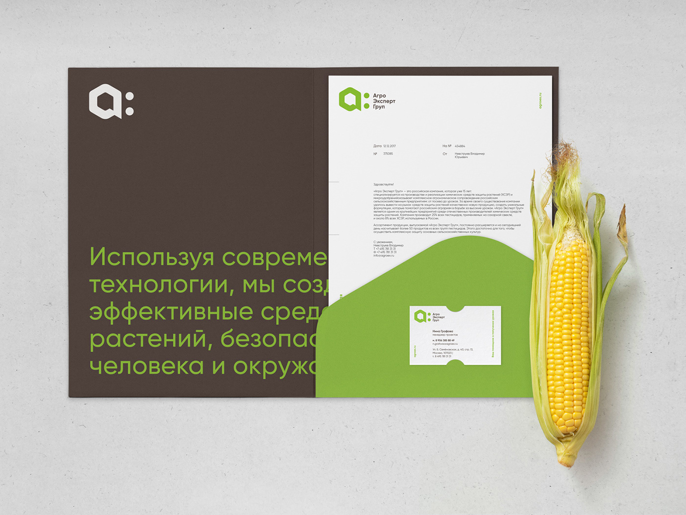
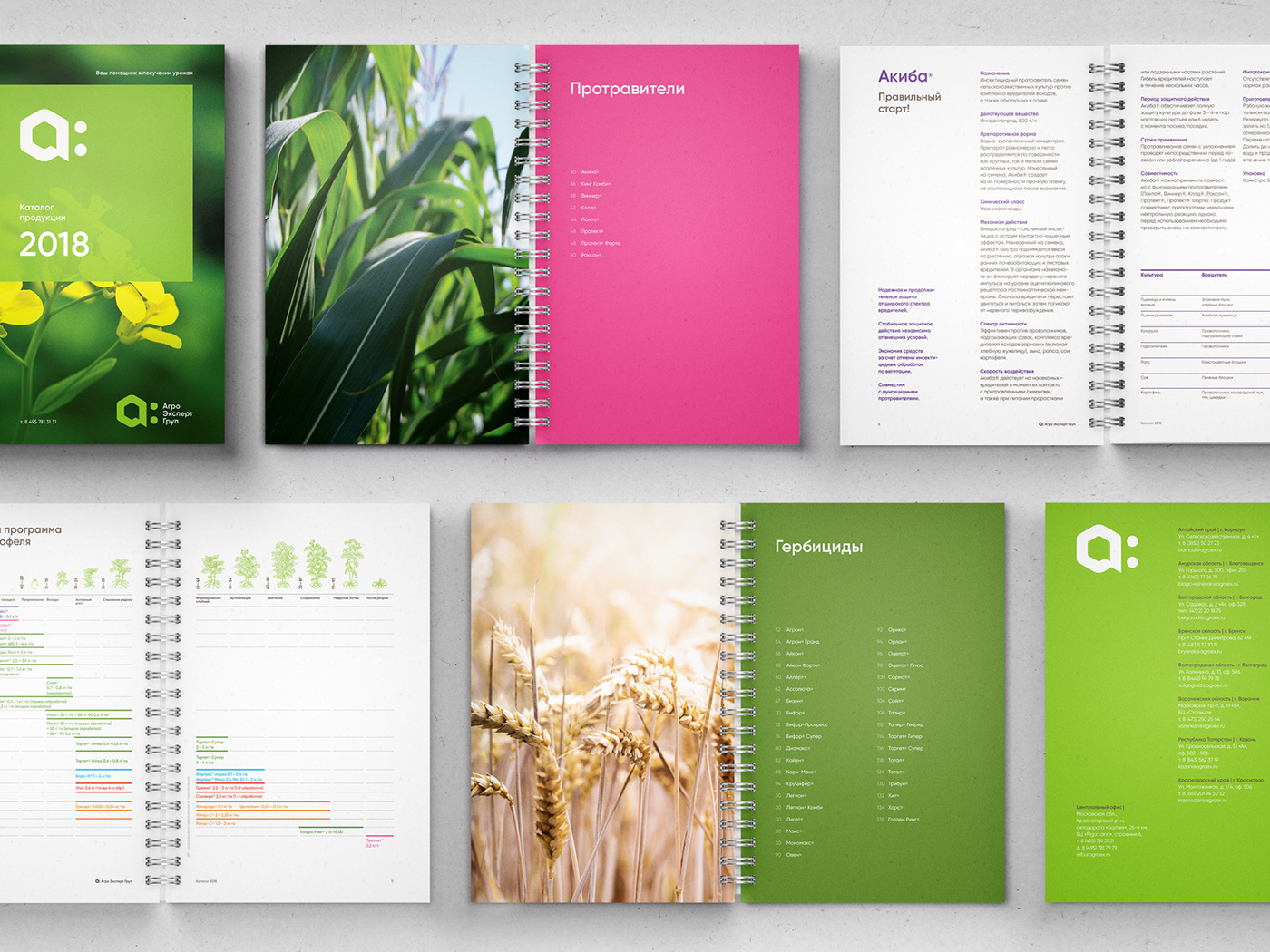
After a round of negotiations with the owners of the holding company and members of the department of marketing, we put together a rebranding project for Agro Expert Group. The project plan included client research, market positioning and brand platform development, and creating new visual identity and communication materials. Materials included corporate identity holders, exhibition booths, branded service cars, catalogues, leaflets and other handouts, staff uniform and much more.

Solution. Strategy
We conducted a desk study and 20 interviews with various client types and found out what their attitude was towards both Agro Expert Group and their competitors, how they chose their partners and which key factors influenced decision-making in the field. We concluded that in the hi-tech industry of plant protection chemicals the most widespread positioning is built around the image of a large, knowledge-intensive and serious company that broadcasts reliability and expertise.
The clients shared with us that the company was not so much client-centered as self-centered. From this point on, both our agency and staff members of Agro Expert Group began to share an understanding that a new positioning should be client-focused. It meant that the emphasis was put on the humanistic approach towards clients’ relations with the holding. Agro Expert Group – created by agronomists for agronomists.
Solution. Design
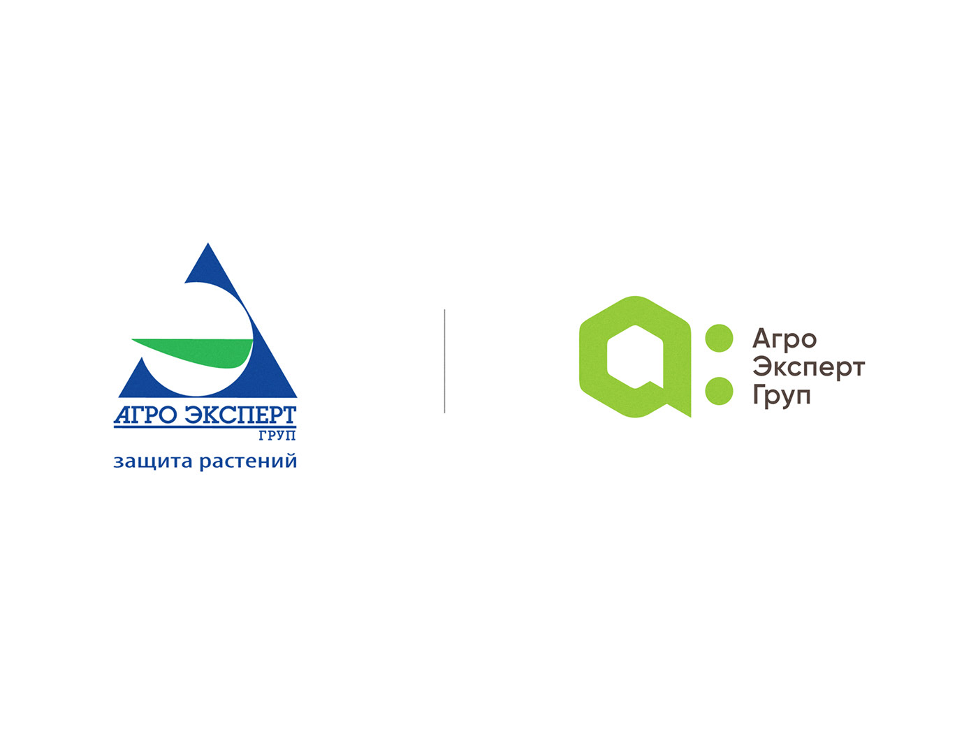
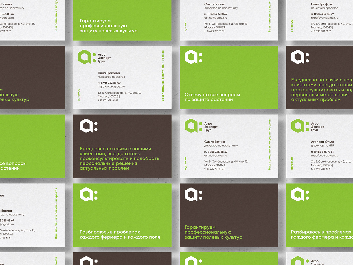
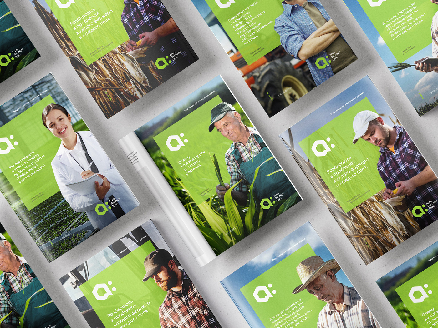
We based the new identity on the direct speech metaphor. It seemed a clear image to illustrate communication between the company’s team members and clients: “We are always eager to give professional advice, share knowledge and invest resources. You won’t have to search for us or wait — we are right here”.
All the basic visual elements are built around this metaphor. The new brand symbol is three things in one: first letter of the brand name, shape of a benzene ring, and two communication bubbles in a dialogue (shape and white space) that symbolize company staff member and client.
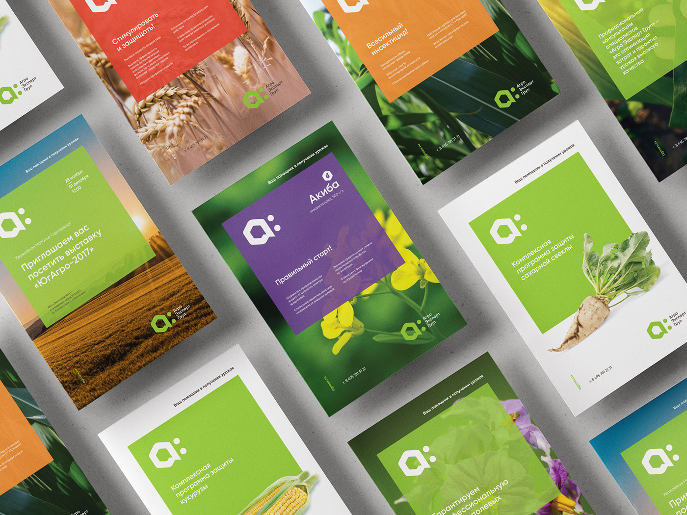
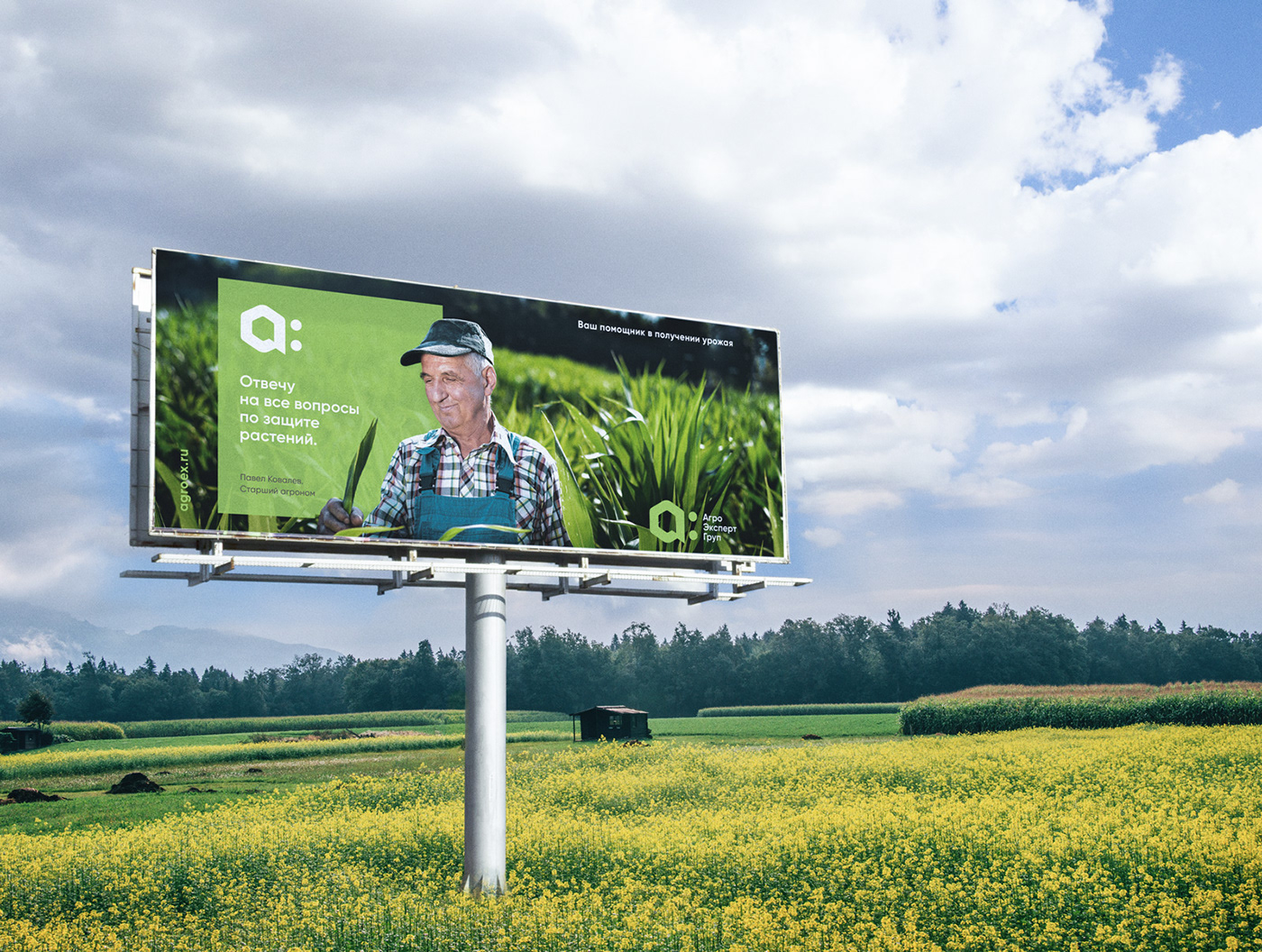
All the verbal brand messages are presented as direct speech because they are taken out of actual conversations of staff members. Phrases are placed on graphic plates integrated in the landscape photos with company's actual clients – farmers and agronomists at work.
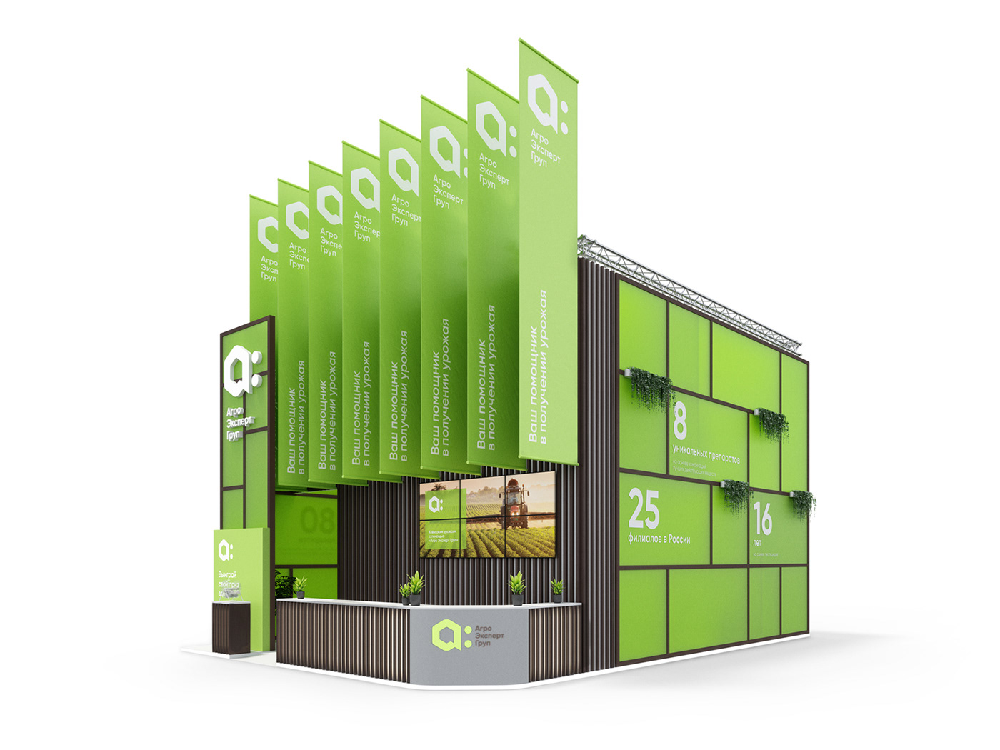

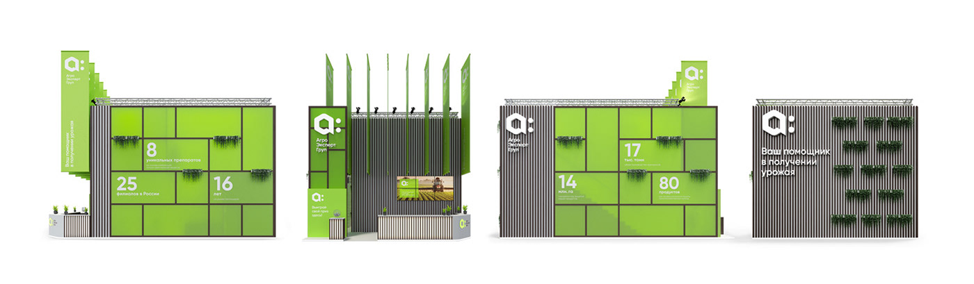

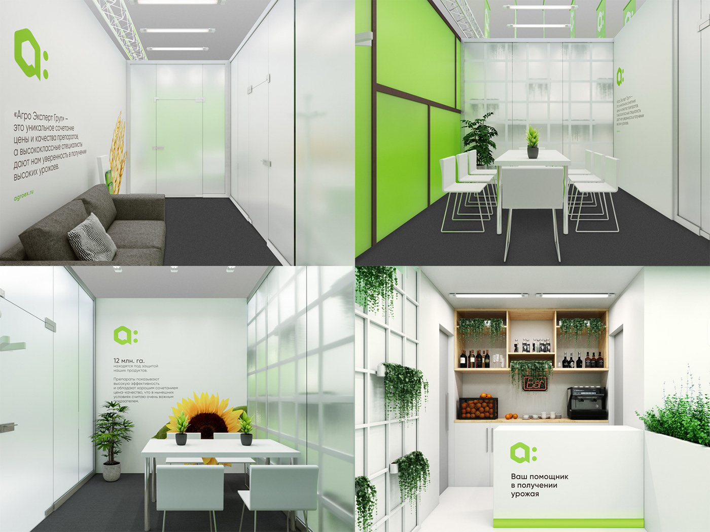
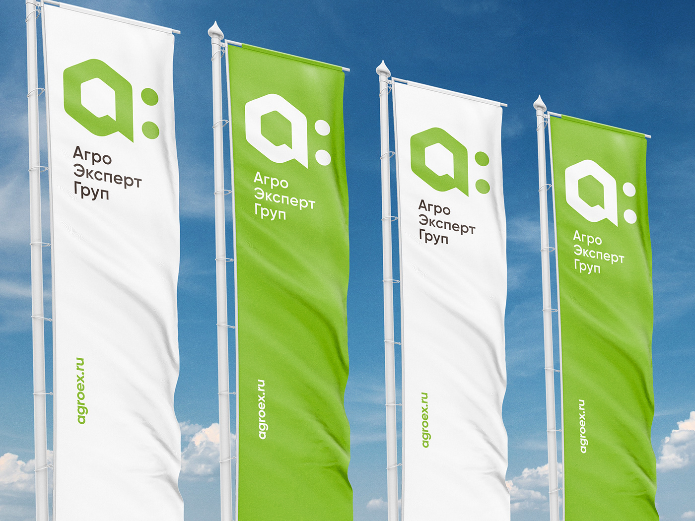
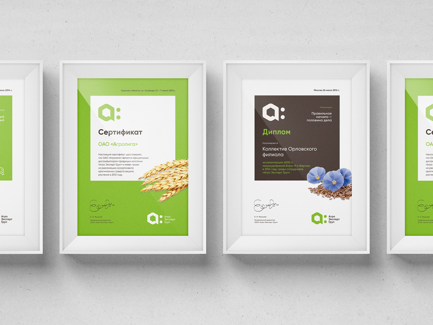
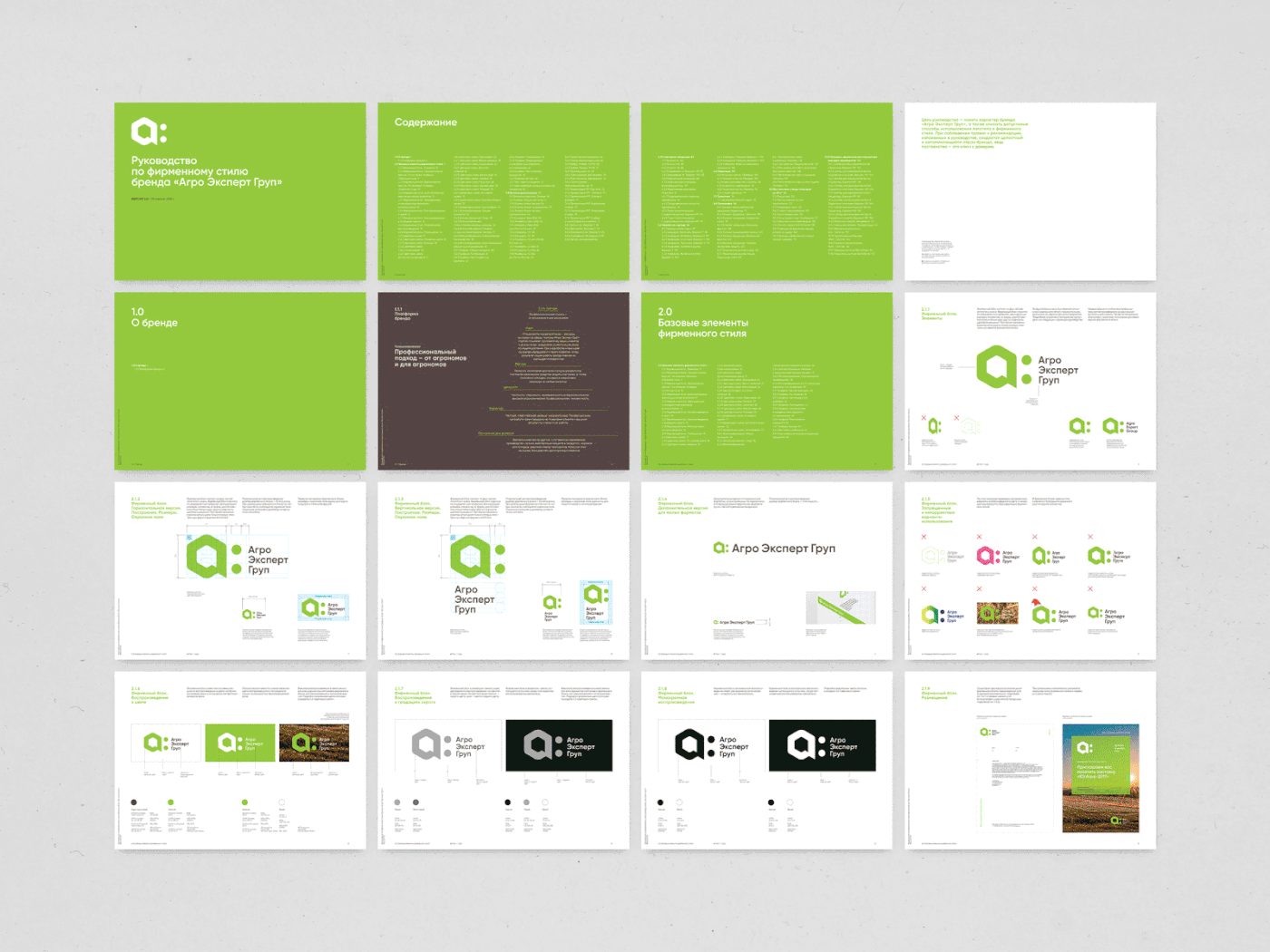
The simple and consistent graphic system is meticulously described in the visual guidelines. These guidelines document compulsory touch points and channels of communication for the company: from customized business cards to uniquely constructed exhibition booths.

Plenum team
Project Director Pavel Nesterenko
Project Manager Varvara Kanevskaya
Creative Director Egor Myznik
Art Director Alyona Sedyakina
Designer Kristina Skoryeva
Designer Darya Ivanova
Designer Maria Sinyutina
Designer Irina Purtova
Copywriter Oleg Ahn
3D Visualizer Konatantin Fedorov
Chief Strategy Officer Andrey Silin
Brand Analyser Lara Gryazeva
Agro Expert Group team
Marketing Director Olga Yestina
Project Manager Nina Grafova
Project by Plenum