


Lövin —
simply the highest
quality coffee.
Always
A new premium brand
of whole bean coffee for HoReCa
Context and the task
A big tea and coffee supplier on the Russian market has decided to launch a new premium brand of whole bean coffee for HoReCa in Russia.
We were to formulate positioning of the new brand, which would make it attractive for key B2B clients on the HoReCa segment. Based on the positioning, a brand’s name and a visual system were to be developed as well as a packaging concept and final materials for launching the brand.

Process and the results
We started with conducting a series of interviews with the company’s top management, analyzing competitors’ approach to similar brand structures and studying market trends.
While conducting strategic research, together with the client we identified a key problem of coffee buyers on the HoReCa market. The problem was in irregular quality and taste of the product, which customers consider very important.
As a result, positioning of the new whole bean coffee brand was born — “Simply the highest quality coffee. Always!” For this coffee, taste and quality remain constant and therefore the client is sure that their establishment has good image and their customers are happy.

The visual system is based on the brand’s name and legend. The name emphasizes premium quality of coffee beans and refined taste of the drink. Lövin is the name of a small Swedish merchant family, a member of the Hanseatic League. The Hanseatic League was a huge commercial confederation in XII—XVII centuries in Europe. It included more than 160 cities and had substantial political influence. Merchants of the Lövin family specialized in importing exotic goods from eastern countries and were always the ones bringing something new and special on the European market. One of such special things, traded in Yemen seaports, came to be coffee beans, which later became known as Mocha.
As a tribute to the merchant heritage, the image of a Hanseatic cog, the main trade vessel of the Hanseatic League, serves as a Lövin brand sign. Similar images can often be found on stamps of the Hanseatic cities and medieval coins.


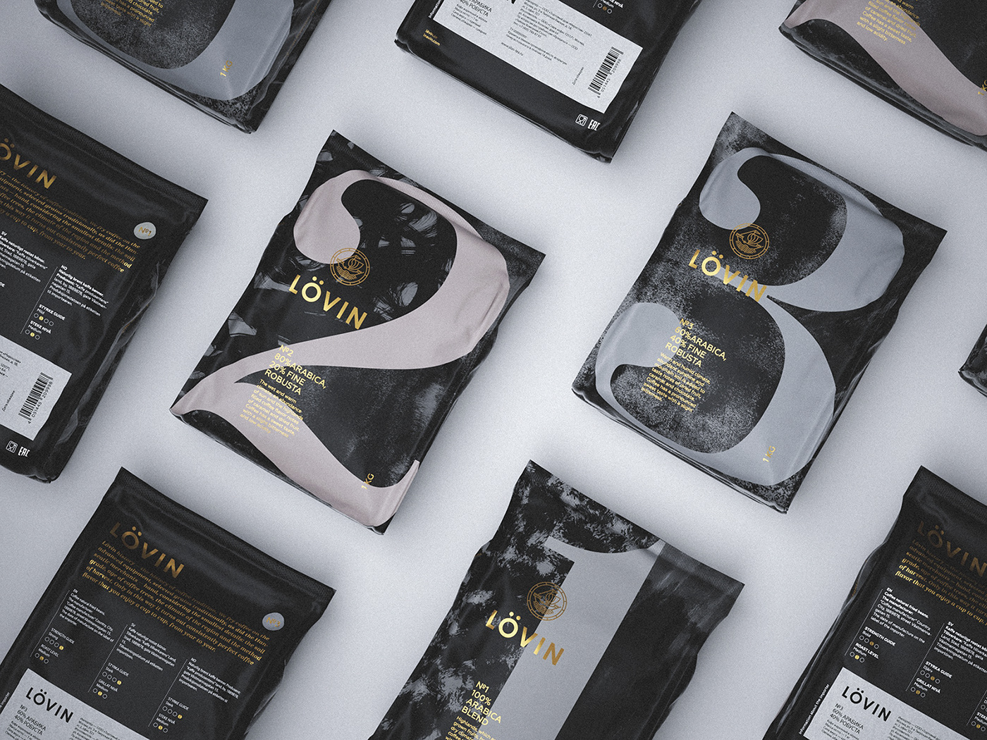
An effective design system was developed for the brand that makes the product stand out on the shelves and helps to navigate easily among items of the product line.
Every item of the product line is a thoroughly selected and balanced coffee bean mix. Technologically advanced and well-organised process of selecting, blending and roasting coffee beans helps to create coffee blends taste and aroma of which are invariably exquisite. Packaging design emphasizes this feature of consistently high quality coffee by numbering each coffee blend package.


The packaging also reflects the key brand expertise, which is attention to details. Combinations of various details bring to life different coffee flavours and these details are numerous. They include coffee variety, soil and altitude at which coffee bushes grow, amount of sun and level of humidity, a way of processing coffee and many other factors. These factors are pictured as textures on the coffee packaging and they symbolically surround the number of a particular coffee mix.

Project by Plenum
Brand Consultant Ilya Lazuchenkov
Creative Director Egor Myznik
Designer Darya Merzlikina
Brand Consultant Ilya Lazuchenkov
Creative Director Egor Myznik
Designer Darya Merzlikina
3D Visualizer Pavel Gubin
Copywriter Roman Urban
Chief Strategy Officer Andrey Silin
Project Director Ekaterina Lypkova
Project Director Ekaterina Lypkova


