


CLIENT - ICELANDAIR
The Airline Icelandair has roots back to 1937 and the previously Flugfélag Akureyrar, which makes it to Icelands oldest airline. Back in the days it was harder to create competition on the Icelandic market for airlines. But now a days there is a rise of competition primary from the low-cost airlines. In the interviews the major reason the travellers didn't choose to fly with Icelandair, though they all knew about the Icelandic airline, was primary in fact of the price. The few interviewed who did fly with Icelandair choose it because they found a cheaper price on the tickets due to longterm planning of the trip.


PROBLEM
The goal in this project is to create a subsidiary airline to Icelandair to be positioned where the competitors are dominating the growing low-cost market to take part of this market share. Furthermore, there is a general generic visual expression the airlines, therefor part of the goal consist of adding uniqueness to the brand from the Icelandic culture and geographic treasures, to positioning the subsidiary brand as The Choice of ultimate travel-experience when travel to Iceland.

RESEARCH & CORE INSIGHT
I decided to follow Designer Bob Gills philosophy and went for my research part in Reykjavik, Iceland, to make an exploration of the consumer-purhase process combined with a place research and qualitative interviews of the travellers, locals and even a loyal Icelandair captain through 30 years. All in the astonishing and inspiring surroundings of the capital of Iceland, for not only a pure visual but fully sensory inspiration for the designprocess of the brand identity.
STRATEGY
The purchase proces is based on dreams and the self-realizational need (self-narrative), created from inspiring histories and pictures which build a motivation for travel. But in the end it is most often the price which is the determining factor for actually realising the dream and take off.
That the advises and inspiration leads the consumer to purchase conclusions, makes the digital medium of an extremely important matter for this case. It is through web surf, stories on blogs and inspiring pictorial that the target group kan dream, search for inspiration, advices and turn the dream into reality through these links. With the digital medias we have acces to today, the whole experience can become easier through smartphones with an App, so that the consumer gets more freedom to select, choose and at the same time the costs of service gets smaller with this self-service-concept.
The motivation for the for the purchase through stories, should be found when the consumers have time to dream, for eksample in the train or at home. Advertising in magazine is therefor relevant due to the fact that the consumer have time for depth, immersion and dreaming. Besides, the smartphone is normally within reach, so through QR-codes and the App, the purchase process is made easier accessable, together with the further maintained motivation in the digital magazine, personal stories from travellers and local advises to increase the appetit for fulfil the dream of take off for such a small price here and now.


INSPIRATION
Inspiration from Icelands capital Reykjavik, contains a uniq yet specific colour scheme, squared patterns, local and traditional symbols, raw nature and the different typographical character with strokes upon the letters.


HISTORICAL BASE - TYPOGRAPHY
The first originally inhabitant of Iceland was Norwegians, therefore a lot of traditions and culture has roots to the Norwegian one. And for same reason the logotype is based on the geometrical sans-serif typography from the original red Norweigian telephone booths, designed by the architect George Fredrik Fasting in 1932 which later was also developed into the typography Telefon.


THE MEANING OF SAAGA comes from the islandic "saga", which basically means a story, fairy-tail (mostly Swedish) or even adventure (Daish/Norwegian). But the time of tales in the 9th till 11th centuries also known as Saga Age is a very known Icelandic literature and the periode is the heyday of Iceland. In this project SAAGA is the name of the airline, focusing on the individual to write his or her own story while attacking specific values to their life (-story) from the travel to Iceland with SAAGA.


LOGO & 5TH ELEMENT
The logotype is characterised by the traditional Icelandic runes together with the unique character of the Icelandic letters, which also recur in the actual logo. This rune, which has formed the logotype, is a bindingrune stand for the following of dreams and passions, and have fundamental common attributes with the basic rune for travelling. Secondary, the logotype consists of one of the most basic forms, used in the traditional and world known symbol of Iceland, the Icelandic Lopapeysa; a knitted pattern used on warm sweaters to protect from the raw weather. The third and last symbol implemented in the forming of the logotype, is a little tick, for the achievements of milestones, goals and dreams. The bucket list term was a central part of the insight-research of the interviewed for this design case.
The logo type is geometrical structured in a way that it can form patterns, as the Icelandic Lopapeysa, or be used as an isolated 5. element of the visual identity.

ASSOCIATIONS
Besides the icelandic inspiration for the logo with its raw, beautiful nature and the scandinavian, nordic minimalism, it also contains associations to Reykjavic's coats of arms and to the mother company Icelandair, which illustrates the two soft svups, as a simplification and modernisation of their original logo. And it even has visual references to the airline's own name, with the first letter S and the geometrical feeling of the double AA..


Boardingpas


Airplane Prototype


SNACK PACKAGING
The in-flight snack box contains a small Icelandic snack from a local bakery in Reykjavik called Sandholt and crystal clear water from Icelandic Claciel in a visually appealing, transparent container which function as an one-use drinking glas. The cooperation with these two local businesses lowers the cost for the airline and at the same time gives a feeling and taste of the Icelandic culture. The brands will share values and the two cooperative brands will appear familiar when in Iceland.


Inflight Magazine
The magazine contains stories from other travellers, to inspire for new adventures. It is sponsored and contains small information boxes from the different locations with direct QR-codes to websites of the facilities and tours.
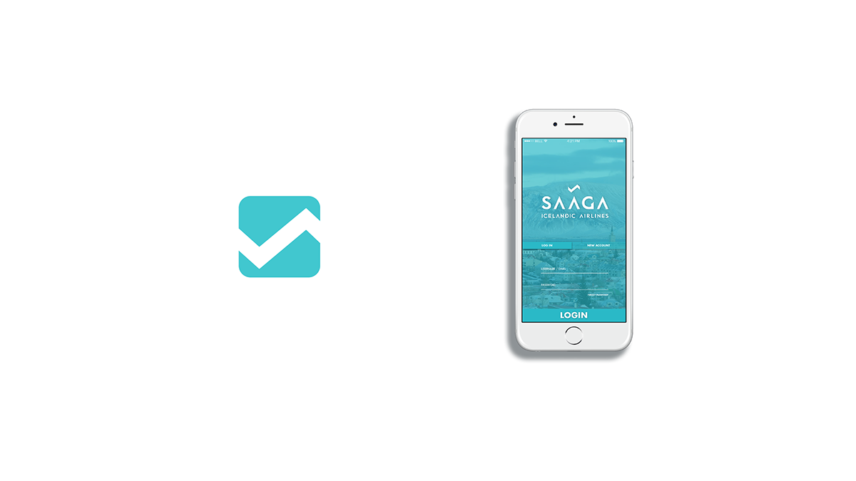

SAAGA APP
A self-service inplemented concept through the booking app.


SMART CHECK-IN


