


Branding • Website • Packaging
Alana Mitchell
Alana Mitchell is a skincare brand that has found great success in the e-commerce industry and now wanted to take their brand to the next level to one that looked more established, more mature (the previous brand was mainly bright pink and white) and that brought higher conversion rates.
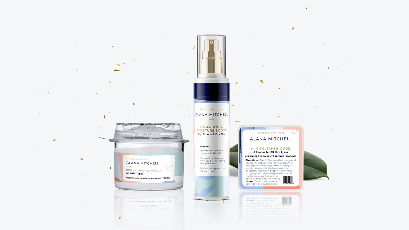
The new identity is comprised of pastel colors to appeal to the target audience, paired with navy blue and gold for the more mature and established look, giving it a high end look to reflect the product’s quality. The logo combines an elegant and timeless sans serif font with the brand’s icon being Alana’s signature with a heart, for that extra personal touch that she brings to her business and brand.
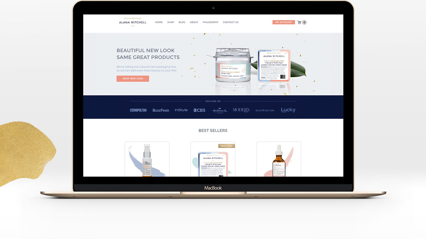
Besides the brand identity, we came up with a new, conversion optimised user experience for the home page, and applied the new brand to it. The results, you can read for yourself in our client’s testimonial.
Client: Alana Mitchell
Art Direction: Joana Galvão
Branding: Diana Santa
Packaging: Diana Santa
Web Design: Diana Santa
Web Design: Diana Santa

Working with Joana and the team was the single handed best experience we have had working with any branding or design agency in 13 years of business, no joke.
The final results exceeded our expectations, and they were never shy to go above and beyond our requests to make sure we were happy. We actually requested that they use us as a reference because we were so impressed with our results. We have seen a positive result in conversion and revenue increase. We are confident their designs will "Pay themselves off" with a positive ROI within the first three months of implementation.
Jared and Alana Mitchell


Thank you for watching our work.
Like if you enjoyed it!
Like if you enjoyed it!


