

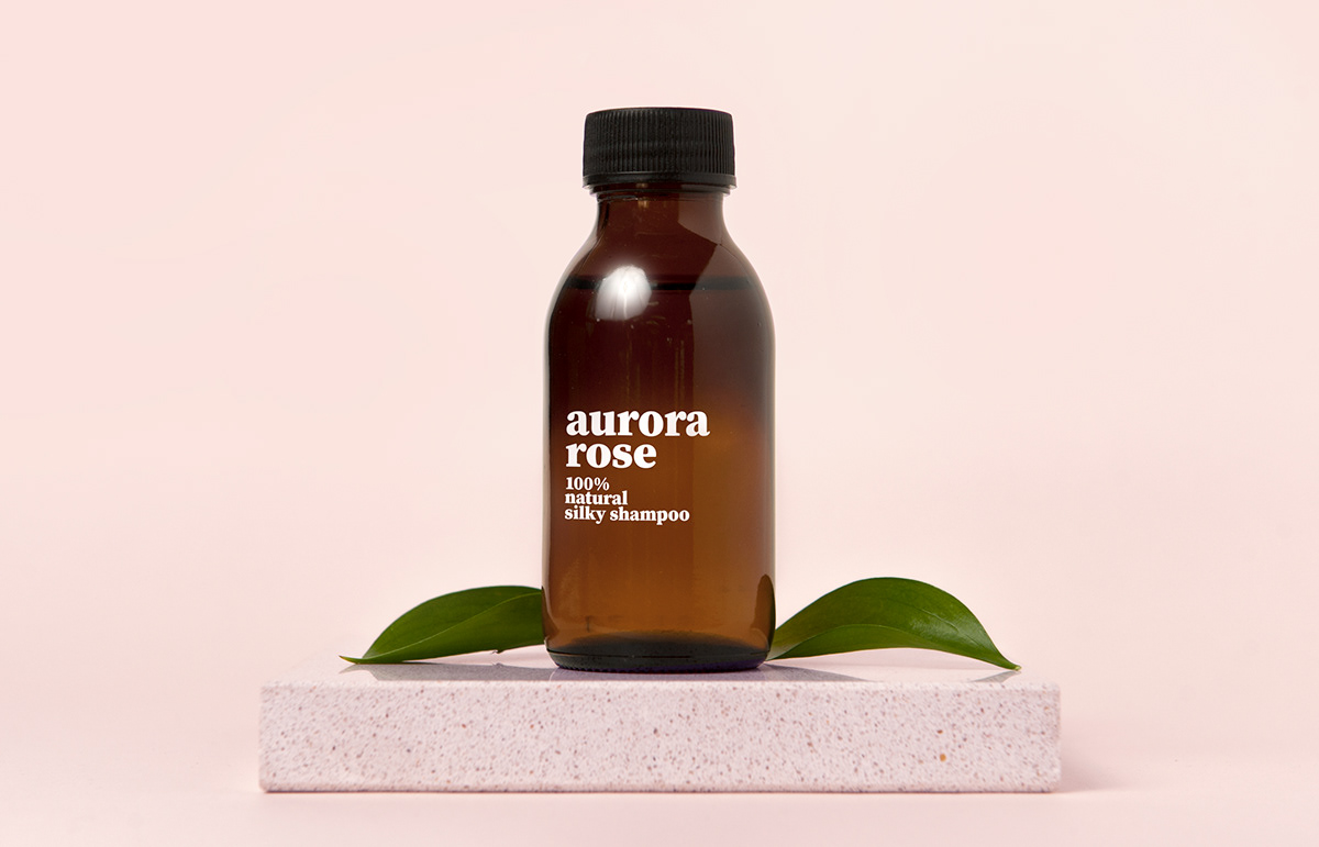
Aurora Rose
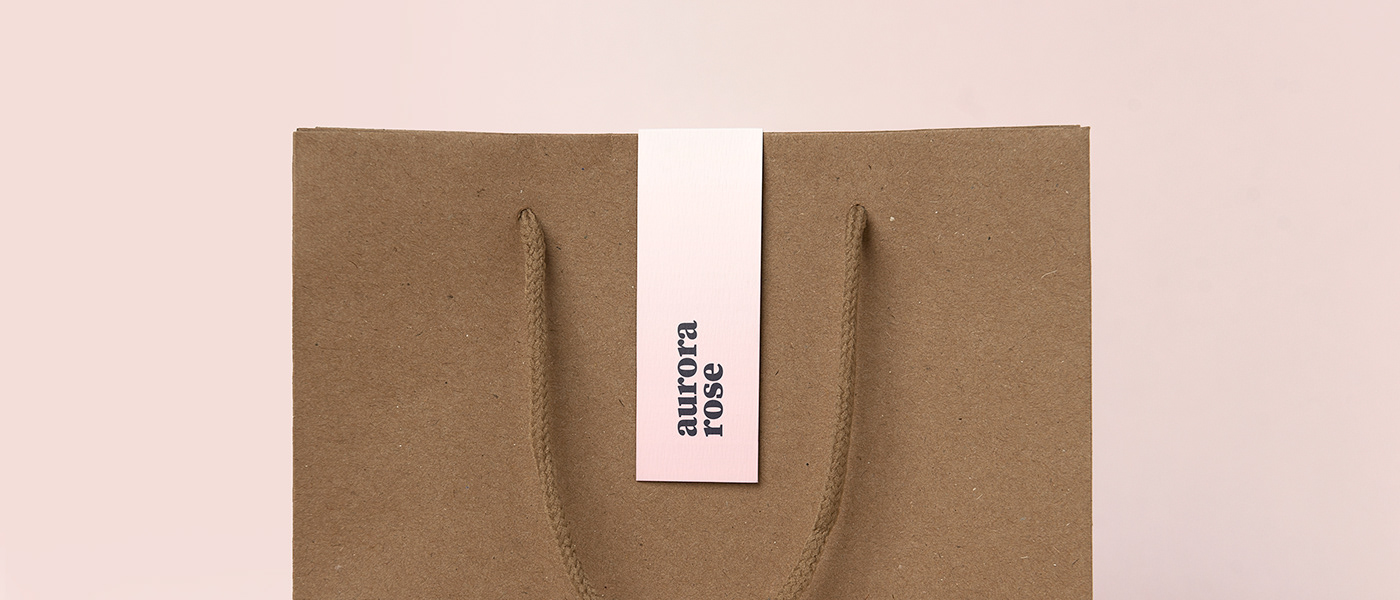
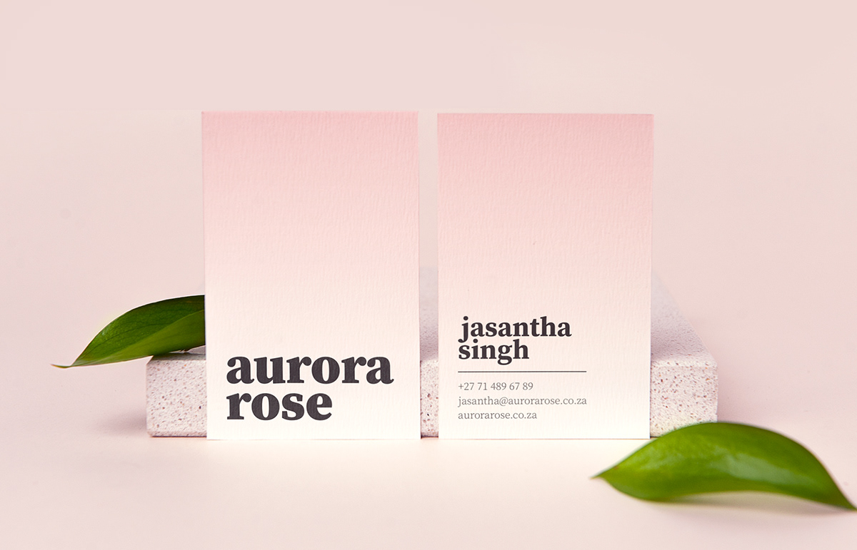
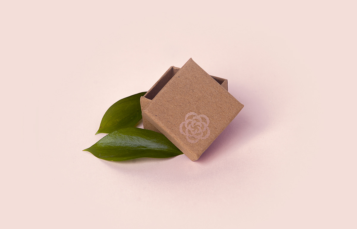
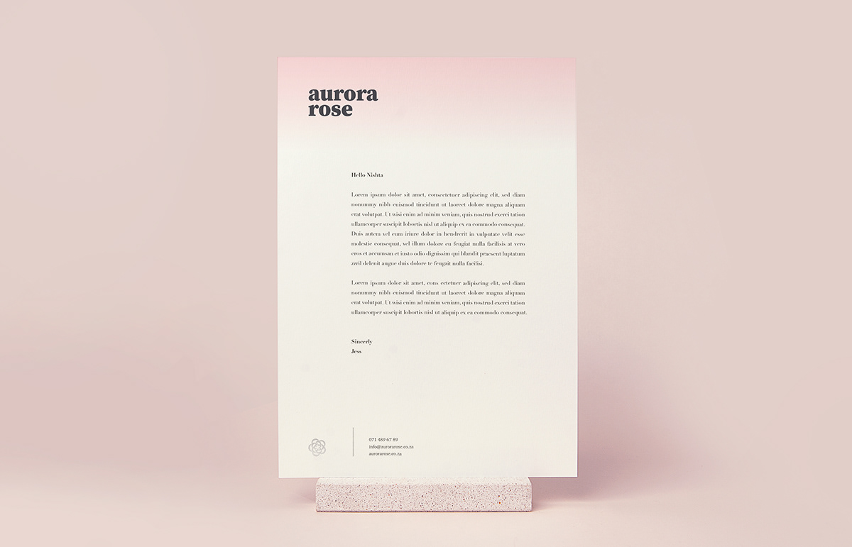
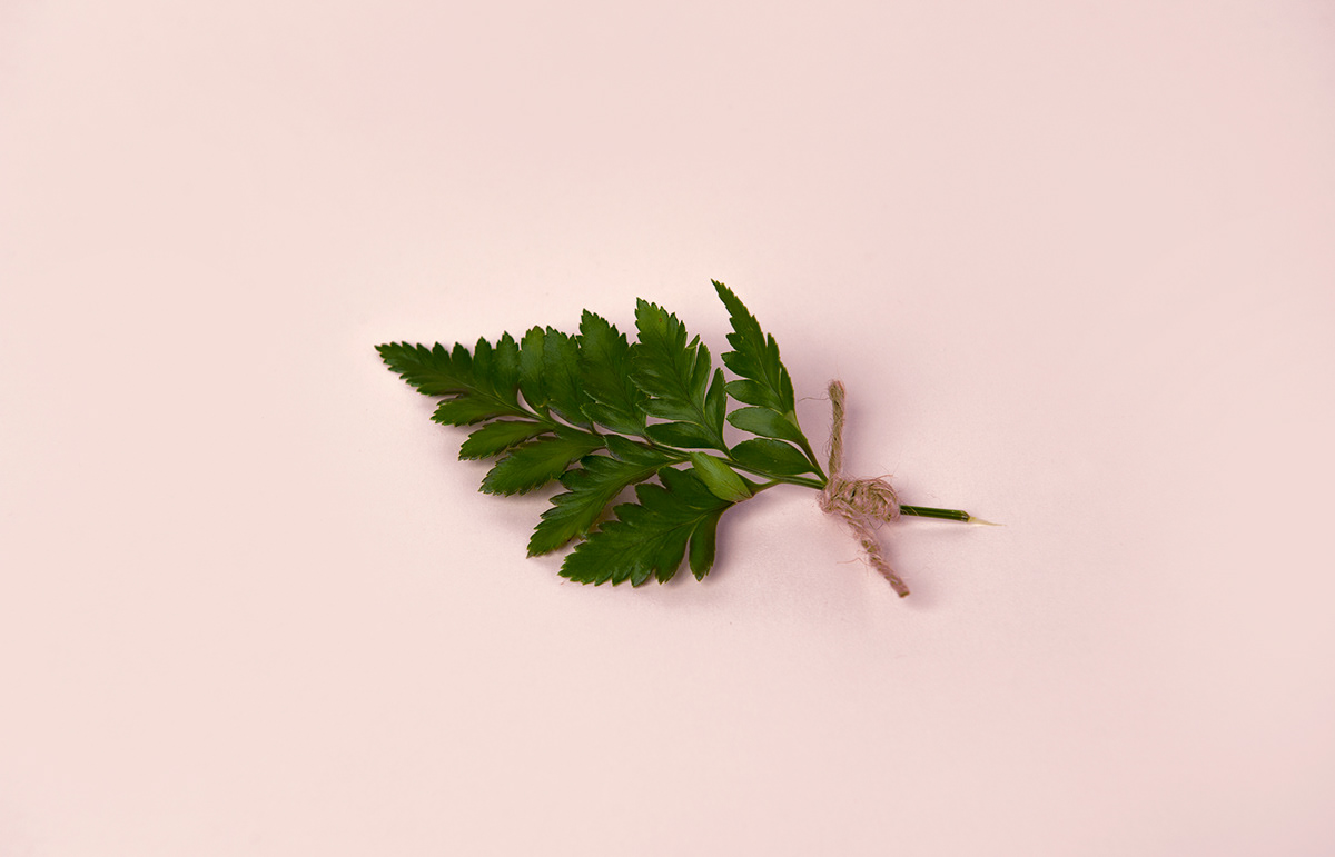
An impassioned approach to high quality organic skincare products sets Aurora Rose apart. Brand development work followed suit with a stripped-back typographic style that is supported by raw, simplistic packaging design. The bold aesthetic of the typography is offset by a delicate pink gradient, and the sparing use of a flower motif.


Did you enjoy this?
Please hit the Appreciate button below! If you have a project in mind, we'd love to hear about it -
Inbox us or visit our website for more information on our full service offering.


