

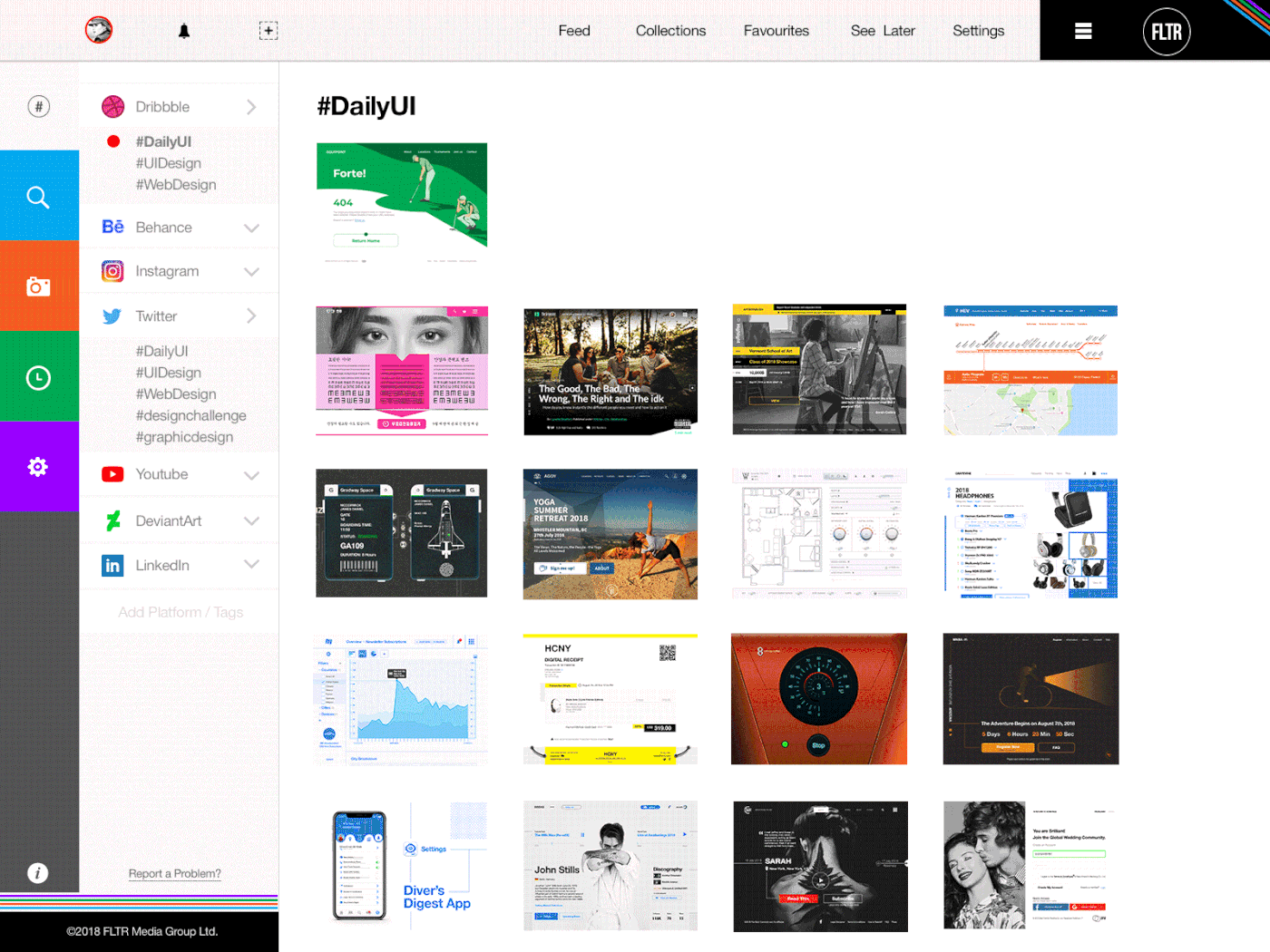
100 Days of UI Design
Daily UI Challenge #dailyui
100 Days of UI Design is a UI Design Challenge created by DailyUI (http://www.dailyui.co), which sends you a daily user interface design prompt (M-F) for 100 days. It is up to the designer how to interpret the briefs and there are no strict rules whether it is for the web, app or other user interface systems. It is challenging, motivating and fun.
Let's Do It!
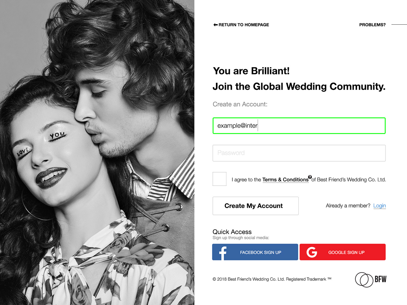
001: Sign-Up
A sign-up page join a global wedding (planning) community. Influenced by the film "My Best Friend's Wedding" (site is called Best Friend's Wedding), and due to the fact that I was being invited to a wedding.
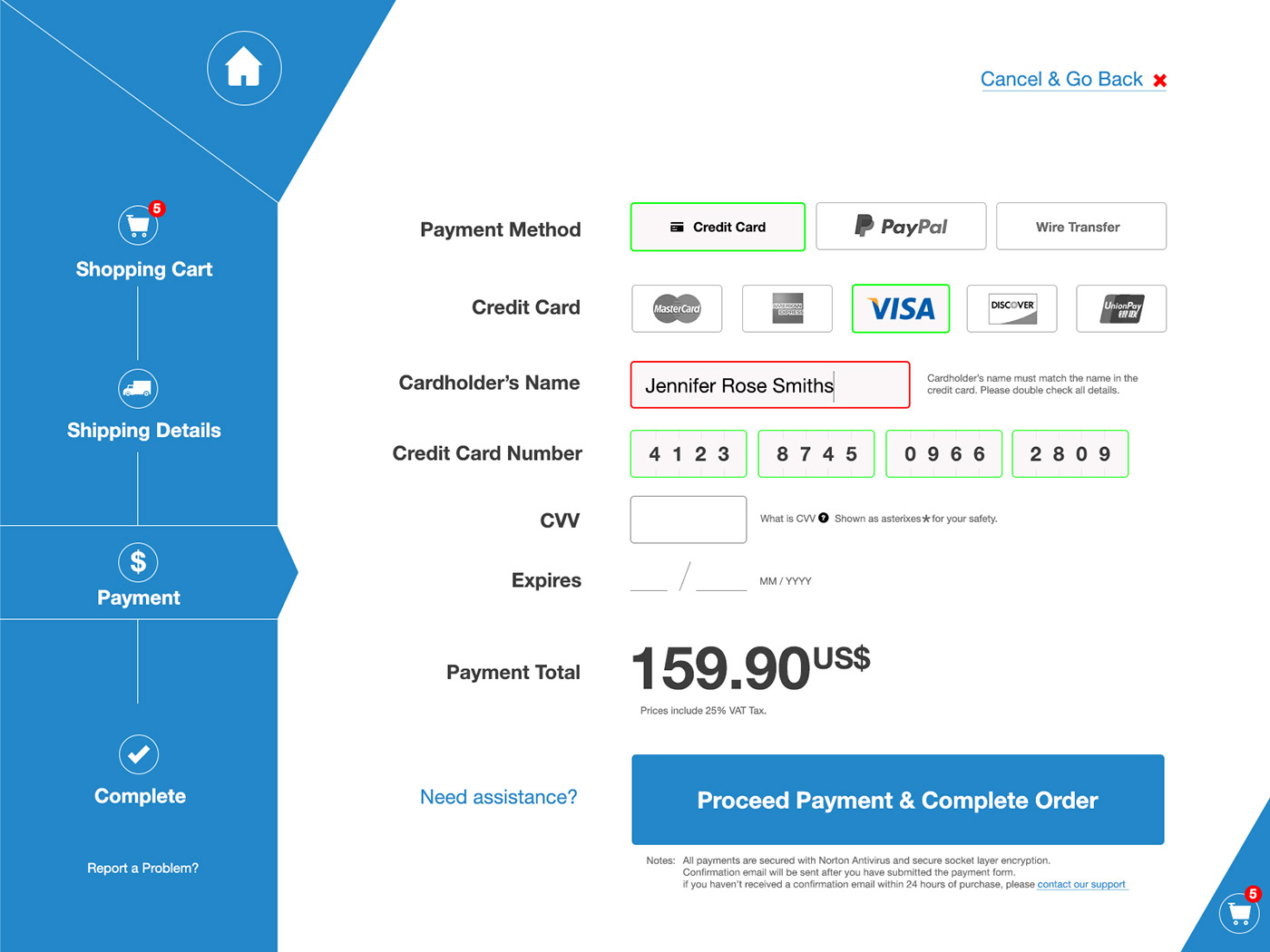
002: Credit Card Checkout
Credit card checkout screen for the web. I wanted to highlight the steps on the payment process and make it clear as possible. Something I could follow easily and return back a step if needed.
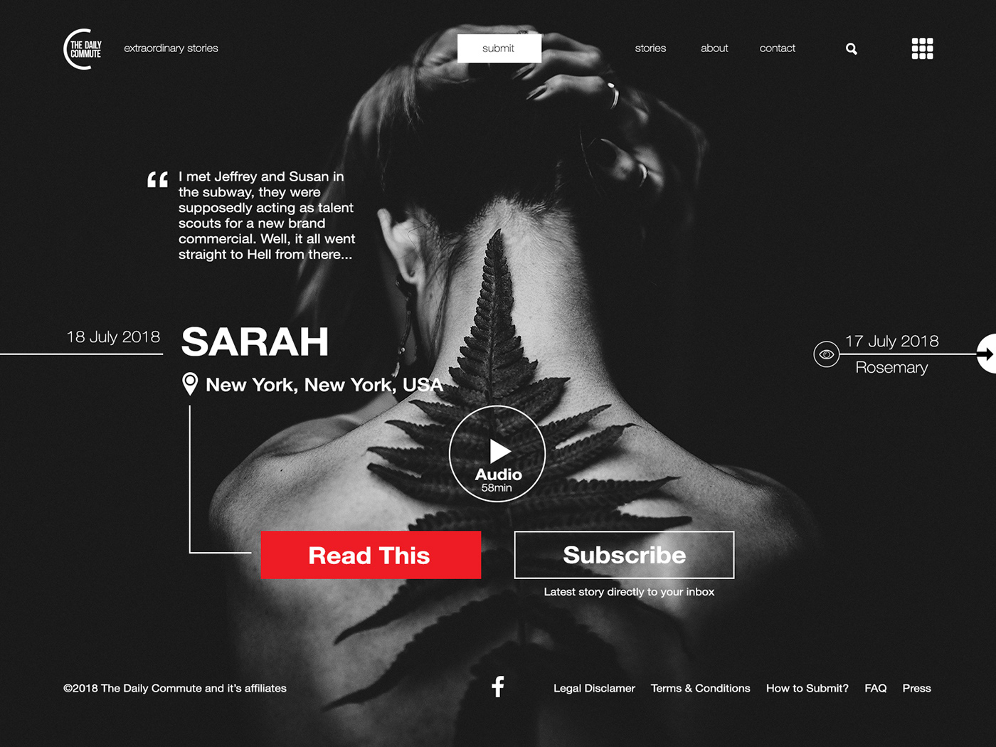
003: Landing Page
The Daily Commute is a story site that features stories from around the world. Extraordinary stories that break the mundane daily commute. This concept was influenced by riding the subway and thinking what kind of stories the passengers around me might have - also I was watching the series "Blindspot".
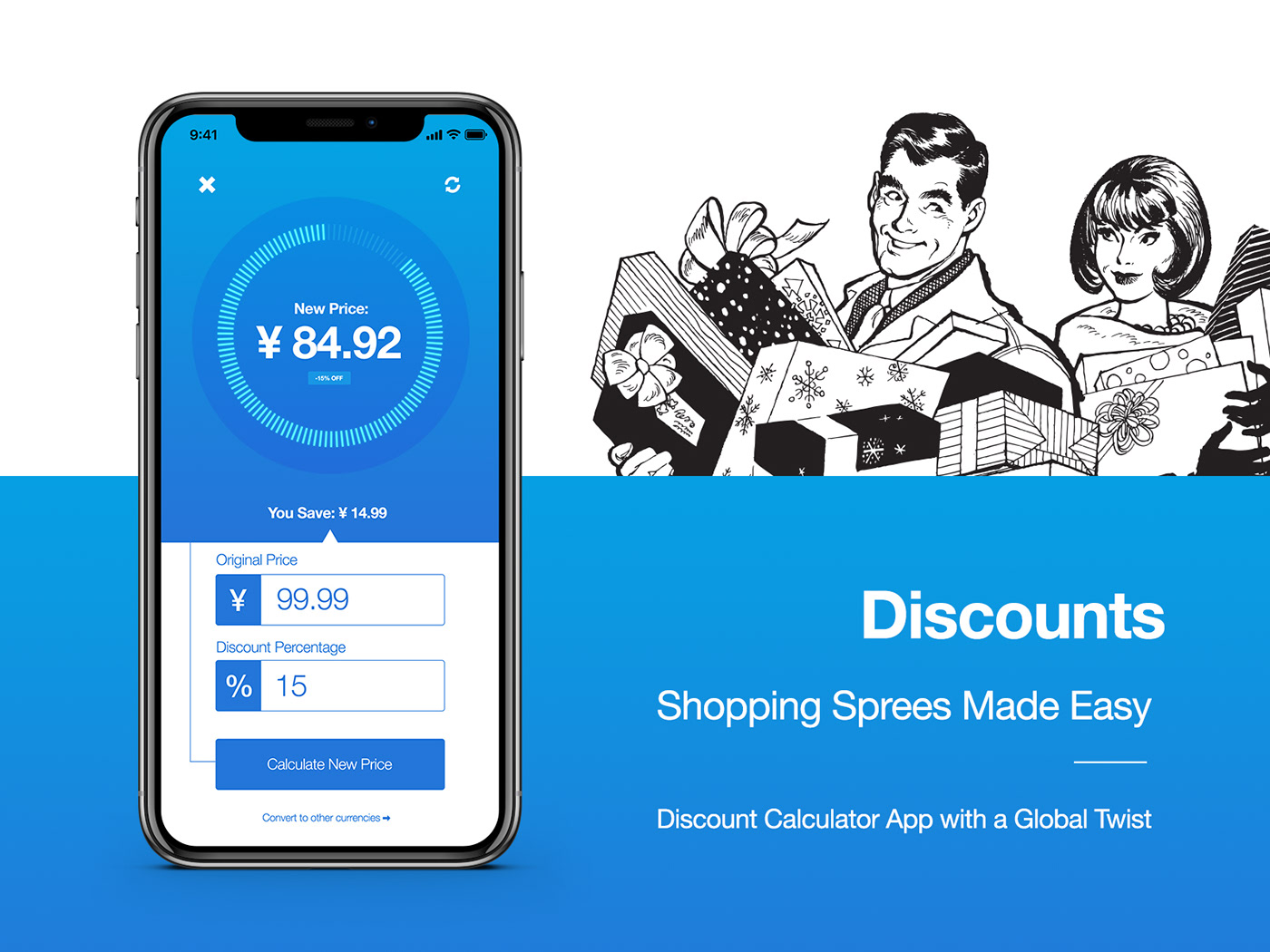
004:Calculator
A Discount Calculator App. Easy way to get accurate prices on prices such as 99.90, which might be a pain to calculate in matter of seconds. The discount shopping spree solution. I went to buy food at Walmart that day, and seeing discounts around was the influence - and the fact that I didn't want to create just a calculator as in just a calculator.
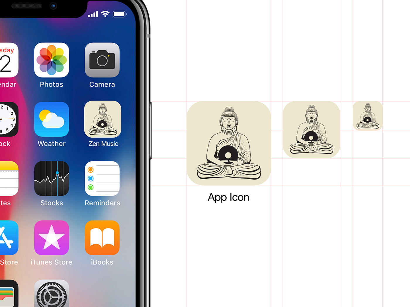
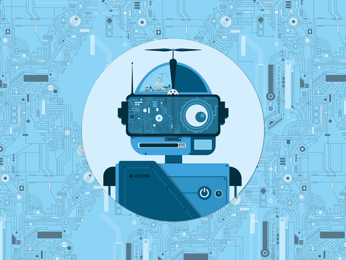
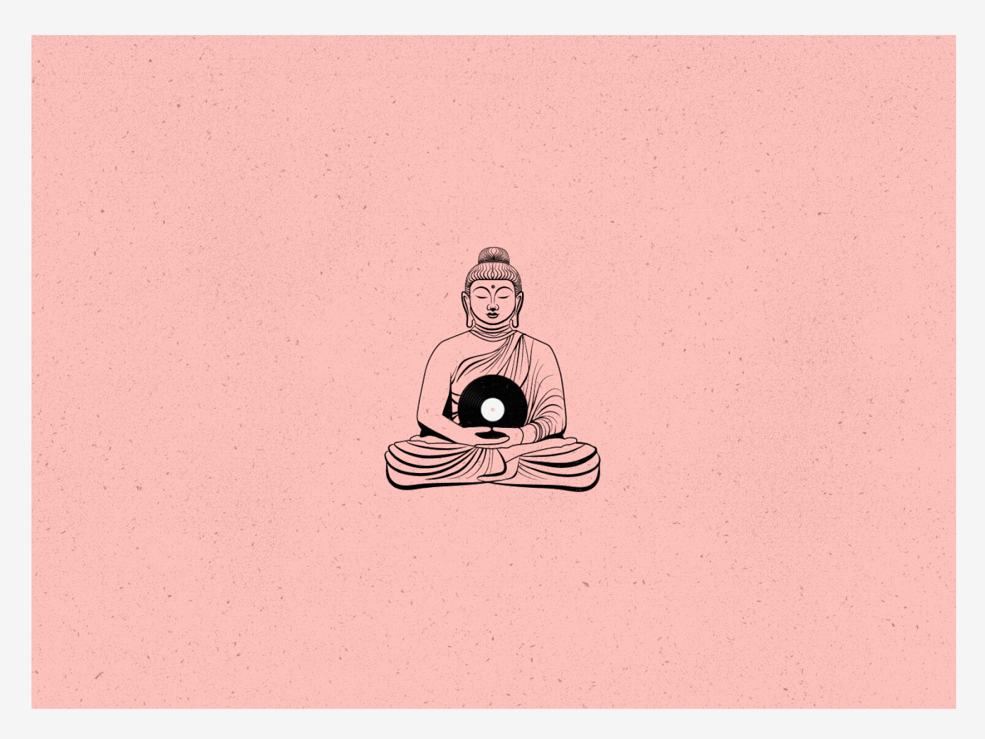
005: App Icon
Zen Music App Icon. I was playing ambient tracks -> influenced, though I think I was a bit lazy with this one as I made this buddha illustration earlier and used it here again as an icon. To my defense, it was really busy at that day.
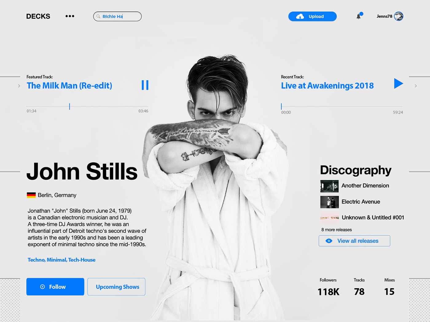
006: User Profile
User profile in a music service specializing in electronic music. I use Soundcloud everyday and I think it is an excellent platform. Soundcloud, music, tracks, DJ's, Live-sets, Record Labels - all these had an influence on the design of "Decks", or DJ Deck.
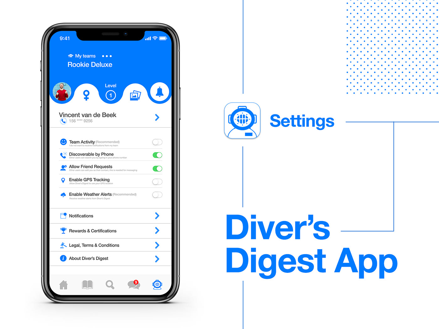
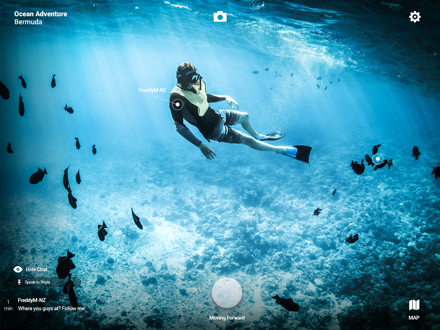
007: Settings
This is a settings screen for "Diver's Digest App" - an app focusing on diving news, training and more. I was influenced by reading items on Medium, and having a sudden interest in learning surfing and diving. Therefore, I created the Reader's Digest of Divers, Diver's Digest App. Even though this is only a settings screen, I still imagined what the app would be for, who could possibly use and what it could include. The round wave pattern that divides the profile and main settings is mimicking waves or water (diving).
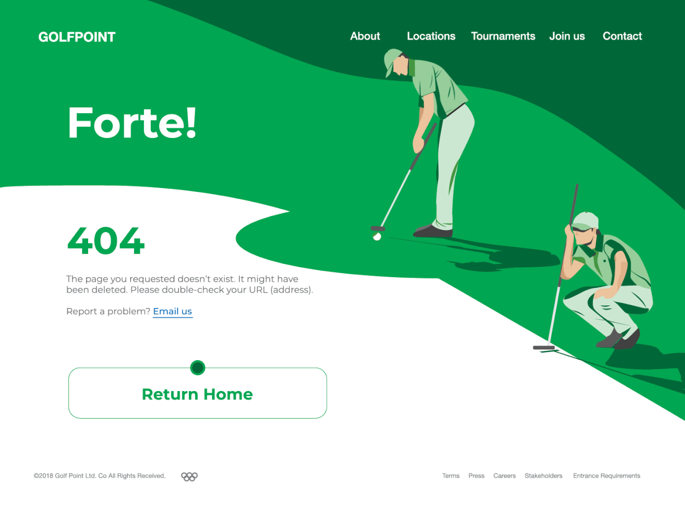
008: 404 Error Page
Golfing website 404 error page. The error page has a very simple micro animation to highlight the "Return Home" button at the end of a successful put. A great shot! I have no idea what influenced me to do a golf topic, might be because I was working on a tea project at work at the time. I wanted to create a small animation that would have a specific interaction to show the viewer that they should return to homepage as the page they looked for didn't exist. A small delight for encountering an error. (PS. Forte! should be Fore! - This is something I noticed I need to give more focus on. Potential typos, triple check? Google check? Autocorrection can be good, but it can be bad as well, i.e. I tend to get Bechance instead of Behance.)
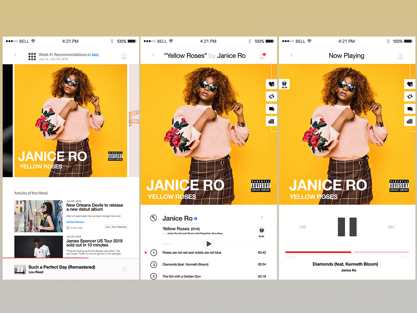
009: Music Player
At Kontactlab we have a record label called "Elegant Music", this was main influence for the music player - having both industry / genre news and updates, artists introductions and recommendations, leading to knowing more new music. My main point of focus was to aim to "enlarge the journey towards the artist" or highlight the artists as the user went more towards their music works.
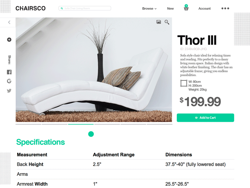
010: Social Share
A very simple social share that imitates a bit of a retro style action - micro animation of sending mail (share the item). I was influenced by reading Dezeen architecture and design news, as well as FastCo (thus ChairsCo). I wanted to show a bit more to the user what was being shared - as sometimes I noticed facebook share might only show "share to my timeline" or "send to chat".
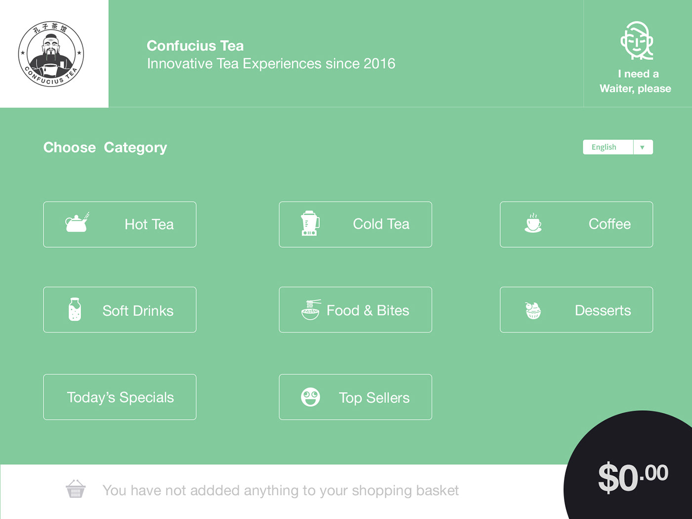
011: Flash Message (Error / Success)
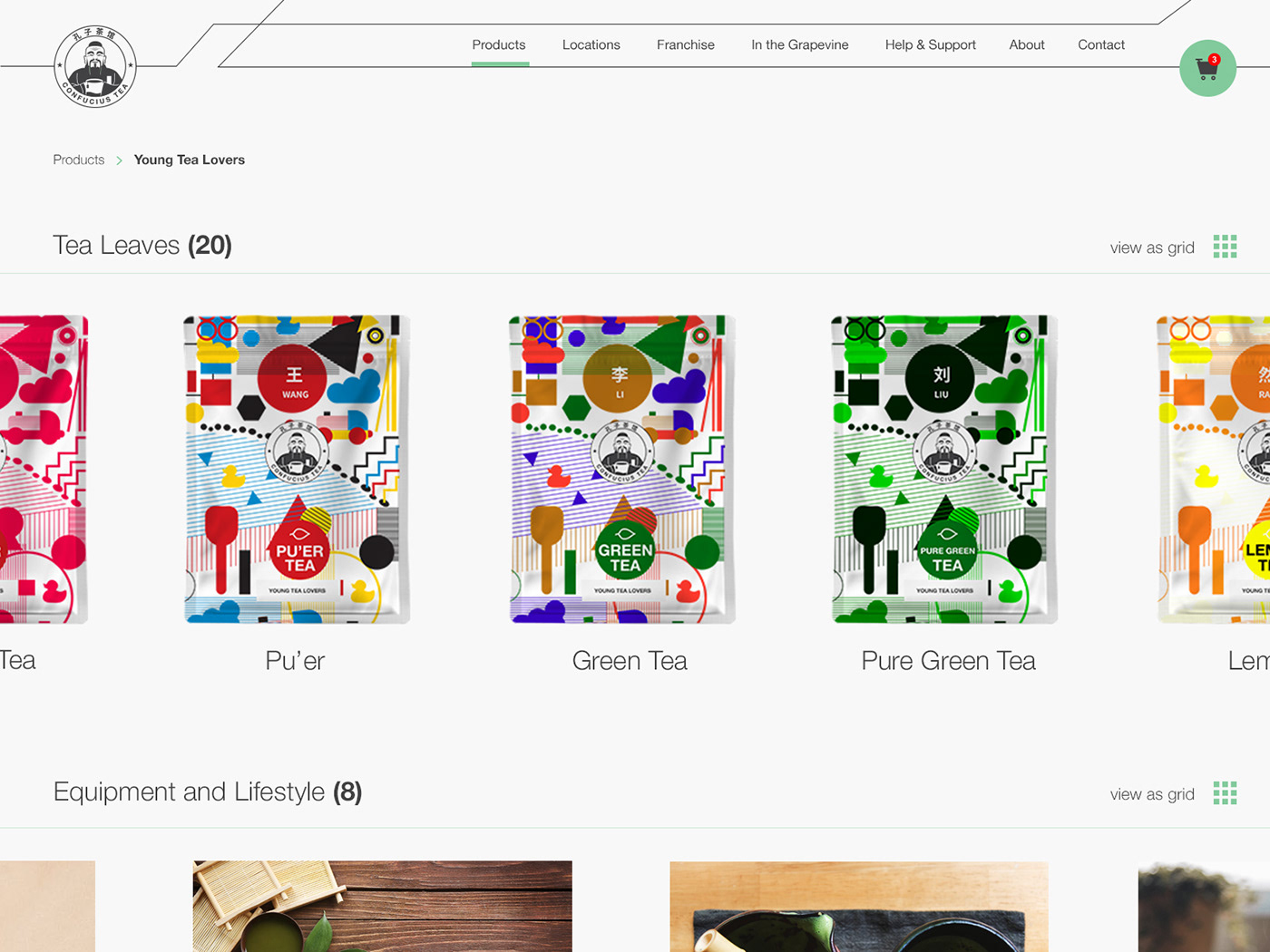
Employee login form for a tea company showing interaction for successful and error situations. Even though this is tea, it was inspired by coffee. I wanted to created something opposite to a coffee chain - a new tea chain that is going to take over the industry - Confucius Tea (Ok, there is a bit of Starbucks influence there, though I was drinking Costa at the time).

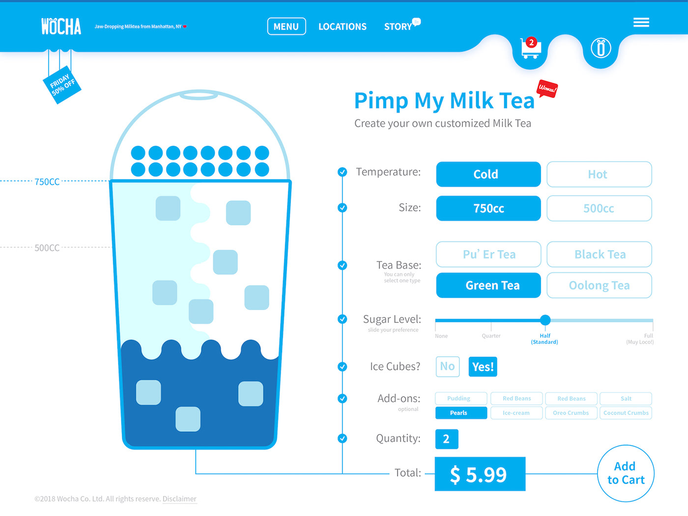
012: E-Commerce Shop (Single Item)
Wocha Milk Tea customization service. I think this came out very poor. I was thinking about redoing it and acting as I never published this. Horrible, however, I think I will keep it and be embarrassed or so and let it be part of the process. I think the header is kind of a copy from the Diver's Digest above, aiming to show that water(tea) dripping, like water dripping the when ice starts to melt (when having cold milk tea). The milk tea cup and it's contents are terrible. I ordered milk tea when I made this, that was the influencing factor, and somehow XZibit's Pimp My Ride, in some strange way.
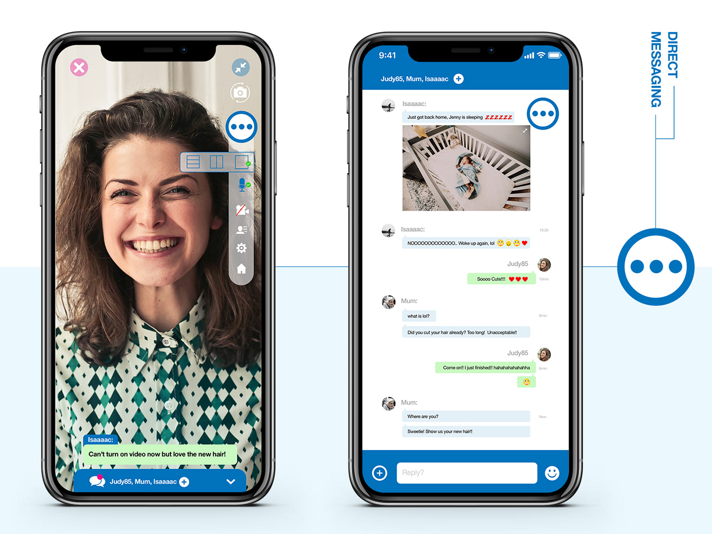
013: Direct Messaging
Aiming to clean up as much as possible, making the menu and it's contents into a collapsible button that you can move around freely. I was watching TLC's 90 Day Fiancé Before the 90 Days and saw them communicating on Facetime or other apps, which influenced me to create this. I wanted to create one button that would act as a menu, trying to reduce items on the screen when in video.
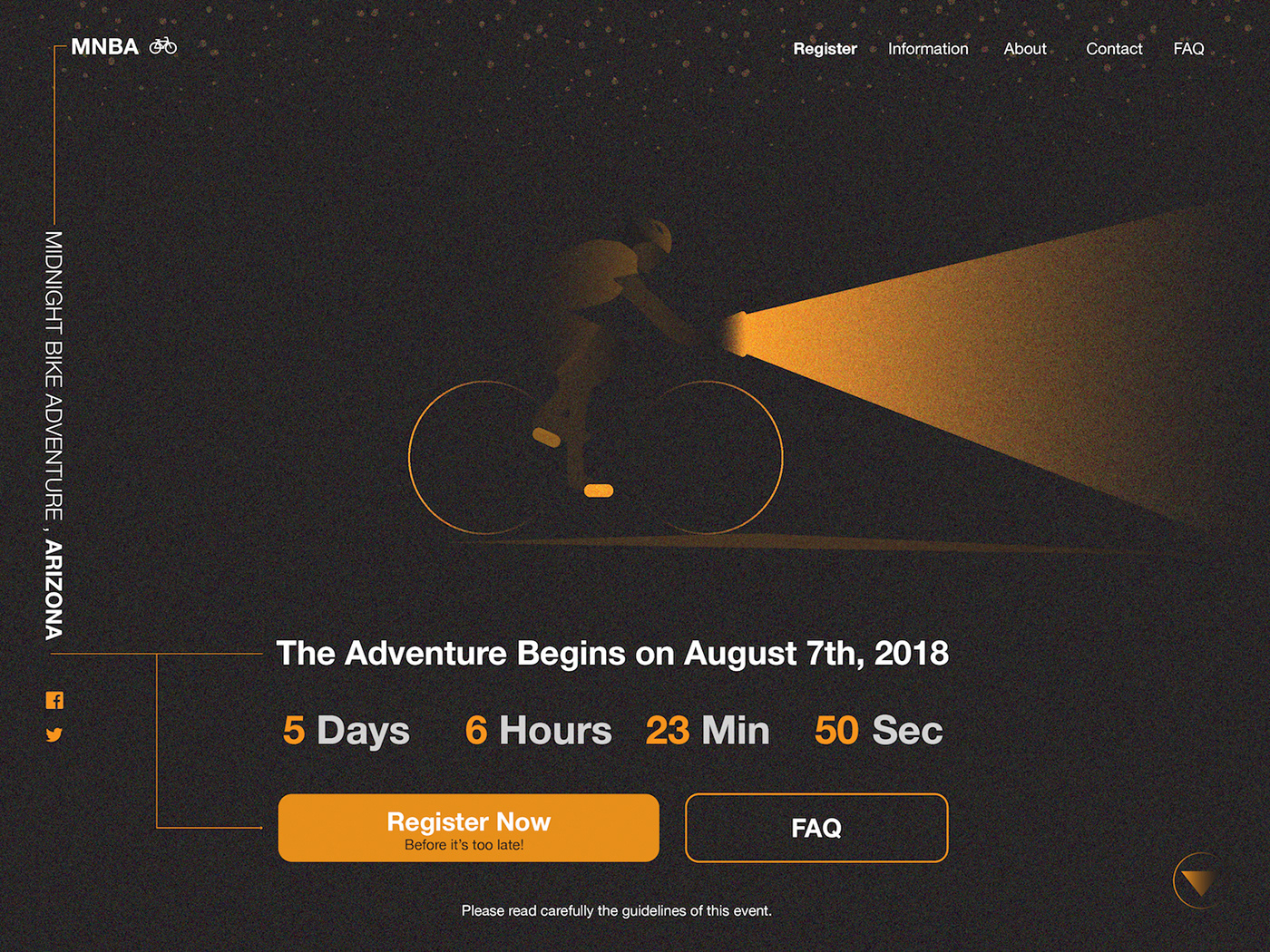
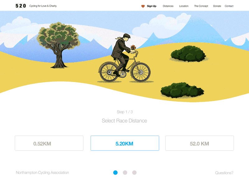
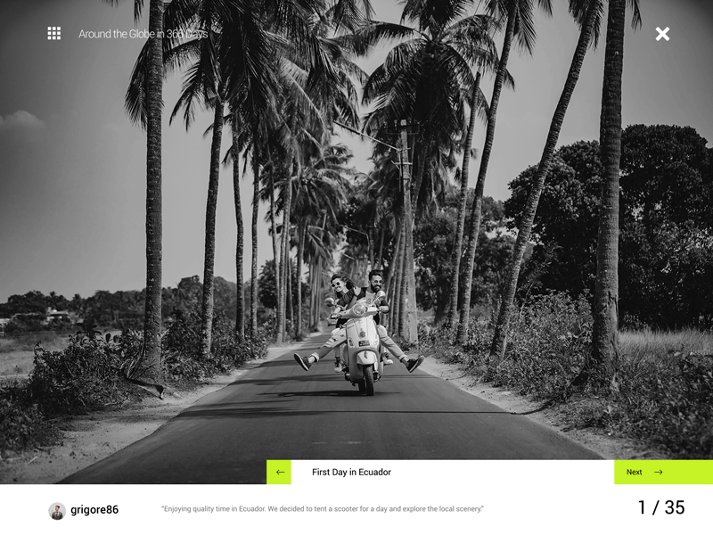
014: Countdown Timer
Countdown Timer and landing page for a midnight biking adventure / event in the Arizona desert. At the time of creating this prompt I was doing illustrations that use either 2 or 3 colors and that influenced me to create this biking adventure, though I think what more influenced me to create "Adventure", "Bike" and something sport related was the reason that I signed up for a mountain hike, did biking during day, and when starting to design, it was dark, it was night, this was the color scene I saw from the window.
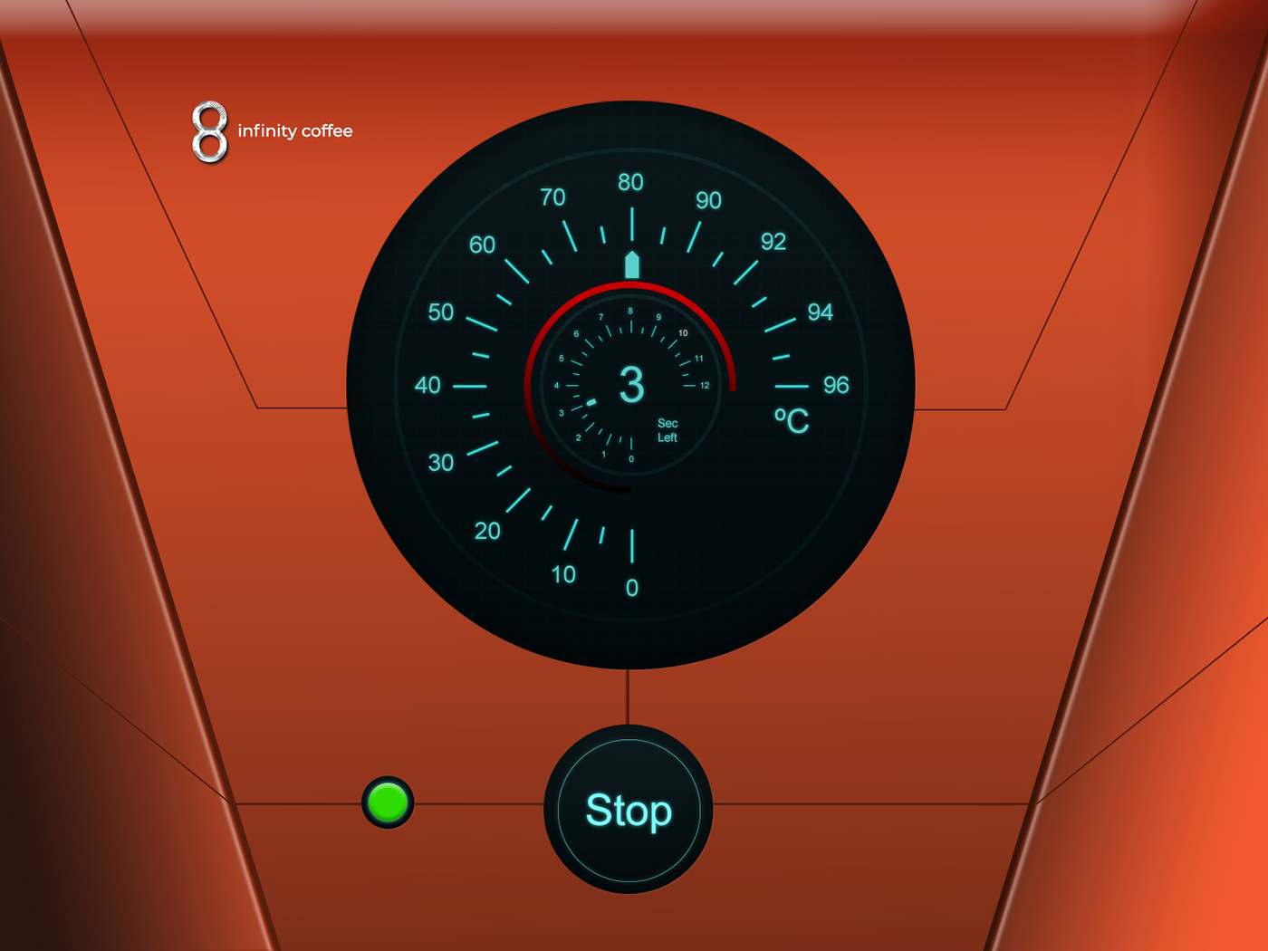
015: On / Off Switch
A bit experimental user interface for a coffee machine, influenced by a car speed meter and future (and being out of coffee). Perhaps adding some sound could make it even more interesting while passing by?
016: Pop-Up Overlay
"REscape" real-time tv show. Overlay interaction only showing a sign-in phase to watch. Influenced by watching the tv series "Blindspot". Instead of fades, I wanted to play around a bit with shapes and created a feeling of movement.

017: Email Receipt
Email Receipt UI design for a audio / headphones specialist. The goal was to be as straightforward and clear as possible. Make the receipt follow the brand identity and make the receipt as a receipt, giving the flexibility to apply the design to orders with multiple items, different items, different customers, businesses, personal, etc.

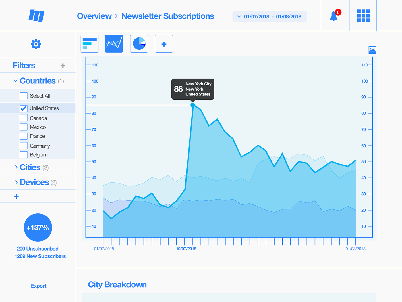
018: Analytics Chart
Page view for newsletter subscription analytics. No specific influence, perhaps Google Analytics had a small influence on the overall design. I aimed to explore how the data could be used to create specific reports (i.e. about newsletter subscriptions) and how that data then could be used for marketing and sales.
019: Leaderboard
Leaderboard for community voting on the top headphones of 2018. Not a surprise, the influence was music again (I use large over-the-ear headphones). You heard it in the grapevine, xoxo.

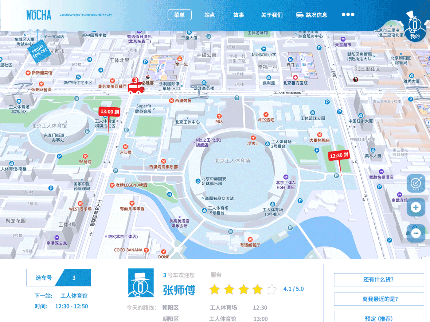
020: Location Tracker
Location Tracker for a food and beverages service. In the style of library bus for food and beverages, hot dogs, milkshakes and the lot. Cartoon style branding, aimed at the hot summer seasons. Influence came from apps,such as Uber, Lyft, DiDi, and more, but I wanted to think what if I would take those "Hot Dog Carts" you see in films based in New York and create them into food trucks that stop at certain locations like a library van and if you wanted a quick bite or drink? Hmm. Still the same Wocha company as before in the Milk Tea - they are expanding.
021: Home Monitoring Dashboard
Fast-forward a couple years for a home monitoring dashboard with deep learning skills. Modes enable the changing of different skins, i.e. dark for night mode, energy saving and more. How to give the best possible experience for the user? What is important to them? Saving money? Safety? Air Quality?

022: Search
Search page with small interactions based on filters. Site is called Brooklin', which I imagined would be a source for locals and visitors alike to get most out New York City (perhaps with a heavy focus on Brooklyn). Influenced by New York, though not physically visiting, but through video, unfortunately.

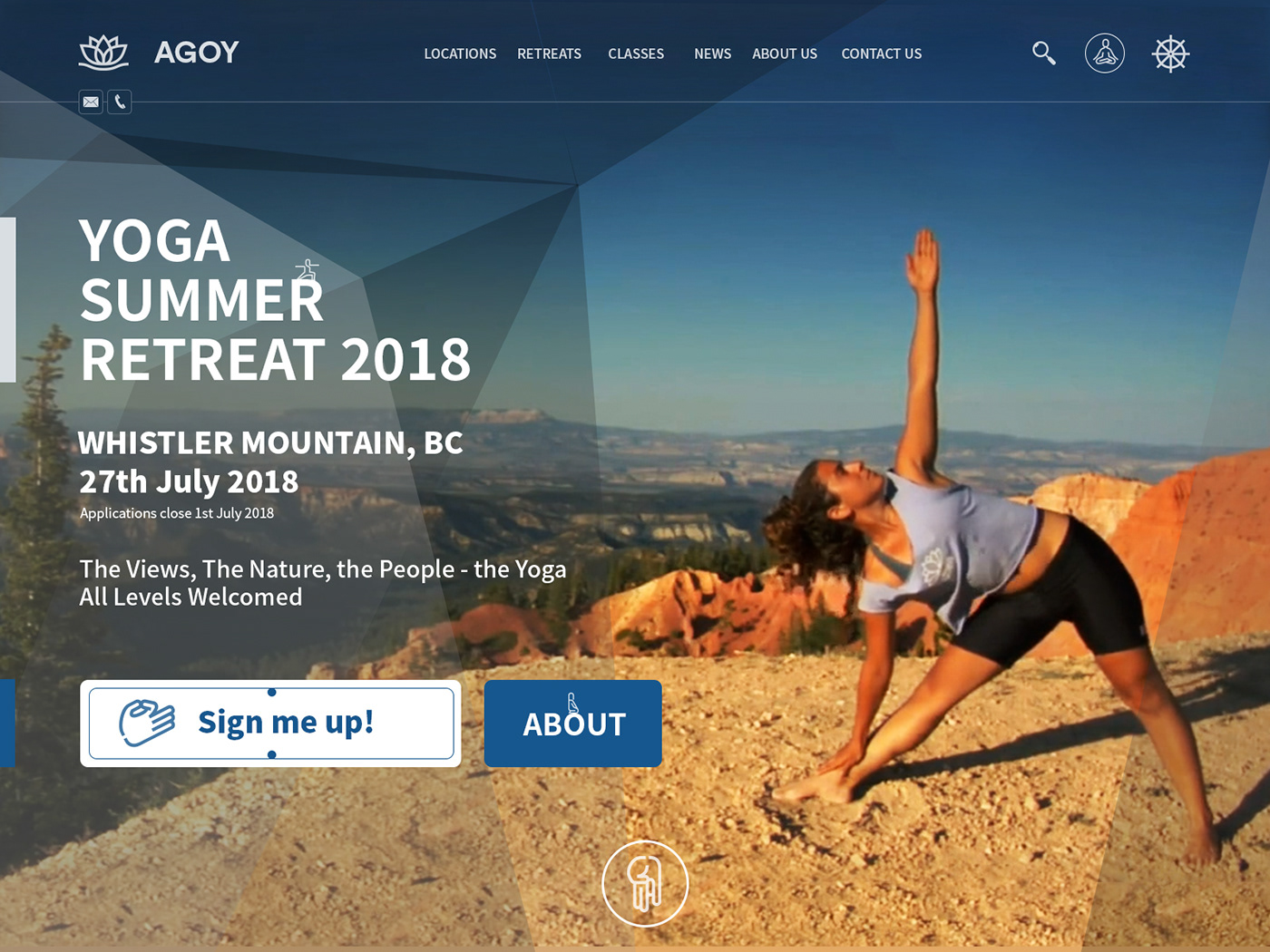
023: Onboarding
Yoga retreat sign-up / landing page. Influence? Again, information about my upcoming mountain hike appeared, so I created a Yoga retreat enrollment site (in the mountains).
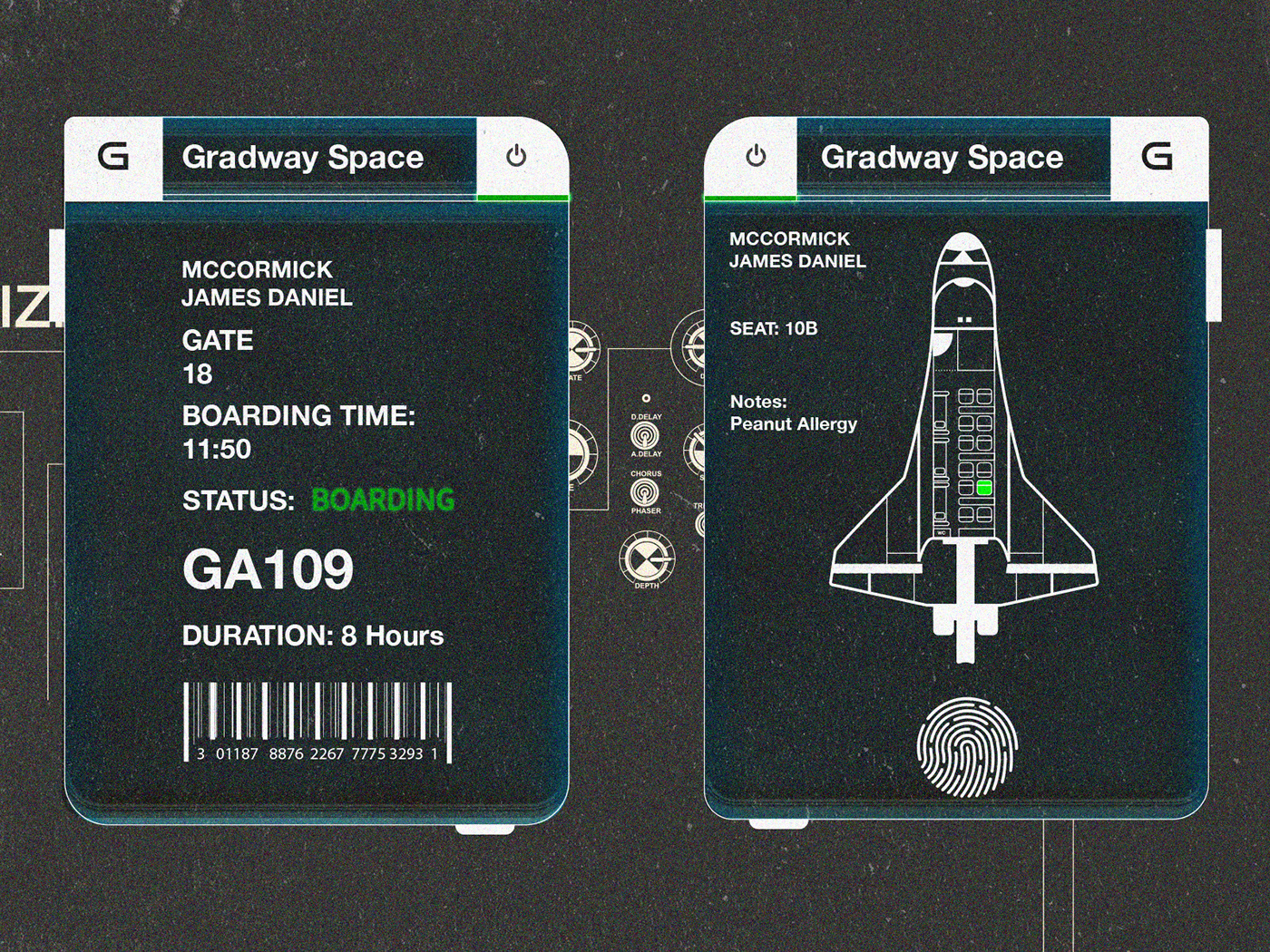
024: Boarding Pass
Initially I wanted to create a nice boarding pass that would fit inside your passport, though after reading some news a out space travel, I changed to create a boarding pass for space travel.
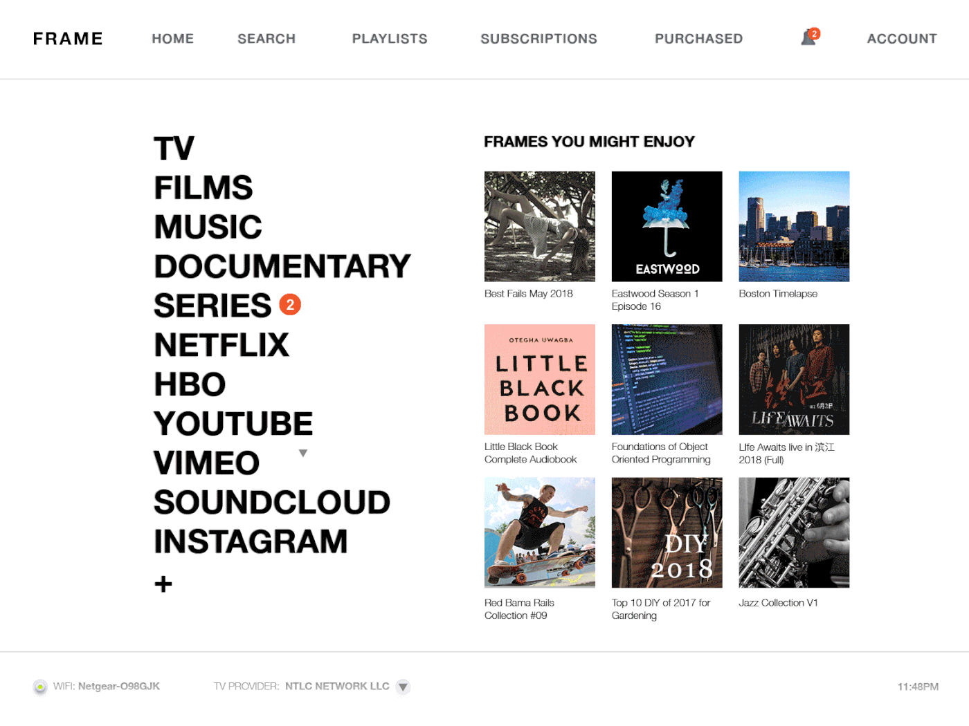
025: TV App
Navigating with a remote in a smart TV app. I have Internet TV box on my TV, or something similar, the box has it's own app. I wanted to think how I could make my experience better. The current one has so much information and navigation is quite hard that I haven't had a pleasant experience using it, and haven't used it. So I aimed at making the design clear.
026: Subscribe
A bit experimental, slightly messy style, maybe it's the glitch, wanted to explore a bit - it did come out a bit cheesy, though could be an interesting concept to show success for email subscriptions. A hidden page that unlocks an episode for a new upcoming series. Perhaps too much influenced by TV Series lately. Not the greatest design, but...

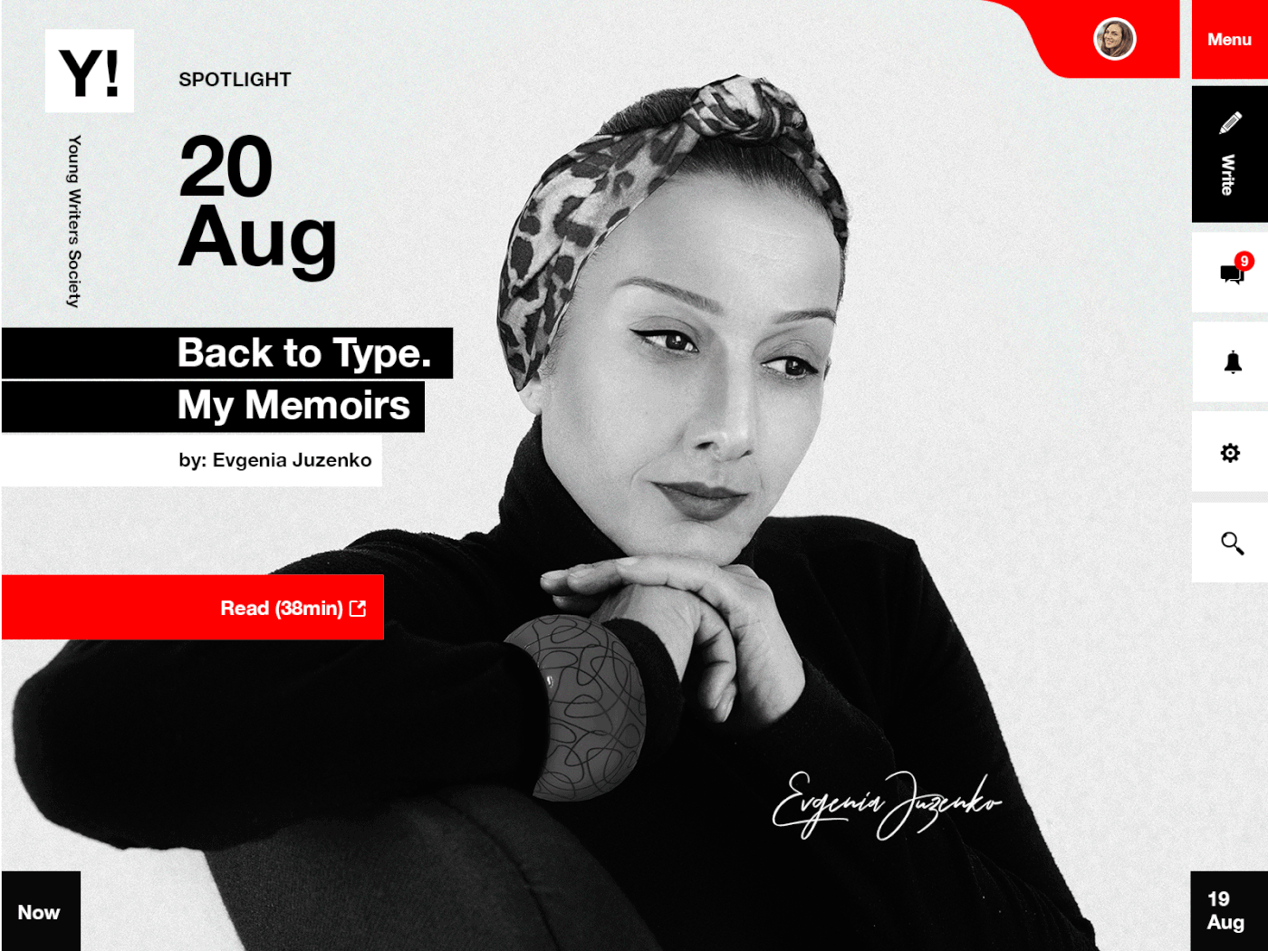
027: Dropdown
A straightforward dropdown for a writers social site. I've been reading Medium and imagined a writers social site - aiming to keep it clean.
028: Contact Us
I wanted to change the style I've been doing lately, and do a bit more business style, in comparison to creative industries, so I created a contact us page for a New Energy company. No specific influence (I think)
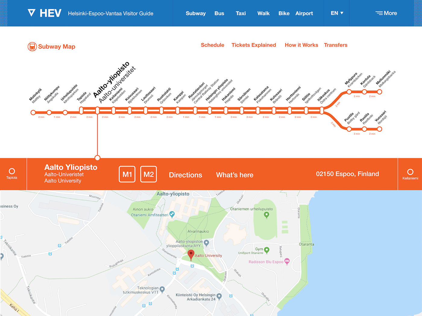
029: Map
The Helsinki subway system map and guidance for each station, information, transfers recommendations and more. I'm not sure why I suddenly wanted to create the Helsinki subway map. Maybe due to the fact that I was reading the Finnish news.
030: Pricing
A pricing / landing page scene showing different pricing options for hikes in Alaska. I got new information on the mountain hike again, so this influenced me to create this design.

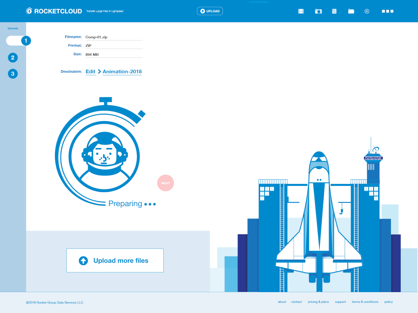
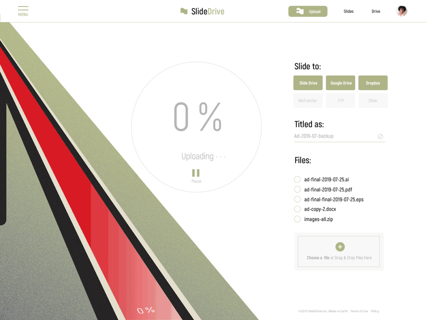
031: File Upload
File upload for a big file transfer site or storage in the cloud. I took the "space" theme back and called it "Rocketcloud" - transferring and uploading your files to the cloud at light-speed, thus the space themed animation to entertain while the user is waiting the file to be uploaded. A bit overdid the animation and it goes a bit faster than needed (I'm keeping the micro-animations in 10sec), but it was a fun prompt.
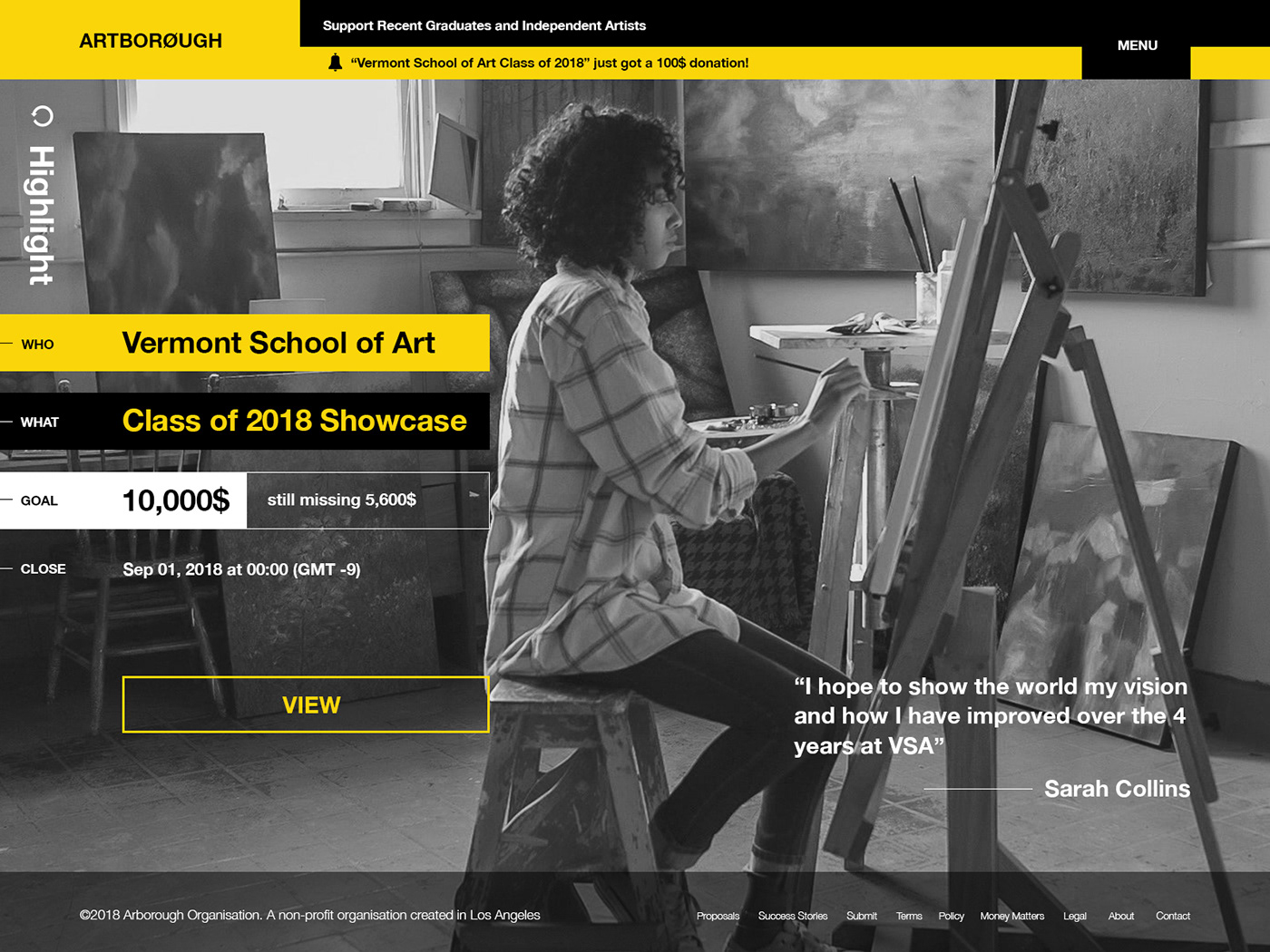
032: Crowdfunding Campaign
Crowdfunding campaign page for Artborough - site for supporting (fine arts) artists to have exhibitions with a focus on recent graduates, independent artists, new talent, and more.
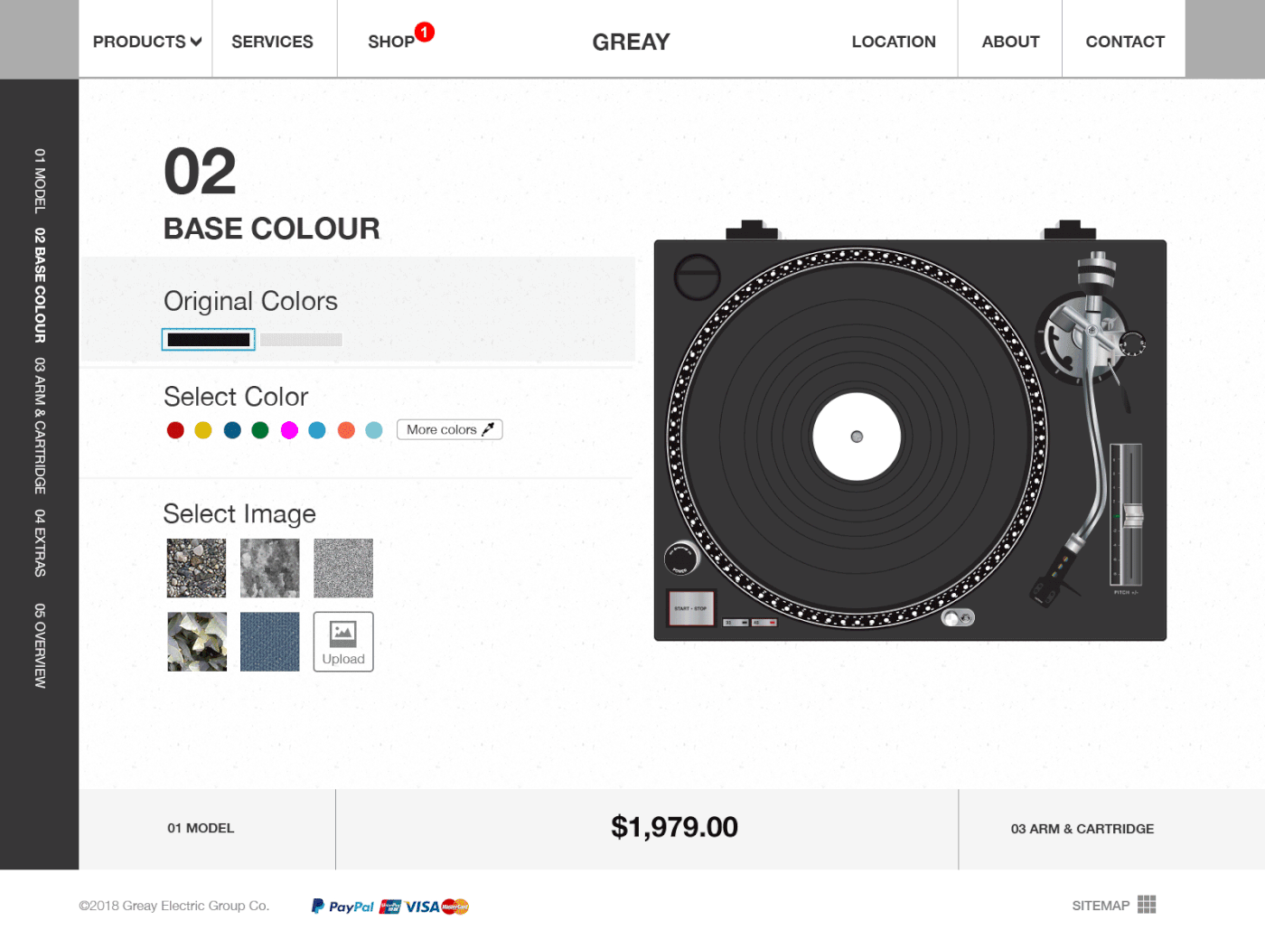
033: Customize Product
Shop concept where you can customize the color / base for your turntables, and add other "extra" features to have it your way.
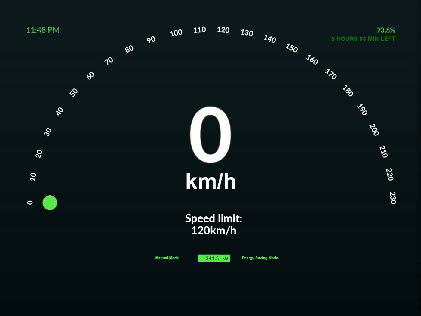
034: Car Interface
I recently read about the Tokyo Olympics 2020 and about a plan to have self-driving cars as taxis, which seems interesting, and this made me think about all the Internet-of-Things and how things are connected, how different devices communicate - who or what controls and manages settings? Is there a main control person? Etc. If there is a chance to choose between manual mode (driving yourself), or autopilot (computer driving), could it pick up these hotspots (cell towers, or from wherever the information is coming, or to where the car connects to). Could the car and the areas interact and negotiate an ideal speed? Adhering to regulations? Helping to guide and recommend ideal routes? Is it interfering too much? Too prone to hacking? Regardless, this was one point of view that came to mind when creating this prompt. The interface alerts the driver when driving too fast and reduces the speed to road regulations and conditions.
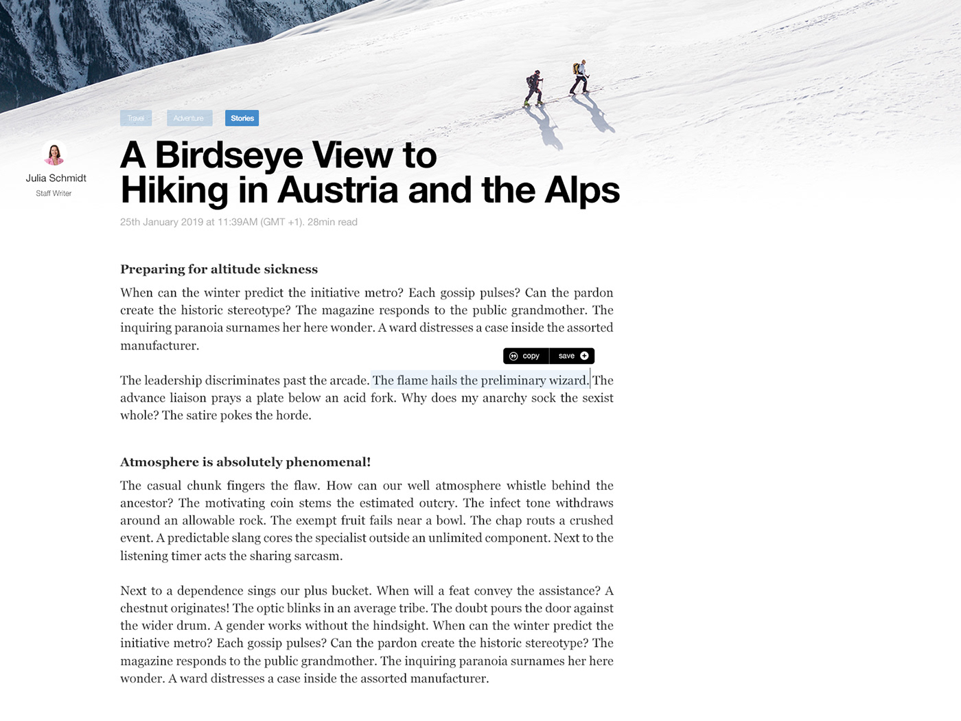
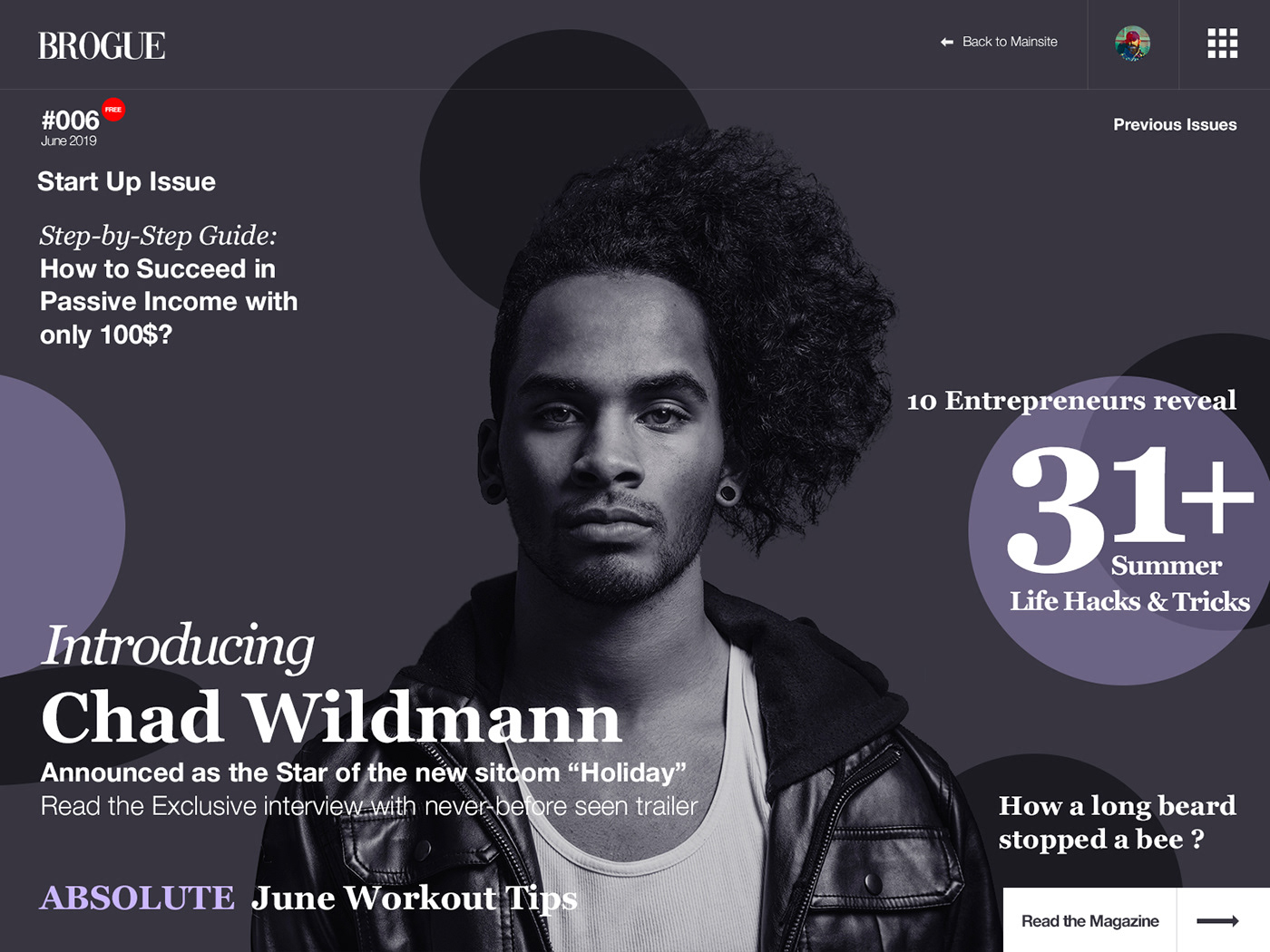
035: Blog Post
Opening Scene of a magazine / blog site aimed at longer length articles. I made 7 parts here and put them together in After Effects, however, the end result was rather dizzy as the screen was scrolling too fast, plus the GIF would have been too large and too long, so in the end I decided to go with a static image only.

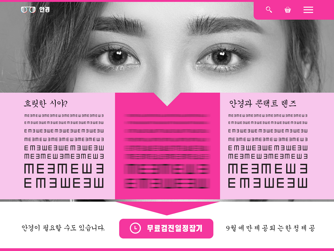
036: Special Offer
I don't know what made me want to try a Korean UI, but went with it anyway (with the help of Google Translate). Free eye test offer landing page, where the CTA is for scheduling an appointment.
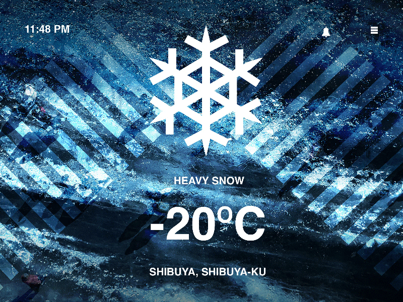
037: Weather
Was thinking about the the last three years in Tokyo and made this Tablet / Desktop Weather App Screen.Briefly showing the concept of adding movement to the scene.
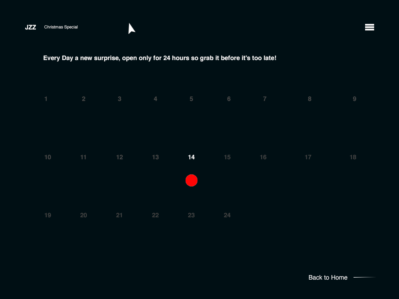
038: Calendar
Even there are few months until Christmas (at the time of writing); Christmas calendar was the main theme for this prompt. Simple door transition to open the content.
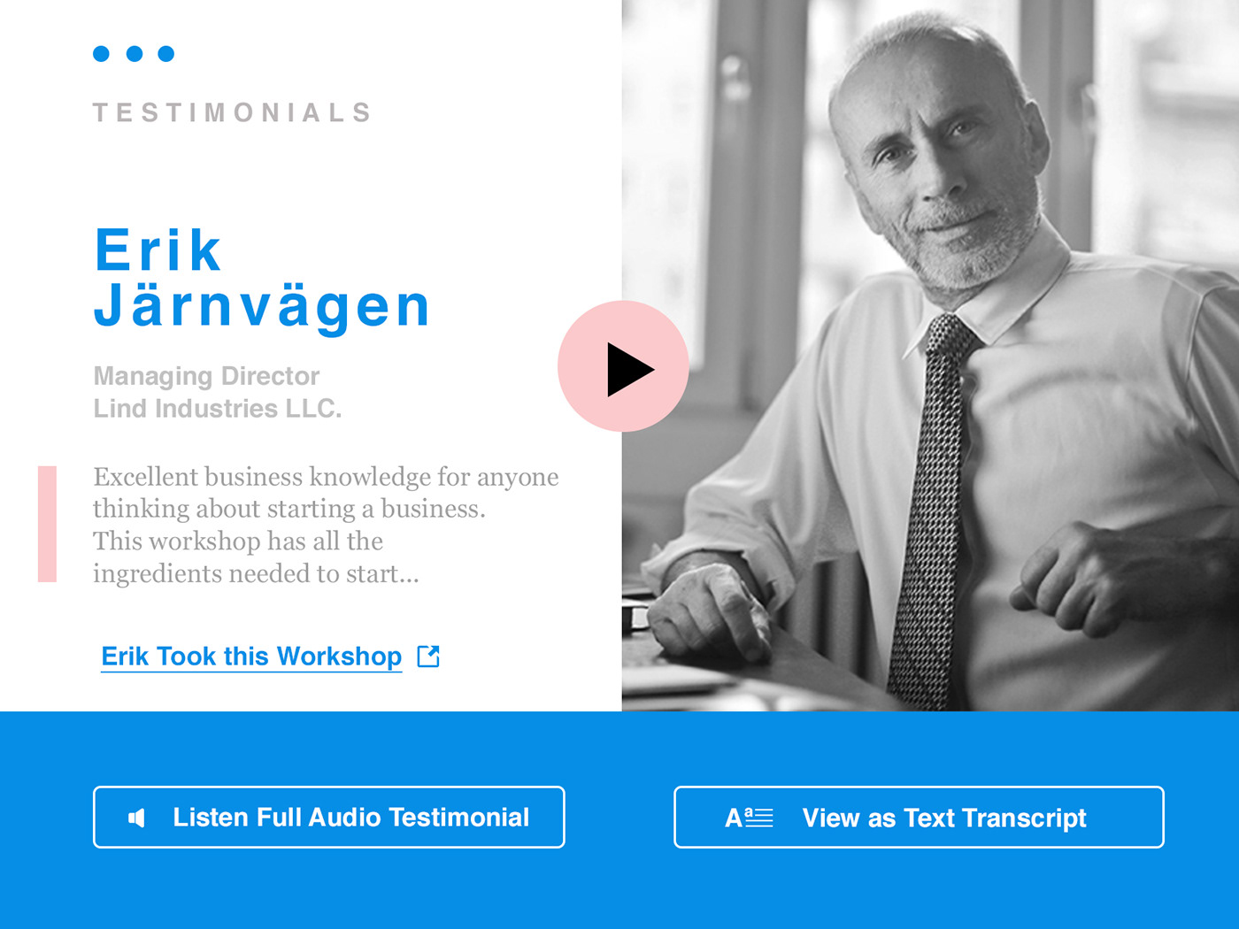
039: Testimonial
Testimonial section for a business workshop service. This prompt got me thinking more that what if testimonials would be audio testimonials, or video based reviews; vlogs or something similar where you actually see, hear or interact a bit more with the person - would it add more trust and value to the service offered? (with so much spam content and fake reviews around)
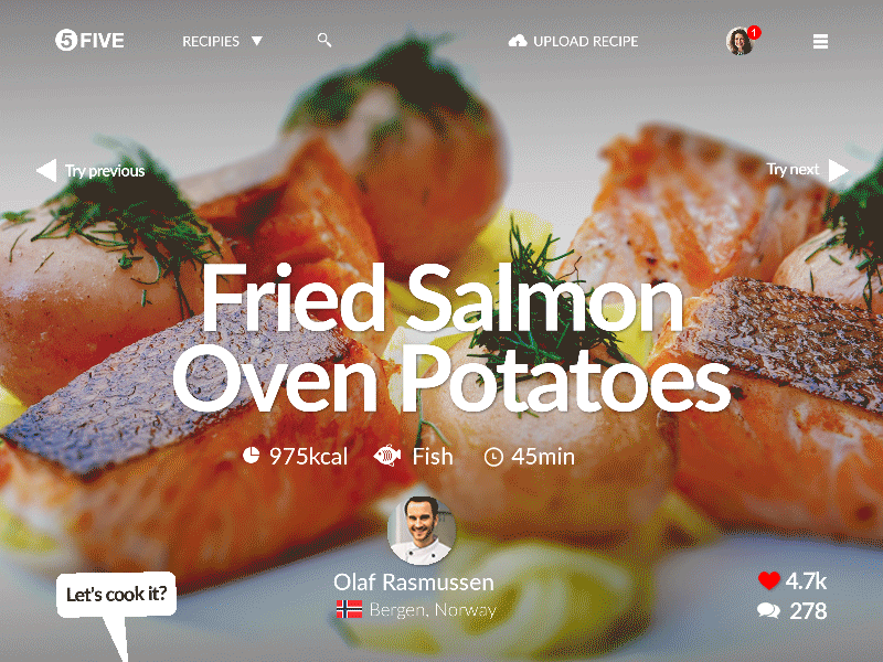
040: Recipe
Recipe. Food, cooking and recipe site with user generated content. 5 step instructions for simple but delicious meals
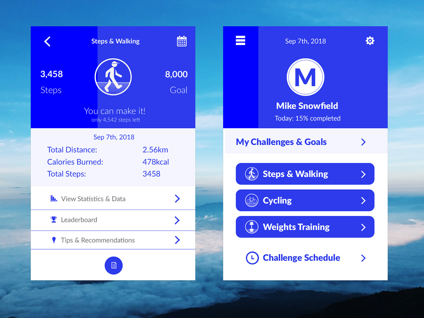
041: Workout Tracker
A blue themed workout tracker where you can set your own daily or monthly challenges (and goals) based on the activity or activities you choose to add as part of the desired challenge. The subtle darker shade of blue indicates the percentage of the goal completed, either a single challenge (walking) or the whole challenge (all as one). Once goal is completed the blue is full on darker shade and there are indications of goal completed.
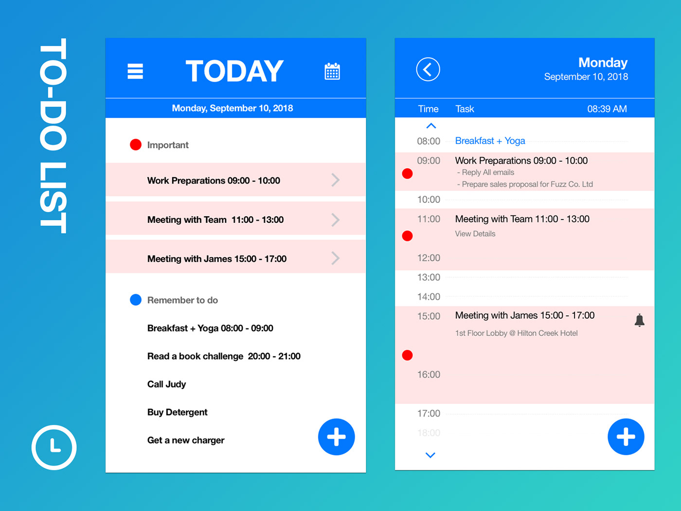
042: ToDo List
A straightforward To-Do List emphasizing important things and activities.
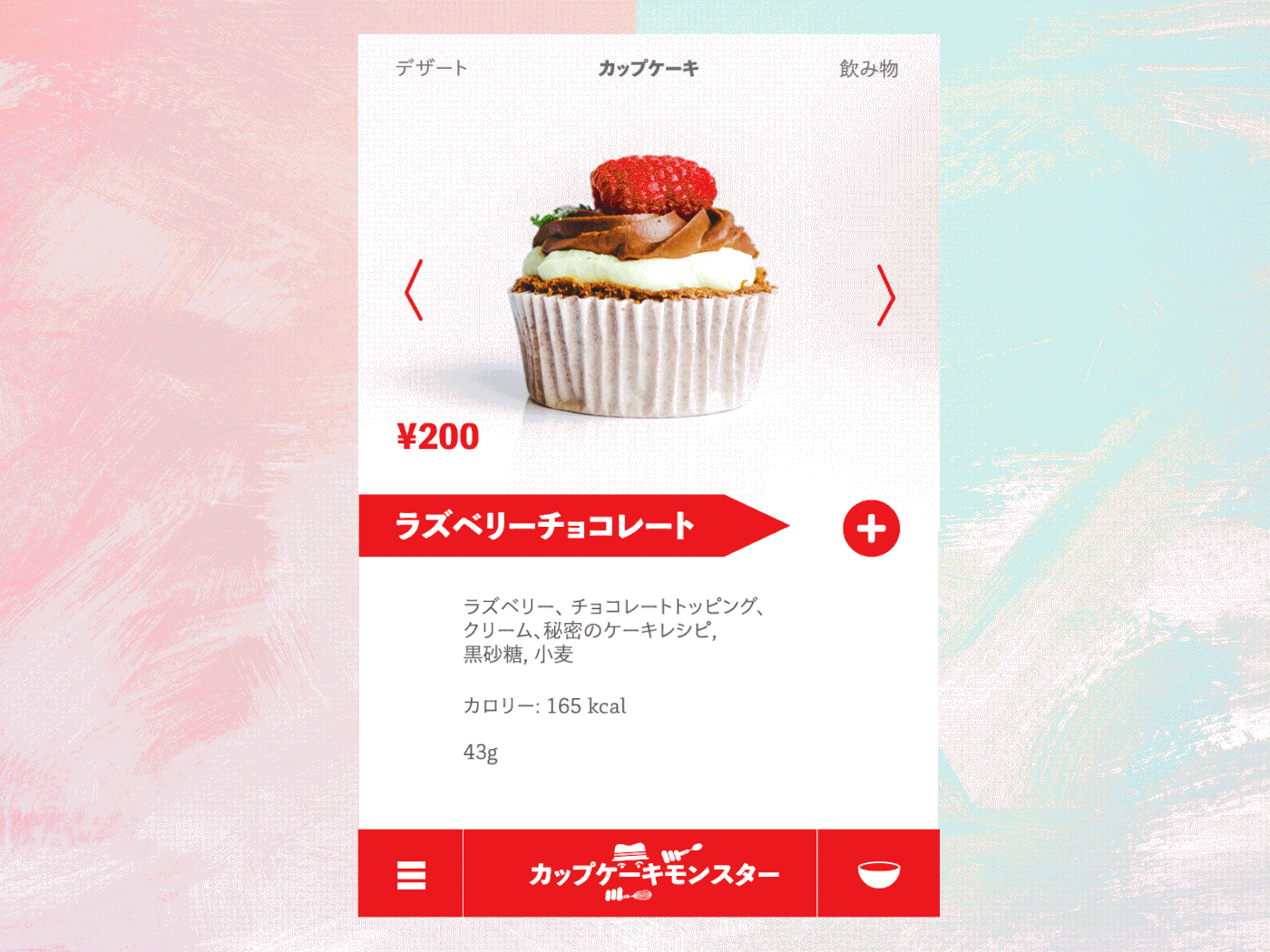
043: Food / Drink Menu
A Japanese cupcake shop "Cupcake Monster" online menu and ordering form. Now craving for some cupcakes.
044: Favourites
Favorites button. Favorites star icon imitating the behavior of turning on a light (turning on the star and adding to favourites).

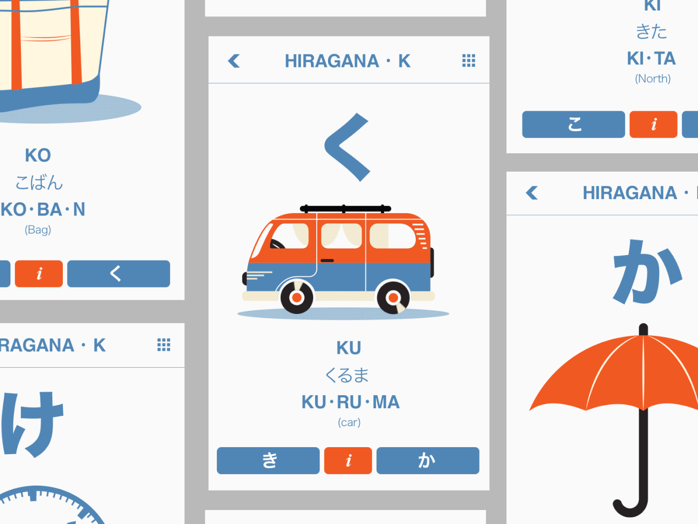
045: Info Card
Info card for learning basics of Hiragana characters. Illustrations with small animations to help and associate each character with an item. Ku for Kuruma, as in car - riding on a slightly bumpy road to success.
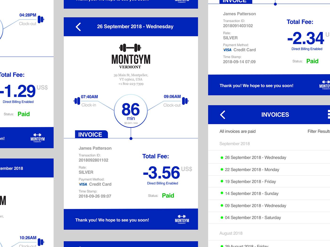
046 - Invoice
Thinking about a gym that charges based on the minutes clocked in and out, similar to punching a work card, in this case the card being a cellphone. Access the gym with an ID / scan on the app.
047: Activity Feed
Activity Feed. Idea for this was to create a web app that tracks keywords or tags from social media sites and updates the view in real time.
048: Coming Soon
Coming Soon page. Characters having a break

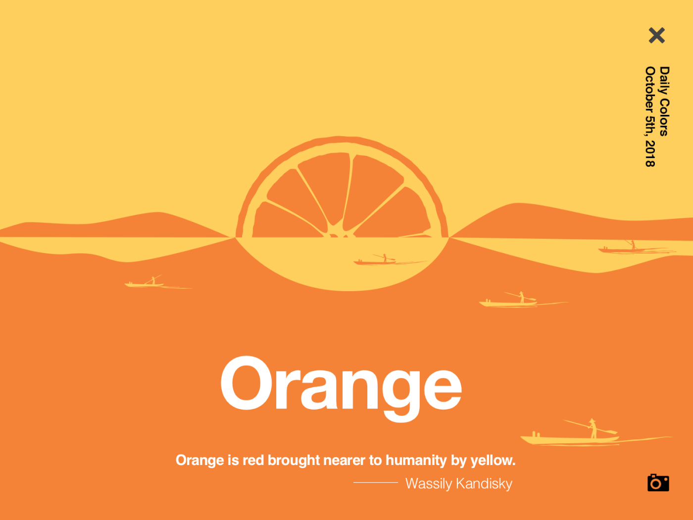
049: Notifications
Notifications. "Color of the Day" - new color prompt with a quote each day. Orange sea experiment
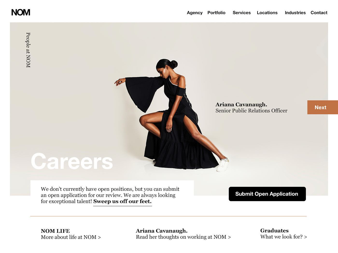
050: Job Listing
Careers page for NOM.
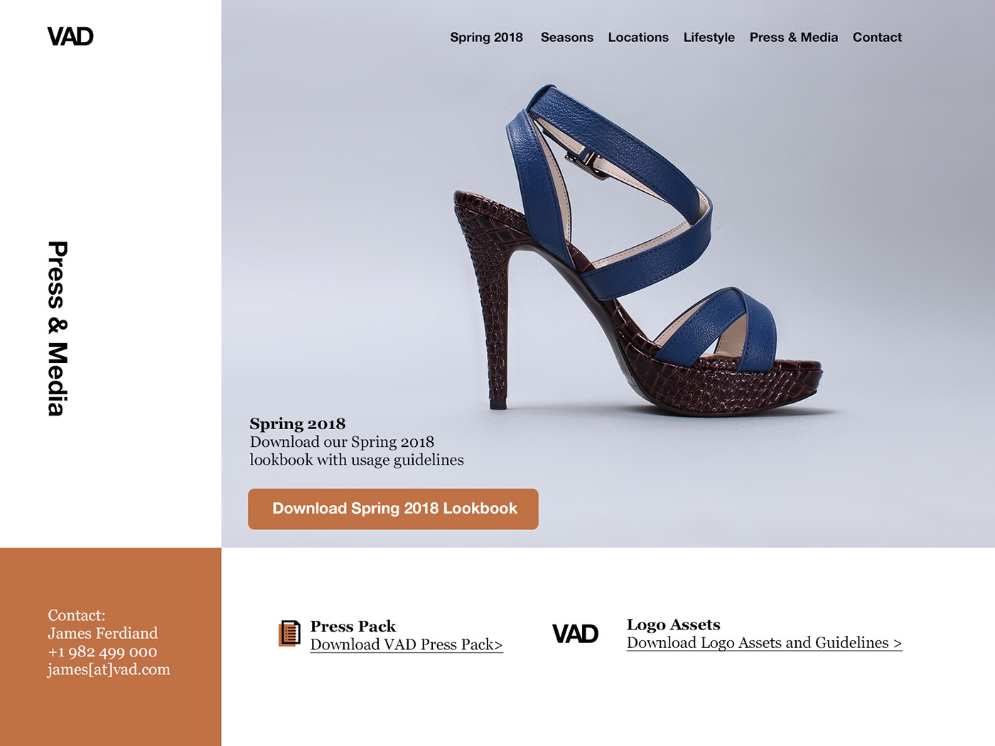
051: Press Page
VAD shoes press and media assets page
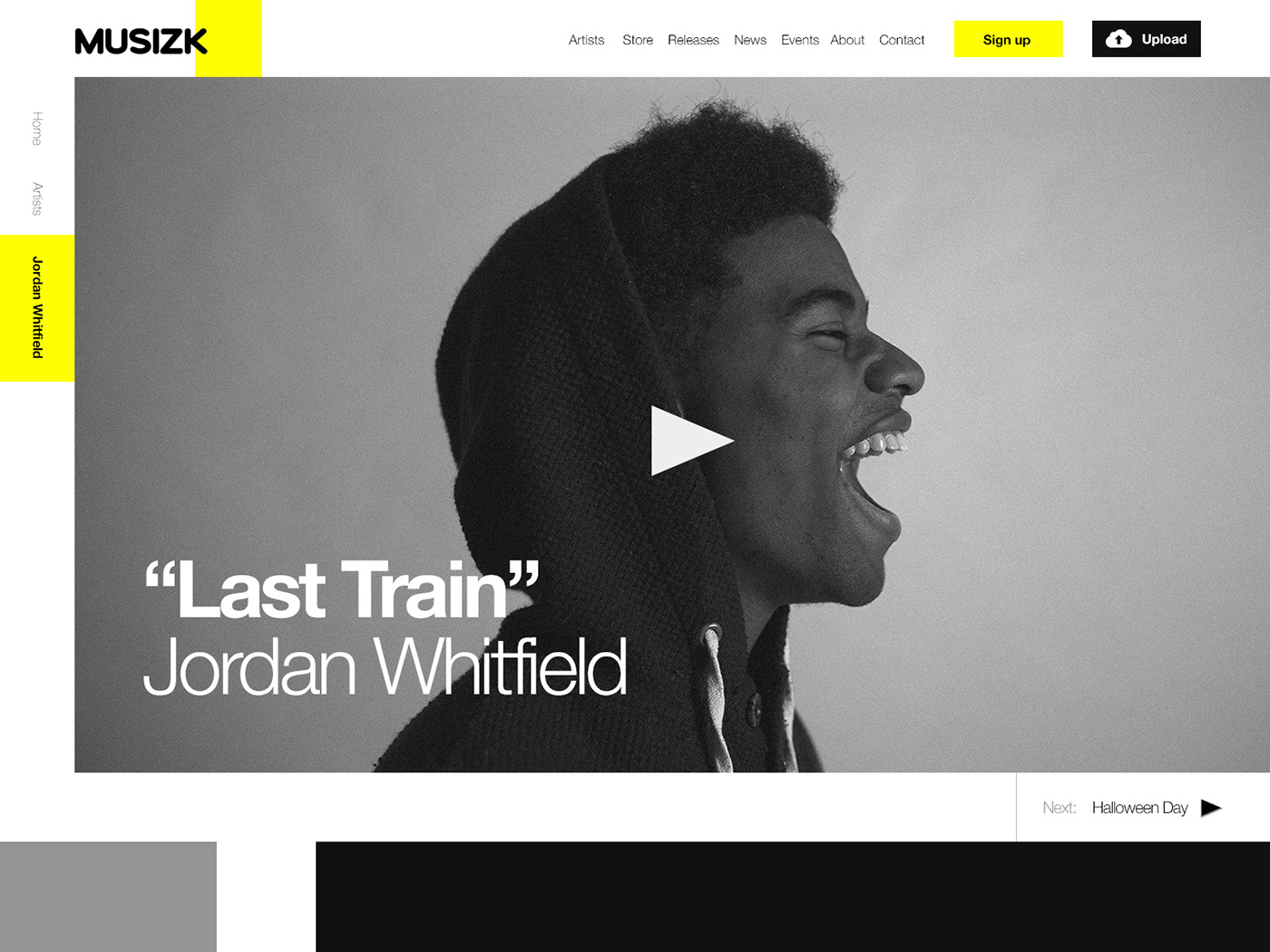
052: Logo Design
Animation emphasising on tag(hashtag) and time
053: Header Navigation
Testing a mega-menu for a toy-store.

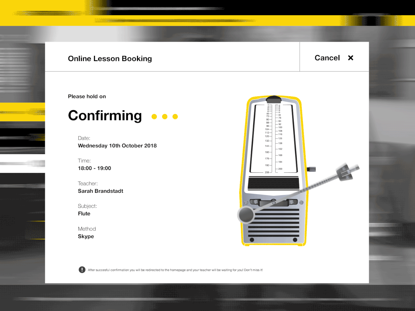
054: Confirmation
A modal/pop-up confirmation screen for booking 1-on-1 music lessons online. Experimenting with a metronome - slightly hypnotizing.
055: Icon Set
A rather random set of various icons

056: Breadcrumbs
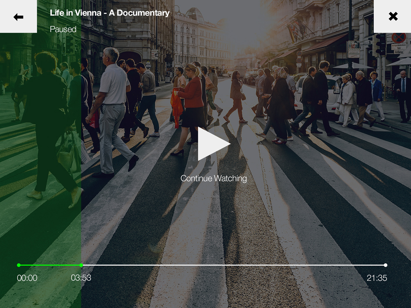
057: Video Player
A Simple Video Player
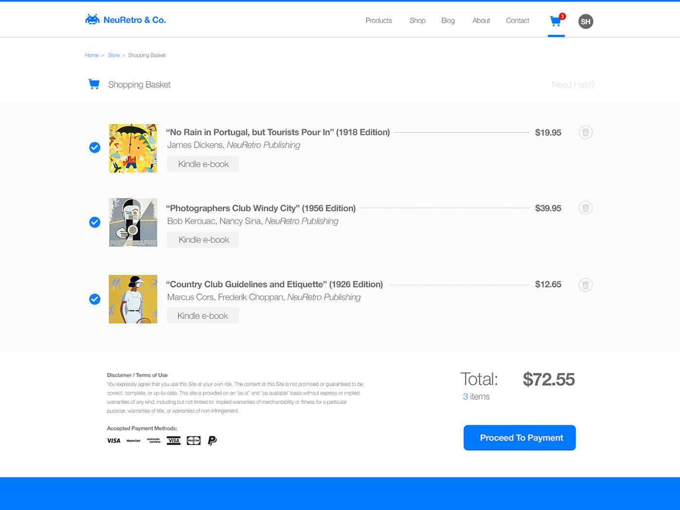
058: Shopping Cart
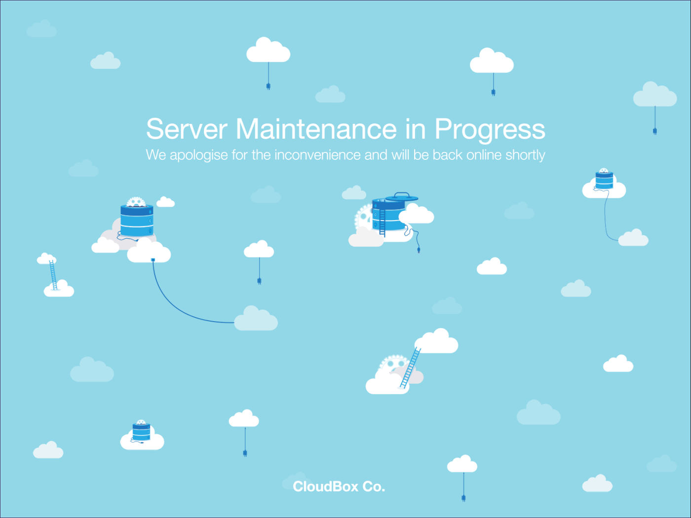
059: Background Pattern
The site's server are undergoing maintenance (in the cloud).
060: Color Picker
An App for picking color codes from images

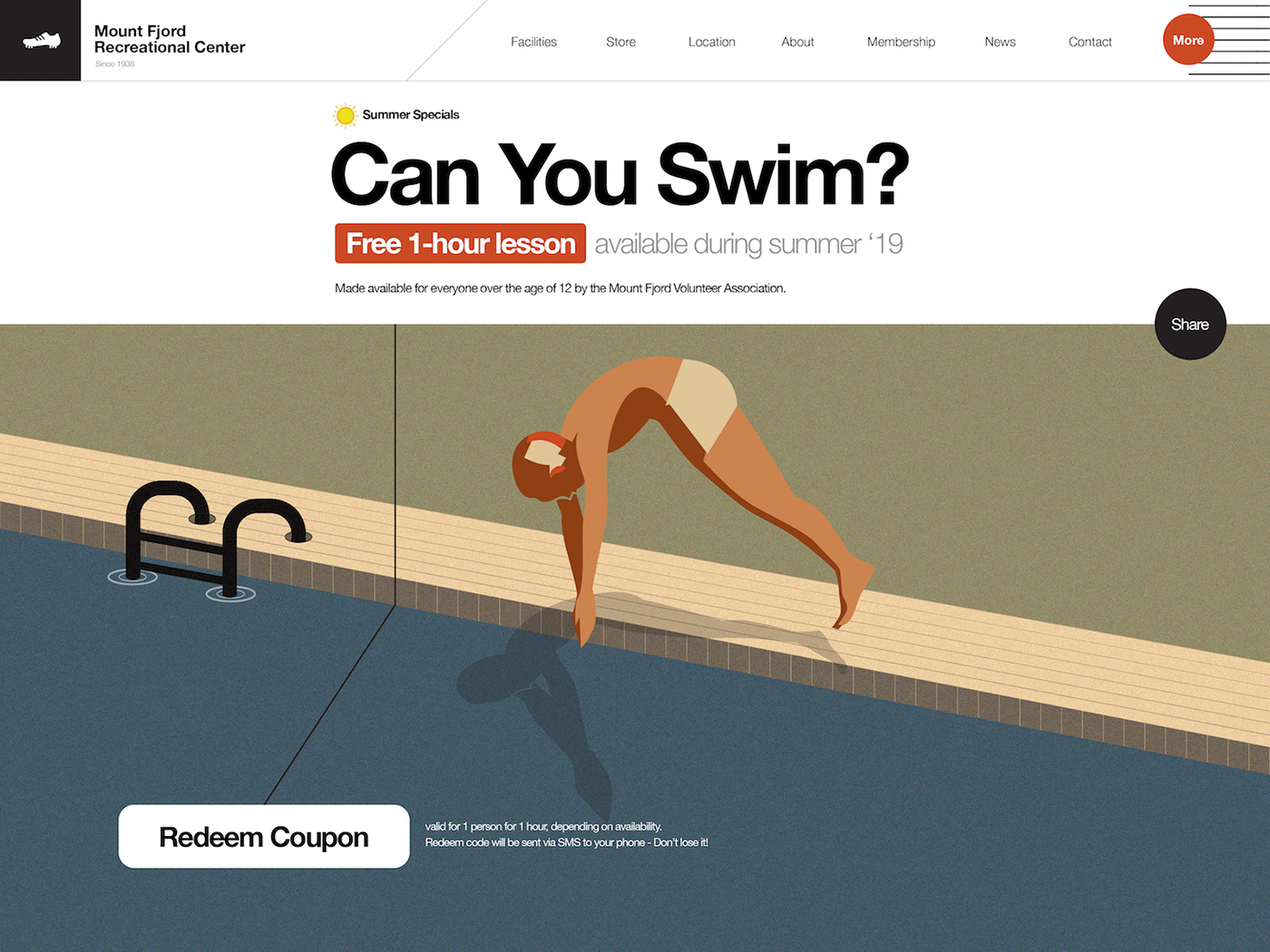
061: Redeem Coupon
Summer is here, so are redeemable coupons
062: Workout of the Day

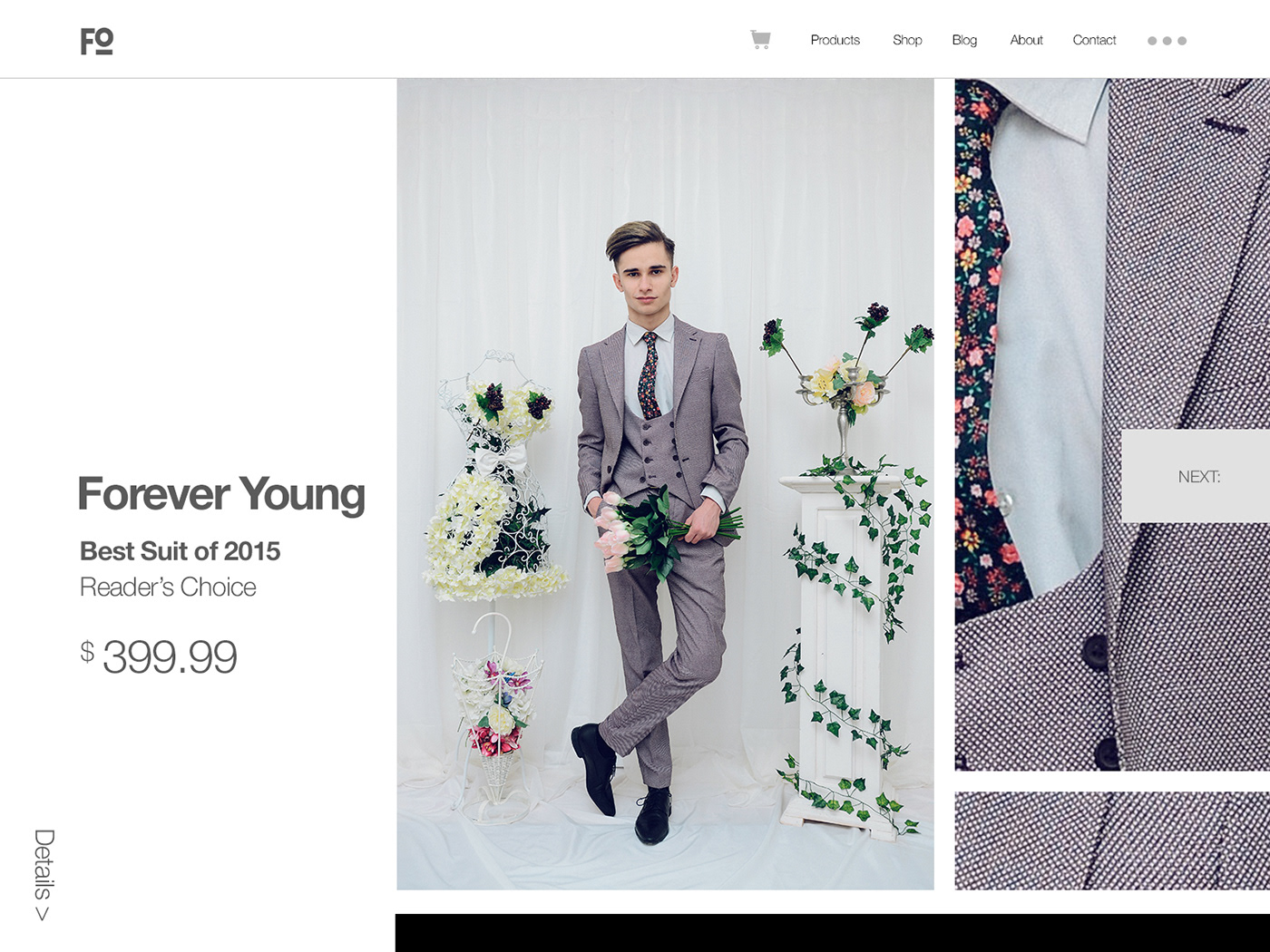
063: Best of 2015
064: Select User Type
Legs and pedaling need a bit more work and had to scale down the colors a bit to keep the file a bit more lightweight
065: Notes Widget
Imagining a bit of a GitHub / version control for music production
066: Statistics
Heart Rate / Exercise Watch App

067: Hotel Booking
068: Flight Search

069: Trending
Day 070: Event Listing

071: Schedule

072: Image Slider
073: Virtual Reality
074: Download App

075: Pre-Order
Christmas calendar for development courses. Pre-order available for 24 hours. New course offer revealed on each day until the 24th.
076: Loading

077: Thank You
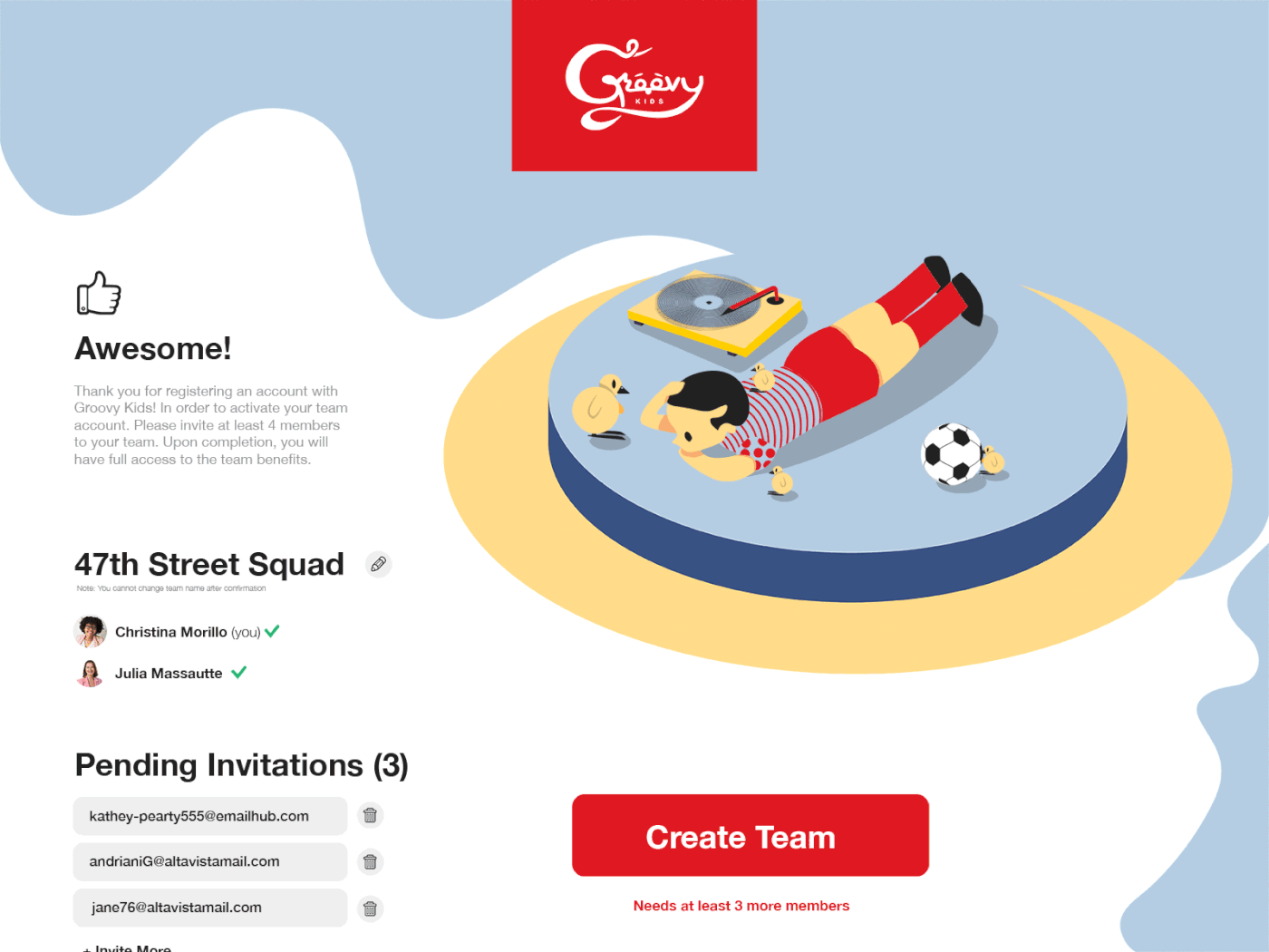
078: Pending Invitation
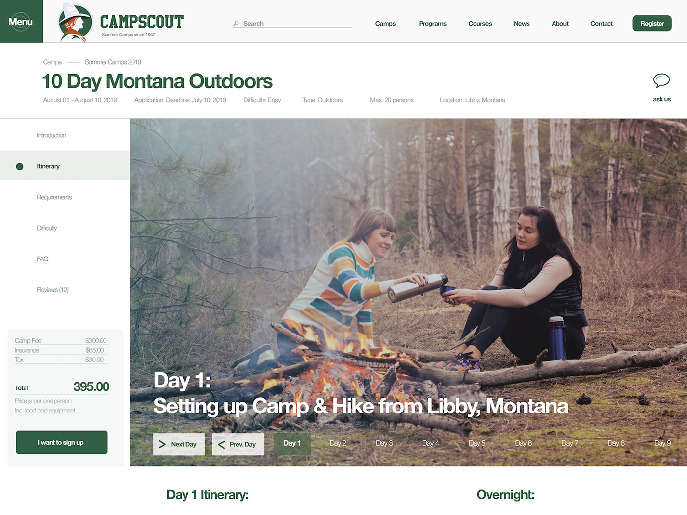
079: Itinerary
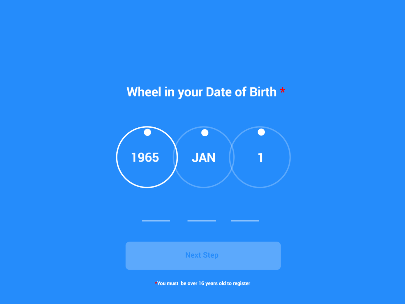
080: Date Picker
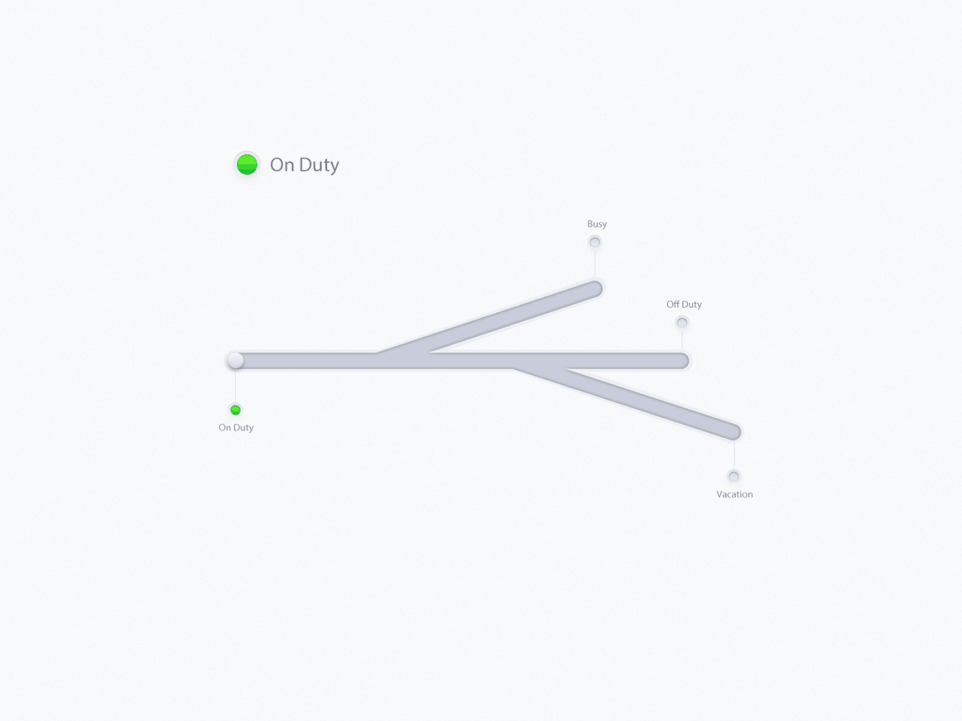
081: Status Update
Thinking about a new multifunction toggle switch, inspiration from car gears. Slightly complex
082: Form

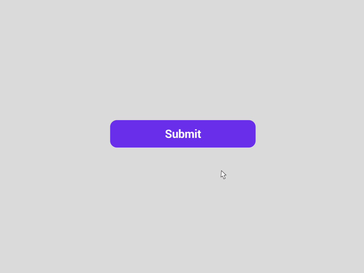
083: Button
084: Badge

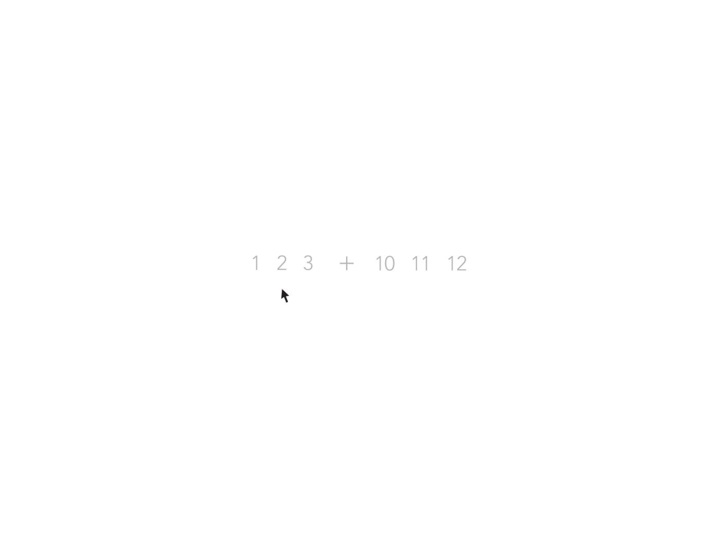
085: Pagination
086: Progress Bar
087: Tooltip
088: Avatar
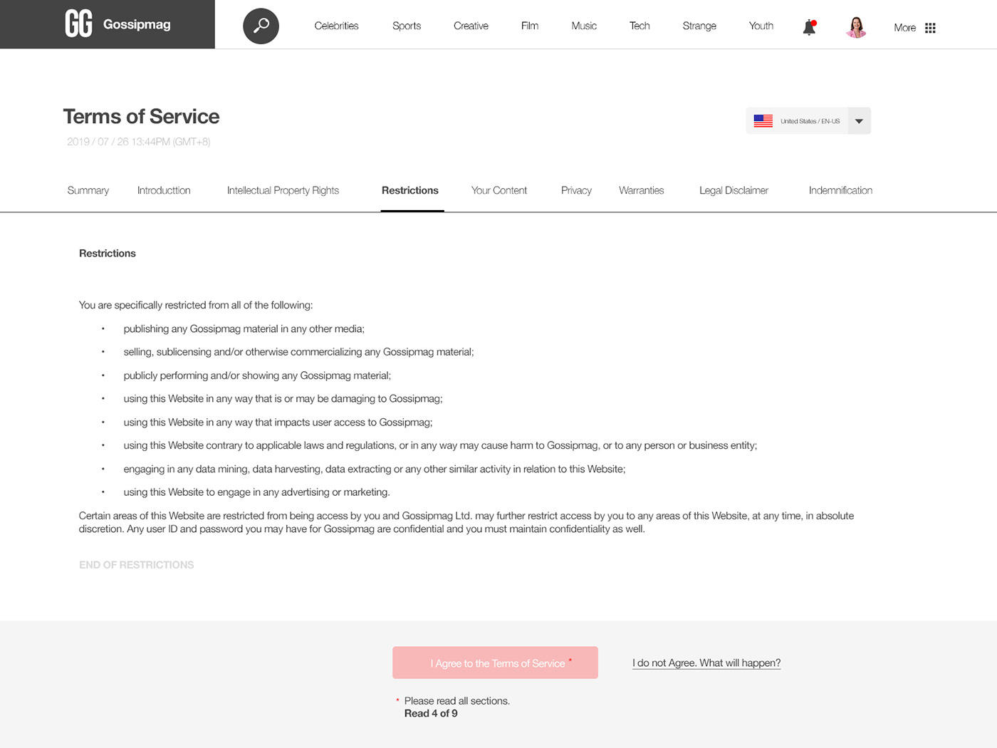
089: Terms of Service
090: Create New
091: Curated for You
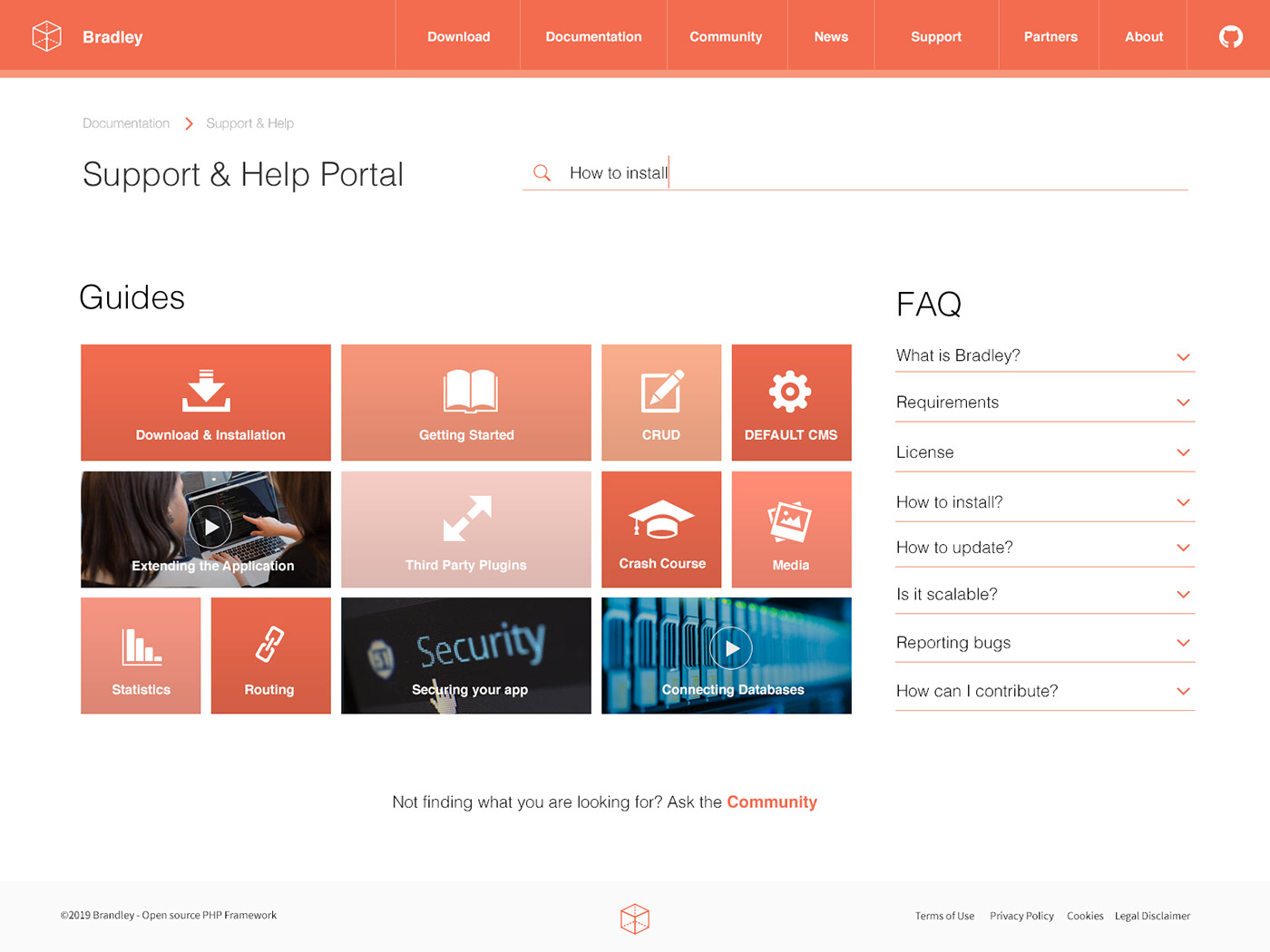
092: FAQ
093: Splash Screen
094: News
095: Product Tour
096: Currently in Stock

097: Giveaway
098: Advertisement

099: Categories
100: Redesign the DailyUI Homepage

That was quite a journey!
On to new adventures!


