


Turning Point Effect Mock-Up & Wireframes 2010
Web interface designed for a custom fitness tracking application, for use with Turning Point Effect training equipment.
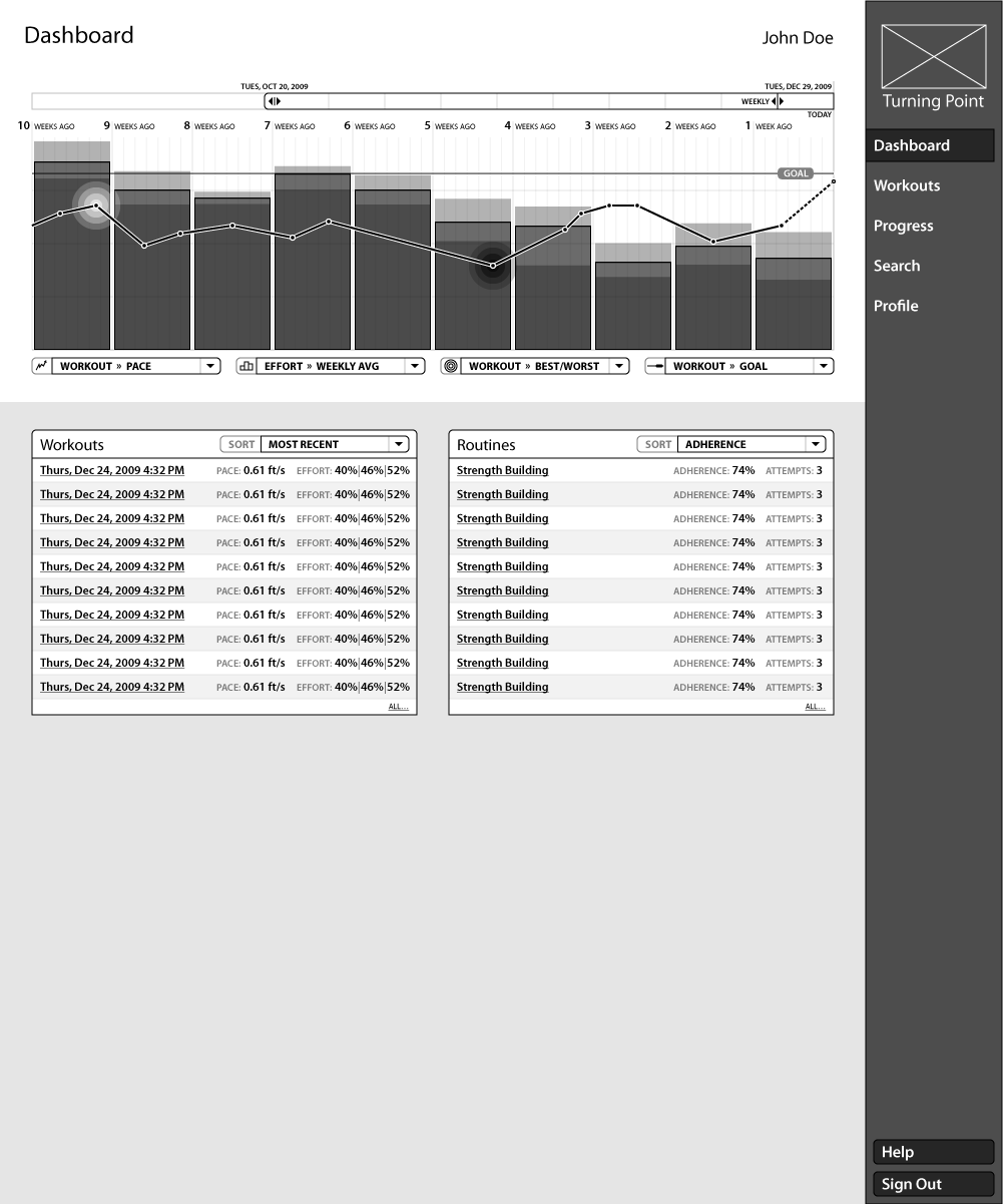
Below, a mock-up for the graphical style, based on the layout of a wireframe further down (ID #2.9.1):

Animated progression of revisions:

◒
Next, wireframes which lay out pages for most of the major pages and states of the app. Page access levels, individual pages, and page states, are denoted by “major.minor.sub” numbers, with a page description next to the number (top left corner). Orange drop-shadowed bubbles and outlines dictate further explanation in the right-hand gutter.

Workout Routine Results (Patient-side)
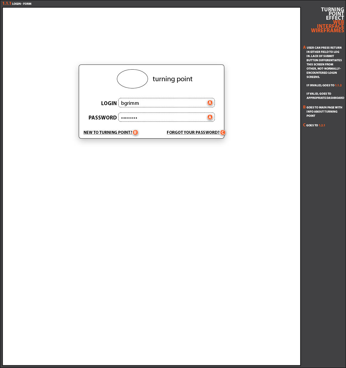
Modal Login Form

Dashboard (Patient-side), with interactive history graph and tooltips

Dashboard (Patient-side), with different graph data toggled on

Patient Workout History (Trainer-side)

Patient Workout Plan Detail (Trainer-side), in create mode
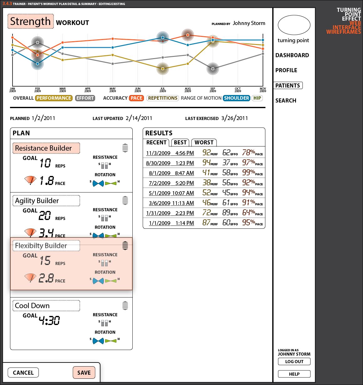
Patient Workout Plan Detail (Trainer-side), in edit mode, with plan being reordered
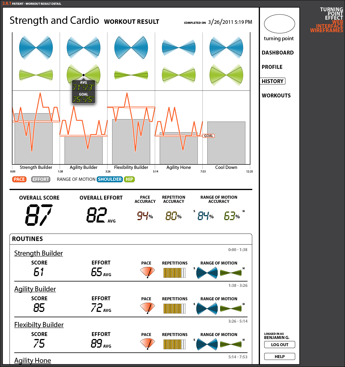
Whole Workout Results (Patient-side), with graph tooltip

Patient Profile Screen (Patient-side), with pending changes for restricted fields

Patient Profile Screen (Trainer-side), in edit mode, with trainer search dropdown
◒
Finally, a more-accurate wireframe style that the project was started with.
We decided to simplify it to the very blocky, simplistic style in the other wireframes above in order to limit discussion about design details and keep all stake-holders focused on the organization and layout of information.
◒
Tools: Illustrator for the graphs, InDesign for the wireframes, Photoshop for the mock-up
Work it baby, work it.


