Enough is Enough Anti-Violence Movement
Rebranding
Brief | To redesign the identity of Enough is Enough Anti-Violence Movement Inc.
Process | From initial consultation with the client, it was established that the organisation’s current identity was no longer relevant to their cause and a new identity was required in order to take them forward into the future - allowing them to stand strong as a brand after their current figurehead had retired. This was an important factor as their image had been heavily reliant on the person themself as opposed to their logo.
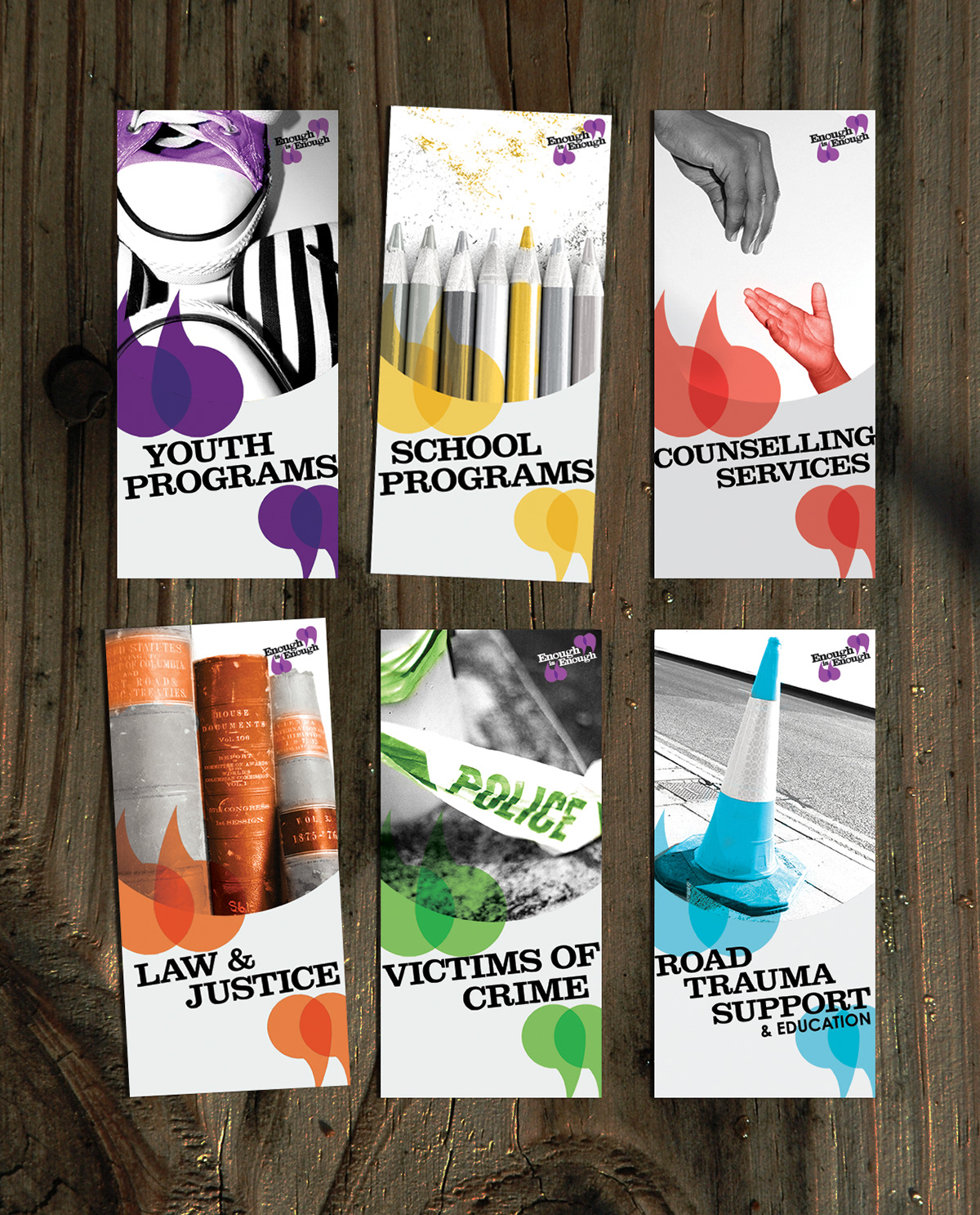
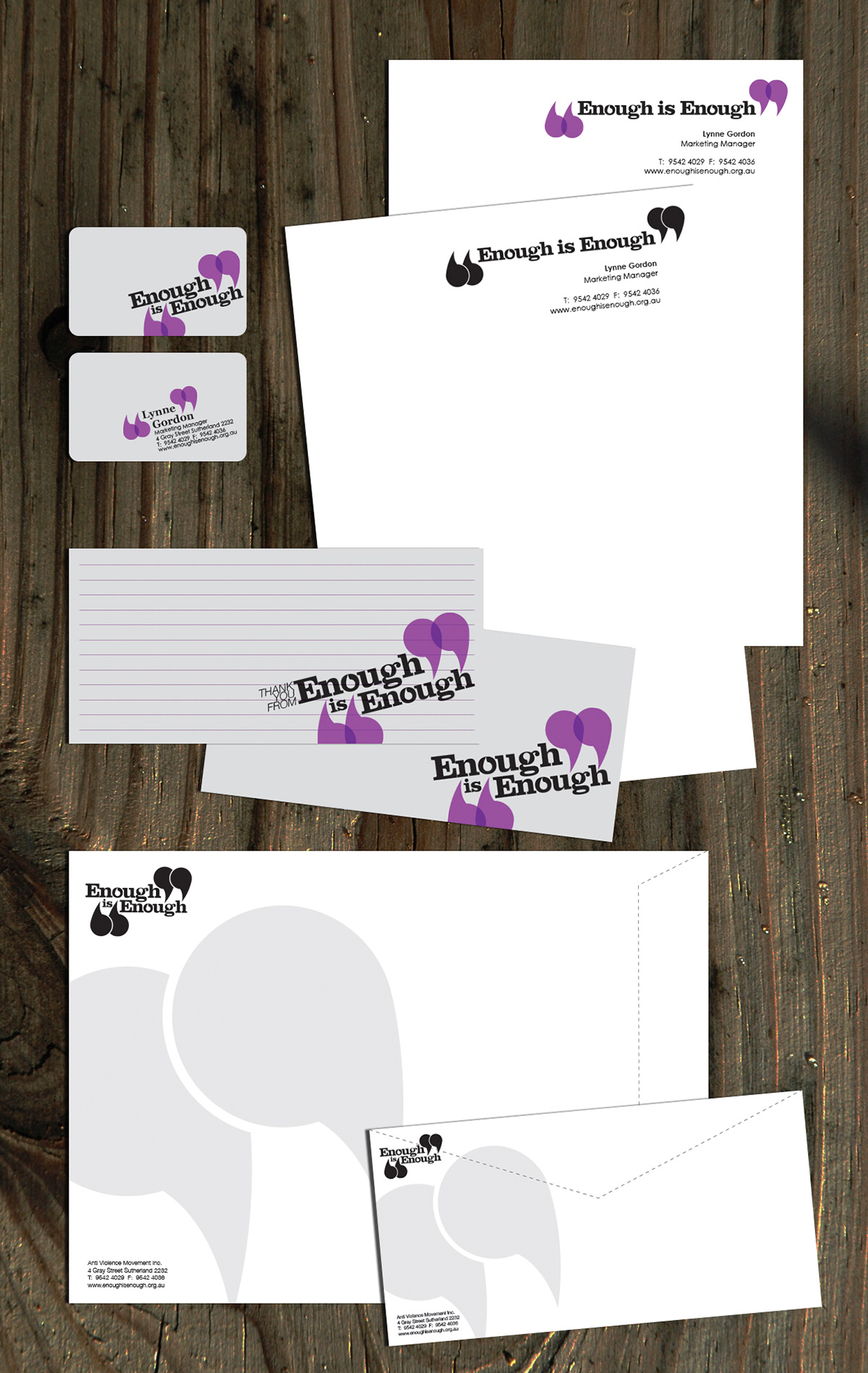
A key aspect of this project was to ensure uniformity amongst their publications, as their current collateral was inconsistent and was working against their ability to grow their recognition. Several refined concepts were presented to the client each approaching the task from a different angle, from the typographic
to the more symbolic.
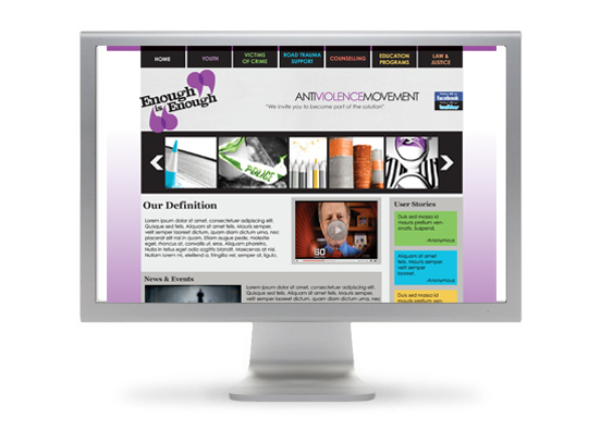
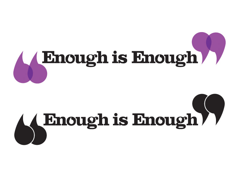
Solution | Enough is Enough is a not-for-profit organisation which provides counselling for victims of abuse, road trauma and crime. The new logo was symbolic of the core feature of Enough is Enough, communication, while the main brand colour being drawn from the roots of Enough is Enough, in memory of Michael Marslew who was the inspiration for the founding of the organisation.
Thus, the overall identity embodies a combination of versatility and practicality, addressing a main concern of the client, which was to make sure that the new logo was flexible enough to be used across a diverse range of formats, while still holding real symbolic value.
I worked on this project as part of a three designer team where we all shared equal responsibility and each contributed to the design process.
The Logo


Brochures
Stationery
Brand Manual


Website