Ektipotiki Axion Print House
A rebrand worth the paper it's printed on
The story
We have known ‘Ektipotiki Axion’ for quite some time and have entrusted them with the printing of most of our projects, especially the ones that require a lot of attention all around. ‘Ektipotiki Axion’ is what you’d call a ‘boutique printing house’ with 50 years of experience. So we couldn’t hide the excitement on our face when Eleftheria, Ektipotiki Axion owner, asked us to work on the company’s rebrand.
The logo & the visual identity
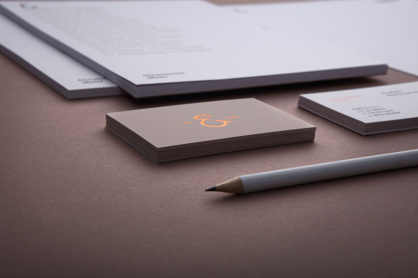
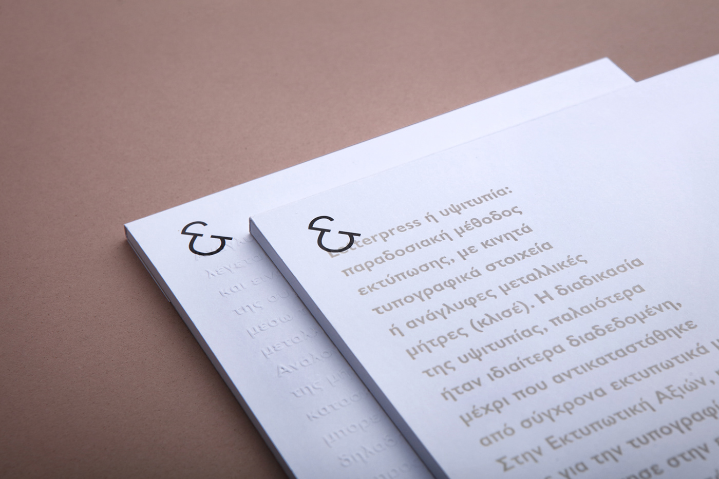
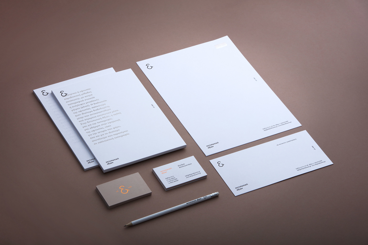
A close look into the company’s logo reveals the combination of ‘E’ and ‘A’ which stand for ‘Ektipotiki’ and ‘Axion’ respectively,forming an ampersand. The decision to create an ampersand-looking symbol is also based upon the company’s long history, considering that in its early days Ektipotiki Axion was printing using metal letterpress blocks, when typography was very much intertwined with printing. Besides its intriguing typographic character, ampersand symbol is a visual interpretation of the Latin ‘et’, which translates to ‘and’, revealing a plethora of services offered by the printing house. Lastly, the typefaces used gives this logo its sense of modern classic.
The visual identity design represented a good opportunity to display the company’s skills and special techniques to potential customers. More specifically, the ability to foil stamp is shown through the business cards while the two types of notebooks showcase letterpress printing and embossing-technique respectively. Therefore, the overall image is that of a boutique printing house with a fresh eyes approach that is also rich in history.