A production of digital layouts in InDesign
We were asked to design Magazine layout inspired by Swiss Style.
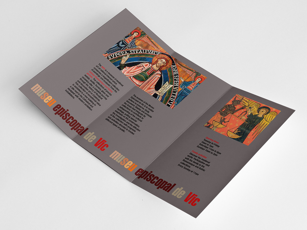
I created a couple of Tri-Fold brochures for Museu Episcopal de Vic (Barcelona).
I used some of the principles of the Swiss style such as whitespace for visual impact and readability, as a great example of the "less is more" principle. Typography (as one of the most fundamental elements of visual communication) and use of Sans serif type: I used Helvetica-Extra Compressed for the titles and Helvetica-Condensed medium for the content in brochure 2 and Folio BT Bold for the titles and Folio BT light for the content in brochure 1. Photography as part of the design and Grid system for page layout.
1. TriFold Brochure


2. TriFold Brochure