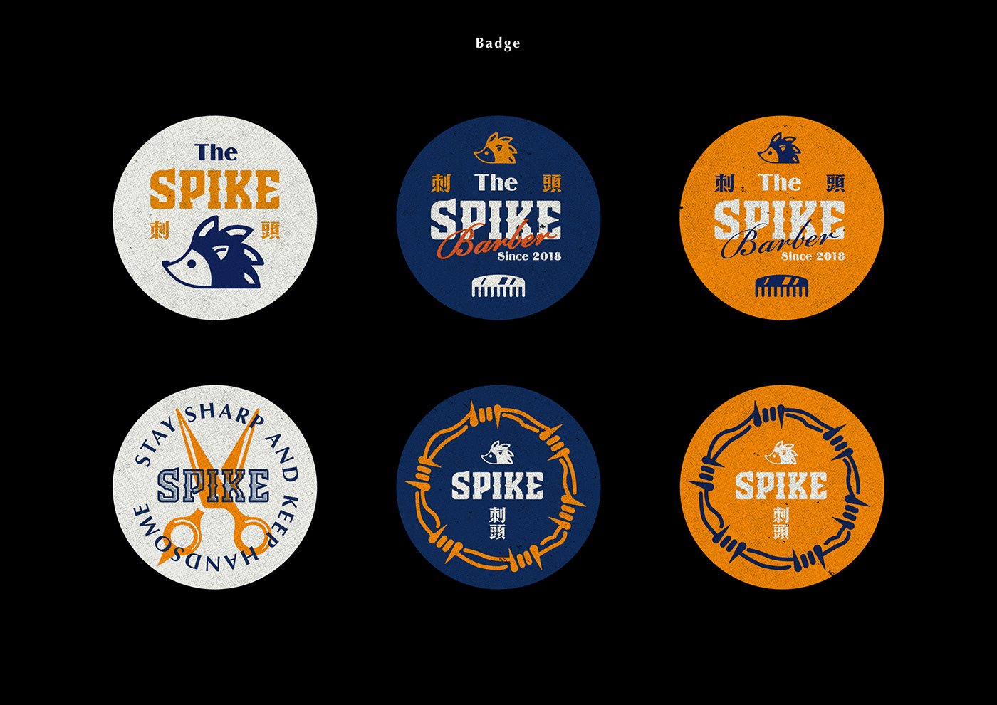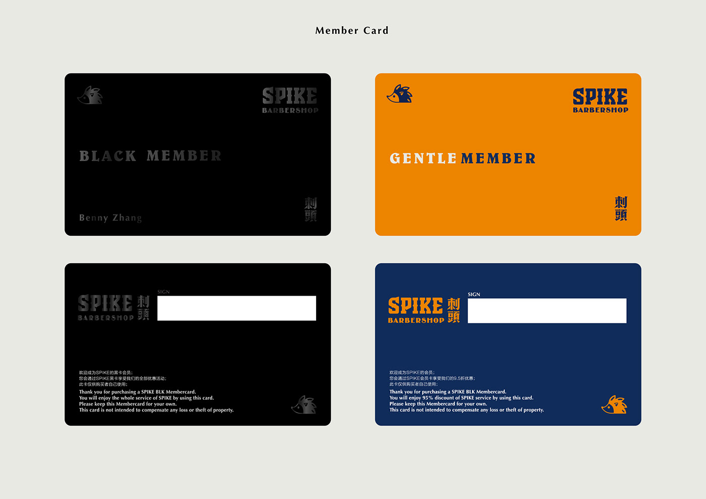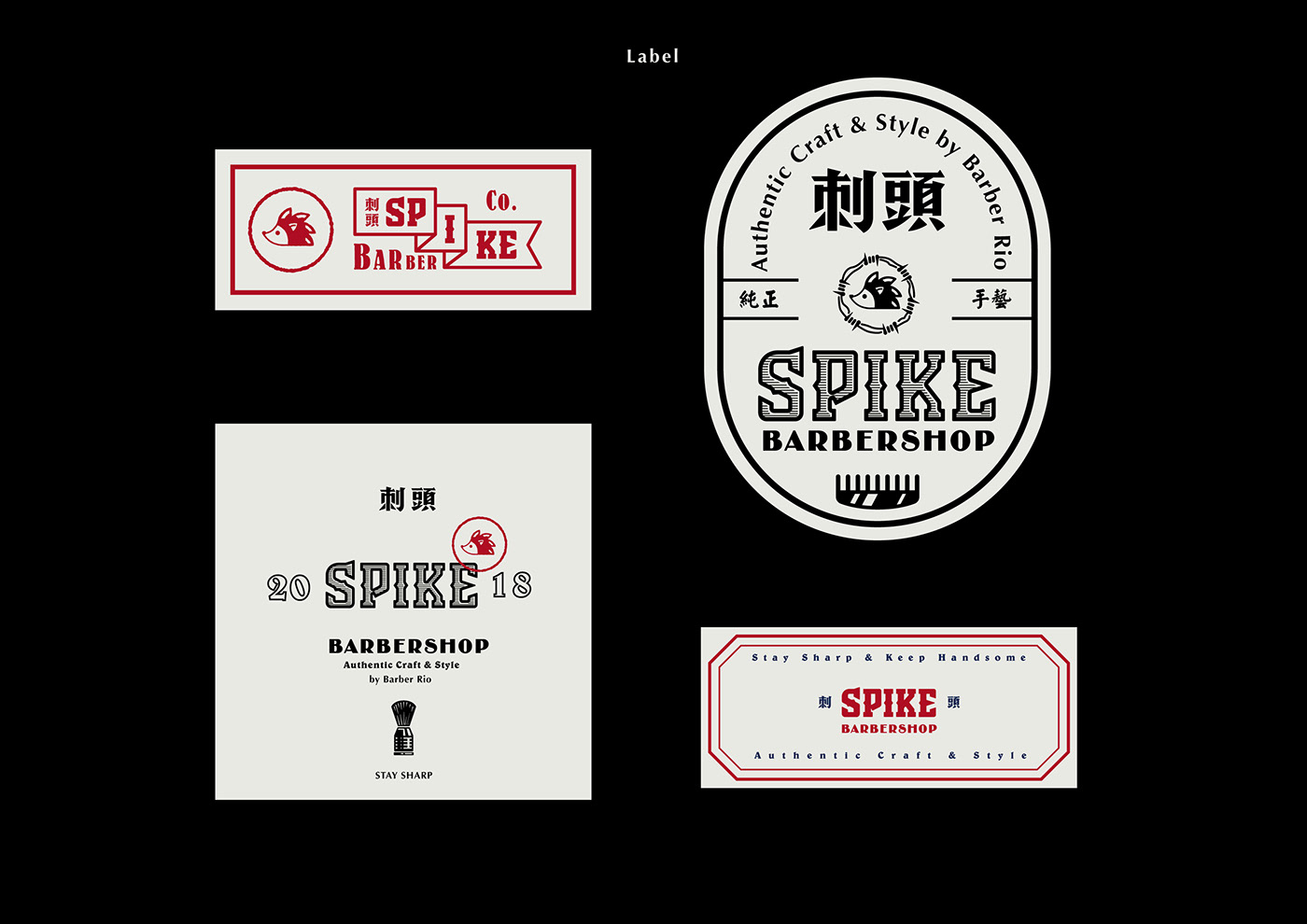
刺头SPIKE Barbershop 是好友Rio的新店,此次委托我为该店进行品牌识别的基础视觉设计,并且希望新的设计能够在传递美式Barber风格的同时,也能在国内一众Barbershop品牌中脱颖而出。图标方面采用了“刺猬”的形象,呼应了“刺头Spike”的概念,另外在中英文的logotype上亦融入了“刺”的形状。在品牌的延展上,我舍弃了传统美式Vintage风格的复杂花纹,仅制作了有限的基础图形来进行多样化的编排,目的是为了让品牌形象能在传达美式风格的同时更能保持着干净利落的视觉效果。
此项目仍在进行中,后续会有更多有意思的延伸品设计。
刺头SPIKE Barbershop is a new barbershop owned by my friend, Rio, who asked me to design a brand new visual identity for this new shop. Rio wants his brand to deliver the American barber style and also to be unique among the brands of Barbershop in China.
I chose the image of a Hedgehog to be the logo of "Spike", which I think that this lovely animal can express the meaning of "spike". Also, I used the shape of thorn when I designed the English and Chinese logotype of 刺头Spike. Overall, I hope to build up the image of "SPIKE" by using specific graphic elements.
In the process of designing the brand extensional materials, I gave up the traditional Vintage style pattern and decided to design several basic graphic elements, which could represent the brand image, and tried to composite them in various ways, in order to express the style of American vintage by keeping the visual identity Clean and smooth.
This ongoing project will be more attractive in the near future, by designing the various extensional product and graphic.


