


Academic Project | Graphic Design · Branding · Editorial
Bilen is a made-up book publisher specialized in music textbooks and didactic material. Their products are thought to be used by all the bilingual education programmes in Spain, in which the main goal is to master the foreign language by understanding it as a tool, a communicative vehicle.
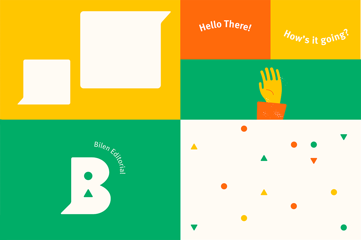
The name, Bilen is created by puting together the words bilingual and learn. When creating the logo I realized that the letter B was the perfect element as it already looks like two speech bubbles that are connected. The counterforms of the original letter were replaced by a circle and a triangle, and represent a message in the mother language (circle) and the foreign language (triangle).
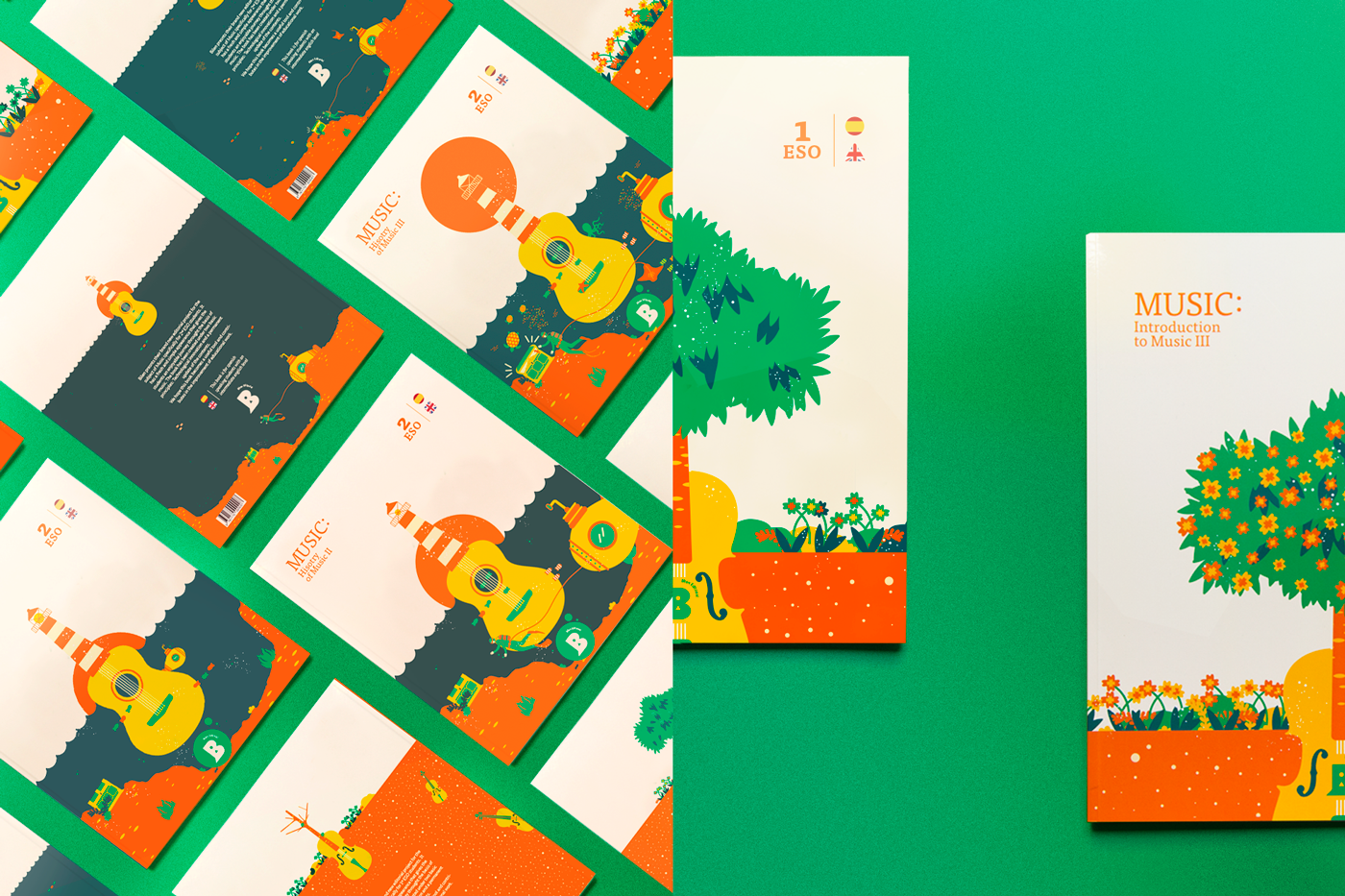
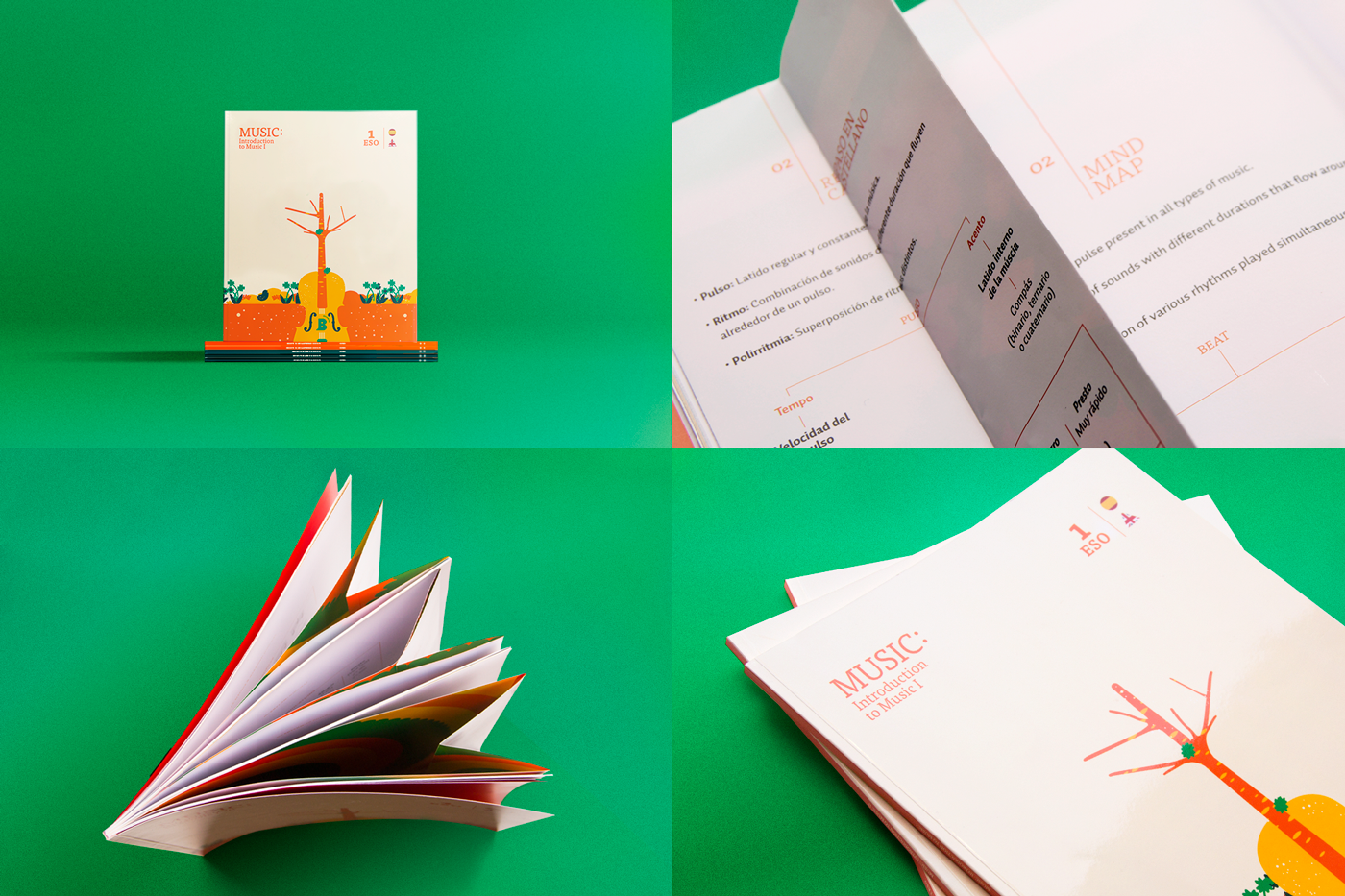
Let's now focus on the book. To achieve the goal of the brand, we created a series of books, divided in three volumes each. The content of each volume corresponds with the units of each semester; that way the weight of the backpack is reduced. The pages have a clean design in which small vectorial illustrations are combined with a youthful yet simple and transparent typography that keeps a happy mood along the lessons without catching too much attention, so as to help the content to stand out. The books also include summaries in Spanish at the end of each unit to assure the comprehension of the contents. Those are strategically placed so the reading of the book isn’t interruped but they aren’t ignored, something that tends to happen when they are placed at the end of the book.


© 2018