Five years ago, “Design Alive” – a quarterly on product, architectural and interior design was created. Twenty issues later, Hopa Studio was asked to co-create a new look for the magazine. “Design Alive” became the new “Da”, broadening its target audience and changing its visual aspect. We were in charge of the rebranding and of the new systemic layout.
Our task was to create its visual aspect from scratch, while keeping the attributes of the previous version: its form, paper and number of pages; to create the system and solutions for the regular sections; to retain the typical elements of the magazine: market reviews, feature articles and reports on fairs and events, and to propose an attractive form for them.

First, we received a set of information, which became the essence of the brief. The magazine discusses design in an unobvious manner and combines it with culture. The tagline ‘Things about Us’ imposes a certain type of narrative, humanises it. Previously, “Design Alive” focused on the design industry, chiefly on products and architecture.
One of the principles during the creation of DA’s new version was to go beyond the design industry; to organise, discuss design in a comprehensible manner, using an accessible visual language; to show how the design world permeates into other parts of our lives. The woman became the focus, largely determining the work on the new identification.


We wished to create a brand whose visual attributes would encourage one to read the magazine, not just browse through it; to set the magazine in the world of a woman who is interested in the story of an object being created, instead of the technical, specialist side of the creative process. However, we had to remember that we were creating a magazine, not avant-garde.
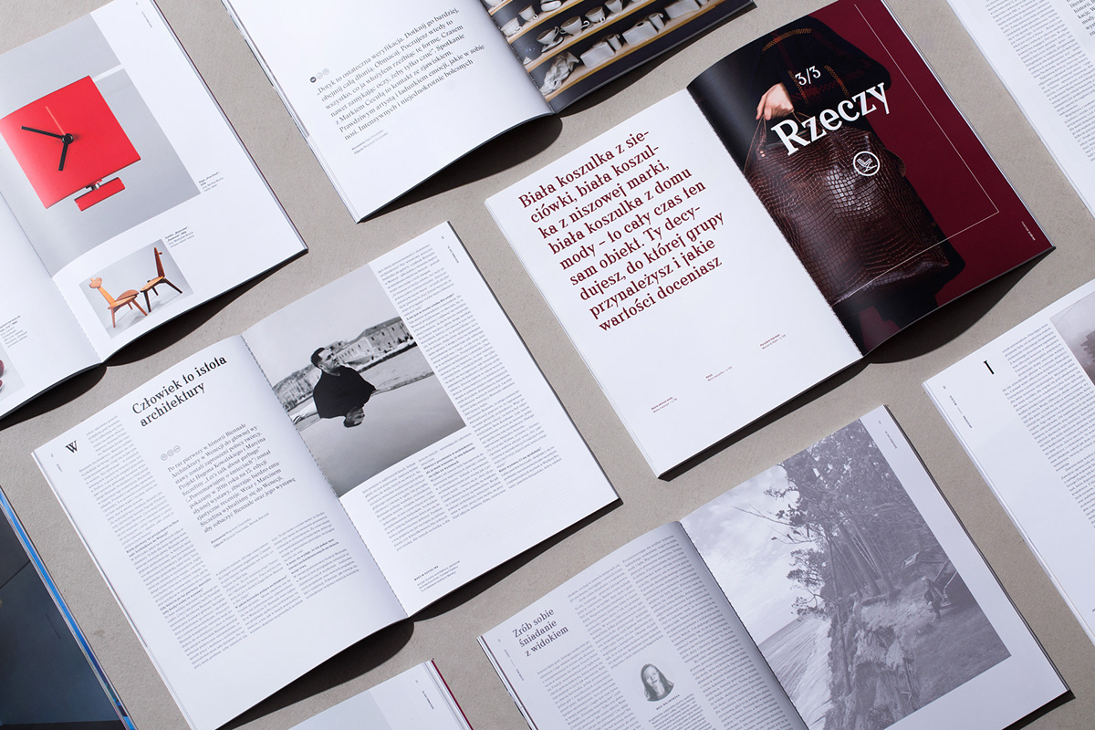
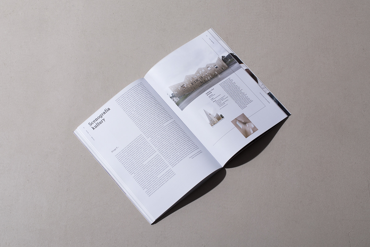
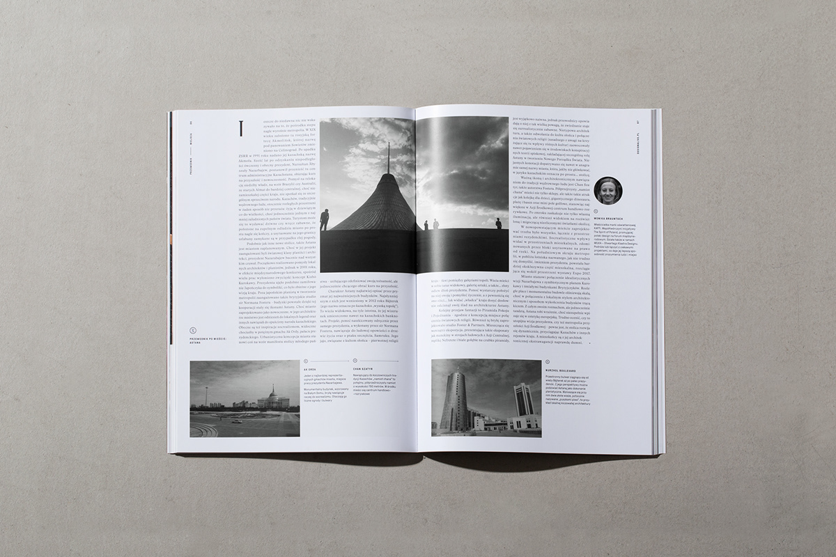
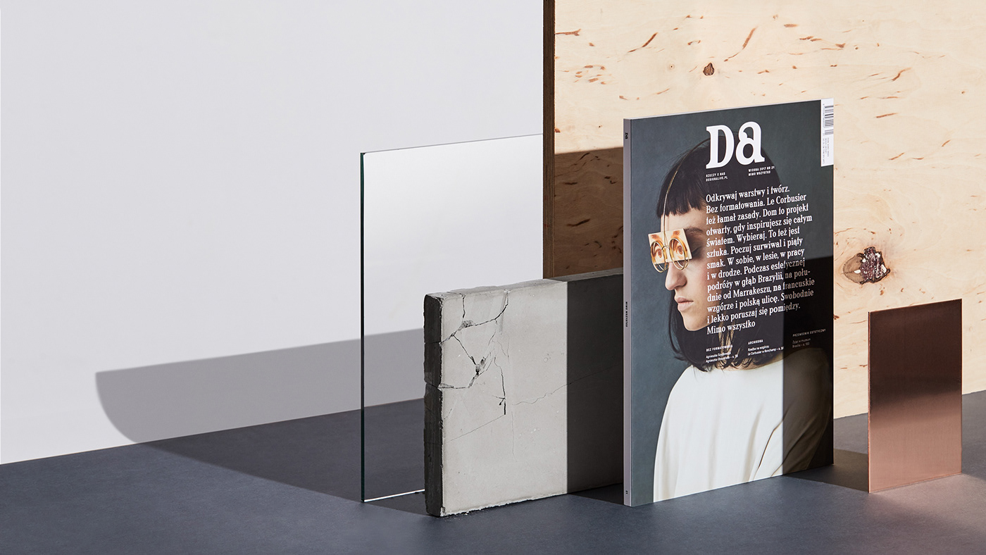
Therefore, we were inspired by books. A book symbolises an interesting story, knowledge, time and experience, and the opposite of fast online forms. We placed an open book in the magazine’s world. The body of the articles retains the attributes of the book. Other solutions, which are more magazine-like, form around the book.
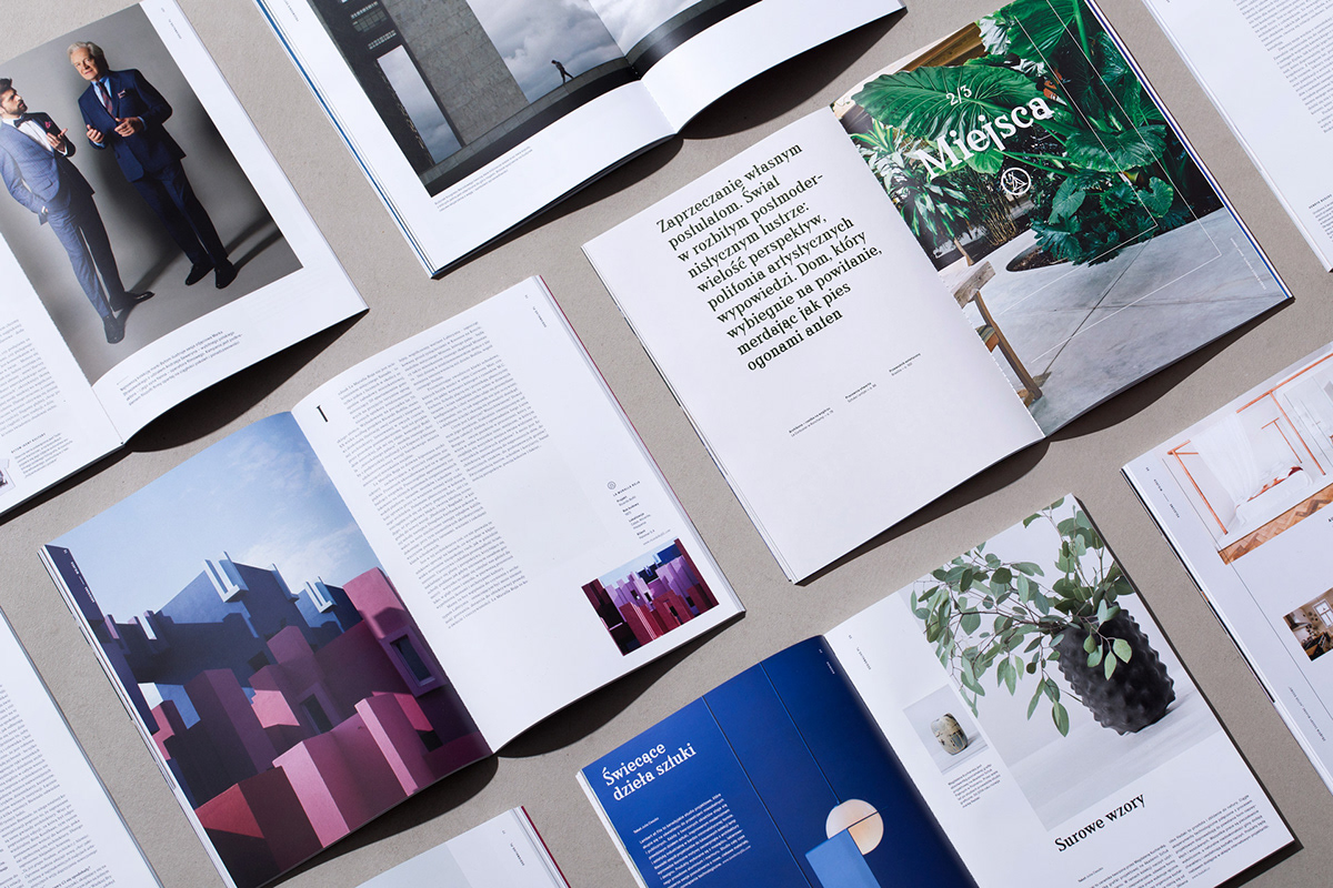
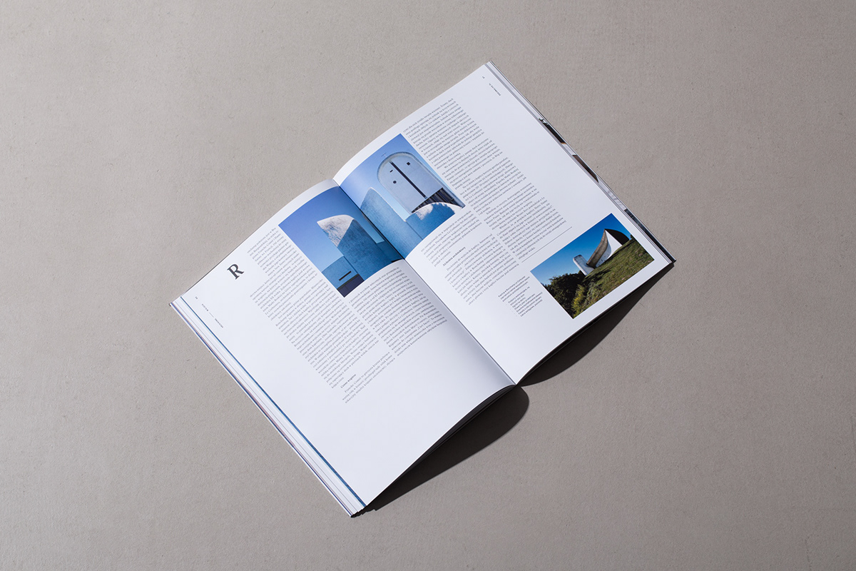
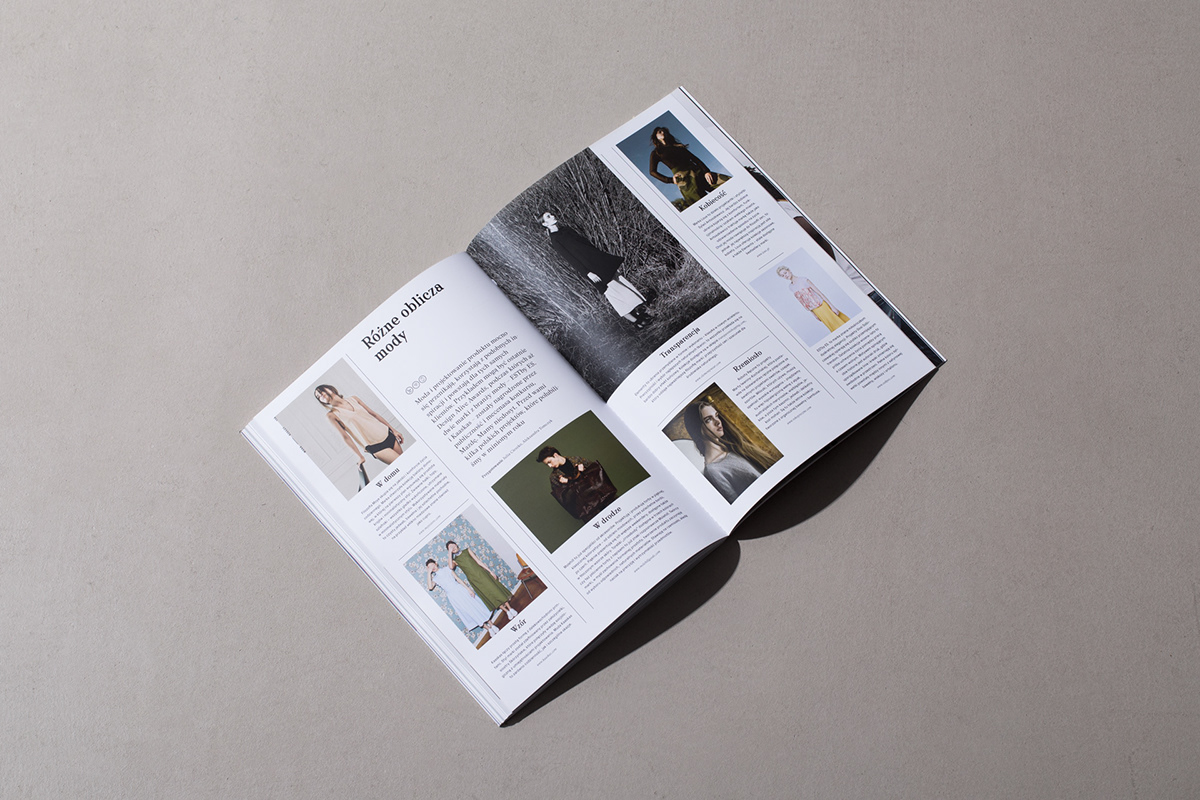
We began our work by building a grid, on which we outlined 3 formats symbolising an open book. Format – i.e. the working space for the body of the text, around which we place descriptions and smaller photographs in the margin. Depending on the section in which the reader finds themselves in, there is a gradation of various journalistic forms.
One of the items in the brief was to organise the topics discussed in the magazine into 3 worlds, through a visual division into people, places and things. We proposed separators – section introductions, which became the navigation for the magazine. As part of the identification and navigation system, we proposed a set of icons, creating a visual commentary on the contents of a given journalistic material.