Life is a race. Refuel!
Before the rebranding, the fixed price fast food restaurant chain -PitStop– offered their customers a typical range of services – express service, fair prices, and a wide range of meals. However, this is insufficient for the present-day competitive market – hundreds of restaurants try to win customers with the same benefits. In addition, conventional design and the lack of an integral image did not help the matters – -PitStop– didn’t stand out and couldn't establish adequate communication with its target audience.
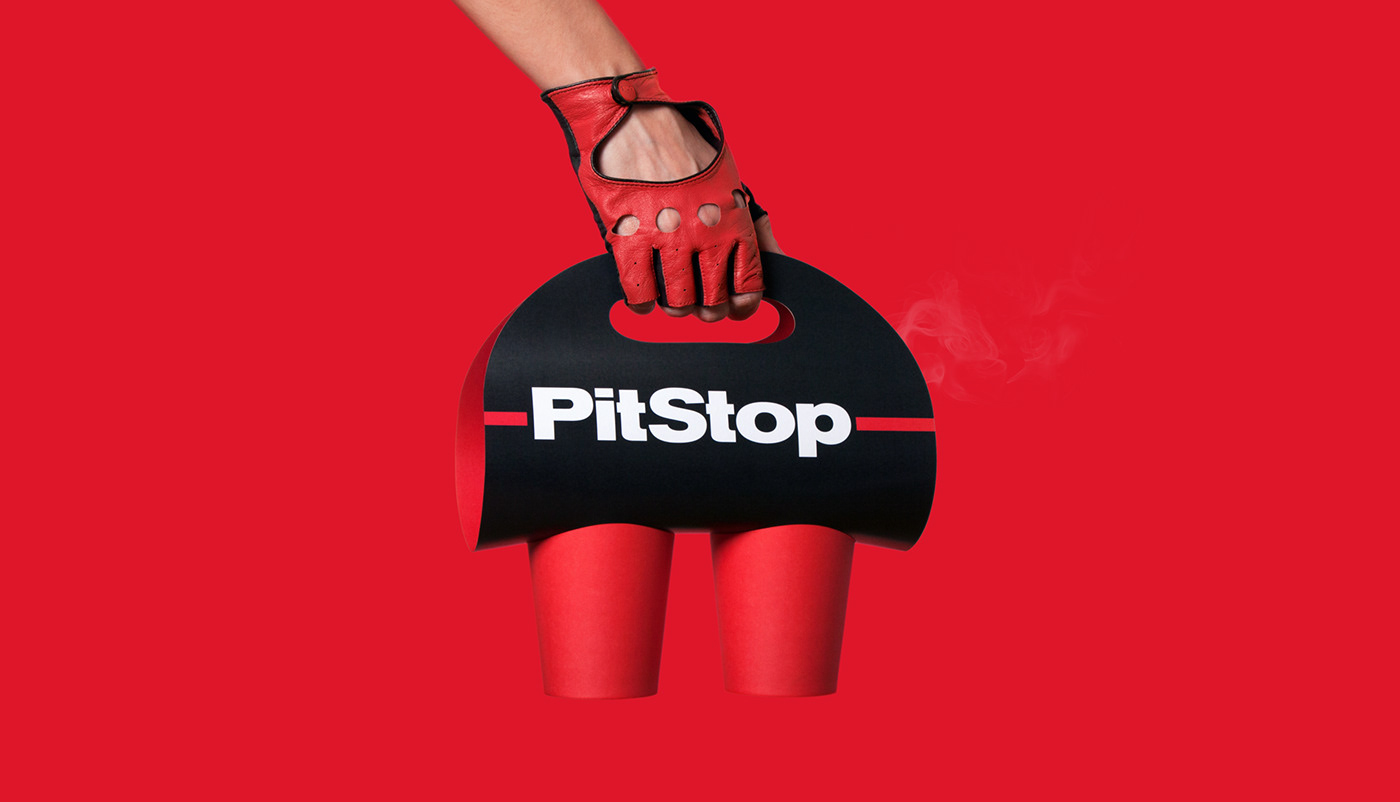
The new identity reflects the metaphor inherent to the brand name: big city life is a race – -PitStop– helps you refuel fast and in good time. This simple comparison communicates the idea of the chain to the customers. Pit stops for refuelling and service of vehicles during a race and ‑PitStop– restaurants for refreshment of people in the hustle of the city.

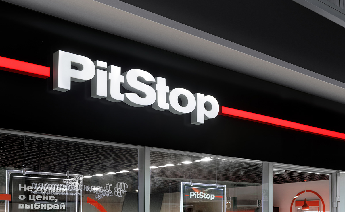
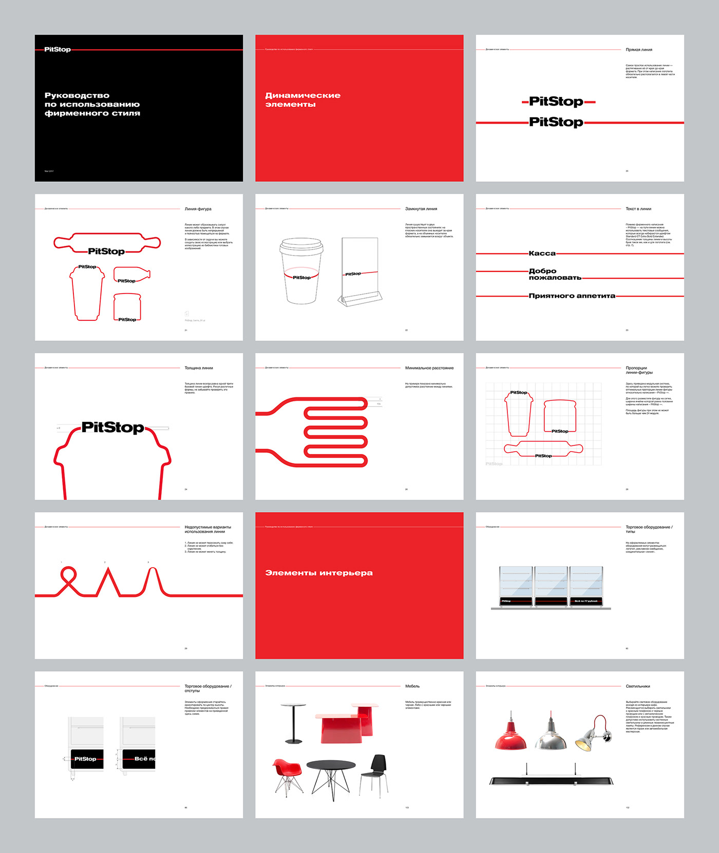
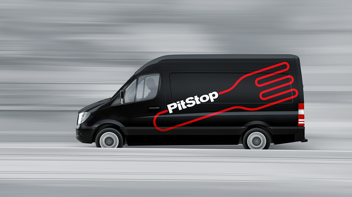
The perfect graphical solution for this metaphor lies in simple associations: life – race – highway – way. The everyday way of every dweller of a big city who is in a hurry to get to work, school, or home. The key idea behind the pit stop is reflected in the image of a highway depicted as a continuing non-intersecting red line. The -PitStop– logo is built into this line just like a pit stop is built into a Formula 1 track.
The dynamic identity adds motion to the style. When it comes to advertising, media, the interior and exterior, the line comes to life. It can change shape depending on the situation – it can denote product taste on the packing and functional areas in a restaurant, as well as be used as a decorative element.

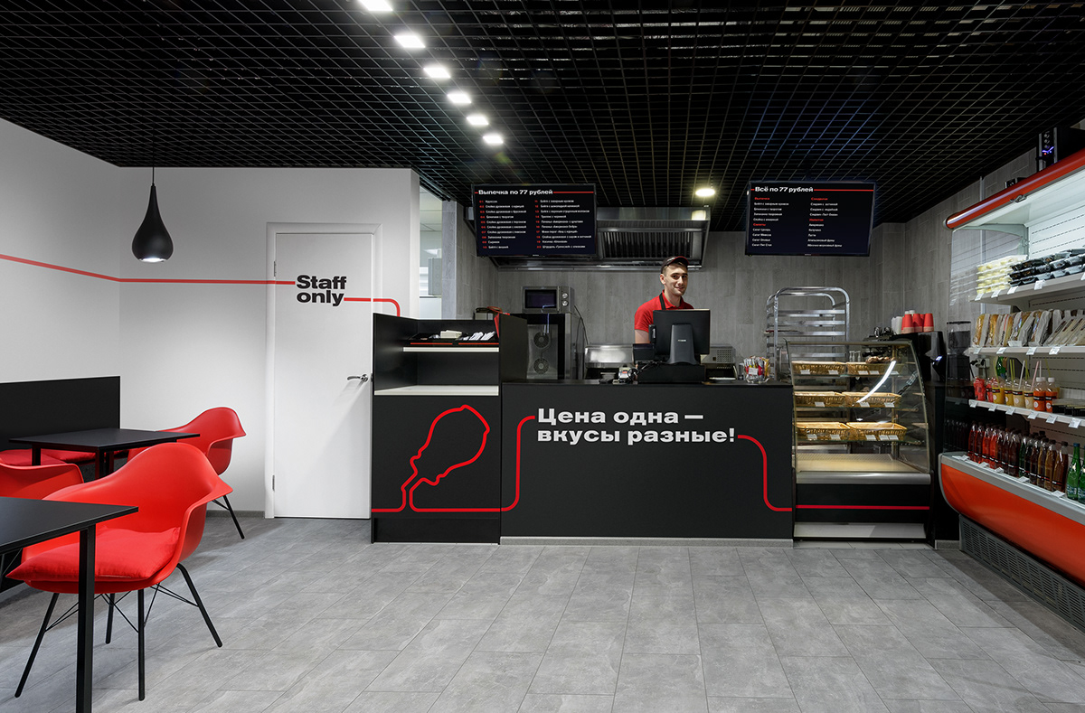

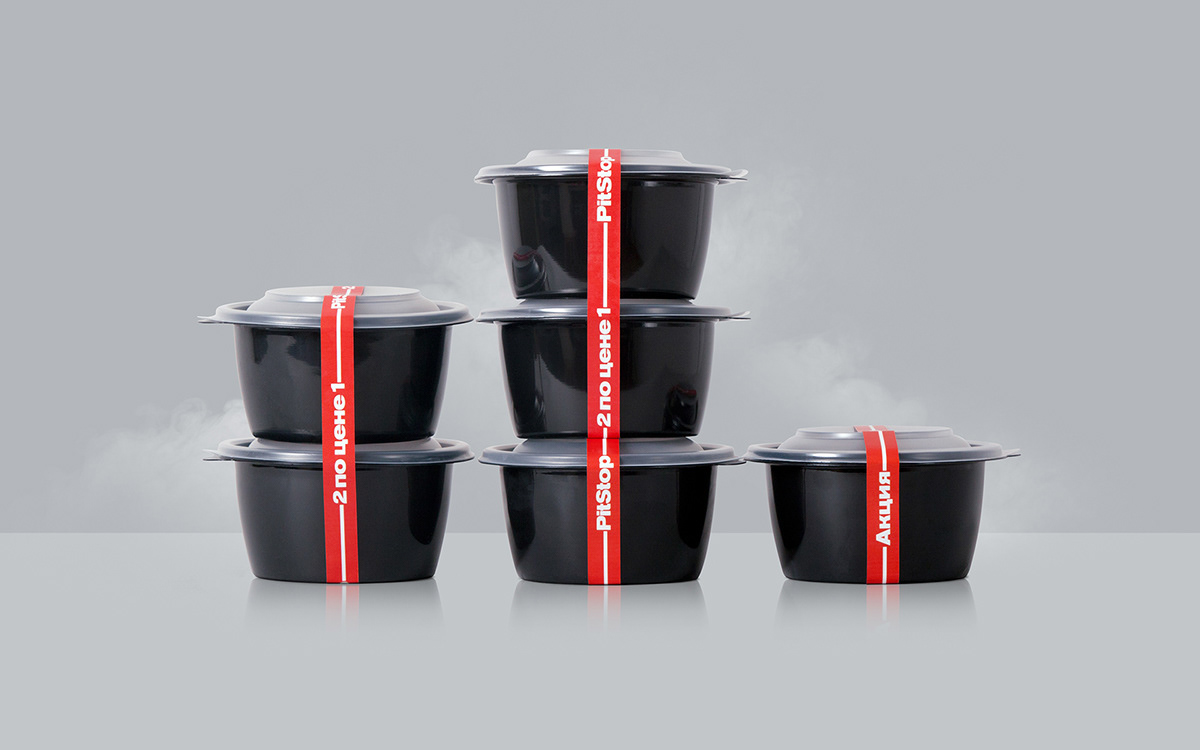
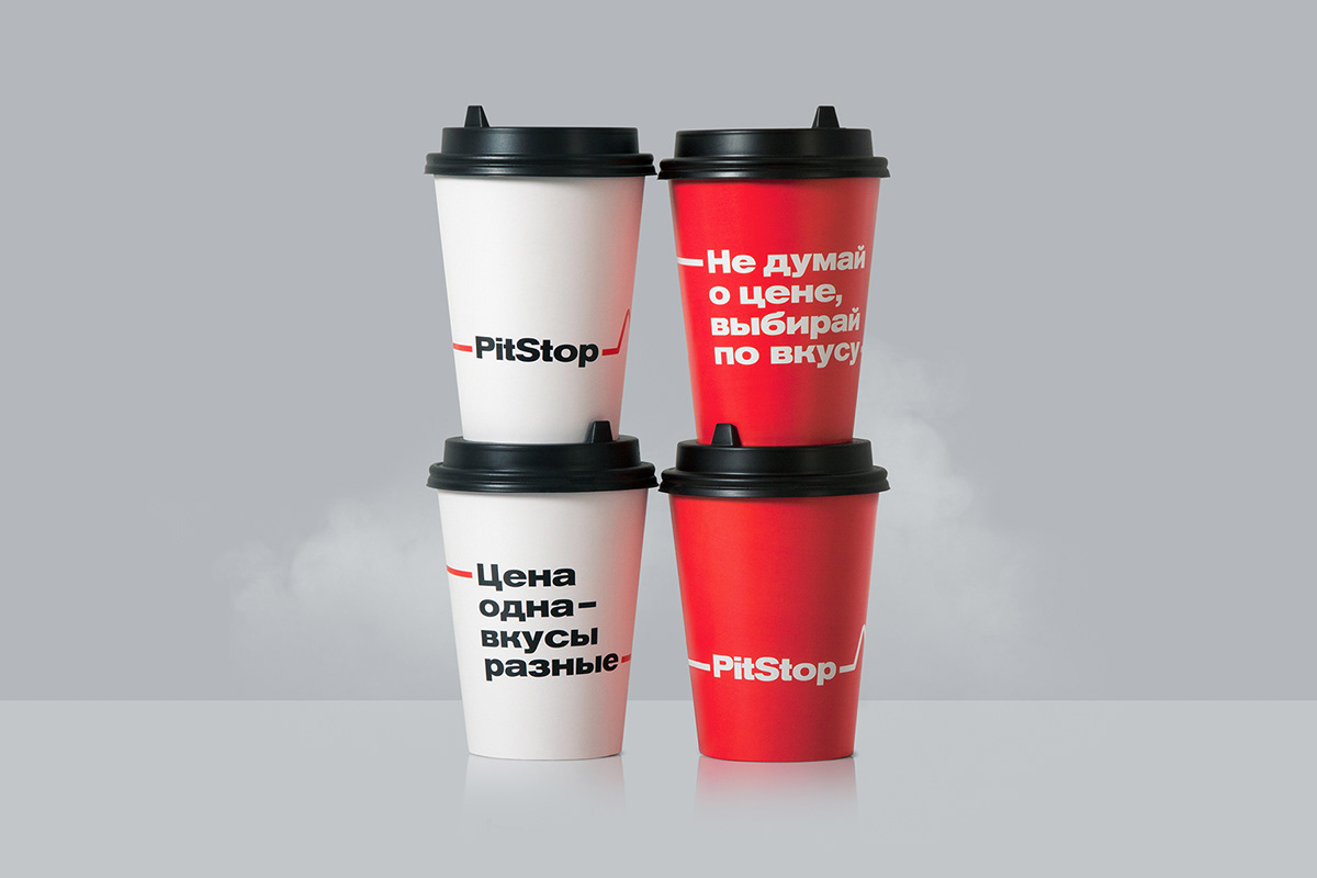
The logo can also be changed with text messages corresponding to the communication strategy. They communicate the advantages of the restaurants in plain language – fixed prices, large portions, fast service, in-house production, wide range.

Despite the fixed price format, the key emphasis in the brand strategy is not on the obvious – cheap prices – but on the taste. Such emphasis informs customers what they get for fixed prices. The chain offers a new format of choice, an opportunity to think differently – think about the taste, not the price.
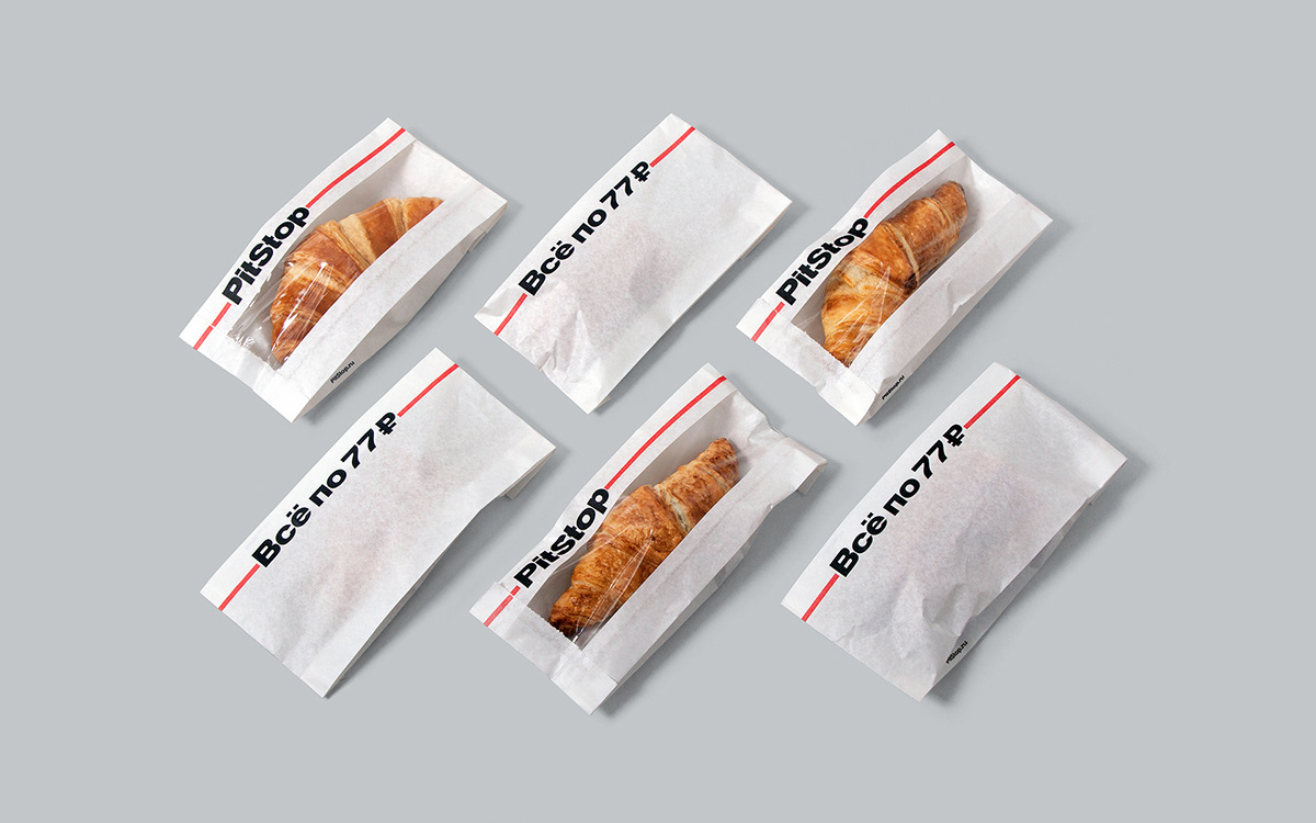


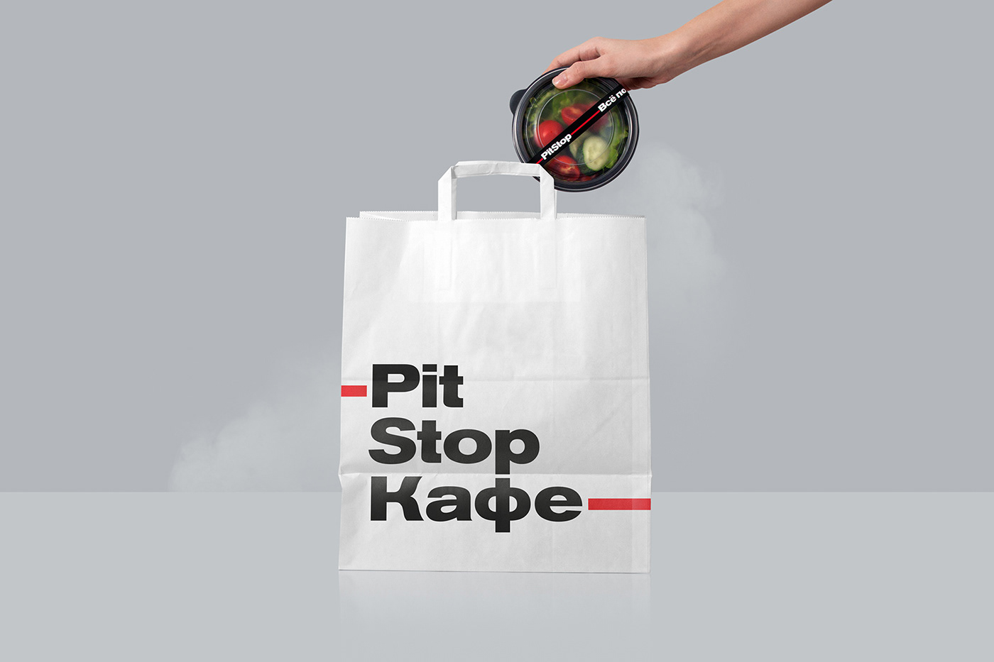


The new level of quality and quantity and plans to introduce a franchising system required changes to the design and the promotion strategy of the restaurant chain. We delivered a number of projects to solve the assigned tasks – we developed brand identity and communication strategy, design system for the retail, including the launch of two pilot facilities, as well as packing, uniforms, and POS materials.
The chain offers a new format of choice, and opportunity to think
differently – think about the taste, not the price.

Creative Director: Andrey Tarakanov
Designers: Albert Safin, Alexander Zakharov, Elena Trofimova
Copywriter, strategist: Dmitry Ardeev
Animation: Alexander Zakharov
Interior photos: Denis Vasiliev
Project Manager: Egor Novozhen, Vlad Zakalichnev
More info: www.tomatdesign.com
Follow us on Instagram