


Making sense of a complex world
Challenge
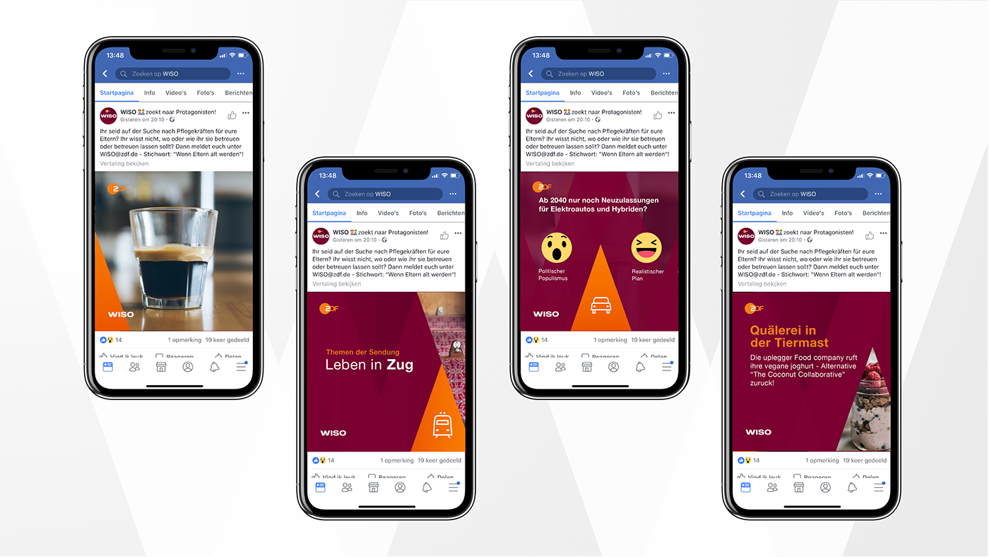
The changing TV landscape forces programs to develop strong branding to work successfully across TV, online and social media to connect with audiences. We collaborated with the creative team of ZDF on the development of an iconic, dynamic and future-proof design.
Change
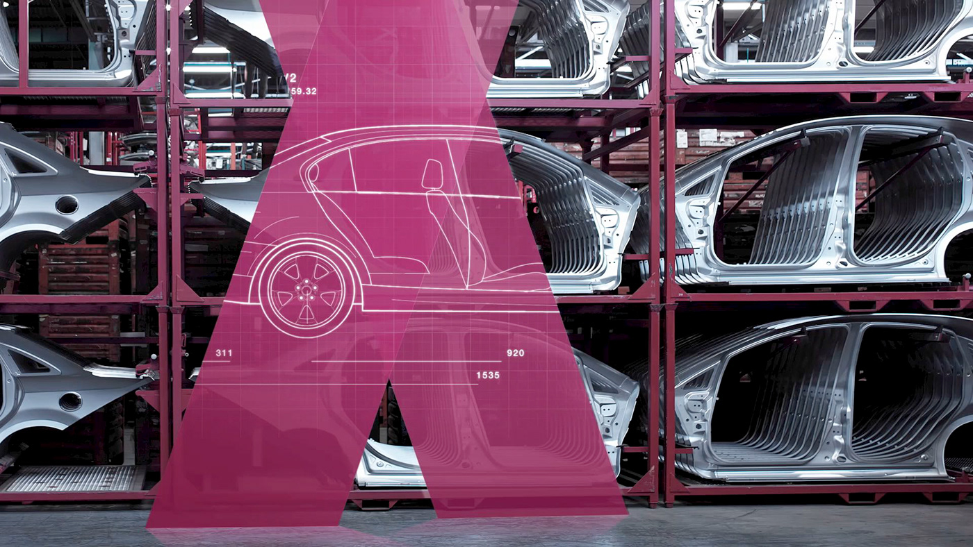
Social and financial issues can be complex with layer upon layer of information. WISO aims to make these matters more transparent by breaking them down into easy-to-grasp bits of story. We reflected this approach in the new design. By deconstructing the logo and using the four diagonals of the letter ‘’W’’ as a base grid for all layouts.
Result
The updated design of WISO is simple yet dynamic and flexible. It is an example of how a strong design approach helps to be recognisable and relevant to its audience.
The four diagonals of the letter ‘’W’’ serve as the base grid for all layouts. This creates a design that is simple yet dynamic and flexible.


All movement starts at the midpoint of the ''W'', giving the on-air design a dynamic feel.
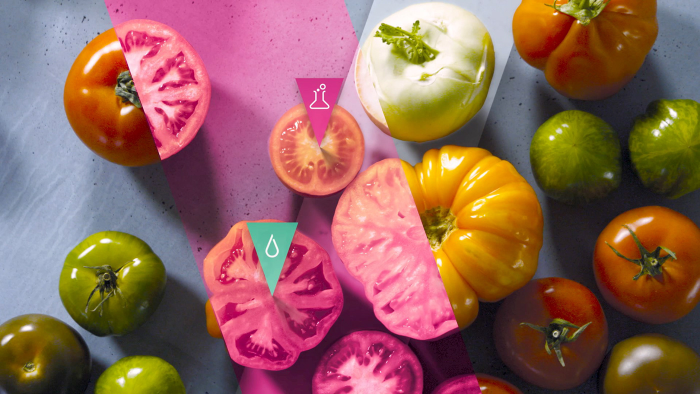
Icons and pointers help to explain subjects at hand in a playful way.


The strong branding works successfully across TV, online and social media to connect with the audience.

WISO Studio
The new studio has a warm and chique feel with the bordeaux main color and orange highlights matching the concrete walls.

Photographer: Kristof Lemp, Darmstadt
Copyright: ZDF/ Jana Kay


