
CORPORATE DESIGN I CAMPAIGN I PACKAGING
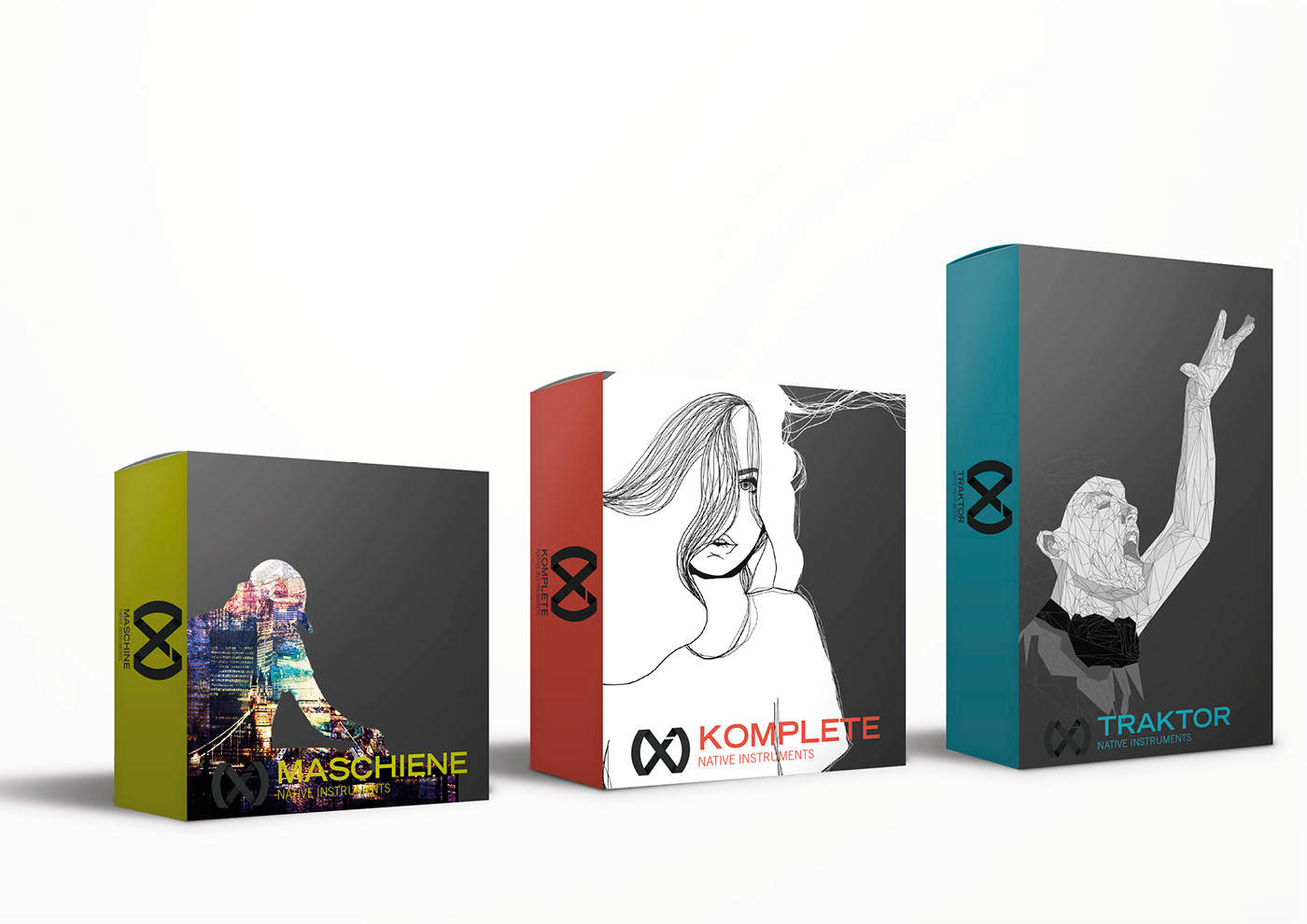
Modern Corporate Design for the computer based music product producer 'Native Instruments' in grey. The variety of musical opportunities which are created through the products are explained with the infinity character in cable design. At the same time the logo shows the abbreviation of the brand 'NI'. In contrast with the logo there are three highlight colours, dedicated to the product rows.


Three design-styles were selected for the campaign, a graphic style, a lining style as well as a collage style. These three styles were adapted to the campaign placards.


Redesigned packaging for the three main products 'Maschine', 'Traktor', and 'Komplete' as design editions. The editions are changed seasonally and show modern designs, fitting to the young target group.

client: Native Instruments
where: Kunstschule Wandsbek, Hamburg Germany – university project


