Agile branding for a smarthome startup
In early 2014 I was tasked with helping to refresh the brand of a local startup company. They only had a budget for a week of my time, and as a branding project like this often takes several months it was obvious from the start that we had to be super efficient with the time.
We started out by running an intensive all-day workshop to map out their vision of who they wanted to be and how they wished to be perceived. We went through several exercises to help them explore and explain what they stood for and this in turn formed the basis for our branding work.
At the time the brand amounted to something resembling a clip-art logo and a colour palette consisting of almost all colours. We resolved to create a clean, professional visual identity which built on their existing ideas, to simplify the colour scheme down to a manageable selection, and to provide them with a simple set of tools and boundaries for implementing the visual identity consistently across all media going forward.

Brainstorming brand positioning and core values, and generating interaction frameworks for the app.
Initial logo explorations
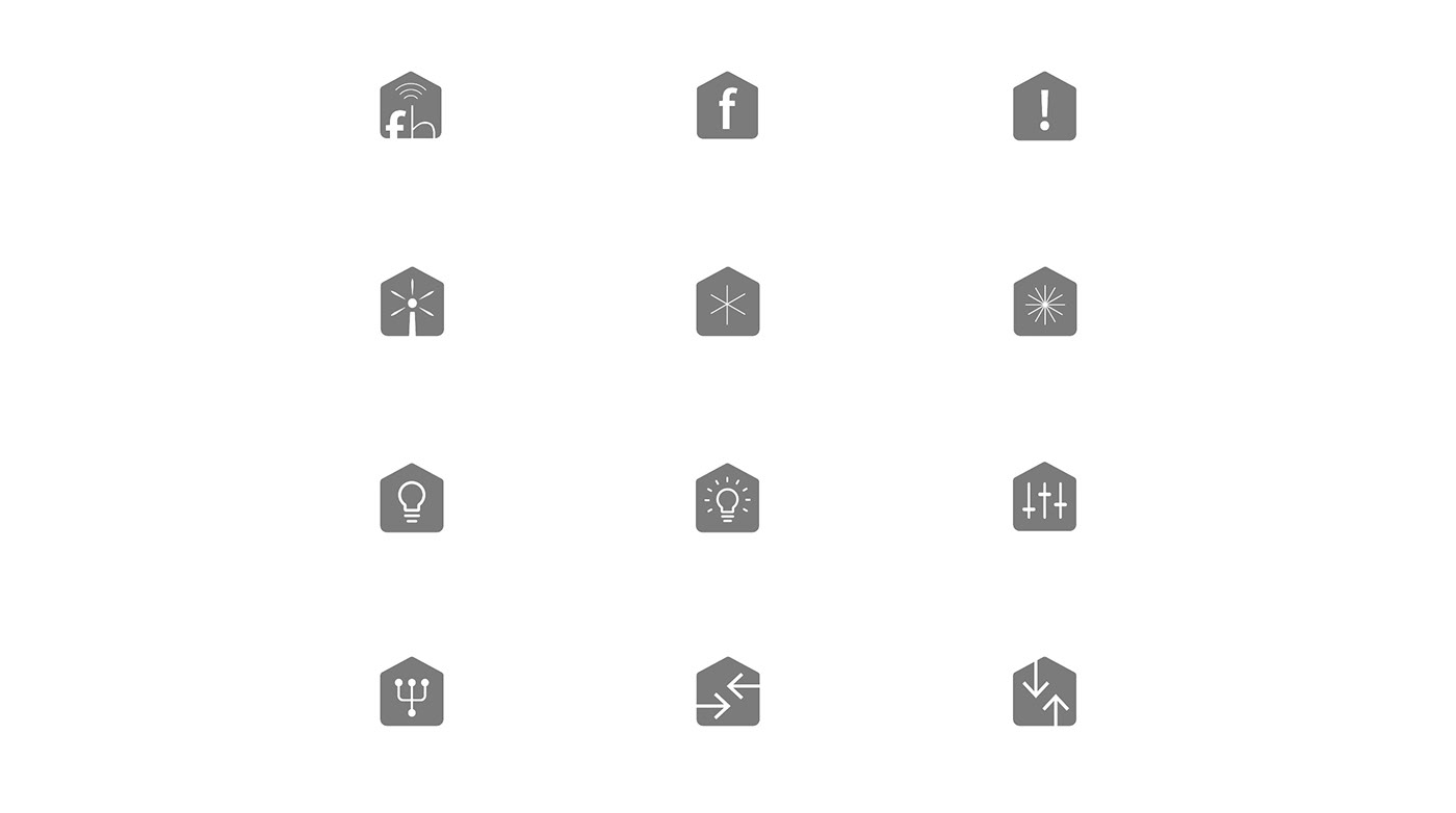
I started by exploring loose ideas around what kind of icons or simple motifs could be used and how they could communicate. With the time constraints we had, it was lucky that the client wanted to stick with the idea of a house and also like the idea of something resembling an icon - due to the digital nature of the product.
Simplifying motifs
At the time this work was being carried out there was a strong trend within Tech branding and startups towards simplistic, slightly futurist styles and motifs. the work above represents repeated client consultation and discussion in the space of a week. In essence we collaborated on selecting the various components of the design and my task was to present options and to refine their presentation once selected. Given our time constraints there was not really any opportunity to over think the details.
In the end, we agreed that a minimalist house form, with some allusion to data being sent, broadcast or received would be ideal. With this in mind it was a short leap to break the house outline leaving a point floating freely - for me representing a wireless device somewhere in the home. I added the arrows to signify a signal or data stream being transmitted. Simple, elegant and in my opinion also memorable.

A really successful logo is, like this, one you can draw fairly easily by hand with a few strokes of a pen.
Experimenting with type
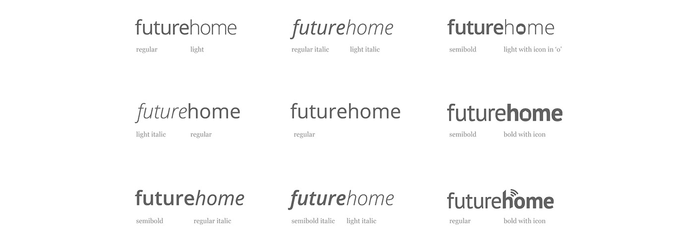
Given that this was a tech startup selecting a sans-serif font for the logo was almost a given. We experimented with several variants but in the end, all lower-case Open Sans with a bold emphasis on ‘future’ was decided upon.
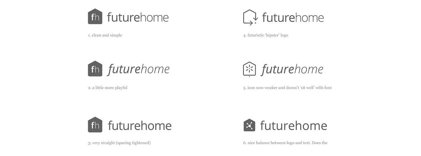
Combining iconography and typography
The left hand column represents conservative variations much closer to the original logo, you can see the original logo below for reference. A couple of wildcards where included (right side) in case my favoured solution (top right) didn’t hit the mark.

Original logo for reference.
Final redesigned logo
Once we all agreed on the option which was most suitable I set about making the final adjustments and testing the logo across various sizes and placements. The logo symbol was adjusted several times for balance and contrast at varying scales.
From very small on website headers on mobile devices and social media avatars, to several metres across for the side of a building or a billboard, we had to be sure of the clarity and legibility of the logo and type. I also did some fine tuning of the letterforms, softening corners and micro-adjusting letter-spacing so it would sit well with the house icon and not have too many harsh corners or edges at large scales.


A ‘square’ version of the logo was also produced for use in places with limited horizontal space.

Embossed on the signal router which controls the smarthome system.

