

CIE is devoted to worldwide cooperation and the exchange of information on all matters relating to the science and art of light and lighting, colour and vision, photobiology and image technology.
Since its inception in 1913, the CIE has become a professional organization and has been accepted as representing the best authority on the subject and as such is recognized by ISO as an international standardization body.

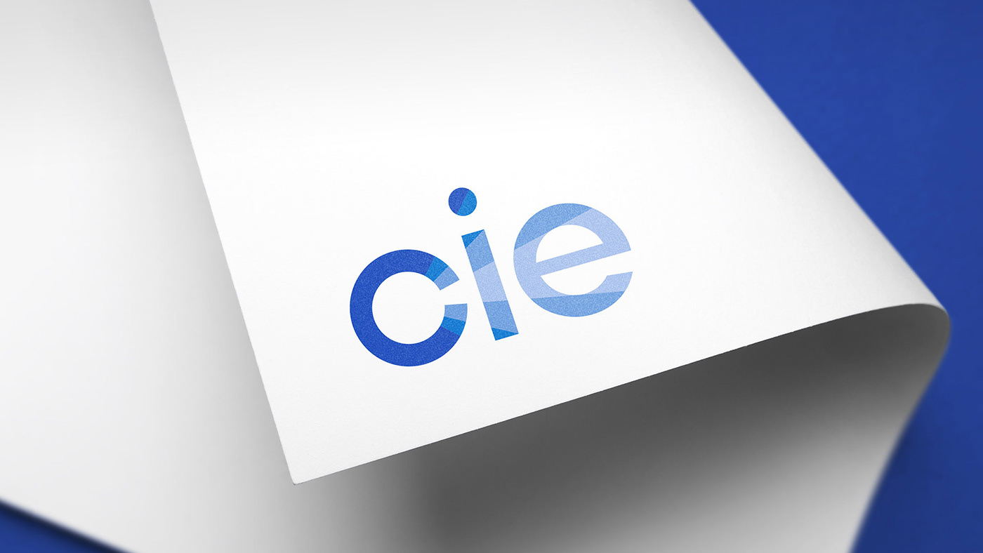
Concept: light, conjunction, Illumination.
Light comes out from inside the C letter. (the most important letter and the one who defines the nature of the organization).
Below: Previous design (left) and new one (right)


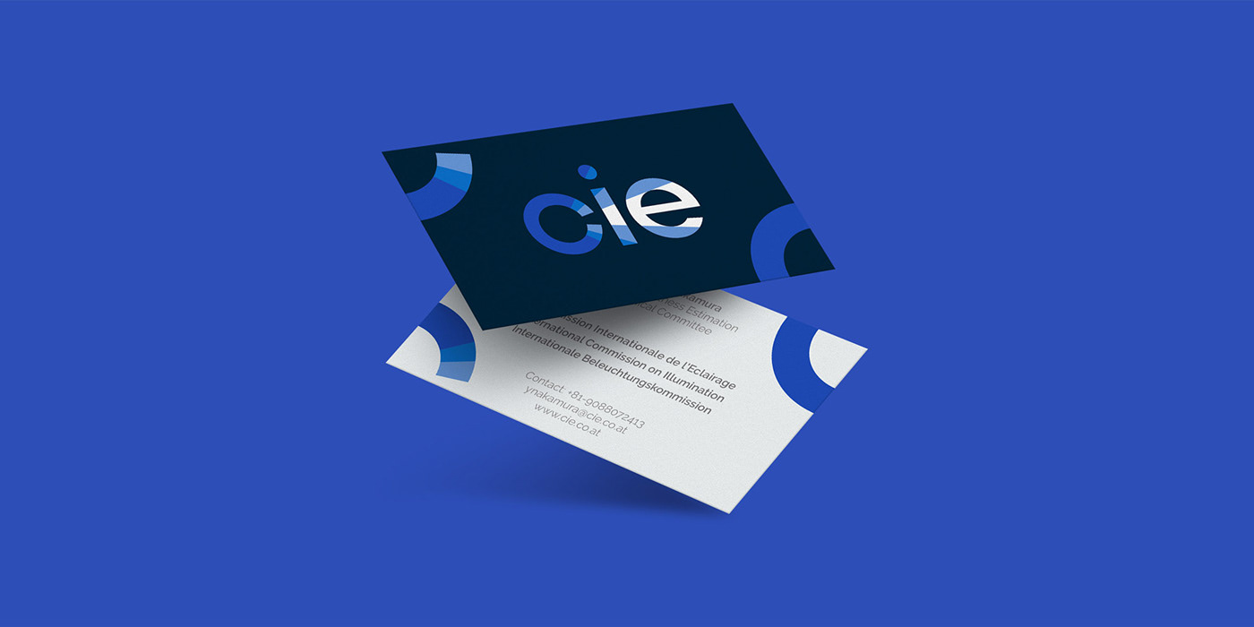
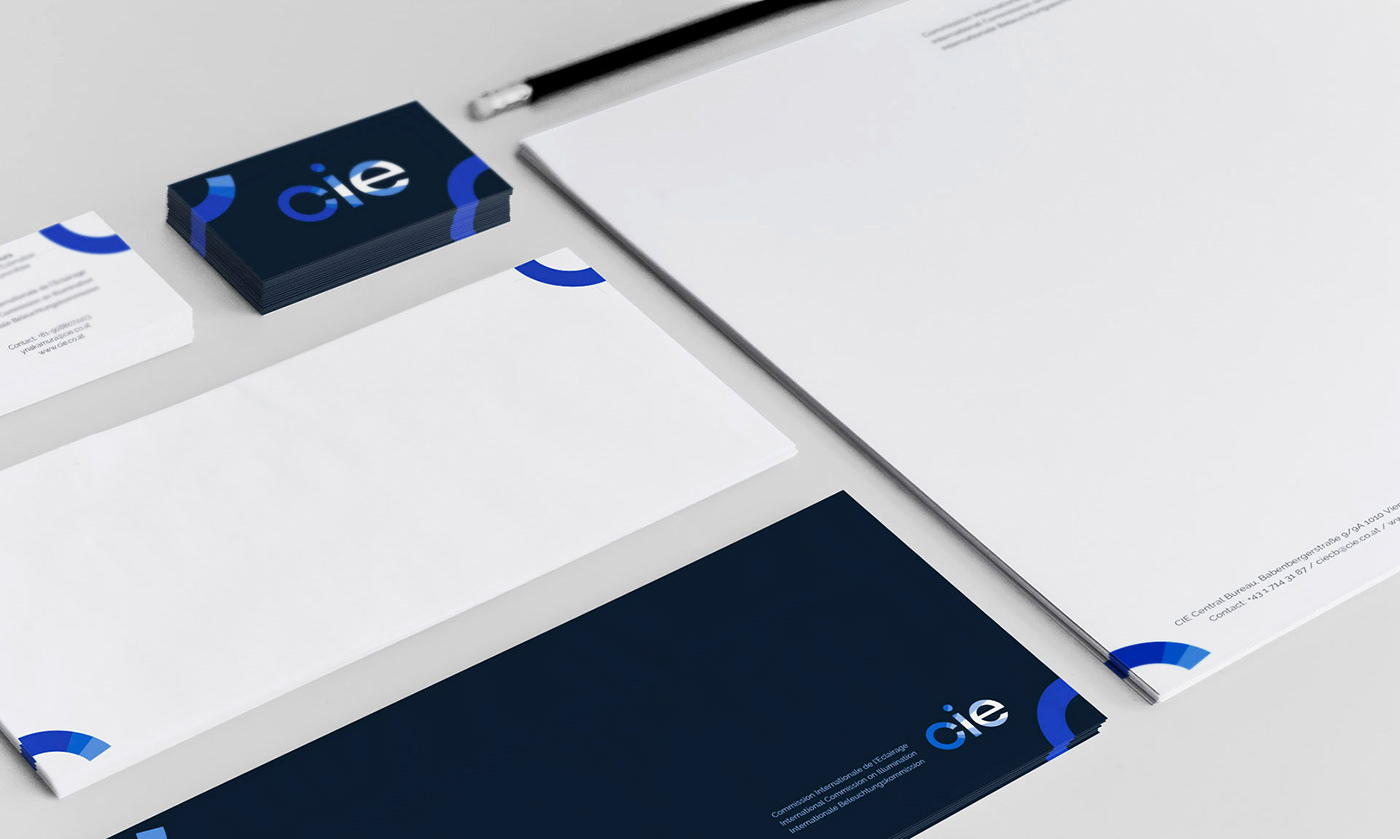
Branding elements
They were designed to generate a C letter when you put more than one together.
Once more, this came from the concept of commission. Were members go united to create something bigger than them.
Once more, this came from the concept of commission. Were members go united to create something bigger than them.


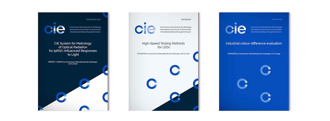
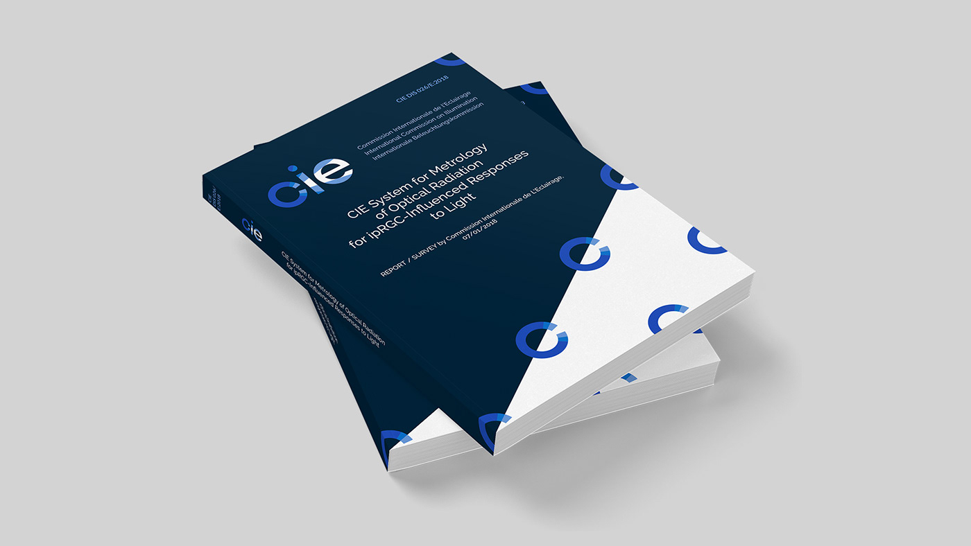
Book covers for their Publications and Standards were developed around the same branding concept.
Thanks for watching.


