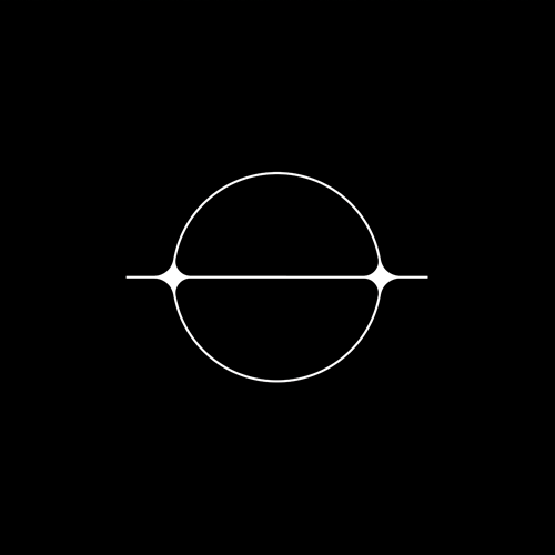
S K Y H I G H
R A D I S S O N B L U H O T E L — H A S S E L T
B R A N D I N G. T Y P O G R A P H Y. S I G N A G E.
.
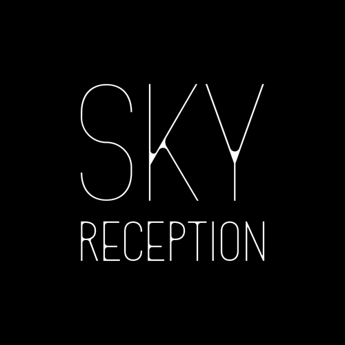
R A D I S S O N B L U H O T E L — H A S S E L T
B R A N D I N G. T Y P O G R A P H Y. S I G N A G E.
.


L I C H T P U N TT Y P E F A C E
.
.
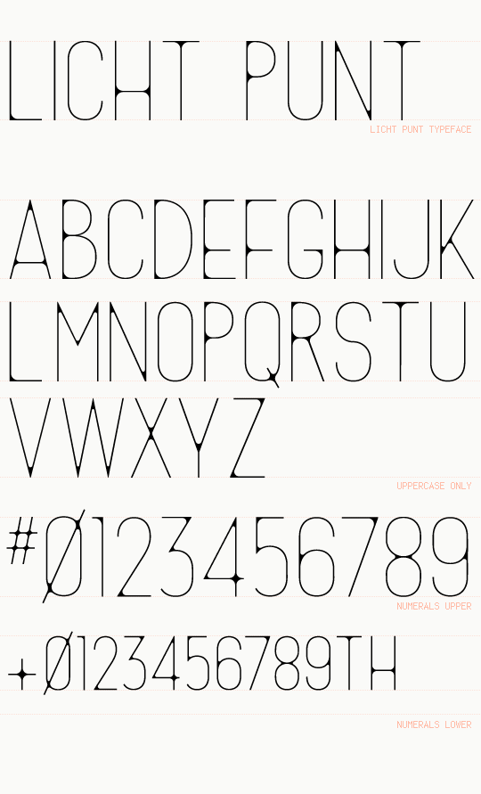
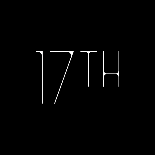
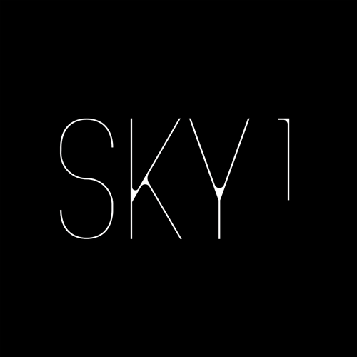
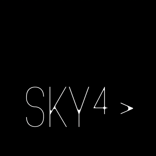
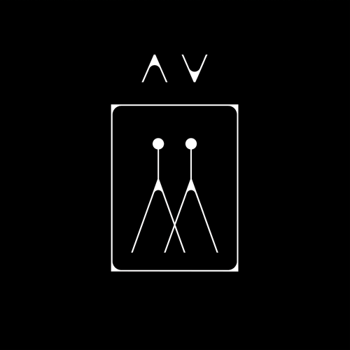
L I C H T P U N T T Y P E F A C EThis typeface was built accordingly to the needs of the Sky High project.
All things stand tall. For that, there was only a need of use of uppercase characters.
All things stand tall. For that, there was only a need of use of uppercase characters.


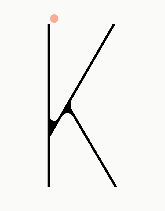

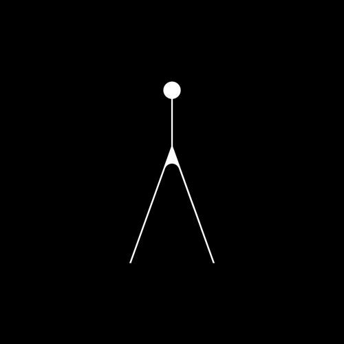
L I C H T P U N T U P P E R C A S EConstruction detail of each character and note of the light points.


L I C H T P U N T N U M E R A L SDue to the signage needs of the Sky High project, there were design two versions for the numerals: upper & lower.
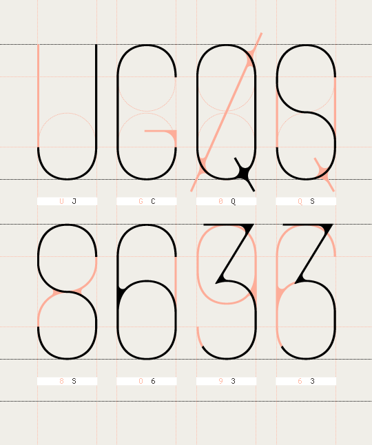
L I C H T P U N Tconstruction detail of the characters

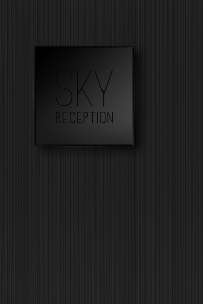
L I C H T P U N Tsignage lettering detail
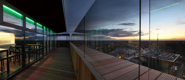
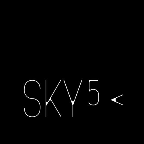
S K Y L O U N G E

S K Y H I G H
.
.