


fused together
After the merger of two local elementary schools, De Parkschool aims at providing the best opportunities for children to develop. The challenge was to create an identity that brings to life their mission and connecting it to the new name.


where children blossom
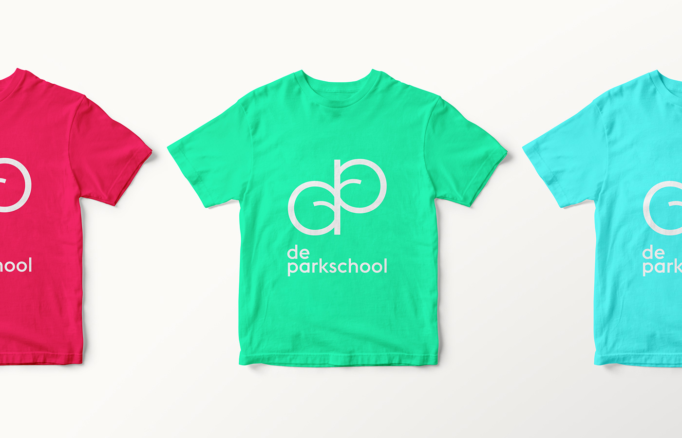
Inspired by the name and location of the school, the logomark shows the fusion of the lowercase d and p resulting in a twig with two leaves. A small piece of nature that serves as a metaphor for the growth and development of kids.

school is exciting
Besides the fact that kids are full of energy, the merger of both school has caused a burst of energy in and of itself. The bold colours refer to this new impulse and shows that going to school is something to be excited about.

playful learning
The basic subjects taught in elementary school like math and language, are visualised by letters and numbers and can be playfully interspersed into imagery, print and products to create a flexible brand asset.


Thanks for scrolling.
Credits:
Patricia Prudente
Pete Bellis
Wang Xi


