While many software companies concentrate on the cold, technical nature of their products, we encouraged ThoughtFarmer to embrace a more personable and tactile approach. In doing so, we believed they could effectively position themselves as a clear alternative to their (often much larger) competitors, while finding a place in their customers’ hearts.

The ThoughtFarmer mark builds upon the hand-crafted sensibility found in their materials, by integrating playful leaf-inspired cursive elements. The mark works independently, or in tandem with their icon and tagline. Additionally, their icon helps identify the product in small areas like smartphone launch screens, and in web/desktop application icons.

Every element in the ThoughtFarmer identity is built from two key forms: a seed and a line. These are moved, sized, rotated, and reorganized to create a wide variety of agrarian icons, elements, tools, and lifeforms. Pictured above (from top left, clockwise): presentation folder, letterhead, greeting card, envelope.

At the heart of ThoughtFarmer is software that helps people collaborate. This core notion is presented from their very first introduction, in the organization’s bright and friendly business cards, which all showcase lifeforms working together. These illustrations, and the large colour fills on the backs of the cards, all use hand-crafted textures to convey a sense of care and craft.

While unlikely to wear a traditional uniform, the people at ThoughtFarmer do attend events that require them to represent the nature of the company. This led us to create a series of simple items they could use to showcase the team spirit, without feeling like corporate drones. From hoodies and caps, to t-shirts and messenger bags, these items help send a cue that these are people you’d like to meet.
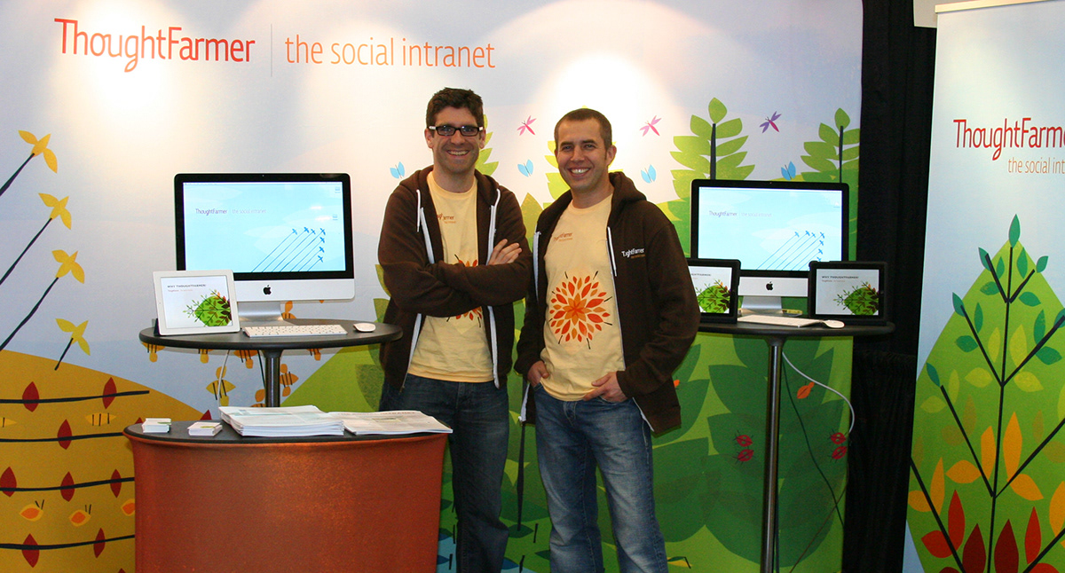
Pictured are two of three ThoughtFarmer founders (Gord and Chris) setting up at the Enterprise 2.0 conference, in Boston. In tow they have their new trade show booth, presentations, screens, collateral, and uniforms. Those feeling particularly spry were invited to join them at a ThoughtFarmer sponsored conference run, the next morning.

The bulk of people are introduced to ThoughtFarmer through their online presence; therefore, a great deal of attention was paid to their website. In this setting, the familiar illustrations continue to tell the story, alongside deeper text, video content, white papers, and a number of helpful resources.

Throughout the site, content is organized to be easy to scan, engaging to read, and visually interesting. This is achieved through an in-depth content strategy, consistent syntax, and visual standards for image treatment. From pages with pricing information to case studies, the ThoughtFarmer brand remains in tact, and compelling, to visitors.

A great deal of discussion and debate went into how to organize information, shape the presentation, and engage interested parties to act on the call to action. The nice part with a site like ThoughtFarmer’s, is that it rarely feels like work to go through. Plain language, large text, bright colours, and useful content cut down—rather dramatically—on the yawn factor commonly associated with technology websites.
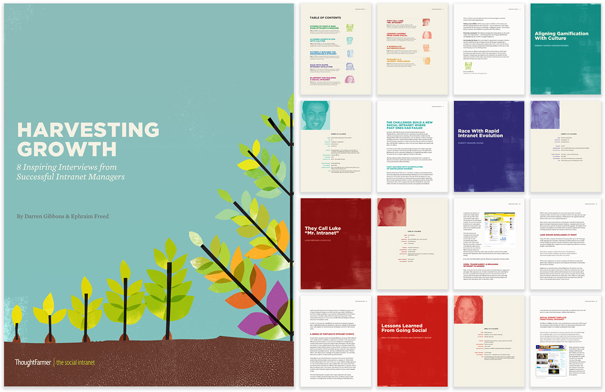
We continue to grow and adapt the ThoughtFarmer system on an ongoing basis. In the above example, we see a recent eBook produced by the organization, and designed by smashLAB. The 65 page digital booklet tells informative stories to those using intranets, and is available as a PDF or iBook—offered through Apple’s iBookstore.
View full case study here.


