
BURGER
A no-nonsense identity for a no-nonsense brand: a bold and simple approach lets BURGER's name say it all.
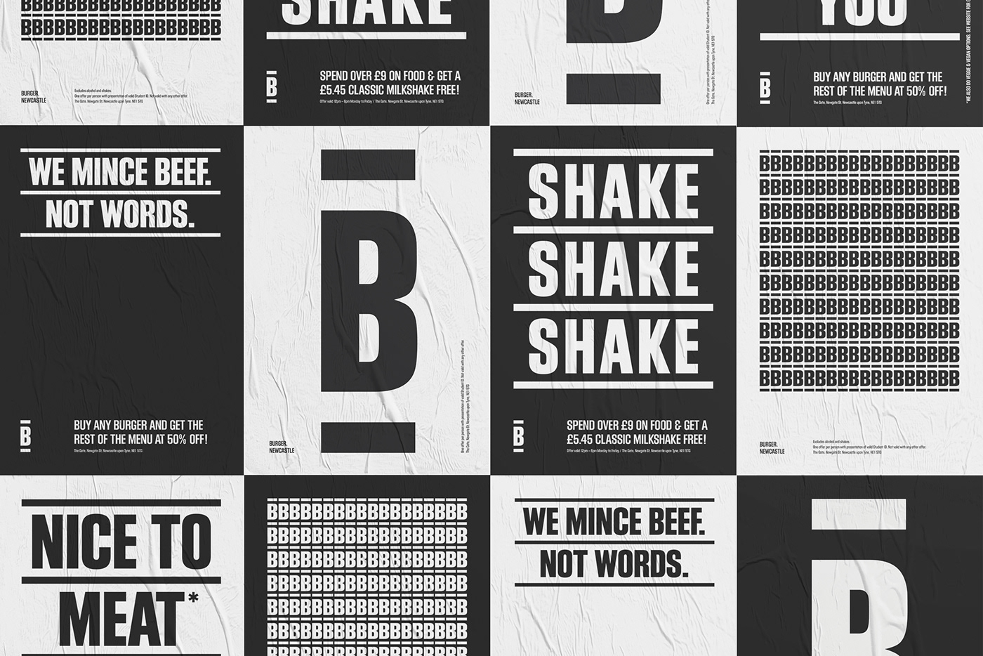
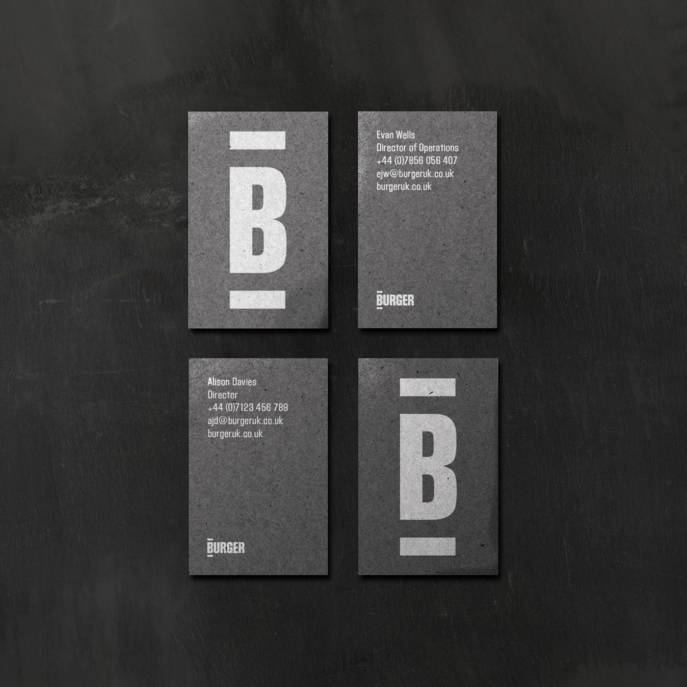
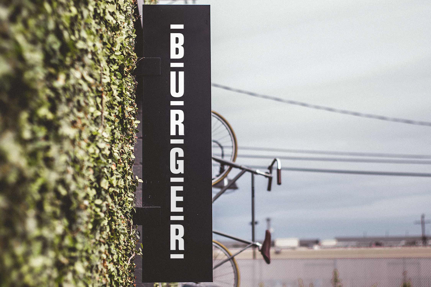
A restaurant with operations in Edinburgh, St Andrew’s and Newcastle, BURGER’s offering is simple. Great burgers. That’s it. The name called for a no-nonsense approach and we began brand development with some stripped-back typography. Leading unapologetically with ‘BURGER’ created a sense of ownership over the word in a competitive space. With origins in woodblock printing, the Block Gothic font had the right overtones of craft and robustness. A simple word-mark can condense to a ‘bun’ in its simplest form, and expand horizontally or vertically to let the name do the talking.
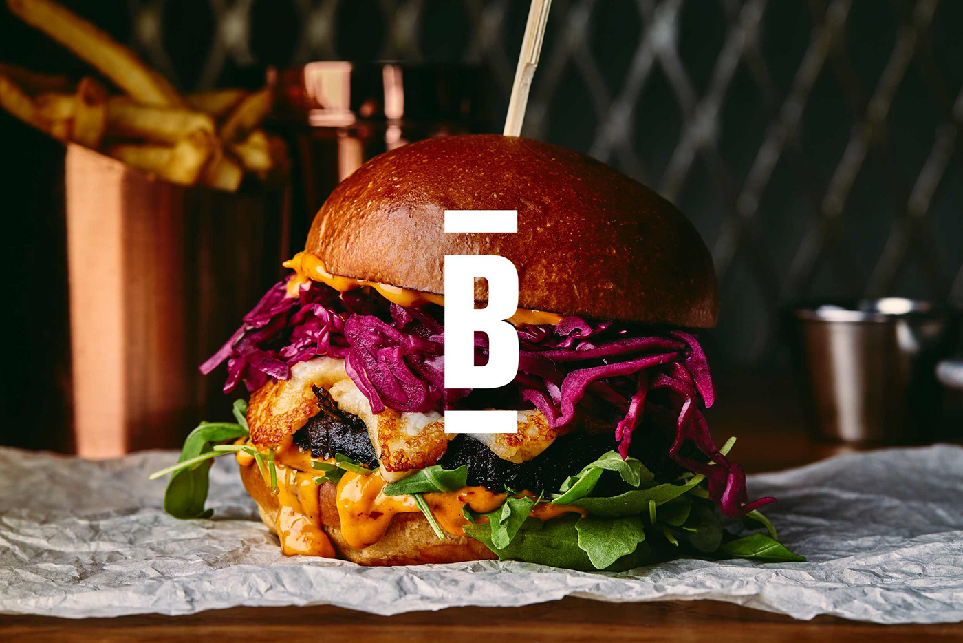
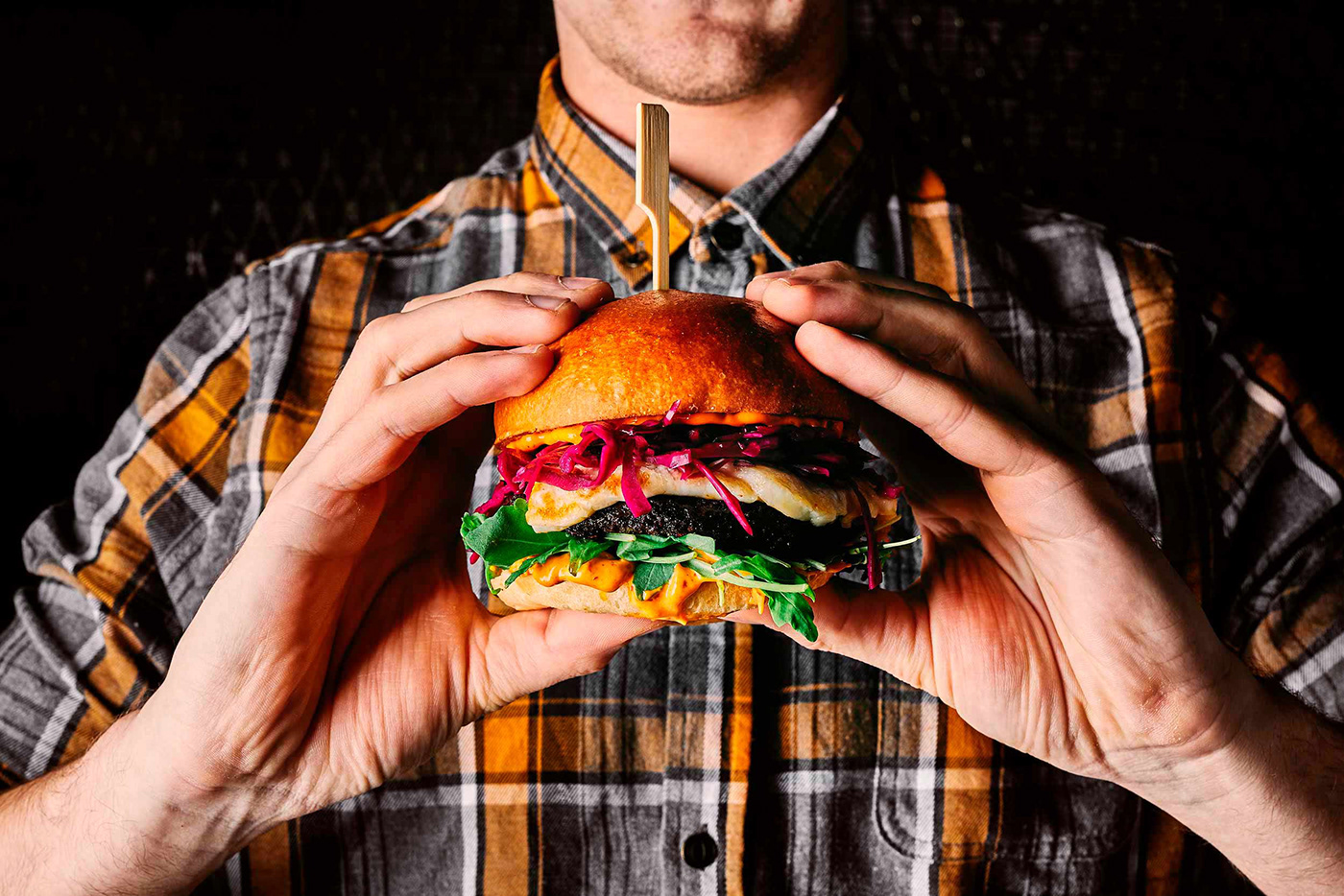
Against a monochrome palette, bright oversaturated photography communicates the intense, messy pleasure of a good burger.


We wanted the identity to feel universal in its colours and styling. Structural, functional and deliberately unembellished, the branding keeps the focus on the food. Scale and deployment are important factors in this brand’s impact, with copy amplifying its voice. Flexible, loud and enjoyably teasing, its intensity provokes the right response.

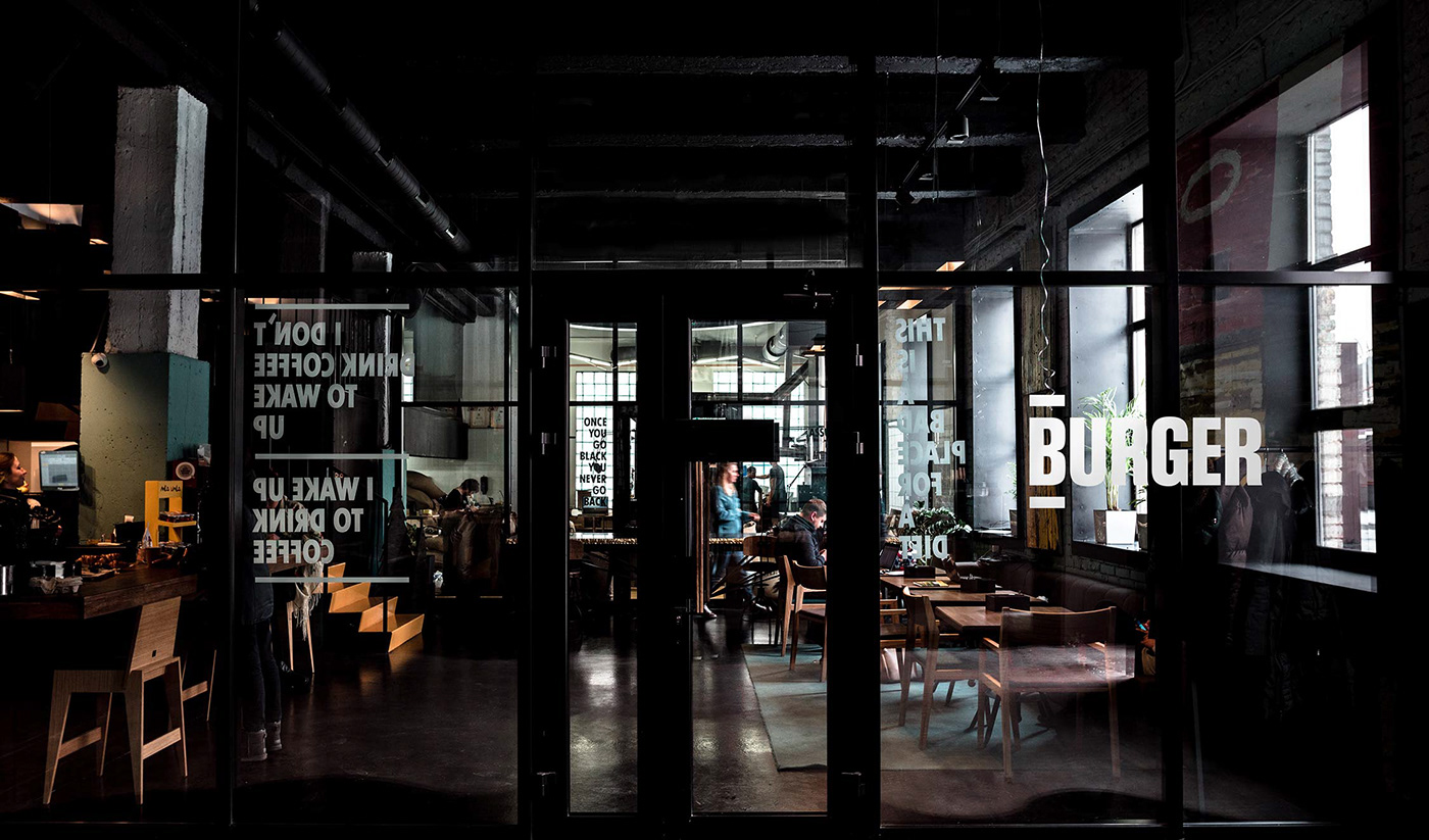
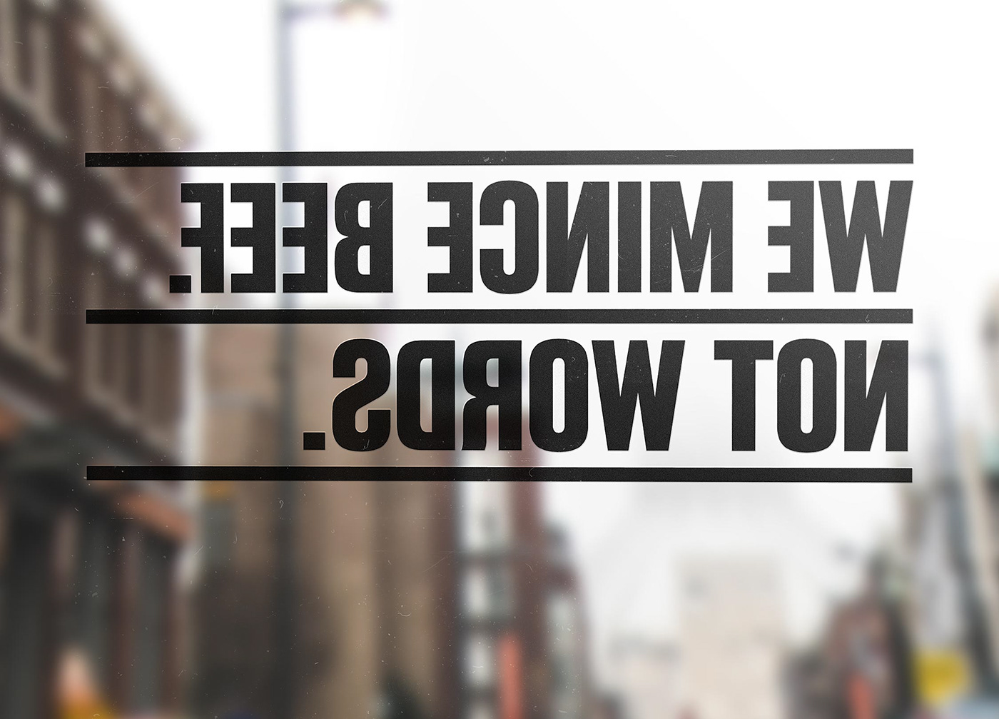
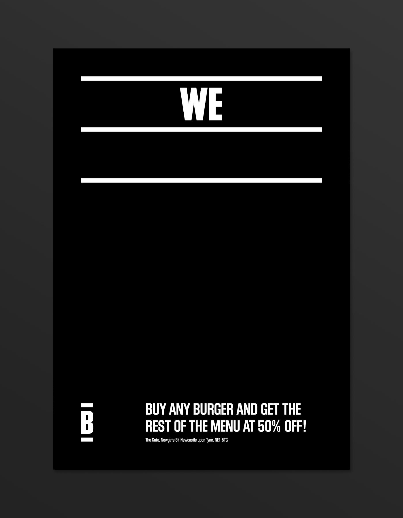
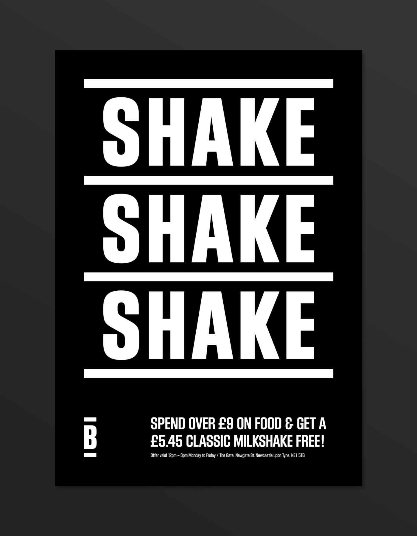
We had fun determining BURGER’s tone of voice. The condensed font stacks neatly into a ‘burger-bun’ format, with headline copy distilled into three irreverent lines to fit. Humour lightens and humanises the brand, and the distinctive three-line format means it can grow through changing words alone.
With the capacity to play on seasonal changes, new offerings and topical events, copy keeps the brand characterful, fresh and current. An almost limitless resource for marketing campaigns, social media and daily signage-board messaging, its simplicity is its strength.

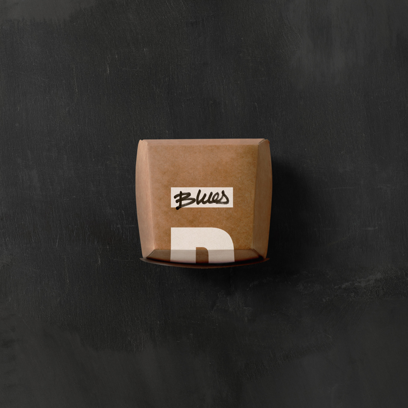
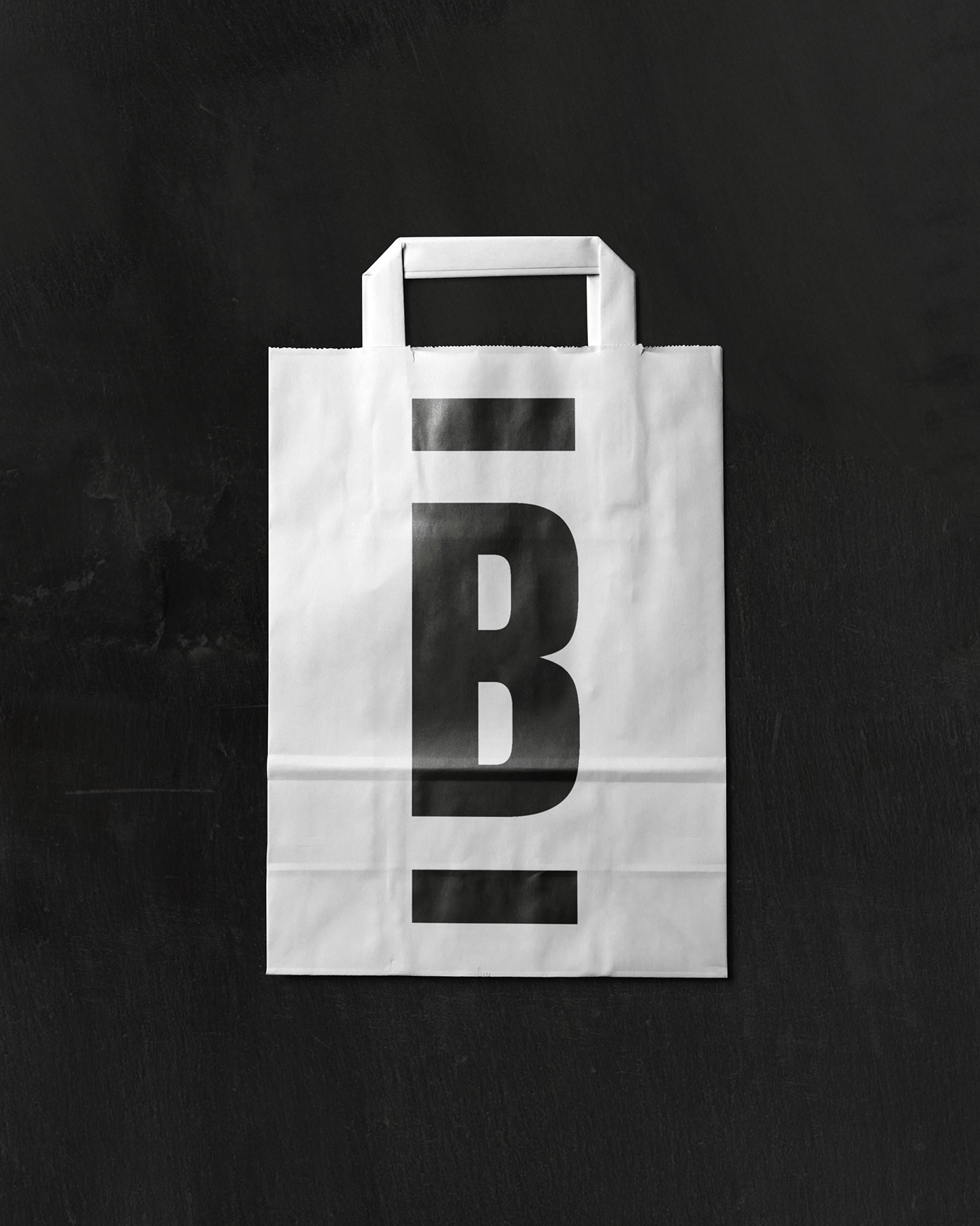
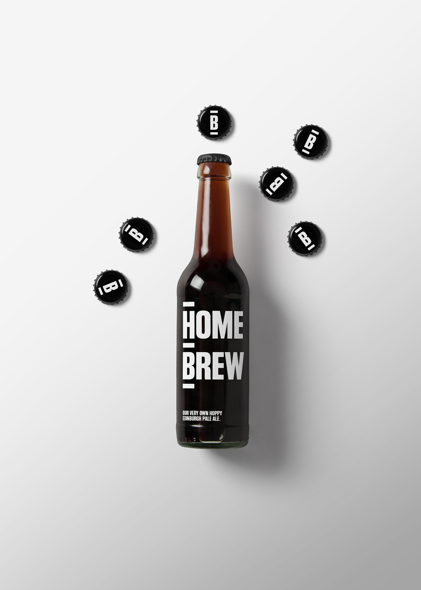
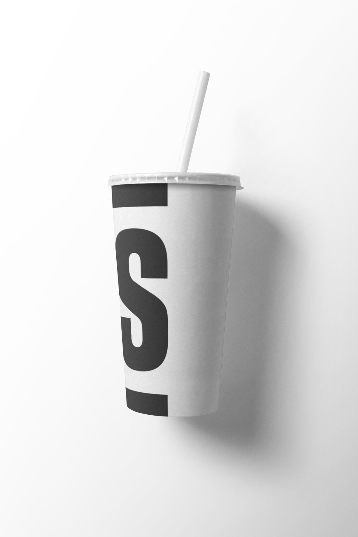
Flexible and cost-effective, copy, font and simple icon can be used with a light touch in restaurant environments as well as on practical applications such as flyers, posters, menus, takeaway packaging and purpose-brewed house drinks. Black or white ink on textured craft papers feels both unpretentious and surprisingly refined. A brand toolkit assists staff in restaurant communications. And with literal animations (like the ‘shaking’ milkshake promo), the brand pokes gentle fun at its own straightforwardness.

Insights
The origins of the burger are much debated, with variants appearing in the early 1700s and ‘Hamburg steak’ made popular in 19th-century America by German emigrants. Several restaurateurs and lunch vendors claimed to have created the hamburger as we’d recognise it between 1885 and 1900. Various chain restaurants sold large numbers in the 1920s and ’30s - culminating in the establishment of McDonald’s in 1940.
An affordable, handily-sized package, the joy of the burger is in its utility as a practical ‘people’s food’. In designing BURGER’s identity we wanted to present the product as just that. The confident, sturdy functionality of Block Gothic - influenced by old printing-press letter blocks - was a characterful match for the BURGER brand.
—
Client: BURGER UK
Role: Strategy / Design / Art-direction / Copywriting
Discipline: Corporate identity / Website / Restaurant print & graphics / Promotional materials
—
Role: Strategy / Design / Art-direction / Copywriting
Discipline: Corporate identity / Website / Restaurant print & graphics / Promotional materials
—
For more information about this project, contact our Project Director Sophie Brown.


