IAB REBRANDING
Blackbot 2018
At Blackbot_ we are convinced that the digital marketing industry is constantly evolving. We have reached a point where the concept "Advertising" is coming to an end; Failing to achieve explains the phenomena of social interaction that occur on digital platforms such as Facebook, Twitter, Instagram or Musically.
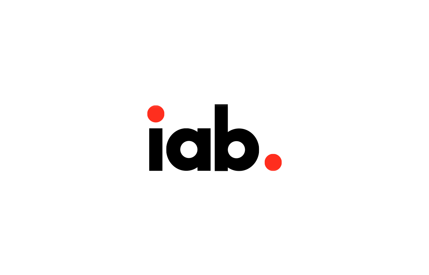
The Interactive Advertising Bureau (IAB) is the global association that groups together the companies of "interactive advertising" of the main markets of the world. The point is that "interactive advertising" seems to us an obsolete, outdated, non-descriptive term, totally alienated from the reality and future of the interactive industry where the center should not be "Ads" but "Humans".
That's why we decided to take the IAB logo (Interactive Advertising Bureau) and replace the "A" of Advertising with the "H" of Human. So it would look like this: IHB (Interactive Human Bureau).
The team of the company Blackbot_ led by Jon Black and Fernanda Rocha created the concept of the project and Daniel Losant led the whole graphic conception. This was the result.

INSPIRATION
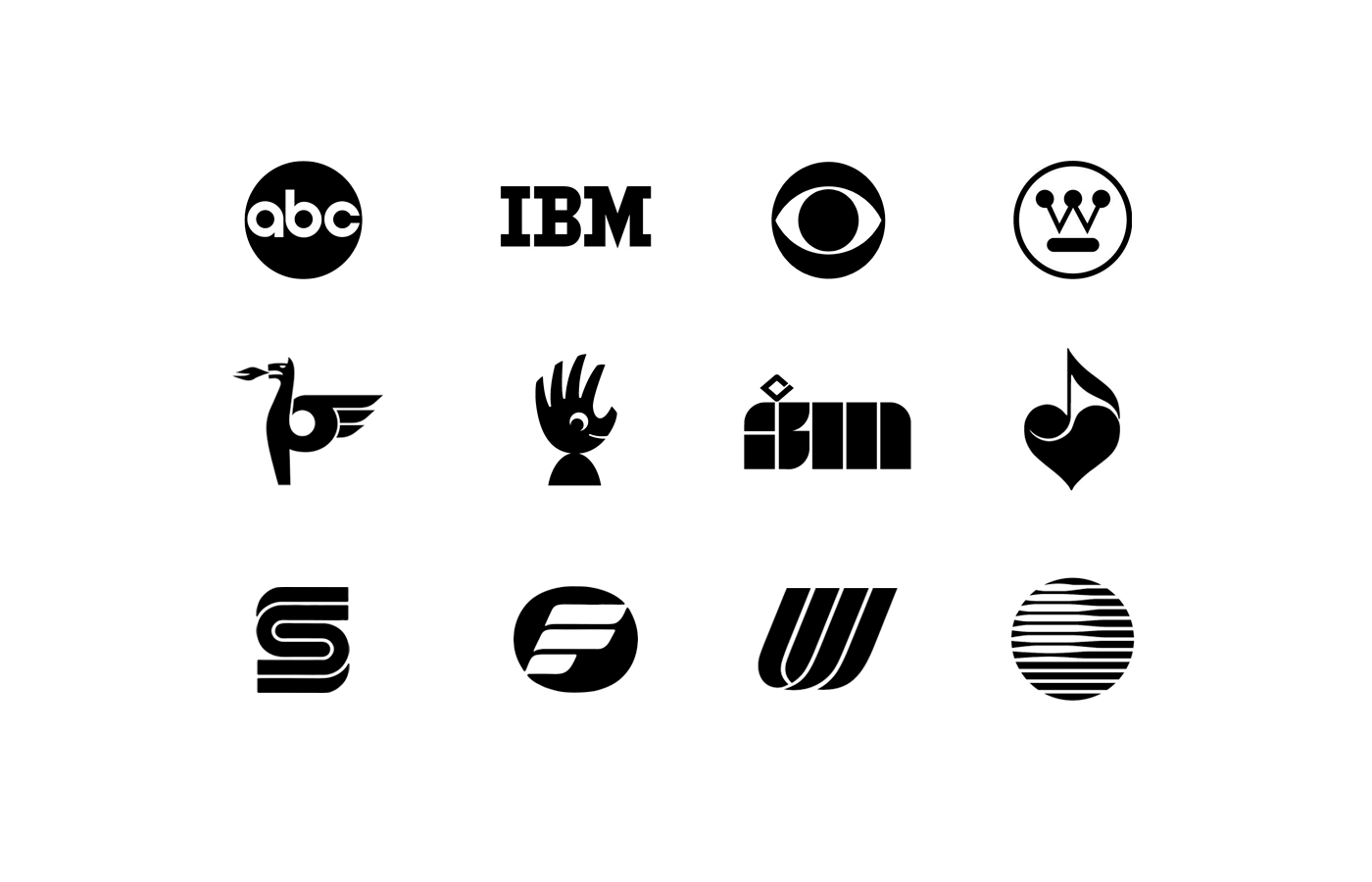
The inspiration for the redesign of IAB arises from the analysis of iconic logos of the 70's - 80's made by great designers such as Paul Rand, Stefan Kanchev, Saul Bass and Lance Wyman. Its timelessness and disruptive aesthetics were the basis for the creation of this proposal.
Th, it is intended to preserve the essence of IAB and its institutional character, reinforcing its identity and recognition as a brand, to create a highly pregnant (recognizable), versatile and aesthetically functional logo.
CONCEPT
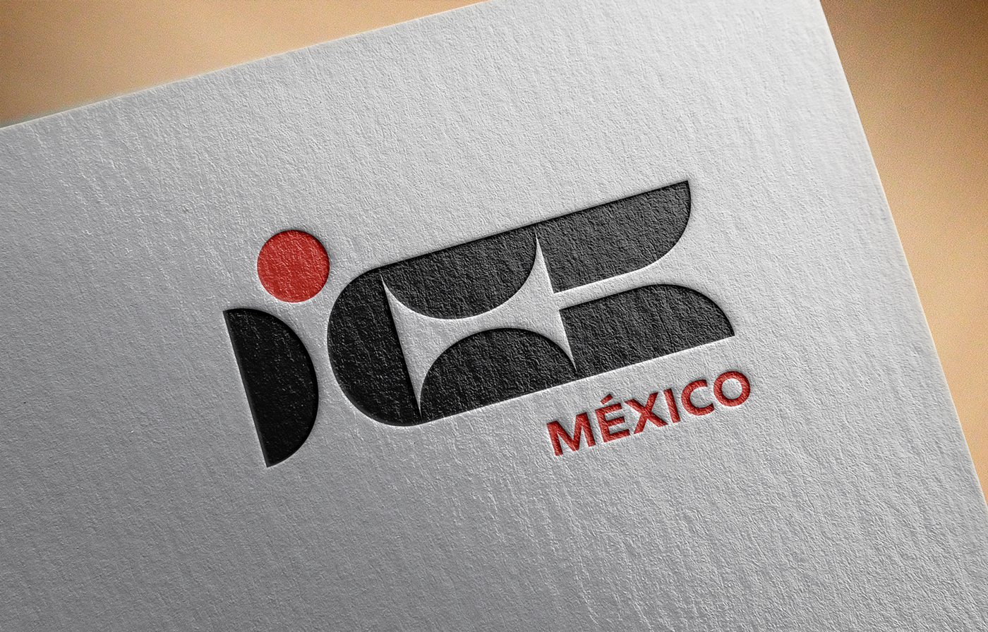
It was important to preserve the already established reading of the brand as IAB, adapted by its position to the whole human concept that arises: Interactive Human Bereau, that is to say, that can now be identified as the initials IHB. An abstract isotype was thus designed under the representation of multiple connected concepts in the same graphic ecosystem.
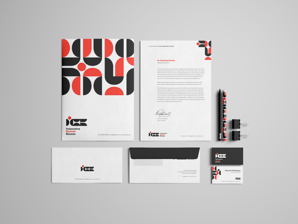
This isotype consists of 3 modules, which as shown have a double meaning. On the one hand, each one represents a letter of the IHB acronym, and in addition there is an analogous and digital duality in a second meaning. Thus, the "I" refers to the people, the users ... that HUMAN part in which they want to focus. The "H" symbolizes INTERACTION with the different technologies of the digital world and, finally, the "B" represents the democratization of knowledge as a platform and institution.
Under a second meaning, the isotype acronym represents the community; It includes a person composed of different parties that allude to the different countries, organizations, offices and members within IHB. Understanding then the figuration of this "person" the upper circle represents the different positions, ideas and methodologies of its members that nourish the community.

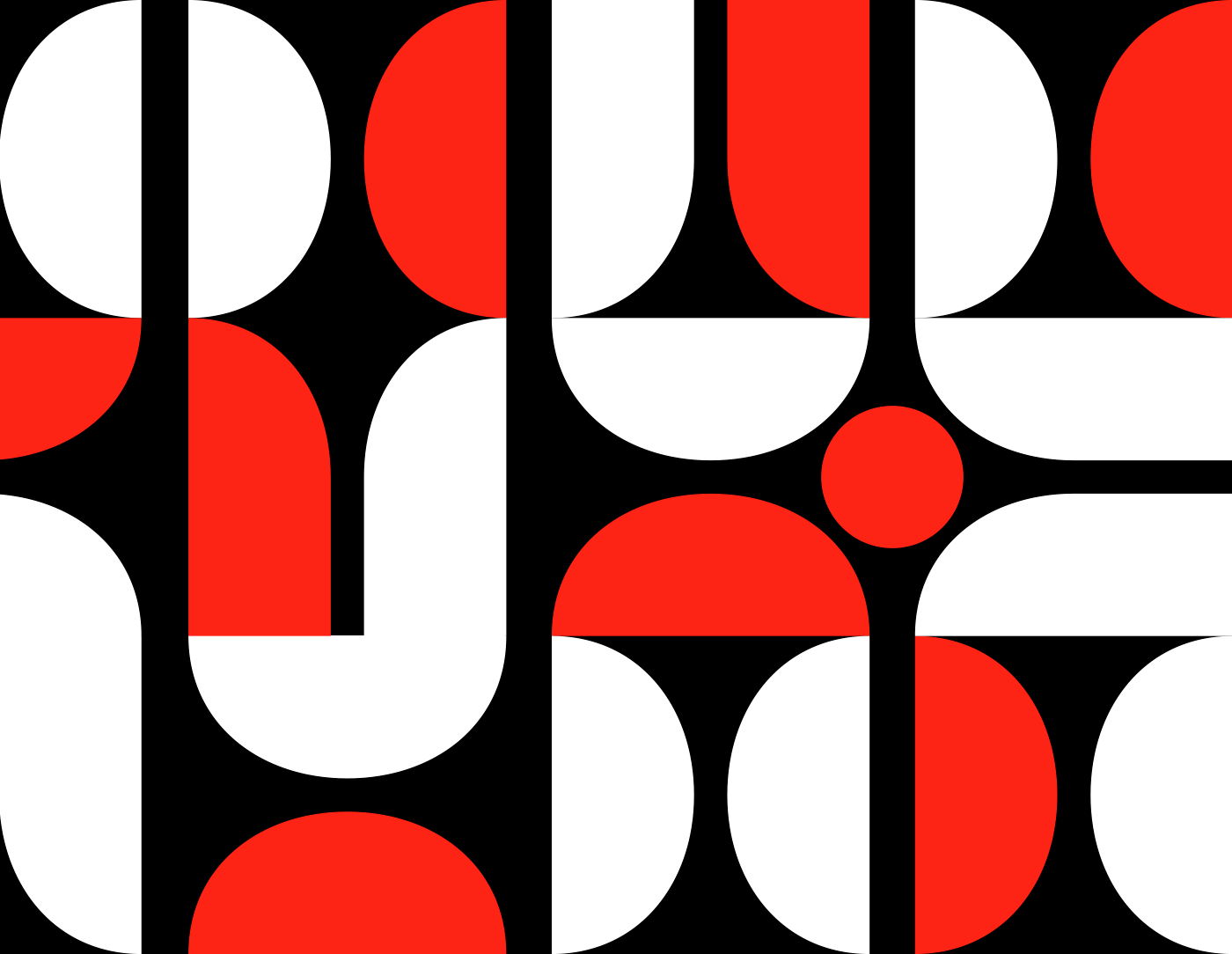
Modular versatility
The logo is designed to have different constructions based on a modular system depending on the type of use, format or application. In this way, under a humanist type, its use can be integrated for different formats; whether global, national and / or organizational.

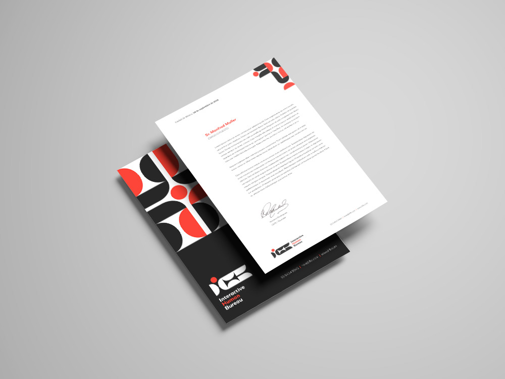
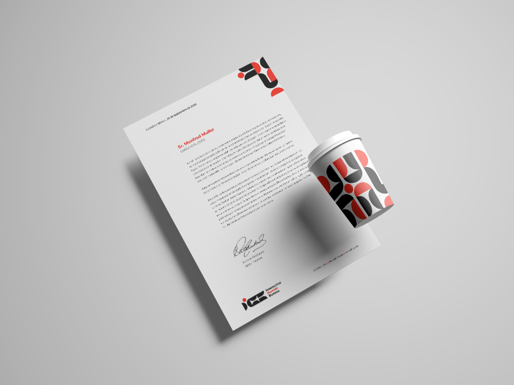
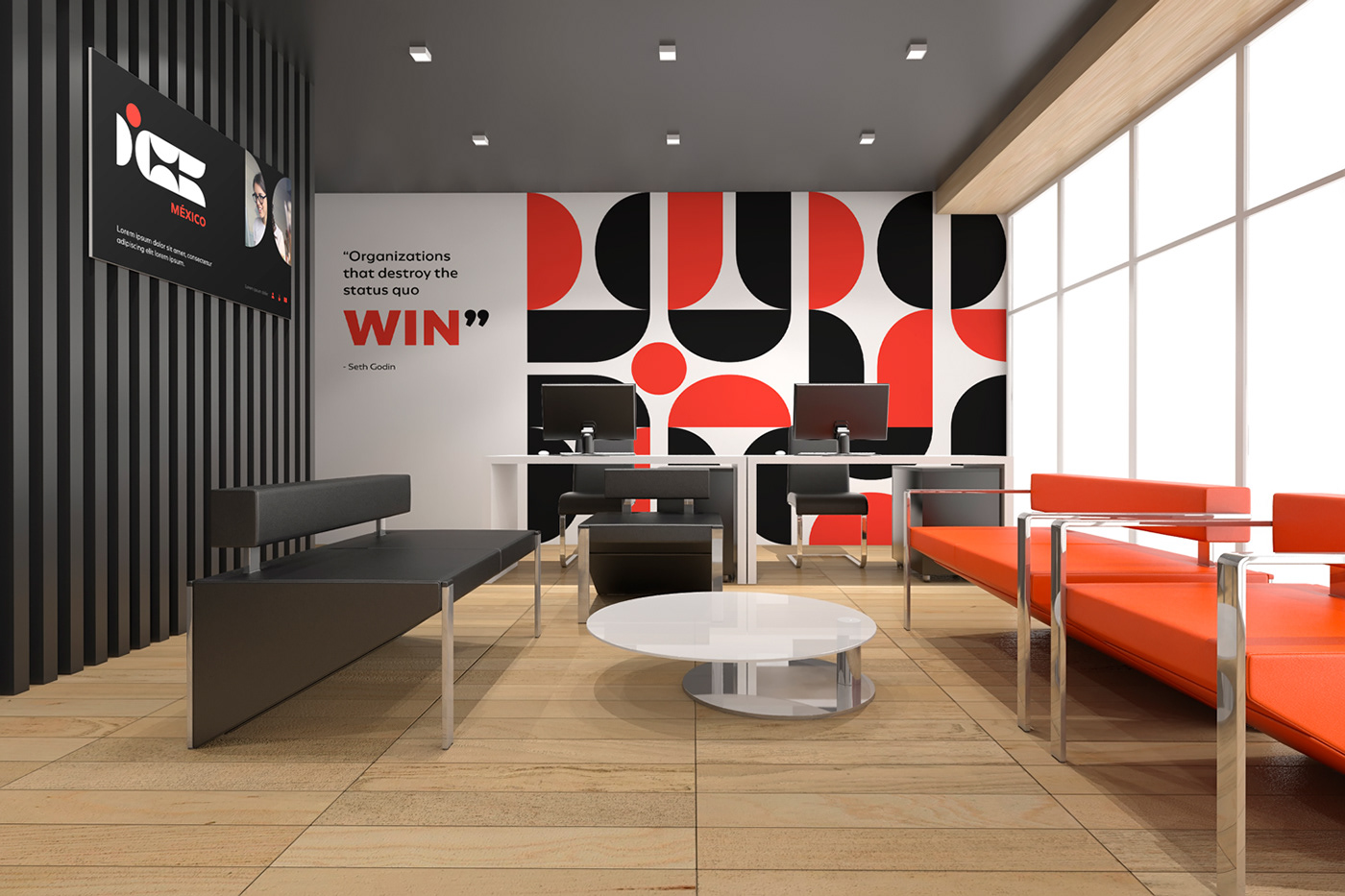
Graphic Applications
This presented modular versatility allows to exploit the visual identity of the brand under a wide range of possibilities. Preserving its institutional character, it makes use of a pattern based on its modules and chromatic palette to transfer its values and vision as a brand to different graphic applications.


IN BLACKBOT_ WE DESIGN THE FUTURE
This is a project for the future in which we experiment in our laboratory to obtain information about the current state of the companies, topics, concepts that interest us; to give you a review on how your status could be in the future. In Blackbot_ we design the future and this time, we did it for IAB where we believe that what they are currently doing is obsolete.
All this material is protected by intellectual authorship by the laws of our country and we share in this platform as a mere intellectual exhibition of what we think, process and propose. Any information can send an email to jon@blackbot.rocks or visit our website.