“Tea Hee Hee”
Branding & identity
Packaging
Branding & identity
Packaging
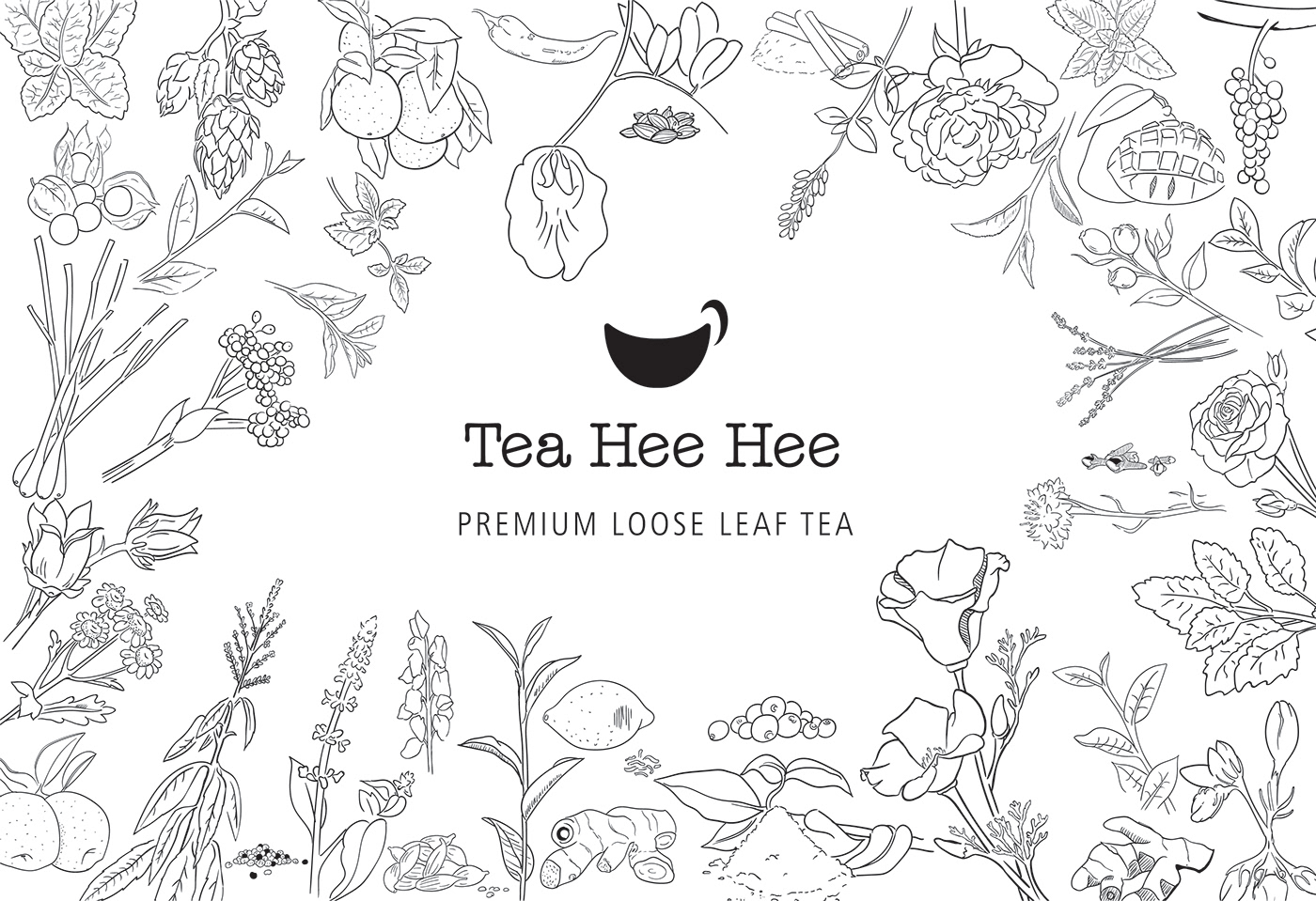
The logo mark is a smile and a cup conveying the core value and representing what it is.
This was a vast but enjoyable undertaking.
This was a vast but enjoyable undertaking.
- Twenty five different variants
- Various sized packaging for each (60+ labels)
- Service tubes
- Stickers
- Bulk bags
- Individual blobs that represent the characteristics of the tea
- Range patterns informed by the tea granules
- Every botanical ingredient illustrated
It was mammoth.
I’m really proud of the result.
Amazing teas prepared and matched by a Naturopath/Herbalist. A Tasmanian company using the highest quality ingredients, only organic, wild picked & fair trade it has no artificial or naturally-derived flavours, fragrance, colour, sugar or other sneaky additives. No plastic in the packaging and most of all they taste amazing! Head over to follow them on fbhttps://www.facebook.com/TeaheeheeTas/ if your in Tassie you can grab them at Reliquaire, Hill Street Grocer or Tasmanian Food and Wine Conservatory to name a few, with more stockists popping up all the time. #supportthelittleguy #localbusiness I’m really proud of the result.
#brandingtasmania #brandingmelbourne#jonnyfalckedesign #jonnyfalcke#teapackaging #graphicdesignmelbourne#graphicdesigntasmania#brandingandidentity #designmelbourne#getacuppaintoya #teaheehee#teaheeheetas