
As media shifted from a film-world to one of more highly divergent media, BC Film changed to BC Film + Media, to better reflect the nature of the projects they help bring to life. This change also necessitated reconsidering how the organization would present itself to those it interacts with.

The new BCFM mark utilizes two key blocks that both cluster information and play off one another to create a little visual tension. The grouping of these forms is echoed throughout all of the organization’s materials, creating a sense of energy and movement. In most settings, this mark is presented in the organization’s key blue tone—in others, it utilizes black or white.

BCFM’s identity system is based on the notion of new forms. Similar to the way the organization helps facilitate the creation of new forms of content, they also help explore the future of media. This is brought to life here, through a number of moving, organic forms that mutate to take on new characteristics in varying settings. Pictured above: presentation folder and letterhead, greeting card, mailing label.
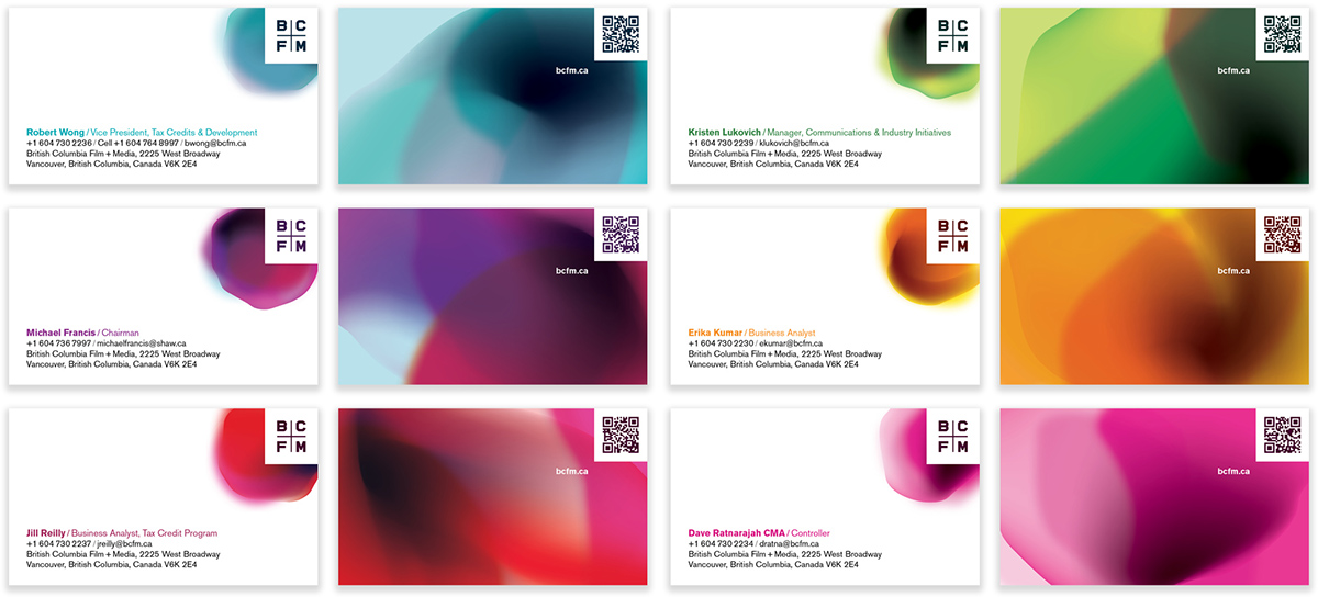
Each individual in the organization has a customized business card, which features a shift in hue from each of their colleagues’ cards. The backs of these cards also utilize QR codes that allow for instant access to the card holder’s VCF (electronic business card) data.

Printed elements in the BCFM identity tend to utilize rich blotches of colour on light backgrounds, whereas their digital counterparts are generally more like light sources in dark settings. In all areas, a rich, broad spectrum of color helps convey the energy found in the industry and the work it creates.

The BCFM identity system is employed across a number of items, ranging from (from top left, clockwise) brochures in English and Chinese, banners for use at industry events, email newsletters, and items around the office.
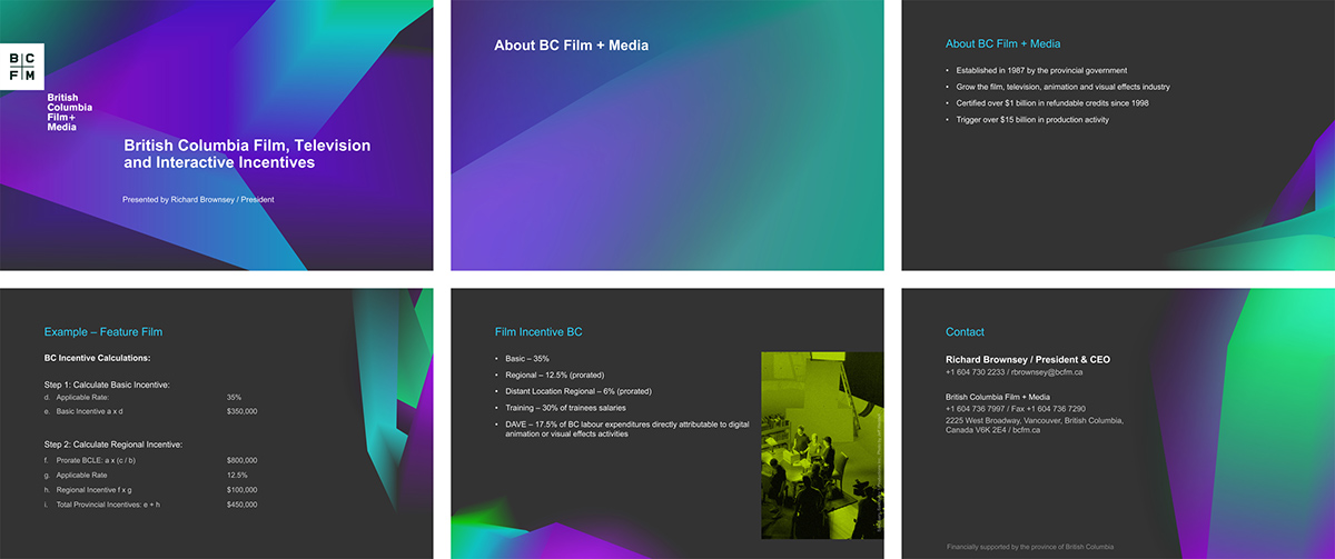
Given the varying data and adaptability required in such settings, design systems are put to the test when ported into presentation applications like PowerPoint and Keynote. The deck for BCFM uses a compressed color palette, alongside carefully created templates that allow for a lot of movement (in content), without diminishing the presentation.

The BCFM website employs a series of large blocks (echoing the logo) that organize and cluster data, atop visually rich backgrounds. The homepage helps explain the nature of the organization, provide the user with their navigation options, and update them on key news items and bulletins.

Site navigation is largely facilitated through a series of large tiles that use simple illustrations and descriptions to help the user find their way. Meanwhile, the core navigation area efficiently situates the visitor in their journey, through visual markers, typographic hierarchy, and visual depth.
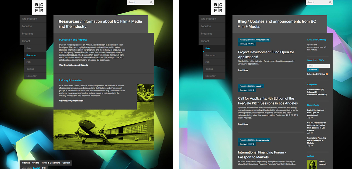
A series of varied background tones lend interest to the visitor’s experience. These are made workable through strict and highly refined type and color standards in the content areas. Each page in the website features a somewhat non-traditional composition, which helps even the least riveting content areas come to life.
View full case study here.


