ABOUT
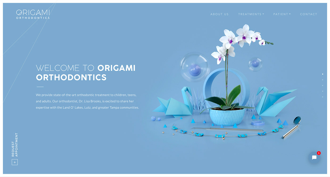
Origami Orthodontics contacted us a few months before the opening of their Florida-based private practice. They asked us to create their brand identity and to design their website with a twofold objective in mind. One, it should revolve around origamis (obviously). Two, we should address both children and adults demographics at the same time.
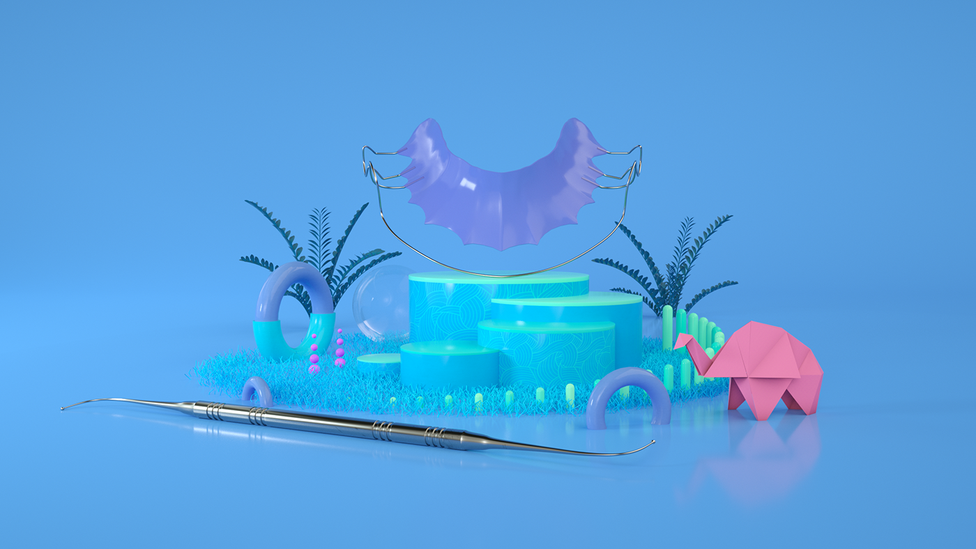
Orthodontics can be fun
Both children and adults dread orthodontics. It’s scary, it’s painful, it’s embarrassing. To make it less intimidating, we created soothing graphics and used pastel colors. We wanted people to feel at ease by creating a zen, playful atmosphere.


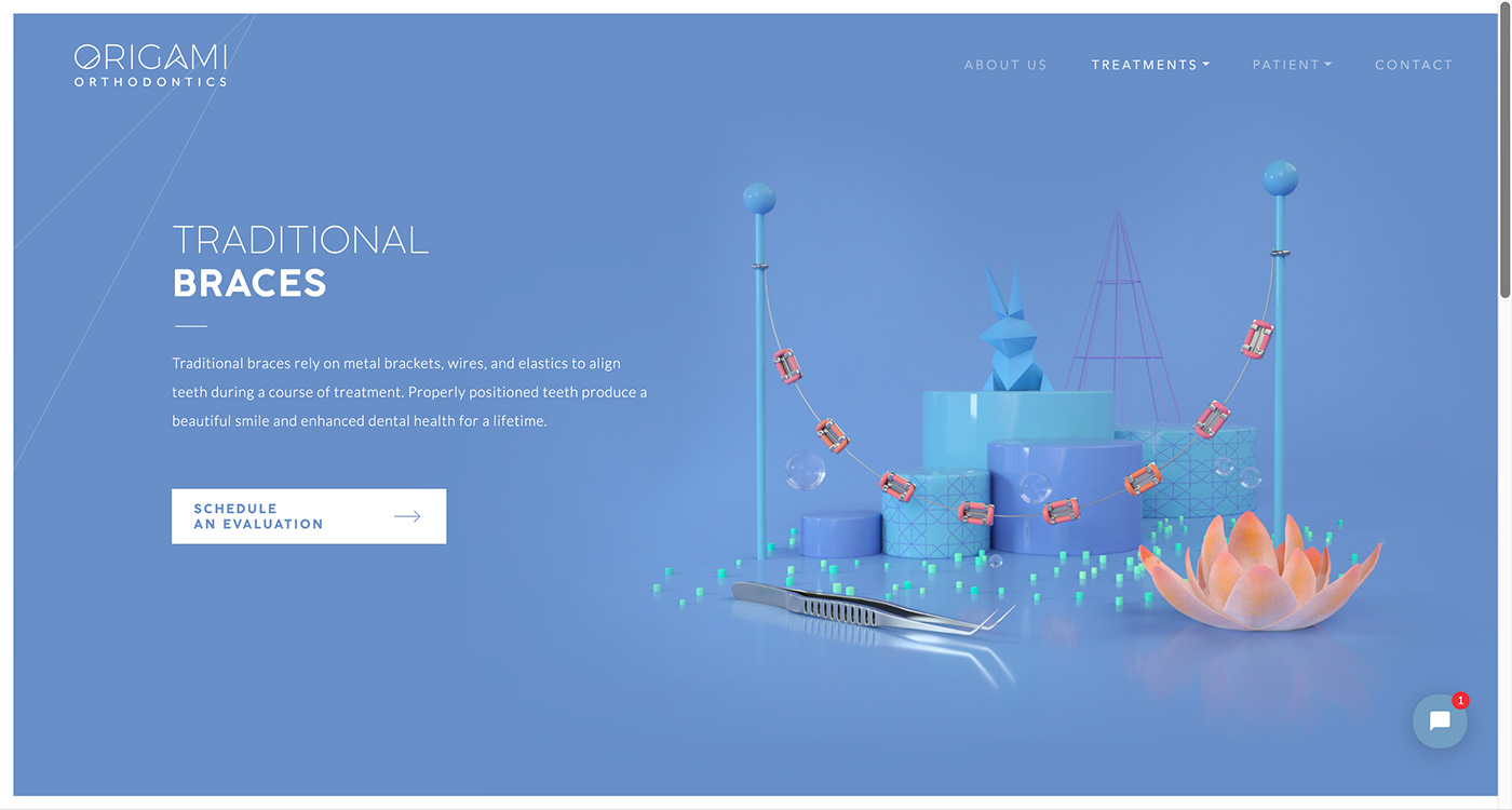
Treatments front and center
Orthodontics is still serious business : it shapes one’s appearance for the rest of their life. To strike the right balance between playfulness and professionalism, we took great care of making the whole design about three things : the actual treatments, the actual doctor, and a crystal clear user interface.