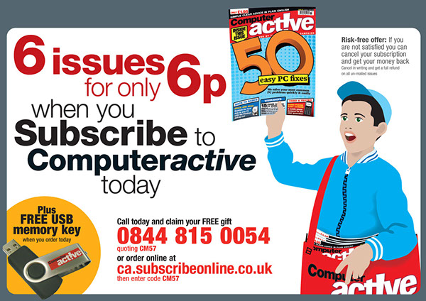
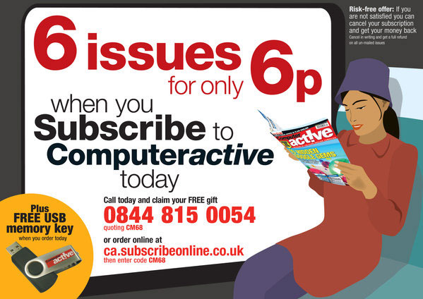
Subcription cards
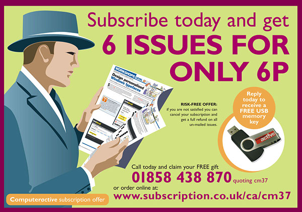
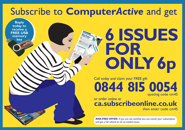
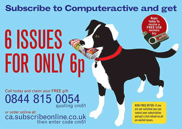
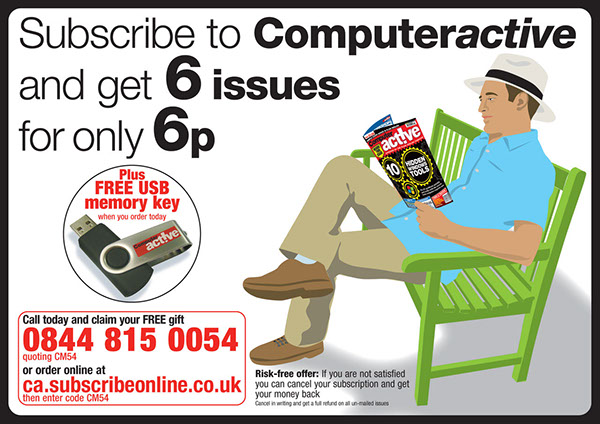
Those annoying bits of junk mail that fall out of your magazine. Still too text heavy but I was given the freedom to come up with my own ideas for the image.
Those annoying bits of junk mail that fall out of your magazine. Still too text heavy but I was given the freedom to come up with my own ideas for the image.
A new approach to make subscription cards less literal in their images and more attractive. My idea was to create something eye-catching with an appealed image. Starting with the dapper man, 1930s style, nostalgic image. Following him I created a French style woman. What next? Then the dog who liked to fetch. Going back to the man, relaxing on a park bench in his panama hat. Then I tried a newspaper boy, reminiscent of old times. Bit of a parody for a technology magazine. Then a commuter reading the magazine on a train.
These cards were each done in half a day, about 3 to 4 hours. I could have gone further with this idea moving towards being less literal, but this theme came to an end. This campaign was effective in that subscription sales went up considerably while these ran.