
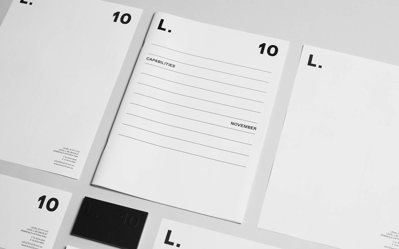

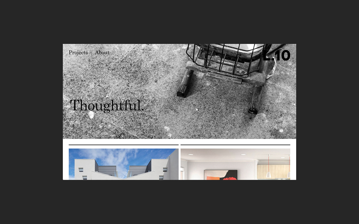
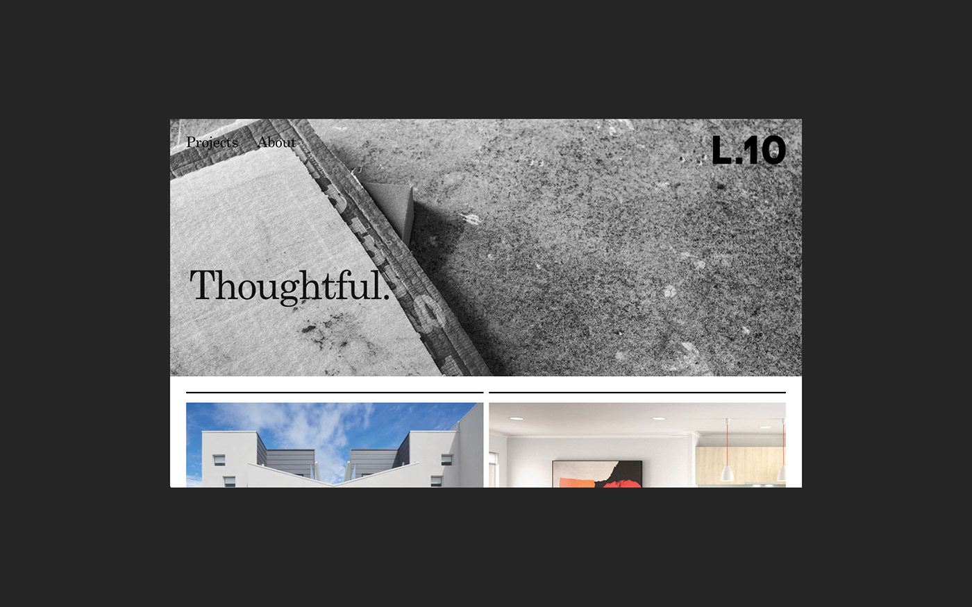


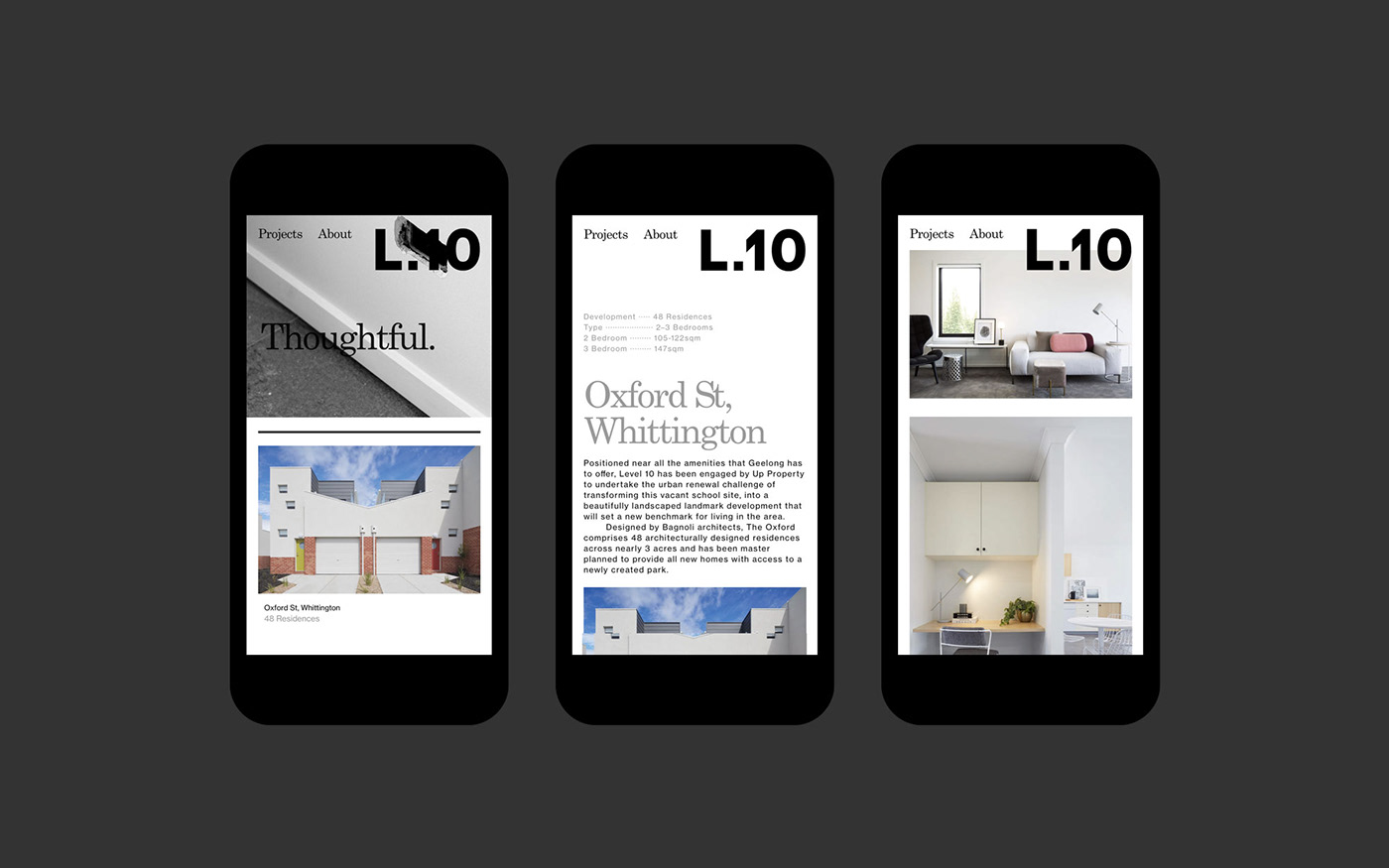


L.10 is a construction business specialising in the development of thoughtfully built residences. They commissioned the design of their new identity in a project including brand strategy development, naming and extensive application of the identity across a range of mediums.
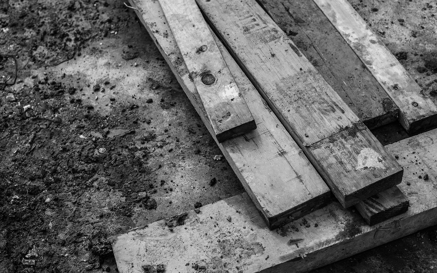
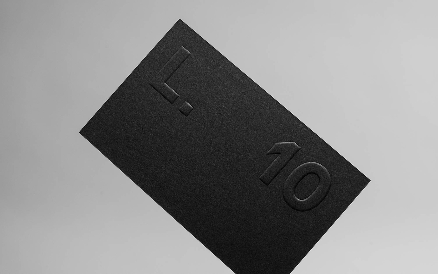
Simplicity is a hallmark of the brand, with a bold typographic aesthetic applied across stationary, documentation, site signage, staff clothing and vehicles. Black and white photography accompanies their story, capturing the authentic texture, materiality and light of an L.10 construction site.


